


 by Tom Gurney
Tom Gurney BSc (Hons) is an art history expert with over 20 years experience
Published on June 19, 2020 / Updated on September 27, 2026
Email: tomgurney1@gmail.com / Phone: +44 7429 011000
An island of lines and signs
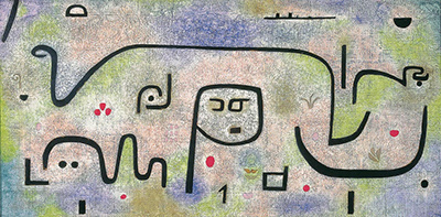
Across a wide field of pale pinks, greens and blues, heavy black lines turn, double back and sometimes stop abruptly. A central form can look like a face, a letter or a vessel; a long curve can suggest an island’s coast, a snake or simply the movement of a brush. Paul Klee’s Insula dulcamara is large enough for its signs to be seen across a room, yet close looking does not make them settle into one story. The Latin title, often translated “Bittersweet Island,” makes the painting feel like a place while leaving open what or who might inhabit it.[1][2][3]
Klee made the work in 1938. The Zentrum Paul Klee in Bern gives its annual work number as 1938,481 (C 1) and its size as 88 × 176 cm. Its current material description is unusually specific: oil and coloured paste paint on newsprint on jute over a stretcher, with original frame strips. The ordinary printed paper, textile support and broad horizontal format are part of the picture’s construction, not just an incidental base for mysterious marks.[1]
Contents
- Which painting is Insula dulcamara?
- How do the lines and colours work together?
- What does “bittersweet island” suggest?
- Was it first called Calypso’s Island?
- Can the black signs be read as writing?
- Is there a figure of death or illness?
- How should we look at the original materials?
- Looking again
Which painting is Insula dulcamara?
The painting belongs to the Zentrum Paul Klee in Bern. The Zentrum’s German, English, French and Italian Foundation pages identify the same 1938,481 (C 1) work and repeat its dimensions and layered medium. 481 is Klee’s number within his 1938 output; C 1 is an additional collection notation, not a second date. The title is Latin, while older English catalogues have often printed an initial capital on Dulcamara. Neither typography turns the work into a different painting.[1]
Older MoMA catalogues call its lender Kunstmuseum Bern, Paul Klee Foundation. That name reflects institutional history: the Paul Klee Foundation was based at Kunstmuseum Bern until the end of 2004 and entered the Zentrum Paul Klee Foundation in 2005. It is not evidence that a separate version travelled between two owners. The earlier MoMA exhibition caption simply says “oil on newspaper, mounted on burlap,” an abbreviated historical description. The current Bern record supplies the more precise oil-and-paste paint, newsprint, jute, stretcher and original frame-strip account.[1][2][4]
At nearly two metres across, the work is exceptional in Klee’s practice. A MoMA exhibition catalogue, printed in the 1970s, places it in a group of seven large horizontal paintings of 1938 and calls it the most expansive and frieze-like among them. Some later accounts call it Klee’s largest painting. The measured size and membership in the seven-work group are more secure than a global superlative, which would require a complete comparison with the catalogue raisonné. The scale already changes the experience: signs that might be intricate and small in another Klee work become broad painted events here.[1][2]
How do the lines and colours work together?
A broad, softly varied field carries thick black strokes. Pale green and pink are especially noticeable, while cooler blue and warmer patches give parts of the surface different weights. The colour does not form a conventional sky above land. There is no fixed horizon that forces every shape into a landscape. Red points and small dark marks interrupt the lighter intervals. Because the ground varies rather than staying blank, the heavy lines can appear both laid over it and absorbed into a single shifting surface.[2][3]
One long black stroke travels across much of the upper half, bending into a loop and extending towards the right. Shorter bars, hooks, curls and angular signs appear beneath and around it. Near the centre, a tall, open structure contains small marks that resemble eyes and a nose. Calling it a “face” describes one compelling visual effect, but a viewer can also notice how the supposed head is built from a line that belongs to the larger network. The work encourages recognition and then makes that recognition unstable.[3]
The extreme width leaves large intervals between some strokes. Those gaps matter as much as the dark pigment. They let a sign stand alone, while the eye continues to join it to a neighbour. A short black line may look like punctuation from a distance; close up, it is a shape with its own edge and thickness. The small local reproduction can show the general arrangement but cannot establish the exact paint order, whether newspaper type is visible under a particular passage, or how the original jute texture feels.[1][3]
MoMA’s catalogue gives a useful account of this relation between scale and line. In the curator’s reading, Klee enlarged his formerly finer calligraphic marks as he worked on much broader surfaces. The heavy strokes therefore retain a life as shapes rather than disappearing into the contours of objects they describe. Pink, green and blue areas interlock with the superimposed drawing to make a fluid field. This is a formal account of what the work does, although the catalogue’s suggestion of a path towards postwar field painting is a later art-historical comparison, not a statement Klee made about future painters.[2]
The same passage proposes possible outside stimuli, including Picasso and Miró, while explicitly leaving the question open. The painting does not need an assigned single influence to explain its bold lines. A more direct question for a viewer is how each stroke performs two jobs: it can be a mark on a surface and part of an image that briefly becomes legible. That double role helps explain why the work can seem playful and grave without requiring every dark element to become a fixed symbol.[2][3]
What does “bittersweet island” suggest?
Insula is Latin for island. Dulcamara carries a sweet-and-bitter association and also occurs in the botanical name Solanum dulcamara, commonly called bittersweet nightshade. The title can therefore pull the viewer towards geography, taste, plant life or a mixed emotional state. It does not, by itself, show which of those Klee meant to illustrate. Red spots have sometimes been compared with berries, but a berry reading is an interpretation of the marks, not a species identification or proof that the artist used a particular herb.[1][5]
Another path runs through Dr Dulcamara, the travelling vendor in Donizetti’s opera L’elisir d’amore. MoMA’s catalogue offers this operatic connection as a way of thinking about the painting’s odd mixture of lightness and mystery. The character does not inhabit an island in the opera, so the pairing is itself curious. It is a later curator’s title reading rather than a documentary explanation by Klee. The title’s ability to sustain unrelated associations helps make it more intriguing than a straightforward label such as “Island.”[2]
The botanical route has sometimes been pushed much further. A French art-magazine account suggests that Klee used bittersweet nightshade medicinally and put its red berries into the picture. That article provides no medical correspondence or treatment record for the claim. The work’s title and red dots cannot establish a therapy, and the page does not assign one to Klee. The same article usefully documents how the painting has been received through plants, illness, exile and coded writing, but those themes need separate evidence before they become biography.[5][6]
There is no need to choose between a literal island and an abstract arrangement before looking. If the broad curve is taken as a coast, other marks might become inhabitants, moons or a ship. If the curve is taken as drawn movement, the same forms remain active without a shore. The title creates a productive expectation of place. The painting tests that expectation with signs whose scale and orientation do not resolve into a map.[2][3]
Was it first called Calypso’s Island?
A widely repeated story links the work to Calypso, the island-dwelling figure in Homer’s Odyssey. The 1970s MoMA catalogue phrases it cautiously: someone suggested that Klee call the painting “Calypso’s Island,” but it became Insula dulcamara. Its note traces the anecdote to Will Grohmann’s 1954 book on Klee, p. 68. Chris Pike’s later article instead paraphrases Grohmann’s English translation as saying “Calypso’s Isle” was a working title Klee found too obvious. Those versions seem to draw on the same earlier account, not two independent records.[2][7]
The distinction matters. A suggestion made to Klee, a working title in conversation and a title written in his own register are different kinds of evidence. The available owner caption gives Insula dulcamara; it does not show a preliminary Insel der Kalypso inscription. Without the artist’s register or Grohmann’s original page checked against his source, the painting should not be described as originally titled The Island of Calypso. The Calypso association is historically significant and worth exploring, but its precise status remains open.[1][2][7]
MoMA reads a possible island with strange creatures or snakes, and a small ship moving between rising and setting moons. A viewer can test each proposed form against the painting. The ship is a small shape near the top, not an established illustration of Odysseus’s voyage. The large central form does not identify Calypso, Odysseus or another mythic character. A long summary of the Odyssey would tell us much more about Homer than about Klee’s particular lines. The title anecdote is best used to sharpen a question: why might the artist have kept a more ambiguous name?[2][3]
Can the black signs be read as writing?
Klee often worked near the boundary between drawing and script. In Insula dulcamara, some thick forms are especially letter-like, and the central shape looks to many viewers like a capital P. That observation opens a line of scholarly debate, but it does not automatically yield a message. A painting can suggest writing without being a cipher with one solution.[3][7][8]
In a 2014 article, Chris Pike argues that the dark marks make a pictorial signature spelling “Paul Klee.” His reading begins with the central P-like figure and adjoining shapes for Paul, then follows further resemblances to Klee’s handwritten signature, reversals and Arabic-script forms to build the surname. He also proposes phonetic and newspaper-text connections and interprets the whole work through identity, authorship and mortality. These are detailed, testable steps in a published argument. They are not a transcribed signature supplied by the Bern museum or a statement by Klee that he hid his name in the painting.[7]
The published case is more complex than saying “there is a P.” The viewer must decide where one letter ends, in which direction to read, when a mark is reversed, and when a resemblance to another alphabet is meaningful. Pike’s author-uploaded article makes those choices visible. Its full painting image was withheld for copyright reasons, which is another reason this page does not reproduce his letter map from an uncleared photograph. A reader can follow the essay’s diagram and assess the proposed correspondences directly.[7]
Oğuz Haşlakoğlu offered a direct counter-reading in a 2022 article in the Turkish journal Kaygı, published in English with a Turkish abstract. He accepts that several forms may be read as letters but rejects Pike’s move from Latin-letter Paul to a literal Arabic-script surname. Instead, he proposes that the marks encode the title, “Insula dulcamara,” in distorted Latin letters that resemble Arabic calligraphy. His central P-like form can also become a broken R in his mapping. The two scholars thus disagree on the text, reading path and role of script resemblance while working from many of the same painted forms.[8]
Neither interpretation is proven by the existence of letter-like shapes alone. Both require selected turns, reversals and ambiguous boundaries. That does not make them worthless: they give precise ways to look at a work that keeps testing the line between sign and image. Their disagreement is a reason to present them as competing interpretations. The public page can explain what each proposes, where their paths diverge and what evidence would be needed to move from a plausible visual reading to a documented account of Klee’s method.[7][8]
Haşlakoğlu extends his argument towards ideas of artistic identity and compares Klee’s process with Cézanne and later philosophy. Pike brings in the theory of the author’s signature. These larger claims belong to the works’ scholarly reception, not to the Bern collection caption. They should come after a reader has seen the simple formal problem at their heart: marks that act as independent painted shapes can suddenly resemble letters, and the words a viewer thinks they see depend on the path chosen across the canvas.[3][7][8]
Is there a figure of death or illness?
Klee made the painting during his late Bern years, after his departure from Germany under National Socialism and while living with serious illness. Those historical circumstances are relevant, especially for a work whose large format and thickened line differ from many earlier sheets. They do not make the painting a medical diagram or prove that every pale patch refers to his body. The central face-like structure has been read as a person, a mask, a letter and a sign of mortality. Each reading must be identified as such.[2][7][9]
The 2019 Portuguese-English Klee exhibition catalogue places this work among reduced, archaic-looking late signs and mentions a sense of approaching death. The interpretation belongs to later reception of the late work; it is not a confession made by Klee beside this painting. The Zentrum’s German easy-language material similarly asks whether a pale figure might be a sick person or death, using deliberately tentative language. Its questions model a useful way to keep visitors looking instead of handing them a supposed iconographic answer.[9][10]
MoMA’s earlier catalogue puts more emphasis on line, format and surface. These accounts need not be forced into agreement. A painter confronting illness can still make active choices about scale, technique and ambiguity. Reducing the work to a farewell would also flatten its unexpected light colours and energetic black turns. Conversely, describing it only as a formal exercise would miss why later viewers have found the title and central figure emotionally charged.[2][3][9]
How should we look at the original materials?
The owner’s material description gives newsprint beneath the paint and jute on the stretcher. Newsprint is not a conventional pristine art-paper surface; it brings ordinary printed matter into a work whose black marks can resemble another form of writing. That coincidence is suggestive, but it does not mean every visible letter of the original newspaper was chosen as part of an encoded message. Pike, for example, reads one reported type fragment as a further allusion. The actual fragment and layer relation require a high-quality, authorised image or examination of the original before this page can verify them.[1][7]
The original frame strips are specifically named by the Zentrum. They belong to the current object record and should not vanish in a generic “oil on canvas” label. Kleisterfarbe is often rendered “coloured paste paint”; it is not the same as saying Klee simply painted with glue. The work’s materials let him combine a printed substrate, a rough textile base, thin colour fields and thick dark signs at a scale unusual for his practice.[1][2]
The small reproduction introduces the composition but cannot establish fine texture or paint detail.[1]
Looking again
Begin at the long upper curve and follow it across the painting. Then look at the central P-like form without naming it for a moment. Notice how several shorter marks stand apart from the network and how coloured intervals affect their weight. On another pass, try the island story, the botanical title, the operatic name and the scholars’ two incompatible reading paths. Each will make certain forms prominent and leave others unexplained.[2][3][7][8]
That is the work’s strength. At 88 × 176 cm, Insula dulcamara gives Klee’s graphic signs an almost architectural reach, while preserving their capacity to turn from stroke into creature, letter, landscape or face. The Bern object record fixes its year, materials and physical scale. Its title and later interpretations invite possibilities, but none supplies an artist-authored key for every mark. For related reading, see Klee’s late work, materials and techniques and the separate 1940 Death and Fire, where letter forms are more openly legible.[1][3][8]
Explore selected works from Klee’s much larger oeuvre. Titles without a link have an authenticated catalogue identity but no reviewed article yet.
Artworks directory
| Name | Date | Medium |
|---|---|---|
| A Gate | 1939 | Painting and mixed media |
| A Woman for Gods | 1938 | Watercolour and mixed media |
| Ab Ovo | 1917 | Watercolour and mixed media |
| Above Mountain Summit | 1917 | Drawing and mixed media |
| Abstract Trio | 1923 | Drawing and mixed media |
| Acrobats | 1915 | Watercolour and mixed media |
| Actor's Mask | 1924 | Painting and mixed media |
| Ad Marginem | 1930 | Drawing and mixed media |
| Ad Parnassum | 1932 | Painting and mixed media |
| Adventurer Ship | 1927 | Drawing and mixed media |
| Affected Place | 1922 | Drawing and mixed media |
| After a Sketch from Zurich | 1914 | Watercolour and mixed media |
| After Drawing | 1919 | |
| After The Floods | 1936 | Watercolour and mixed media |
| All Souls' Picture | 1921 | |
| Ancient Harmony | 1925 | Painting and mixed media |
| Angel Applicant | 1939 | Drawing and mixed media |
| Angel Serves the Desired | 1920 | |
| Angel, Still Female | 1939 | Painting and mixed media |
| Angelus Novus | 1920 | Drawing and mixed media |
| Animal Terror | 1926 | Painting and mixed media |
| Arab Song | 1932 | Painting and mixed media |
| Archangel | 1938 | Painting and mixed media |
| Architecture | 1923 | Painting and mixed media |
| Architecture of the Plain | 1923 | Drawing and mixed media |
| Around the Fish | 1926 | Painting and mixed media |
| Arrival of the Air Steamer | 1921 | Drawing and mixed media |
| Asiatic God | 1924 | Painting and mixed media |
| Astrological Fantasy Portrait | 1924 | Drawing and mixed media |
| Athlete's Head | 1932 | Watercolour and mixed media |
| Aufgehender Stern | 1931 | Painting and mixed media |
| Autumn Flower | 1922 | Painting and mixed media |
| Bad Band | 1920 | Drawing and mixed media |
| Baroque Centaur | 1939 | Painting and mixed media |
| Before the Blitz | 1923 | Drawing and mixed media |
| Before the Snow | 1929 | Drawing and mixed media |
| Besessenes Madchen | 1924 | Watercolour and mixed media |
| Bird Garden | 1924 | |
| Bird Wandering Off | 1926 | Watercolour and mixed media |
| Blossoms in the Night | 1930 | Watercolour and mixed media |
| Blue-Bird-Pumpkin | 1939 | Painting and mixed media |
| Boats in the Flood | 1937 | Painting and mixed media |
| Botanical Theatre | 1934 | Drawing and mixed media |
| Boy in Fancy Dress | 1931 | Watercolour and mixed media |
| Broken Key | 1938 | |
| Brother and Sister | 1930 | Watercolour and mixed media |
| But the Red Roof | 1935 | Painting and mixed media |
| C - C = Fisch | 1931 | Watercolour and mixed media |
| Cacti | 1912 | Painting and mixed media |
| Camel (in Rhythmic Landscape with Trees) | 1920 | Drawing and mixed media |
| Captive Pierrot | 1923 | Drawing and mixed media |
| Castle and Sun | 1928 | Drawing and mixed media |
| Cat and Bird | 1928 | Drawing and mixed media |
| Cathedrals | 1925 | Watercolour and mixed media |
| Chalice of the Heart | 1937 | Painting and mixed media |
| Characters in Yellow | 1937 | Painting and mixed media |
| Chosen Site | 1927 | Mixed media |
| Christmas Picture | 1923 | Drawing and mixed media |
| City of Towers | 1916 | Painting and mixed media |
| Clarification | 1932 | Painting and mixed media |
| Collection of Figurines | 1926 | Painting and mixed media |
| Colorful Architecture | 1917 | Painting and mixed media |
| Comedians' Handbill | 1938 | |
| Comic Opera Singer | 1927 | Painting and mixed media |
| Composition | 1939 | Painting and mixed media |
| Composition with Figures | 1915 | Drawing and mixed media |
| Composition with the Yellow Half-Moon and the Y | 1918 | Watercolour and mixed media |
| Conch–Still Life II | 1939 | Watercolour and mixed media |
| Cosmic Composition | 1919 | Painting and mixed media |
| Crystal Gradation | 1921 | Drawing and mixed media |
| Dance of the Grieving Child | 1922 | Painting and mixed media |
| Dancing Girl | 1940 | Painting and mixed media |
| Das Licht und Etliches | 1931 | Mixed media |
| Death and Fire | 1940 | Painting and mixed media |
| Death for the Idea | 1915 | |
| Demon as Pirate | 1926 | Watercolour and mixed media |
| Diana | 1931 | Painting and mixed media |
| Diavolo Player | 1923 | Drawing and mixed media |
| Die Kapelle | 1917 | Watercolour and mixed media |
| Die Vase | 1938 | Painting and mixed media |
| Doctor | 1930 | Drawing and mixed media |
| Dredger and Sailboat | 1931 | Watercolour and mixed media |
| Ein Tor | 1939 | Painting and mixed media |
| Ein Weib fur Gotter | 1938 | Mixed media |
| Embrace | 1939 | Watercolour and mixed media |
| Episode before an Arab Town | 1923 | |
| Equals Infinity | 1932 | Painting and mixed media |
| Eros | 1923 | Drawing and mixed media |
| Error on Green | 1930 | Watercolour and mixed media |
| Evening Figure | 1935 | Drawing and mixed media |
| Falling Bird | 1919 | |
| Fermata | 1932 | Watercolour and mixed media |
| Fire Clown | 1921 | Watercolour and mixed media |
| Fire Full Moon | 1933 | Watercolour and mixed media |
| Fire in the Evening | 1929 | Painting and mixed media |
| Fish in the Harbour | 1916 | Watercolour and mixed media |
| Fish Magic | 1925 | Watercolour and mixed media |
| Flock of Birds | 1917 | Drawing and mixed media |
| Flora on Sand | 1927 | Watercolour and mixed media |
| Flower Myth | 1918 | |
| Flower Stand with Watering Can and Bucket | 1910 | Watercolour and mixed media |
| Flowering Tree (Abstraction with Reference to a Flowering Tree) | 1925 | Painting and mixed media |
| Flowers in Pots | 1923 | |
| Flowers in Stone | 1939 | Painting and mixed media |
| Forest Witch | 1938 | Painting and mixed media |
| Fright of a Girl | 1922 | Drawing and mixed media |
| Fruits on Red | 1930 | Drawing and mixed media |
| Full Moon | 1919 | Mixed media |
| Föhn Wind in Franz Marc's Garden | 1915 | Watercolour and mixed media |
| Garden in St Germain, The European Quarter near Tunis | 1914 | Watercolour and mixed media |
| Ghost Chamber with the Tall Door (New Version) | 1925 | |
| Ghost of a Genius | 1922 | Drawing and mixed media |
| Girl in Mourning | 1939 | Painting and mixed media |
| Glance of a Landscape | 1926 | Watercolour and mixed media |
| Gluht Nach | 1939 | Drawing and mixed media |
| Golden Fish | 1925 | Watercolour and mixed media |
| Goldfish Wife | 1921 | Watercolour and mixed media |
| Green Plant, Blood, Louse | 1924 | Drawing and mixed media |
| Hafenbild | 1918 | Mixed media |
| Hammamet with Mosque | 1914 | Watercolour and mixed media |
| Harbour with Sailing Ships | 1937 | Painting and mixed media |
| Hauptweg und Nebenwege | 1929 | Painting and mixed media |
| Heavenly and Earthly Time | 1927 | Drawing and mixed media |
| Heroic Fiddling | 1938 | Painting and mixed media |
| Heroic Roses | 1938 | Painting and mixed media |
| Heroic Strokes of the Bow | — | Mixed media |
| Highway and Byways | 1929 | Drawing and mixed media |
| Houses near the Gravel Pit | 1913 | Watercolour and mixed media |
| Howling Dog | 1928 | Painting and mixed media |
| In the Current Six Thresholds | 1929 | Painting and mixed media |
| In the Style of Kairouan | 1914 | Drawing and mixed media |
| Individualized Altimetry of Stripes | 1930 | Painting and mixed media |
| Insula Dulcamara | 1938 | |
| Interior with the Clock | 1913 | Watercolour and mixed media |
| Irma Rossa the Animal Tamer | 1918 | Drawing and mixed media |
| Journey in Corsica | 1927 | Drawing and mixed media |
| Landscape with Bluebirds | 1919 | Watercolour and mixed media |
| Legend of the Nile | 1937 | Painting and mixed media |
| Lemon Harvest | 1937 | Watercolour and mixed media |
| Likeness in the Bower | 1930 | Watercolour and mixed media |
| Limits of Reason | 1927 | Painting and mixed media |
| Little Hope | 1938 | Watercolour and mixed media |
| Magdalena before the Conversion | 1938 | Drawing and mixed media |
| Mask of Fear | 1932 | Painting and mixed media |
| May Picture | 1925 | Painting and mixed media |
| Monument in a Cemetery | 1922 | Watercolour and mixed media |
| Monuments at G | 1929 | Watercolour and mixed media |
| Municipal Jewel | 1917 | Watercolour and mixed media |
| Mural from the Temple of Longing Thither | 1922 | |
| Nach der Uberschwemmung | 1936 | Watercolour and mixed media |
| New Harmony | 1936 | Painting and mixed media |
| New House in the Suburbs | — | Mixed media |
| Old Steamboat | 1922 | Drawing and mixed media |
| On the Edge | 1930 | Drawing and mixed media |
| Once Emerged from the Gray of Night | 1918 | Drawing and mixed media |
| One Who Understands | 1934 | Painting and mixed media |
| Oriental Pleasure Garden | 1925 | Painting and mixed media |
| Park of Idols | 1939 | Watercolour and mixed media |
| Passing by Red Pillars | 1928 | Watercolour and mixed media |
| Persian Nightingales | 1917 | Drawing and mixed media |
| Popular Wall Painting | 1922 | Painting and mixed media |
| Prestidigitator | 1927 | Watercolour and mixed media |
| Rainy Day | 1931 | Watercolour and mixed media |
| Red and White Domes | 1914 | Watercolour and mixed media |
| Red Balloon | 1922 | Drawing and mixed media |
| Redgreen and Violet-Yellow Rhythms | 1920 | Drawing and mixed media |
| Refuge | 1930 | Watercolour and mixed media |
| Rhythmic Rythmical | 1930 | Painting and mixed media |
| Saint of the Inner Light | 1921 | |
| Scaffolding of a New Building | 1930 | Painting and mixed media |
| Scholar in Dealing with Stars | 1926 | Watercolour and mixed media |
| Seated Woman | 1930 | Drawing and mixed media |
| Senecio | 1922 | Painting and mixed media |
| Separation in the Evening | 1922 | Drawing and mixed media |
| Sinbad the Sailor | 1923 | Drawing and mixed media |
| Skeptically Smiling | — | Mixed media |
| Small House in the Garden City | 1928 | Watercolour and mixed media |
| Small Portrait of a Girl in Yellow | 1925 | Painting and mixed media |
| Southern Gardens | 1919 | Watercolour and mixed media |
| Static-Dynamic Gradation | 1923 | Drawing and mixed media |
| Still Life | 1927 | Painting and mixed media |
| Still Life with Gladioli | 1932 | Watercolour and mixed media |
| Strange Garden | 1923 | Drawing and mixed media |
| Stricken City | 1936 | Painting and mixed media |
| Strong Dream | 1929 | Watercolour and mixed media |
| Struck from the List | 1933 | Drawing and mixed media |
| Structural I | 1924 | Drawing and mixed media |
| Sumpflegende | 1919 | Painting and mixed media |
| Temple Gardens | 1920 | Drawing and mixed media |
| The Arrow before the Target | 1921 | Drawing and mixed media |
| The Barbed Noose with the Mice | 1923 | Watercolour and mixed media |
| The Flora of the Heath | 1925 | Watercolour and mixed media |
| The Goldfish | 1925 | Watercolour and mixed media |
| The Hour Before One Night | 1940 | Painting and mixed media |
| The Man in Love | 1923 | |
| The Mask with the Flag | 1925 | Mixed media |
| The Pathos of Fertility | 1921 | |
| The Rhine at Duisburg | 1937 | Painting and mixed media |
| The Way to the Citadel | 1937 | Painting and mixed media |
| Three Houses and a Bridge | 1922 | Watercolour and mixed media |
| Tightrope Walker | 1923 | |
| Tomb in Three Parts | 1923 | Watercolour and mixed media |
| Tomcat's Turf | 1919 | Watercolour and mixed media |
| Tower in Orange and Green | 1922 | Drawing and mixed media |
| Tree and Architecture - Rhythms I | 1920 | Watercolour and mixed media |
| Tree and Architecture - Rhythms II | 1920 | Painting and mixed media |
| Tropical Dawn with the Owl | 1921 | Mixed media |
| Tropische Dammerung | 1921 | Painting and mixed media |
| Twittering Machine | 1922 | Drawing and mixed media |
| Variations (Progressive Motif) | 1927 | Watercolour and mixed media |
| Ventriloquist and Crier in the Moor | 1923 | |
| Viaducts Break Ranks | 1937 | Drawing and mixed media |
| Villa R | 1919 | Painting and mixed media |
| Village Carnival | 1926 | Painting and mixed media |
| Vor dem Blitz | 1923 | Drawing and mixed media |
| Wald-Hexen | 1938 | Painting and mixed media |
| Young Forest | 1925 | Drawing and mixed media |
Related artworks
Explore eight other Klee works, beginning with works close in date to this one.
Viaducts Break Ranks
1937
Death and Fire
1940
New Harmony
1936
Fire Full Moon
1933
Struck from the List
1933
Ad Parnassum
1932
Mask of Fear
1932
Discussion
Klee spread heavy black marks across a broad, softly coloured surface.
The Latin title invites several readings without resolving every mark.
Reader Insights
Which black marks first look like an image or a letter to you?
Where does a line begin to resemble a coast, creature or face?
How does the broad horizontal format change the way you follow the signs?
Join the Conversation
Share the detail or source behind your reading.
References
- Zentrum Paul Klee, Paul Klee Foundation collection page, German object caption to Insula dulcamara, 1938,481 (C 1), oil and coloured paste paint on newsprint on jute over stretcher, original frame strips, 88 × 176 cm, Bern; its English Foundation history documents the 2005 institutional transition.
- Museum of Modern Art, European Master Paintings from Swiss Collections: Post-Impressionism to World War II, printed p. 150 (PDF p. 153), with source notes to p. 150 on PDF pp. 172–73. Museum-hosted catalogue read directly: seven-work 1938 group, line/scale reading, suggested Calypso title, Dr Dulcamara analogy and sources. Its older medium wording is superseded by the current owner record, View source.
- Existing page reproduction, visually inspected in its unchanged local splash; a small overview suited to broad composition, not technical or letter-by-letter verification.
- Museum of Modern Art, Paintings, Drawings, and Prints by Paul Klee historical catalogue, no. 84, earlier lender name and abbreviated historical medium, View source.
- Switzerland Tourism, Insula dulcamara collection summary, title/botanical association and largest-work claim; this tourism text is not a conservation or medical source, View source.
- Bénédicte Ramade, “Paul Klee Insula Dulcamara, 1938”, L’Œil, 2016, French exhibition reception. Claims about Klee’s medicinal use of nightshade and specific illness effects are not supported there by a primary treatment record and are not adopted as facts here, View source.
- Chris Pike, “Signing off: Paul Klee’s Insula dulcamara ”, Word & Image 30:2 (2014), pp. 117–130, author-uploaded full text and notes read. The hidden-name/signature, Arabic-letter and mortality proposals are his interpretations. His note 52 cites Grohmann’s English translation p. 146 for the Calypso account; the original German page remains to check, View source.
- Oğuz Haşlakoğlu, “‘Bittersweet Island’ as Encoded Epithet: Klee in the Making”, Kaygı 21:1 (2022), pp. 68–77, English with Turkish abstract, read in full. It critiques Pike and proposes title rather than name in the signs. Its decoding and broad philosophical claims remain attributed interpretations, View source.
- Zentrum Paul Klee-linked exhibition catalogue, Paul Klee: Equilíbrio Instável (2019), Portuguese/English, illustration 34 and discussion of ambiguous late signs and mortality as reception, View source.
- Zentrum Paul Klee, Kosmos Klee easy-language exhibition sheet, German: qualified map/sea/figure/death questions rather than a fixed decoding; and Swiss inclusive-museum practice handbook, open-ended looking exercise using the painting.
- Zentrum Paul Klee, image requests; 2025 press-image sheet. These show an image request route and limited press asset, not item-level commercial clearance for new website details.