


 by Tom Gurney
Tom Gurney BSc (Hons) is an art history expert with over 20 years experience
Published on June 19, 2020 / Updated on September 27, 2026
Email: tomgurney1@gmail.com / Phone: +44 7429 011000
A botanical title, a field of colour
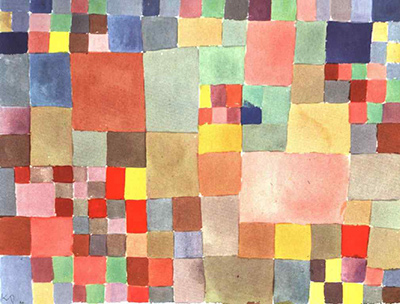
Paul Klee's Flora auf Sand, commonly called Flora on Sand, offers a botanical title and a field of coloured rectangles. No flower stands apart from the pattern. No horizon makes the sand a conventional landscape. Instead, small and large patches seem to gather, separate and recur across a horizontal sheet. The title asks us to think about growth and ground while the image makes colour relationships the chief event.[1][2]
The work is dated 1927 and appears in a secondary index as 1927,226. A multilingual caption printed on a 1988 facsimile calls it a watercolour on white Ingres paper, measuring 23.2 × 30.3 cm, then in a Swiss private collection. An auction database also calls it watercolour but records 24.1 × 30.4 cm. Those sources point toward a work on paper, while leaving its exact measured component, provenance after 1988 and present location unresolved. A reproduction seller's label of “oil on canvas” does not outweigh the two watercolour records.[1][2][3]
Contents
- What can be established about the object?
- How does the field hold together?
- Where are the flora and sand?
- What have scholars seen in its colour?
- How does it compare with the other flora works?
- What does the work's later record show?
- Look again
What can be established about the object?
Klee used a year and sequence number for his works. The secondary annual index assigns Flora auf Sand 1927,226. The caption photographed on the 1988 facsimile adds W 6 (226). Together they offer a plausible identity, but neither substitutes for inspection of the printed nine-volume catalogue raisonné or Klee's own work register. The artwork has also travelled under Flora on the Sand, French Flore sur le sable and Italian Flora sulla sabbia. These are translations of one German title, not separate pictures.[1][2]
The 1988 caption's material description is unusually specific: watercolour on white Ingres paper. Ingres paper is a textured drawing paper, so this wording matters to how a translucent painted patch might meet the surface. Yet the facsimile is a later reproduction, not the owner's present conservation record. Artnet's entry independently gives “Watercolor” and the same 1927 German title. A Danish municipal document includes a reproduced caption saying “Akvarel” and 23.2 × 30.3 cm; it appears to be copied from an earlier image source, not a Danish collection record. None of these documents tells us whether the artist mounted the sheet, whether a painted area was measured separately, or what is inscribed on the back.[1][2][3][4]
The two recorded sizes differ by 0.9 cm in height and 0.1 cm in width. This might be a sheet-versus-image measurement, a change in how a mount was counted, or simply an error. The available evidence does not choose among those explanations. The page therefore presents both figures with their sources rather than averaging them into a false precision. The 1988 caption says “private Swiss collection” at that time. Artnet lists a past auction and its artist-results index dates it 26 June 1992, but the public result conceals the sale house, lot and result. Neither item demonstrates a current owner or a completed sale. The original auction catalogue and catalogue raisonné entry are necessary next checks.[1][2][3]
How does the field hold together?
The available reproductions show a wide rectangular field covered by adjoining patches. It is tempting to call it a checkerboard, but an ordinary board requires repeated equal units. Here broad soft areas sit beside narrower strips and short blocks. Some vertical joins seem to continue over several rows; others break after one cell. A darker mark can make its neighbour appear brighter, while a pale join can open a small pause in an otherwise dense run. These are observations from reproduced images, so exact pigment, paper grain and the order of overlapping washes await a better source.[1][5]
The colour range does not reduce to primary red, yellow and blue. Warm rose, rust and ochre meet violet, greyed green and blue-grey. Some fields seem saturated; others look as if light has passed through a thin wash or colour has been softened by its neighbour. The eye finds temporary clusters rather than one central emblem. A larger warm region draws attention left of centre, but smaller high-contrast units send the eye outward again. One can look along rows, down columns or across diagonal colour echoes without finding a mandatory reading direction.[5]
The pattern appears ordered because almost every patch participates in a neighbouring sequence. It appears alive because the intervals vary. A hand-painted border need not be a mathematically ruled grid. A painter can use a framework and then let a single colour change the apparent weight of several cells around it. The result is neither a diagram of plant species nor a mosaic whose individual tiles need to represent leaves. The title supplies a natural analogy; the field remains an abstract arrangement of relations.[5][6]
The small image can sustain broad observations about patchwork and scale. It cannot establish whether a particular edge was drawn first, masked by a later wash or produced by a paper reserve.[5]
Where are the flora and sand?
Flora names plant life collectively. Sand suggests a ground, medium or landscape condition. Klee's title puts them together, yet the picture does not supply a labelled flower, root or dune. A plausible reading is that a field of colour evokes the density and variation of plants over a granular ground. That remains a reading, not an identification Klee wrote on a preparatory sketch. The uneven patches may give a sense of growth because their sizes and hues change, but they do not show a botanical lifecycle in a fixed sequence.[1][5]
This distinction lets the title work without forcing representation onto every shape. A viewer may imagine beds, seedlings or mineral strata; another may see only a colour structure. The painting's force lies partly in how both experiences can coexist. “Sand” need not be a beige strip at the bottom, and “flora” need not be green at the top. The title offers a way into the visual field while withholding an illustrated answer. Reading it as proof of a Tunisian scene, an Italian mosaic or a particular garden would require evidence that the title and image do not provide.[1][5]
Klee returned to nature as a problem of making, not merely as a supply of motifs. That broad context can make this title suggestive, but it cannot replace evidence about this sheet. Its 1927 date places it in his Dessau Bauhaus years. His teaching and writing on order, movement and colour belong to that environment. Yet the University of Bern dissertation by Marianne Keller Tschirren warns against simply laying a lesson over a finished picture as though it were an answer key: Klee could use a concept in teaching and make intuitive decisions in painting. The grid here should be described first, then compared with theory carefully.[6]
What have scholars seen in its colour?
German art historian Lorenz Dittmann names Flora auf Sand in his 1990 essay on growth in Klee's thinking and art. In the searchable passage, he considers the colours as if lit from within and sets them alongside Harmonie der nördlichen Flora, also from 1927. He associates the shared luminosity of differently coloured patches with the experience of stained glass. That is Dittmann's visual interpretation, not a quotation from Klee or proof that the painting was intended as a church window. His essay's full context and colour plate remain to be consulted because the Heidelberg-hosted PDF currently restricts direct access.[7]
Dittmann's reading helps explain why a greyed patch need not be a dead interval. A muted colour can make the next one seem to shine; a warm cell can appear to glow when surrounded by cooler or darker neighbours. The comparison is especially useful because Harmonie der nördlichen Flora has another flora title and a related rectangular construction. Yet that work is a 1927 oil picture on prepared cardboard and plywood, not this watercolour on paper. One cannot transfer its material properties to Flora auf Sand merely because their titles and formal structures rhyme.[6][7]
Italian researcher Roberto Fabbri, writing primarily about Max Bill, groups Flora auf Sand with Klee's grid or chessboard pictures. He argues that a predefined mesh can isolate the rhythm made by adjacent colours. That is a helpful formal proposition: the boundaries let a viewer notice what changes when one hue meets another. Fabbri also presents Klee as ordering such colours by a scientific method and cites Will Grohmann's recollection of a numbered scheme found among Klee's papers. Neither the thesis passage nor the quoted recollection identifies that scheme as a study for Flora auf Sand. The claim should therefore not be turned into a factual account of this work's preparation.[8]
The two readings illuminate different features. Fabbri emphasises the structure that makes colour comparisons possible. Dittmann emphasises an effect of luminosity that seems to cross cell boundaries. They need not be mutually exclusive: a patch can have a definite place in a grid and still alter the apparent light of the whole. Neither account establishes an exact sequence in which Klee painted the rectangles. Technical examination or an artist drawing would be needed for that.[7][8]
How does it compare with the other flora works?
The closest numerical neighbour is Klang der südlichen Flora, 1927,227 (W 7). A Fondation Beyeler exhibition guide discusses its freehand rows of coloured squares, including a narrower column at the right, and treats its title as a clue to an imagined light-filled plant world rather than a literal subject inventory. A Fundació Joan Miró exhibition dossier calls that separate work watercolour on paper on cardboard, 23 × 30 cm, and lists a private Barcelona collection for the 2022–23 exhibition. Its near match in date, scale, medium and title makes comparison productive, but does not establish that Flora auf Sand shared a mount, owner or exact technique.[9][10]
The northern title needs particular care. Harmonie der nördlichen Flora is 1927,144 and belongs to Zentrum Paul Klee, Bern, according to Keller Tschirren's figure list. ein Klang der nördlichen Flora is a different work, 1924,74, listed there with the Fondation Jean et Suzanne Planque. The two have been confused in a later exhibition press text. Keller Tschirren compares mirrored colour areas in the 1924 and 1927 northern works, while also noting where symmetry becomes difficult to assign. That nuanced comparison is more useful than treating all “flora” paintings as one series executed by one formula. Flora auf Sand has a different title and, on present evidence, a different support from the northern oil.[6]
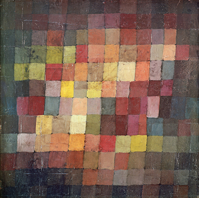
The Ancient Harmony page offers another comparison: Klee could make a coloured grid carry temporal or musical language without depicting instruments. Fabbri lists that earlier 1925 work in his comparison, but his grouping does not prove it was a direct prototype for Flora auf Sand. The music guide explores how such terms operate in the oeuvre. On this page, flora and sand remain the relevant words; comparisons help us see what is distinctive about their pairing.[8]
What does the work's later record show?
The multilingual 1988 caption demonstrates that the image circulated with German, French, English and Italian titles and a specific watercolour description. The 1992 auction index indicates later market visibility, though its publicly visible record is too thin for a provenance chain. A 1990 German scholarly essay discussed its light; a 2009 Italian thesis placed it in a comparison of gridded colour. These are moments in the work's reception. They do not establish that Klee himself explained it in the same terms.[1][3][7][8]
The familiar online account has often been more confident than its evidence. Some sellers call the work oil on canvas and assign it to a “Felix Klee Collection,” while their images and descriptions are copied across retail sites. The 1988 private-Swiss caption and later auction listing make a present collection attribution especially unsafe without an owner's record. This page therefore names the source behind each object claim and leaves the unknowns open. It also avoids the inherited claims that this particular sheet derives from Mondrian, Italian mosaics, children's art or an unverified Paris exhibition.[1][3][5]
The catalogue raisonné entry may clarify inscription, support, measurements and provenance; the 1992 sale catalogue may clarify the second size and ownership sequence. Dittmann’s complete essay and its colour plate remain important for a fuller interpretation. These gaps do not justify inventing certainty.[1][3][7]
Look again
Follow one row until a change of cell size interrupts it. Then follow a colour rather than a line: where does a warm tone reappear, and what happens to it beside a cooler neighbour? Look for a patch that seems brighter because of what surrounds it. Finally ask whether “flora” arises from a depicted plant or from the feeling of variation across the field. Those questions let the work's title and its visible structure speak together without turning an abstract watercolour into a coded botanical chart.[5][7][8]
Flora auf Sand remains a small, materially underdocumented work in the accessible record. What can be said securely is that a 1927 Klee sheet circulated as a watercolour under this title, that its colour patches resist a uniform grid, and that later German and Italian readers have used it to think about growth, rhythm and light. The precise dimensions and present ownership await stronger primary evidence. Within those limits, the painting rewards slow looking: its ordered field never quite settles into repetition, and its natural title never quite settles into a literal scene.[1][2][3][7][8]
Related artworks
Explore eight other Klee works, beginning with works close in date to this one.
Around the Fish
1926
Castle and Sun
1928
Cat and Bird
1928
Ancient Harmony
1925
Fire in the Evening
1929
Fish Magic
1925
Highway and Byways
1929
The Goldfish
1925
Discussion
Flora on Sand gives us a botanical title and an abstract field of colour.
Its object record is incomplete, while its visual pattern invites close comparison.
Reader Insights
Where does a regular row break or change its pace?
Which neighbouring colours make one patch seem brighter?
How does the word flora change what you notice in the grid?
Join the Conversation
Share the detail and source behind your reading.
References
- 1988 Nouvelles Images facsimile caption, photographed on an Etsy listing: Flora auf Sand,
1927-W6 (226), watercolour on white Ingres paper, 23.2 × 30.3 cm, private Swiss collection at publication; German, French, English and Italian titles. A later facsimile, not a present owner or conservation record, View source. - PaulKlee.fr, 1927 annual work index, 201–end, entries 1927,226 (Flora auf Sand) and 1927,227 (Klang der südlichen Flora). Secondary index; original artist register and printed catalogue raisonné remain to inspect, View source.
- Artnet, Flora auf Sand auction entry, watercolour, 24.1 × 30.4 cm, and artist result index, sale date 26 June 1992. Venue, lot, result and original catalogue inaccessible in public view.
- Copenhagen municipal archive file, PDF with copied Klee caption, “Akvarel” and 23.2 × 30.3 cm (Danish/German). Unrelated to ownership; the caption's original source is unidentified, View source.
- Wikimedia Commons, Paul-klee-flora-on-sand.jpg, nominal 3030 × 2292 px, sourced from ArtsDot with visible watermark and copied oil-on-canvas metadata. Used only to assess reproduction quality and the spread of conflicting captions; not an image master, View source.
- Marianne Keller Tschirren, Dreieck, Kreis, Kugel: Farbenordnungen im Unterricht von Paul Klee am Bauhaus, University of Bern dissertation, accepted 2012, introduction and printed pp. 153–155 and figure list (German). Distinguishes the 1924 and 1927 northern-flora works and cautions against direct equivalence between lessons and finished pictures, View source.
- Lorenz Dittmann, “Wachstum im Denken und Schaffen Paul Klees”, in Ernst-Gerhard Güse, ed., Paul Klee: Wachstum regt sich; Klees Zwiesprache mit der Natur (1990), searchable passage naming Flora auf Sand and plate p. 163 (German). Full Heidelberg PDF currently access-protected; the full essay and plate have not been directly reviewed, View source.
- Roberto Fabbri, doctoral thesis, printed pp. 123–124 / PDF pp. 134–135 (Italian), directly read. Discussion of Klee's colour grids within a Max Bill study; its Grohmann quotation is not tied to this particular sheet, View source.
- Fondation Beyeler, Paul Klee: The Abstract Dimension, room 3 exhibition guide (2017), entry for distinct Klang der südlichen Flora, 1927,227 (English; German edition also available), View source.
- Fundació Joan Miró, Paul Klee and the Secrets of Nature exhibition dossier (2022–23), caption for distinct Klang der südlichen Flora, watercolour on paper on cardboard, 23 × 30 cm, private Barcelona collection at exhibition (English/Spanish), View source.
