



 by Tom Gurney
Tom Gurney BSc (Hons) is an art history expert with over 20 years experience
Published on June 19, 2020 / Updated on November 3, 2026
Email: tomgurney1@gmail.com / Phone: +44 7429 011000
La Revue blanche by Henri de Toulouse-Lautrec: Introduction
A dark dress sweeps across the lower half of the poster, its red spots scattered beneath an enormous pale collar. Above it, a small face looks out from under a hat whose feathers curl almost as high as the magazine's name. Toulouse-Lautrec's La Revue blanche, made in 1895, advertises a literary journal through the appearance of Misia Natanson, wife of one of its editors and a hostess within its artistic circle. The advertisement turns a person associated with the publication into its most arresting public image. [1]
The movement seems effortless until one follows its construction. The skirt travels towards one corner, the extended arm towards another, while a column of lettering occupies the space beside the hat. Fur, feathers, spotted fabric and carefully diminished words each have a different visual weight. Their coordination makes the sheet readable at a glance and rewarding at close range.
At a Glance
- Artist and dateHenri de Toulouse-Lautrec, 1895. [1]
- ObjectA colour lithographic poster for the arts and literary journal La Revue blanche. The Bibliothèque nationale de France records brush, crayon and spatter lithography. [2]
- SitterMisia Natanson, born Godebska, who married Thadée Natanson in 1893. [3]
- PrintingEdward Ancourt's workshop, Paris. [1] [2]
- Separate painted versionLa revue blanche—Portrait of Madame Misia Natanson, 1895, oil on cardboard, Dortu P.568. [3]
- Surviving examplesThe catalogue distinguishes poster states as well as a separate painting. [3]
This work across Henri de Toulouse-Lautrec’s career
Contents
- Misia and the people behind the journal
- A skating movement without visible skates
- Fur, feathers and a dress made into a colour field
- Reading the words beside the figure
- The painted Misia and the printed advertisement
- The workshop behind the apparent ease
- Dark letters, red letters and individual impressions
- A magazine advertised, and an image collected
- Annotated details
Misia and the people behind the journal
Misia belonged to the social world the poster was promoting. The Musée d'Orsay's exhibition account describes her welcoming contributors close to Thadée, including Bonnard, Vuillard, Vallotton, Lautrec and Romain Coolus. Their gatherings linked the journal's offices with domestic spaces and country houses. The museum interprets her at this moment as an embodiment of the elegant Parisian reader. That is a useful description of the advertisement's proposition: a publication could acquire an attractive identity through someone who brought its contributors together. [13]
Her importance was not confined to posing. Trained at the piano under Gabriel Fauré, she gave a public concert in 1892, although she chose not to pursue a professional career. This musical activity belongs beside her role as hostess when considering the range of people around the journal. The association was cultural as well as social. It helps explain why reducing her to an anonymous fashion figure would lose something particular about the poster, even though most passing viewers could hardly have known her whole history. [13]
The publication itself provided practical support for artists. Phillip Dennis Cate places Lautrec among the printmakers whose work appeared through La Revue blanche, alongside Bonnard, Vuillard, Vallotton and others. Selected prints were gathered into an album at the end of 1894; the journal also published lithographs of performers and the illustrated supplement NIB. The 1895 poster therefore belonged to an existing relationship between the artist and a publisher of images. It promoted an enterprise that also helped his work circulate. [14]
Wolfgang Wittrock's exhibition catalogue identifies Alexandre Natanson as publisher and his brothers Thadée and Alfred among the contributors. It also describes the offices as a meeting place Lautrec visited frequently. These connections distinguish the commission from an advertisement for a business with which the artist had only a distant association. Misia's appearance could mean one thing to friends who recognised her and another to viewers attracted by the fashionable silhouette. The journal's name and purchase information made the message intelligible to both audiences. [3]
A skating movement without visible skates
The figure is commonly understood as skating. Matthias Arnold identifies her as an ice-skating woman in his 1985 discussion of the poster, but the finished composition withholds the most obvious equipment: her feet disappear below the lower edge. No rink barrier, crowd or surrounding architecture supplies a setting. The identification consequently sharpens attention to the body and clothing. The movement has to become legible through their arrangement. [15]
Start with the skirt. Its left boundary descends almost vertically, whereas its right edge slopes strongly outwards towards the lower corner. This widening dark shape gives the figure a direction that her comparatively frontal face does not share. The red spots travel across it without describing elaborate folds. They keep the dress active as a surface while allowing the broad silhouette to carry the sense of a body in motion. It is possible to follow the sweep before deciding exactly where the legs might be underneath.
The arms complicate that direction. One drops beside the skirt, ending in a small pale hand. The other extends diagonally towards the right, its dark sleeve narrowing before it reaches a large fur muff at the edge. The interval beneath this arm opens a wedge of background between sleeve and skirt. That opening is crucial: it separates the two moving forms and prevents the right side of the figure from becoming one undifferentiated mass.
The muff then answers the full width of the collar. Both are pale and textured, but one spreads across the shoulders while the other pulls towards the side. Their separation makes the extended arm feel longer. The large curling hat feathers carry a further movement above the head, where their loops offer a compact, almost suspended counterpart to the skirt's expansive diagonal. Nothing needs to blur for the figure to appear mobile.
The face provides a small area of relative steadiness within those changing directions. Eyes, eyebrows and a red mouth require very little space beneath the brim. The face remains readable while most of the image's activity is assigned to costume. The poster makes a recognisable person emerge from an emphatic arrangement of things worn and carried.
Annotated Details from La Revue blanche
The numbered points identify visible features discussed in this article. Return from each detail to the whole composition. Henri de Toulouse-Lautrec, La Revue blanche,1895. Dark-lettered impression with Charpentier and Fasquelle publication lines. Photograph: Françoise Foliot / Wikimédia France, via Wikimedia Commons; CC BY-SA4.0. Image source. CC BY-SA 4.0. Numbers added to a separately resized overview; detail crops taken from the immutable original. These overview and crop derivatives are shared under CC BY-SA 4.0. No recolouring or retouching.
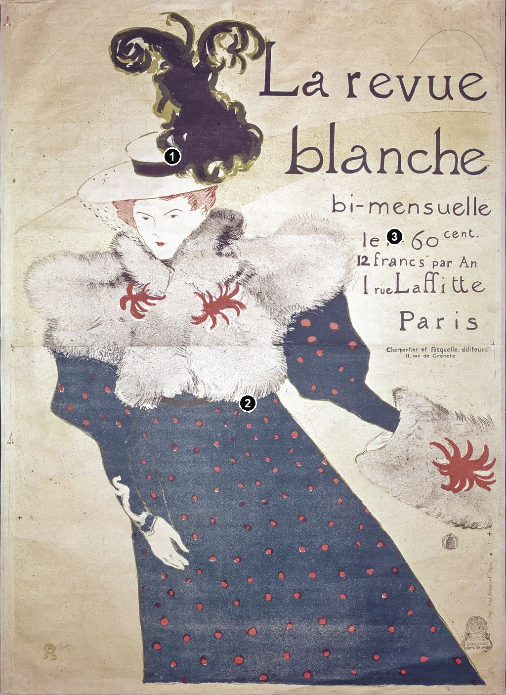
Details from LA REVUE BLANCHE
Compare the cropped details with the complete images above. Notice how their colours, shapes and positions contribute to the larger compositions.
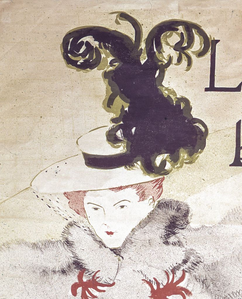
The plume and face
The plume and small face give the figure an asymmetrical upper contour.
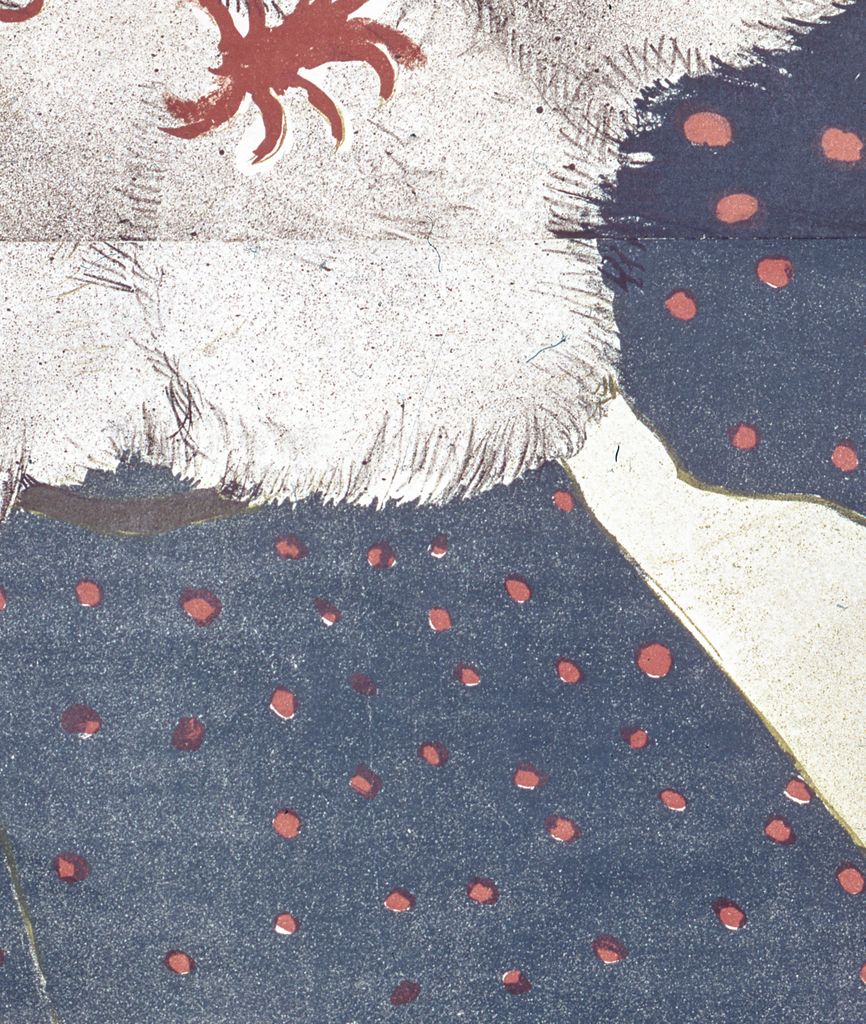
The spotted blue dress
Spots and blue strokes make the dress an active colour field.
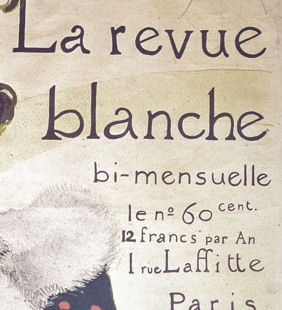
Title and pricing
The printed words share space with the figure rather than sitting in a separate frame.
Fur, feathers and a dress made into a colour field
In the dark-lettered MoMA impression, the dress has a deep blue-green appearance, punctuated by irregular red-orange spots. The surface is comparatively continuous. Its density lets the pale hand and the lower edge of the fur register immediately. Across the shoulders, however, little dark marks break into the surrounding light field. The eye encounters the skirt as a large bounded shape and the fur as a vibrating edge. These contrasting treatments give the clothes distinct tactile suggestions without describing every fold or hair. [1]
The BnF's medium description is especially helpful here: brush, crayon and crachis, or spatter. That vocabulary places the scattered grain within the making of a lithograph. The tiny marks can contribute to an impression of soft fur while remaining printed ink on a flat sheet. They are part of an image capable of repetition, however much they resemble an immediately applied drawing. [2]
Three red ornaments concentrate colour within the pale fur: two at the chest and another on the muff. Their radiating shapes interrupt the much smaller grain. In turn, the dress repeats red at a different scale through its spots, while red hair and lips bring it into the face. This distribution connects widely separated passages without requiring them to have the same texture. Colour moves through the figure in several forms: minute facial accents, compact ornaments and an extensive pattern.
The hat is denser and more curling than the fur. Large dark loops enclose pockets of the light ground, with greenish edges visible around parts of the plume. Its apparently extravagant volume remains economical as a design: a few sweeping boundaries and enclosed openings make the hat dominate the upper left. The fur, by contrast, depends on countless small interruptions. The two accessories are equally conspicuous but constructed through different kinds of mark.
Colta Ives's checklist describes the Met's La Revue blanche as printed in four colours. A restricted number of printing colours need not mean a monotonous surface. The image combines extensive dark areas, fine contours, scattered grain and small contrasting accents. The four-colour description concerns the Met's sheet; the visible textures explain how such an economical palette could sustain variety. [11]
Reading the words beside the figure
The lettering has room to breathe because so much of the surrounding setting has been omitted. At the top, the two lines of the title occupy the space to the right of the feathers. Their height answers the hat without imitating its dense curls. Below, the publication frequency, price and address form progressively smaller units. The reader can move from recognising a name to finding the practical terms of purchase. The BnF catalogues the inscription as part of the poster's title, preserving that commercial information rather than treating it as incidental decoration. [2]
The poster announces publication twice monthly, a price of sixty centimes per issue, an annual subscription of twelve francs, and the address at 1 rue Laffitte. Smaller lettering names Charpentier and Fasquelle as publishers at 11 rue de Grenelle. Each line adds a different kind of information: how often the reader might encounter the journal, what it costs, and which addresses belong to its circulation. An image that initially seems devoted to clothing becomes a usable advertisement through these details. [2]
The figure and text are fitted together rather than divided by a rule or frame. The projecting shoulder stops below the lower title line; the sleeve and muff leave room beneath the block of smaller words. At the same time, the feather's height holds the title within the figure's overall reach. The advertisement maintains two distinct activities, looking at a person and reading an offer, while making them occupy one coordinated rectangle.
The printed credits also separate responsibilities. The Natanson family supplied the editorial and social enterprise associated with the journal; Charpentier and Fasquelle appear in the publication information; Ancourt's workshop produced the lithographic impressions. MoMA records the publisher under the journal's name with Charpentier and Fasquelle, and separately names Edward Ancourt as printer. Reading those credits together gives a more accurate picture of collaboration than attributing every part of production to the artist alone. [1] [3]
Watch: Toulouse-Lautrec
Choose an artist introduction, a film about graphic design or a closer look at At the Moulin Rouge.
The painted Misia and the printed advertisement
A separate 1895 painting makes the poster's decisions more visible. Wittrock catalogues La revue blanche—Portrait of Madame Misia Natanson as oil on cardboard, 94 × 71.8 cm, Dortu P.568, in a private collection at the time of the 1985 exhibition. Its reproduction shows the same great hat, high fur collar, lowered hand and outward sweep of the skirt. That painted object is distinct from every printed impression of the poster. [3]
In the painting, the clothing remains remarkably open. Dark blue lines describe folds and boundaries over the brown support, while pale strokes flicker around the fur and bodice. The skirt is held by a few long directions with broad intervals between them. There is no equivalent to the poster's extensive spotted field. The hat already rises above the head, but its loops remain more dispersed and linear. Much of the figure comes into being through the alternation between marks and unoccupied cardboard.
The print consolidates those directions into a much more emphatic public image. Its dark skirt takes possession of the lower rectangle; its spots make that large area internally varied without breaking it apart. The fur expands into a grainy light mass, and the hat becomes denser. Lettering occupies space that the painting leaves comparatively open. Comparing the works shows how a similar pose can acquire another visual rhythm through changes in surface, scale and purpose. The looser painted version is useful precisely because it lets us see how much has been reformulated.
The workshop behind the apparent ease
Deborah Wye's account at MoMA stresses Lautrec's reliance on skilled printers. She points to the cover of L'Estampe originale, where Père Cotelle works at a press and Jane Avril examines an impression. The image makes technical collaboration visible within the artist's own work. It offers an apt companion to La Revue blanche, whose flowing forms depended on a workshop's ability to repeat carefully differentiated marks. [1]
Cate distinguishes the artist's preparation and approval of images from the printer's mechanical production of the edition. In his account, proofs were pulled so Lautrec could correct or approve them before the full run. Ives likewise identifies Cotelle at Ancourt's press and describes the artist overseeing editions. The energy of a printed contour depended on the discipline of preparation and checking. The resulting sheet could look mobile and direct because its separate parts had been made to work together. [14] [11]
Misia appears elsewhere in that publishing world. Ives identifies her seated in the audience on Lautrec's 1895 cover for the final L'Estampe originale album, across the composition from an ornamental elephant. The change of setting matters. One image places her in an elaborately framed theatre scene; the magazine poster enlarges her and removes almost everything around her. Both draw on a person within overlapping circles of artists and publishers, while giving her appearance a different task. [11]
Dark letters, red letters and individual impressions
The Art Institute of Chicago's impression makes a significant variant immediately visible. Its title, frequency, price and address are red. The smaller Charpentier and Fasquelle publication lines visible in MoMA's example are absent. Chicago's record explicitly describes a version without publication information and with text only in red, catalogued as Wittrock P16 C/D. Those differences alter the distribution of colour: the red moves out of the dress and ornaments into the whole column of words. [16]
Chicago also records tan wove paper, an image measuring 124.8 × 88.9 cm, and assembled sheets measured at sight at 129.7 × 93 cm. These measurements belong to accession 1932.1322 in the Clarence Buckingham Collection. They should accompany that object rather than every reproduction of the design. Its tan support, red lettering and pieced-sheet construction are parts of a particular surviving impression. [16]
Wittrock's 1985 exhibition catalogue separately lists a P16/B poster as Delteil's first state and MoMA's P16/C example as his second state. Ives's later Met checklist records another P16/c impression, accession 63.663.8, from the Chester Dale bequest. The records preserve distinctions within a familiar image. Looking from one to another, the question becomes which text, paper and issue are represented, as well as whether the composition is recognisable. The broader history of Lautrec's prints explains how these terms operate across his graphic work. [3] [11]
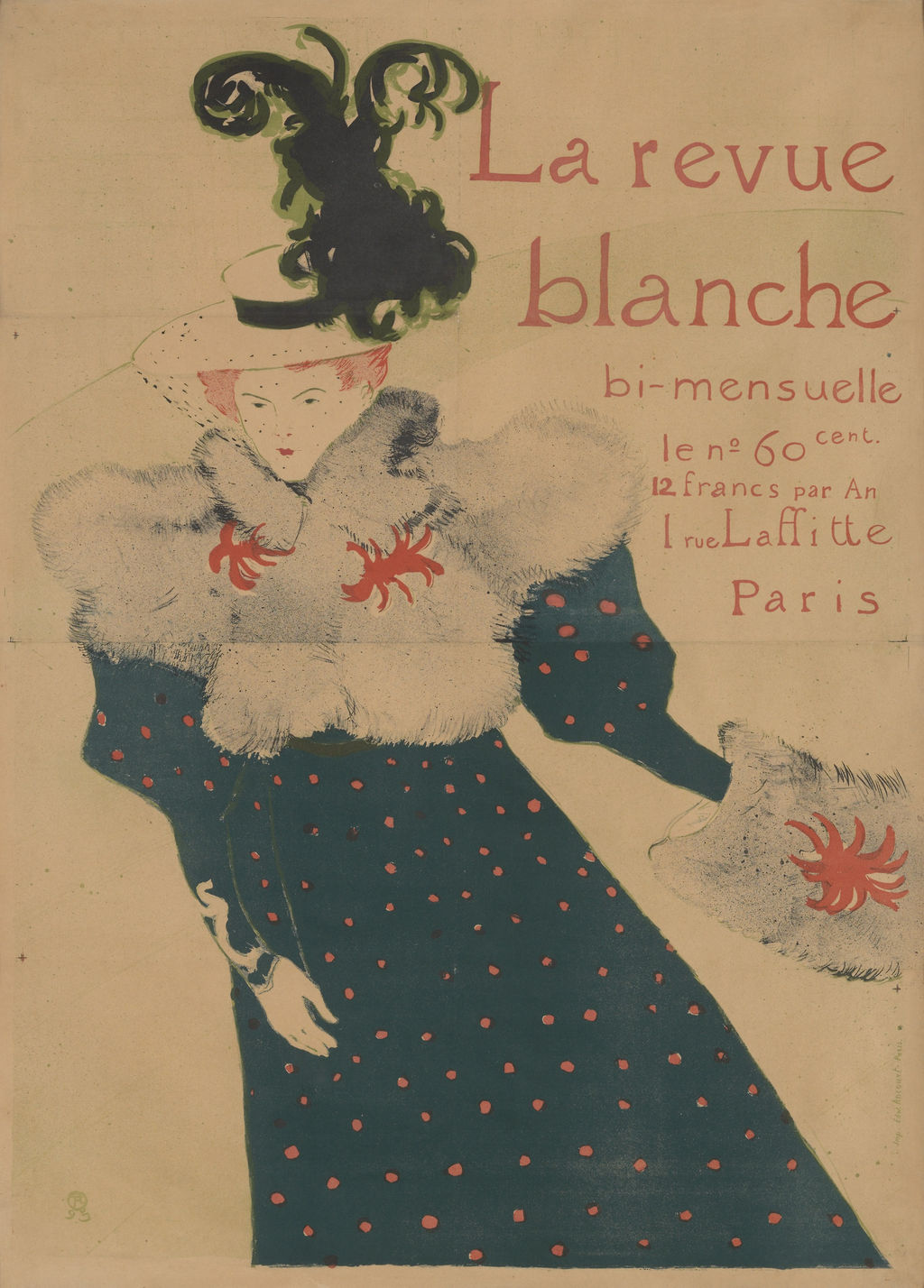
La Revue blanche,1895, red-lettered impression without publication lines. Art Institute of Chicago,Clarence Buckingham Collection,1932.1322; image124.8 × 88.9 cm,assembled sheets at sight129.7 × 93 cm. Image source. Public domain. Resized only; native appearance preserved.
A magazine advertised, and an image collected
The sheet had a second market as collectible graphic art. Cate reports La Revue blanche priced at two francs fifty with lettering, five francs before lettering, and ten francs for one of twenty-five signed and numbered proofs without lettering and with a remarque. These are historical offers for different forms of the poster. Removing the practical words could increase its appeal to a purchaser interested in a scarce proof, even while those same words were essential to its use as a magazine advertisement. [14]
That double existence helps explain the interest of the comparison with Bonnard's 1894 poster for the same journal. His composition includes a woman holding a copy amid a densely patterned display of publications; large letters cross the lower part of the scene. In Arnold's reading, Bonnard tied the subject more directly to the product, whereas Lautrec's skating Misia required recognition of someone within the journal's circle. His preference for Bonnard is a critical judgement, but the distinction identifies two different promotional solutions. [15]
Lautrec's design makes association do much of the work. The advertised magazine is present principally as words beside the figure, while her clothes and movement supply its public attraction. Viewed close by, the feathery loops, fur's grain, tiny face and red spots sustain a slower encounter. The very passages that arrest the eye across a distance also create differences worth returning to on a retained sheet. Advertising and collecting draw on the same coordination of conspicuous shape and selective detail.
Toulouse-Lautrec artworks directory
Browse 84 identified works and publications in this researched selection. Dates and titles follow the individual records; this is not a complete catalogue of the surviving oeuvre. Print impressions remain attached to their designs. Some listed works do not have a dedicated article. The Drawings guide also contains nine illustrated studies consolidated from former articles.
Frequently Asked Questions
The figure is identified as skating in Arnold's catalogue essay. Her feet are cropped away, leaving the extended arm, sideways muff and spreading skirt to suggest movement. [15]
Discussion
Look again at the images and ideas explored in La Revue blanche by Henri de Toulouse-Lautrec. These editorial prompts invite your observations.
Reader Insights
How does the triangular opening beneath the extended arm help separate the muff from the skirt? Consider how the figure would change if that light interval were filled.
Join the Conversation
Share a detail, comparison or question about La Revue blanche by Henri de Toulouse-Lautrec below.
References
- Museum of Modern Art, The White Review (La Revue blanche), 1895, object 298.1967, current object credits and image; Deborah Wye, excerpt from Artists and Prints: Masterworks from The Museum of Modern Art, 2004, p. 36, reproduced in the record. View source.
- Bibliothèque nationale de France, La revue blanche, 1895, notice FRBNF40459142, lettering transcription, Ancourt printing credit, brush/crayon/spatter medium and sitter identification (in French). View source.
- Wolfgang Wittrock, “Catalogue of the Exhibition,” in Riva Castleman and Wolfgang Wittrock, eds., Henri de Toulouse-Lautrec: Images of the 1890s, Museum of Modern Art, 1985, pp. 238–239, cats. 271–273, painted portrait, poster states, Natanson circle and reproductions. View source.
- Autoportrait, 1880 (in French). View source.
- ALBERTINA: Der Schimmel Gazelle,GE123DL. View source. (in German).
- Franka Blok, Portrait of Vincent van Gogh, 2024. View source.
- Art Institute of Chicago: Moulin Rouge, La Goulue. View source.
- Art Institute of Chicago: At the Moulin Rouge. View source.
- Jane Avril, 1893. View source.
- Au Salon de la rue des Moulins (in French). View source.
- Colta Ives, Toulouse-Lautrec in The Metropolitan Museum of Art, 1996, p. 41 on Cotelle and the workshop; pp. 44–45 and figures 45/48 on Misia and the 1895 L'Estampe originale cover; checklist p. 67, La Revue blanche, 63.663.8, four-colour lithograph and exact impression identity. View source.
- Maurice Joyant (in French). View source.
- Musée d'Orsay, Misia, reine de Paris, 2012 exhibition account, “De la musique avant toute chose,” “Misia au temps de La Revue blanche,” and 1893 chronology (in French). View source.
- Phillip Dennis Cate, “The Popularization of Lautrec,” in Henri de Toulouse-Lautrec: Images of the 1890s, Museum of Modern Art, 1985, pp. 81–85 and 89, proofing, printers, journal publications and prices for lettered and unlettered variants; p. 92, note 19, the journal's 1895 print advertisements. View source.
- Matthias Arnold, “Toulouse-Lautrec and the Art of His Century,” in Henri de Toulouse-Lautrec: Images of the 1890s, Museum of Modern Art, 1985, p. 65, figure 35 and discussion of Bonnard's and Lautrec's advertisements, including the skating identification. View source.
- Art Institute of Chicago, La revue blanche, 1895, accession 1932.1322, complete institutional API record, medium, measurements, collection credit and Wittrock P16 C/D description of red lettering without publication information. View source 1. View source 2.
- Splash image, Henri de Toulouse-Lautrec, La Revue blanche,1895. Dark-lettered impression with Charpentier and Fasquelle publication lines. Photograph: Françoise Foliot / Wikimédia France, via Wikimedia Commons; CC BY-SA4.0. Image source. CC BY-SA 4.0. Resized only; original appearance preserved. This photographic derivative is shared under CC BY-SA 4.0.


 Henri de Toulouse-Lautrec.jpg)