



 by Tom Gurney
Tom Gurney BSc (Hons) is an art history expert with over 20 years experience
Published on June 19, 2020 / Updated on November 3, 2026
Email: tomgurney1@gmail.com / Phone: +44 7429 011000
Divan Japonais by Henri de Toulouse-Lautrec: Introduction
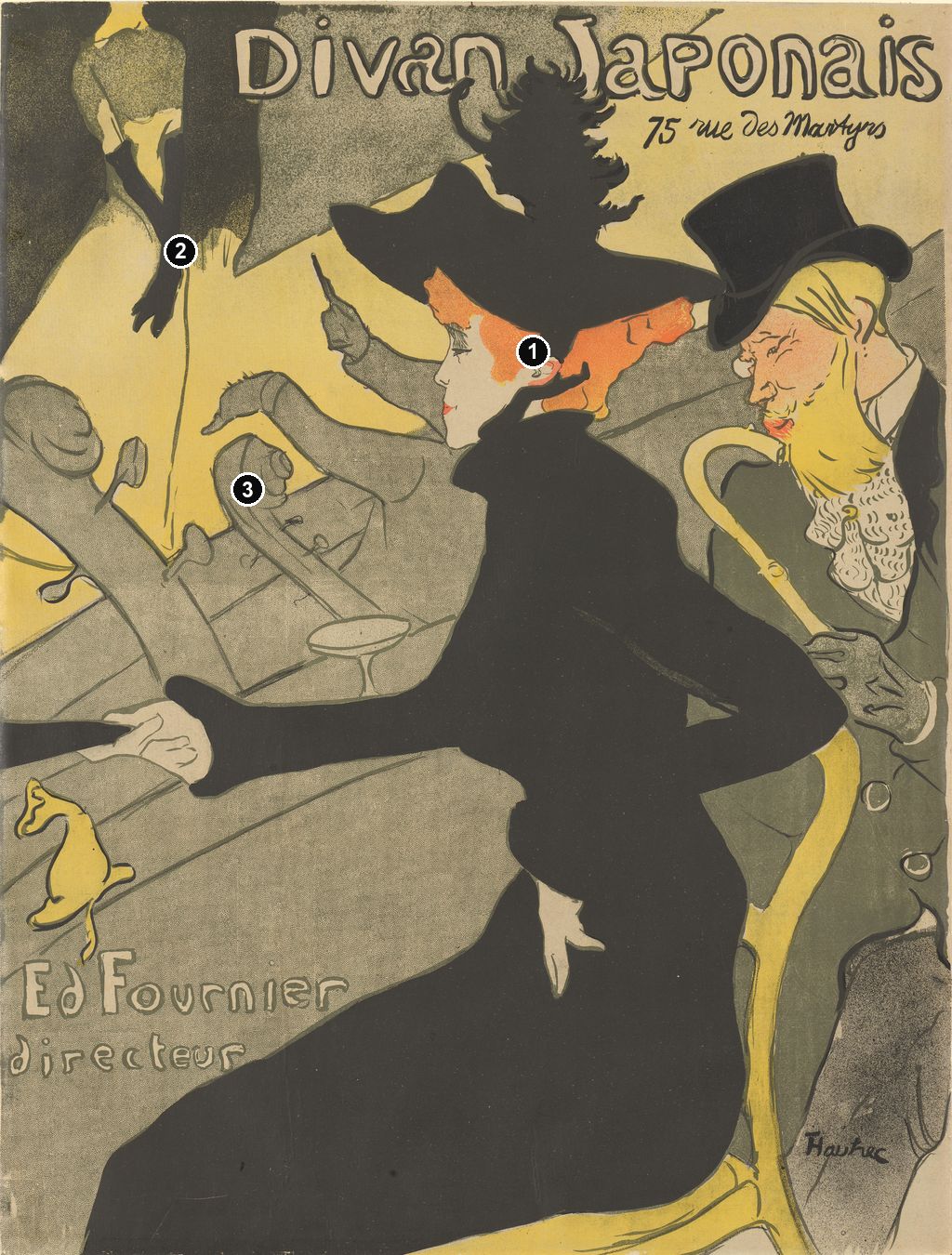
A huge black hat seems to upstage the singer. Beneath it, Jane Avril sits in profile, her red hair bright against an almost uninterrupted black dress. Behind her, a performance survives in fragments: gloved hands, a pale skirt, raised arms and the necks of instruments. In Divan Japonais, Toulouse-Lautrec makes watching a show the most conspicuous part of the show itself. The Metropolitan Museum of Art dates its impression of this café-concert advertisement to 1892–93. [1]
The design rewards two different speeds of looking. Its black silhouette and large lettering register at once; the identities, musical gestures and interlocking contours take longer to untangle. What first looks like a fashionable woman at a table becomes a remarkably economical image of an entire entertainment business.
At a Glance
- ArtistHenri de Toulouse-Lautrec.
- TitleDivan Japonais.
- Date1892–93 in the Met's record; 1893 in the Art Institute of Chicago and National Gallery of Victoria records. [1] [2] [3]
- MediumColour lithograph; the Met describes four colours on wove paper. [1]
- Advertised venueDivan Japonais, 75 rue des Martyrs, Paris; director Édouard Fournier. The NGV identifies Fournier as commissioner and Édouard Ancourt as printer. [3]
- People representedDancer Jane Avril and writer Édouard Dujardin in the audience; singer Yvette Guilbert on stage. [4]
- Examples in museum collectionsMet 58.621.17, Art Institute 1949.1002 and NGV 1846-4 are separate impressions. [1] [2] [3]
This work across Henri de Toulouse-Lautrec’s career
Contents
- A spectator becomes the attraction
- A singer recognised without her face
- An orchestra made from fragments
- The Japanese name and the Paris address
- Four colours, several surviving sheets
- An advertisement that collectors could buy
- Avril dancing, Avril watching, Bruant commanding
- Annotated details
A spectator becomes the attraction
Avril's body commands the sheet from the feathered hat near the title to the spreading skirt at the lower edge. The size of that uninterrupted black area is striking. It carries almost none of the internal description that might establish folds, a bodice or the direction of light. Instead, the outline supplies the information: a projecting collar, narrow waist, bent elbow and long skirt. The black shape reads as an elegant garment and as the principal structure holding the composition together. Colta Ives draws attention to this decorative silhouette in her account of the poster. [12]
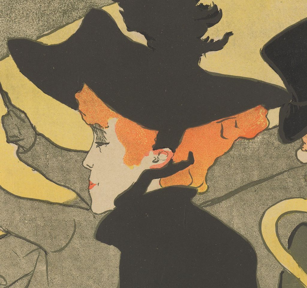
Small pale interruptions make the mass legible as a person. Avril's face points left, towards the stage; one hand reaches across the foreground while the other rests low against her skirt. Orange-red hair emerges beneath the hat in an emphatic horizontal band. These few visible parts establish her orientation without opening the black dress into a fully modelled body. Even the plume extends the same dark shape upwards, letting the hat compete with the venue's name. The spectator takes up the space a conventional advertisement might have reserved for its star act.
The Art Institute's interpretation makes this reversal explicit: Avril, although seated among the audience, remains on display to her companion and to the people seeing the advertisement. The museum also contrasts her black clothes here with the vivid costume of her performances. Recognising her as a dancer adds a second level to the image. The professional performer has temporarily assumed the role of customer, but her recognisable appearance still does promotional work. [2]
Dujardin occupies a narrower strip at the right. His tall hat, pointed profile, yellow beard and patterned shirtfront receive the kinds of small internal marks largely withheld from Avril's dress. His curved cane descends beside her chair, multiplying the loops and bends around her angular waist. The juxtaposition is economical: her broad black shape holds the centre while his clustered details enliven the edge. Ives identifies him as a music critic; the exhibition catalogue also places him beside Avril in the foreground group. [12] [4]
Their proximity establishes a social grouping. Avril faces the performance; Dujardin's inclined head draws attention towards her side of the composition. The arrangement promises interesting company as well as a spectacle on stage, while leaving the pair's conversation and feelings unspecified. Looking at people who are themselves worth looking at becomes one of the venue's attractions.
A singer recognised without her face
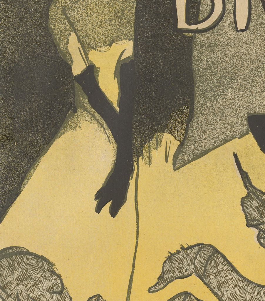
Guilbert stands at the upper left, where the top edge cuts through her neck. Her face, normally the expected centre of a performer's likeness, is completely absent. A pale skirt narrows towards her waist; long black gloves extend down against it. The identification rests on a distinctive stage appearance that the Met associates especially with those gloves. A viewer already familiar with Guilbert could recognise the performer from an accessory and a silhouette. [1]
This is a precise kind of cropping. The image does not merely lose a little background at its edge: it removes the feature by which a portrait would usually establish identity. Yet the remaining fragment is conspicuous. The light dress creates an upright wedge within the dark upper corner, while the gloved arms supply sharp downward accents. Guilbert's distance from the foreground is immediately understandable even though the room around her is only briefly described. The small stage figure and the enormous spectator operate at different scales but remain easy to read.
Avril and Guilbert consequently offer two forms of recognition within one advertisement. Avril is close enough for a delicately outlined profile, but much of her body becomes pure black shape. Guilbert is too severely cropped to have a profile at all, yet the gloves do the work of a name. The two women share the black-and-pale contrasts while reversing their distribution. The foreground dress is dark around pale hands and face; the distant dress is pale beside dark arms. This exchange helps connect parts of the sheet that seem, at first, dramatically unequal.
The historical evidence also changes what this gathering can mean. Wolfgang Wittrock's 1985 catalogue states that Guilbert had not appeared at the Divan Japonais since 1890. Her presence in the advertisement therefore cannot establish that this exact company attended a performance there in 1892 or 1893. The design assembles recognisable people into a persuasive image of the place. That is a different kind of evidence from a programme naming a performer for a particular evening. [4]
Annotated Details from Divan Japonais
The numbered points identify visible features discussed in this article. Return from each detail to the whole composition. Divan Japonais, 1893. Colour lithograph. National Gallery of Victoria, Melbourne, Felton Bequest 1948, 1846-4. Jane Avril’s silhouette dominates the advertisement while Guilbert’s gloves identify the cropped singer. National Gallery of Victoria, Melbourne, 1846-4. Image source. Public domain. Resized only; native appearance preserved.
Details from DIVAN JAPONAIS
Compare the cropped details with the complete images above. Notice how their colours, shapes and positions contribute to the larger compositions.
Jane Avril’s hat and profile
The black hat sharply frames Avril’s pale profile and red hair.
Guilbert’s black gloves
The long dark gloves identify a performer whose head falls outside the image.
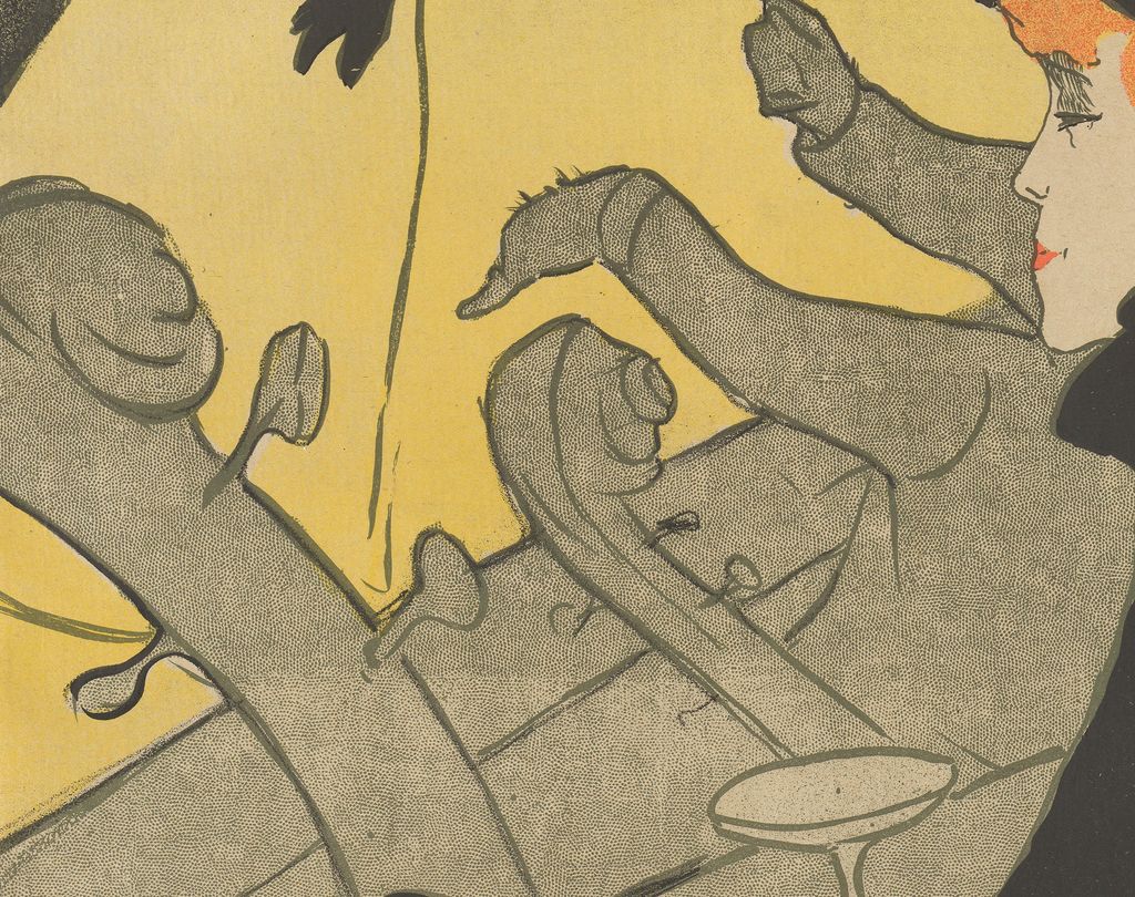
Fragments of the orchestra
Instrument necks and raised arms interrupt the view towards the stage.
An orchestra made from fragments
Between Avril and the stage, the conductor's arms rise without a visible torso. One hand carries a slim baton; the other bends across the grey-green space below. At the left, the curled heads and long necks of stringed instruments lean into the image. These fragments do not need complete musicians attached to them to suggest the orchestra pit. Their different slopes give the relatively still foreground figure a surrounding field of motion. Ives discusses both the detached arms and instrument necks as essential elements of the design. [12]
Follow the diagonals and the room becomes less stable than it first appeared. The counter or ledge climbs steeply behind Avril's extended arm. Further lines run across the orchestra, carrying the eye towards opposite sides of the sheet. A small stemmed glass is seen from above, whereas the adjacent heads appear in profile. Lautrec does not provide a single comfortable viewing platform from which every object falls into place. He brings together the views that make each shape most useful.
The interruptions put us close to the spectators, looking past them towards a performance. Avril occupies much of the route into the room. Her dress denies the open central vista that might otherwise lead straight to Guilbert. We have to travel around it: past a pale hand, along an instrument, between conductor's arm and hat brim. The poster offers a lively view partly by making access to it incomplete. Its density comes from the fit between fragments rather than from a crowd of individually described heads.
Black, yellow and grey-green also mark different kinds of space. The strongly bounded black clothes sit forward, while the mottled grey-green passages seem more diffuse. Yellow areas open the upper right around the address and brighten the stage figure's dress. These are broad colour relationships, not a naturalistic account of every lamp in the room. Ives relates the compressed arrangement to flat colour masses and tilted perspectives in Japanese prints, while treating the cropping and orchestral fragments in relation to Degas. Her comparisons help explain specific devices without requiring one source for every unusual contour. [12]
The Japanese name and the Paris address
The title names a real commercial identity. Ives translates Divan Japonais as Japanese Settee and describes a long, narrow café-concert decorated with silks and fans, with waitresses dressed in kimonos. This was a Parisian entertainment venue presenting a fashionable version of Japan to its customers. The address beneath the name keeps that promise firmly attached to a particular destination: 75 rue des Martyrs. [12] [3]
The poster does not illustrate that décor through a collection of fans or Japanese furnishings. Its stronger connection with Japanese art is compositional. Ives compares the tilted perspective and the tightly fitted silhouettes with ukiyo-e prints. Elsewhere in the same study, she connects Lautrec's poster designs with curving, emphatically outlined forms filled by flat colour. Here those devices help turn the cramped interior into a readable pattern. The relationship is more specific than an atmosphere of the exotic, and it need not mean that the design copies an identifiable Japanese print. [12]
The distinction matters when looking at Japonisme: the venue's borrowed name and décor belong to commercial fashion, while the artist's adaptations concern ways of constructing an image. Both operate within this advertisement, but they do different work. The lettering announces the establishment; the shapes organise the experience it promises. Avril's hat reaches into the title, binding the printed name to the person whose silhouette already holds the eye. The address supplies the practical information below, where it remains clear of the busiest orchestral details.
Fournier's name appears near the lower left, separated from the main title by much of the composition. The NGV records him as the commissioner. Wittrock dates his takeover from Jehan Sarrazin to late 1892 and describes repeated closures associated with reconstruction and fire regulations. The venue's short periods of activity extended into early 1894, after which Fournier sold it. This unstable business history makes the advertisement's assured, fashionable interior particularly interesting: the printed image gives coherence to a venue whose actual operation was intermittent. [3] [4]
Four colours, several surviving sheets
The material description sharpens the apparent simplicity of the design. The 2005 Toulouse-Lautrec and Montmartre checklist describes Chicago's impression as a lithographic poster, with transferred screen, in black, olive-green-grey, yellow and red, on cream wove paper laid down on linen. The four named inks account for a composition whose effects range from dense black to lightly textured colour. The image's economy is therefore also a material achievement: a small set of printing colours sustains a complicated network of overlapping forms. [14]
Avril's dress appears much denser than the grey-green orchestra and background. Across those lighter passages, grain interrupts the colour. The checklist's transferred-screen description places texture within the recorded printing process. The contrast between solid mass and textured field helps separate the foreground figure from the space around her even when outlines collide. [14]
The NGV credits Ancourt with the printing. That credit reminds us that the design reached its audience through a workshop as well as an artist's drawing. In his study of Lautrec's graphic production, Phillip Dennis Cate distinguishes drawing on lithographic stones, checking proofs and printing the edition. A printer could pull proofs for the artist to correct before undertaking the full run. The apparently immediate line of an arm or brim belongs to a medium capable of repeating that effect across many sheets. [3] [15]
Four printing colours do not imply that every hue was generated by overlapping primary inks. Cate's account distinguishes different colour systems and explains Lautrec's use of separately mixed inks in the early 1890s. For this design, the named inks in the exhibition checklist offer firmer guidance than a general formula about how colour lithographs work. Nor does a digital reproduction disclose the exact sequence in which the stones were printed. The useful question is how the recorded colours divide and join the composition, rather than how to reconstruct an undocumented printing order. [14] [15]
Surviving sheets also have their own identities. The Met lists its Furst-bequest impression at 80.8 × 60.8 cm. Chicago records an image of 80.1 × 60.1 cm within a sheet of 80.2 × 61.8 cm. The NGV gives 78.5 × 59.5 cm for image and sheet and records its acquisition through the Felton Bequest in 1948. These measurements belong to individual collection objects; they should not be combined into one supposedly universal size. The same design survives in material examples that museums describe and measure separately. [1] [2] [3]
An advertisement that collectors could buy
The poster's life was not confined to directing customers towards the rue des Martyrs. Cate records Divan Japonais among the Lautrec designs offered in Edmond Sagot's June–July 1893 catalogue. By 1894, a copy was priced at two francs, or three francs fifty centimes mounted on linen. The distinction between an ordinary sheet and a mounted one shows a dealer addressing people who wanted to keep and handle the image. These are dated historical prices, rather than evidence for the cost of attending the venue. [15]
That market changes how a surviving poster can be understood. Some impressions circulated as advertisements, while others could be purchased directly as graphic art. A museum sheet does not necessarily owe its survival to someone rescuing it from a wall. Cate uses the trade in posters to show that the commercial purpose of an image and appreciation of its artistic qualities could coexist from an early stage. Divan Japonais entered that economy while the establishment it named was still operating. [15]
The design suits both encounters. At a distance, the venue's name and Avril's black silhouette provide a strong initial impression. Close examination brings out the conductor's fingers, Dujardin's patterned shirt and the tiny glass suspended among larger diagonals. Collecting allows those slower discoveries to become part of the object's appeal. The very compression that makes an effective advertisement also gives a retained sheet something to yield on repeated viewing.
Avril dancing, Avril watching, Bruant commanding
The contrast with Lautrec's Jane Avril poster of 1893 is especially revealing. Avril commissioned that advertisement for the Jardin de Paris. There, her lifted leg and flounced costume make the dancer's action central, with the thrust of a double bass echoing the kick. The Met stresses this relationship between the instrument and her movement. In Divan Japonais, the instruments form a busy intermediate zone while Avril herself sits still. The orchestra participates in both compositions, but its place in the visual argument changes. [10]
One design promises the sight of Avril performing; the other makes her presence as a spectator part of a venue's attraction. The shift also changes the function of her clothes. A dancing costume can multiply frills and moving edges, whereas the black dress here concentrates the figure into a compact silhouette. Lautrec does not need the same public identity to produce the same image each time. He selects the aspect of a performer that serves the particular advertisement.
In Ambassadeurs: Aristide Bruant, dated 1892, another forceful dark silhouette is built around a broad hat, cloak and red scarf. Albi's museum describes the singer's massive three-quarter figure against a bright background and identifies those accessories as emblematic. Bruant's conspicuous self-presentation becomes the advertisement's centre. In Divan Japonais, the comparable visual authority belongs to someone in the audience, while the singer occupies a small cropped area above her. The contrast clarifies how radically Lautrec could redistribute publicity within a scene. [16]
The singer's gloves, the dancer's hat and the writer's cane offer distinct ways into the room. Each belongs to a recognisable person, yet each also contributes a line or mass essential to the whole. The poster keeps personal identity and decorative shape in unusually close contact. Once Guilbert's missing head has been noticed, it becomes difficult to look at any other fragment as a casual omission: every retained feature seems to have earned its place.
Toulouse-Lautrec artworks directory
Browse 84 identified works and publications in this researched selection. Dates and titles follow the individual records; this is not a complete catalogue of the surviving oeuvre. Print impressions remain attached to their designs. Some listed works do not have a dedicated article. The Drawings guide also contains nine illustrated studies consolidated from former articles.
Frequently Asked Questions
She is Jane Avril, the dancer. In this advertisement she appears as a spectator beside the writer Édouard Dujardin. [4]
The composition crops Yvette Guilbert at the neck. Her long black gloves retain a distinctive part of her stage identity, allowing recognition without a face. The cropping also concentrates attention on the much larger foreground spectator. [12]
It is a colour lithographic poster. Chicago's example is catalogued as printed in black, olive-green-grey, yellow and red on cream wove paper, mounted on linen. [14]
The advertisement does not establish that. Wittrock notes that Guilbert had not appeared at the venue since 1890. Her inclusion should be understood as part of the promotional composition. [4]
No. The separate Yvette Guilbert project, dated 1894, concerned a commission for her Ambassadeurs appearances in the 1894–95 season. Albi's account records her refusal of that design and the subsequent continuation of their collaboration. [17]
Discussion
Look again at the images and ideas explored in Divan Japonais by Henri de Toulouse-Lautrec. These editorial prompts invite your observations.
Reader Insights
How does Avril's black dress change the route your eye takes towards the singer? Follow one specific diagonal through the orchestra.
If you covered the upper-left corner, how much would the poster lose? Consider the contrast between Guilbert's pale dress and Avril's dark silhouette.
Join the Conversation
Share a detail, comparison or question about Divan Japonais by Henri de Toulouse-Lautrec below.
References
- Metropolitan Museum of Art, Divan Japonais, 1892–93, object 58.621.17, collection interpretation and object details. View source.
- Art Institute of Chicago, Divan Japonais, 1893, object 1949.1002; complete institutional API record, description, medium and measurements. View source 1. View source 2.
- National Gallery of Victoria, Divan Japonais, 1893, accession 1846-4, printing, commissioning, inscriptions, measurements and acquisition credit. View source.
- Wolfgang Wittrock, “Catalogue of the Exhibition,” in Riva Castleman and Wolfgang Wittrock, eds., Henri de Toulouse-Lautrec: Images of the 1890s, Museum of Modern Art, 1985, p. 232, cats. 259–261 and accompanying venue history. View source.
- Autoportrait, 1880 (in French). View source.
- ALBERTINA: Der Schimmel Gazelle,GE123DL. View source. (in German).
- Franka Blok, Portrait of Vincent van Gogh, 2024. View source.
- Art Institute of Chicago: Moulin Rouge, La Goulue. View source.
- Art Institute of Chicago: At the Moulin Rouge. View source.
- Metropolitan Museum of Art, Jane Avril, 1893, object 32.88.15, commission and compositional interpretation. View source.
- Au Salon de la rue des Moulins (in French). View source.
- Colta Ives, Toulouse-Lautrec in The Metropolitan Museum of Art, 1996, pp. 18–19, 36–41 and checklist p. 62; especially p. 38 on Divan Japonais, its venue and composition. View source.
- Maurice Joyant (in French). View source.
- Art Institute of Chicago, Toulouse-Lautrec and Montmartre, exhibition checklist, 2005, cat. 164, technical description of accession 1949.1002. View source.
- Phillip Dennis Cate, “The Popularization of Lautrec,” in Henri de Toulouse-Lautrec: Images of the 1890s, Museum of Modern Art, 1985, pp. 77–83 and 89, journal processes, colour printing, printers, Sagot's catalogues and poster prices. View source.
- Musée Toulouse-Lautrec, Albi, Ambassadeurs. Aristide Bruant dans son cabaret, 1892, collection interpretation (in French). View source.
- Musée Toulouse-Lautrec, Albi, Toulouse-Lautrec et l’art de l’affiche, 2025 press dossier, p. 11, the 1894 Guilbert project and later albums (in French). View source.
- Splash image, Divan Japonais, 1893. Colour lithograph. National Gallery of Victoria, Melbourne, Felton Bequest 1948, 1846-4. Jane Avril’s silhouette dominates the advertisement while Guilbert’s gloves identify the cropped singer. National Gallery of Victoria, Melbourne, 1846-4. Image source. Public domain. Resized only; native appearance preserved.


 Henri de Toulouse-Lautrec.jpg)