

 by Tom Gurney
Tom Gurney BSc (Hons) is an art history expert with over 20 years experience
Published on June 19, 2020 / Updated on November 3, 2026
Email: tomgurney1@gmail.com / Phone: +44 7429 011000
Cycle Michael by Henri de Toulouse-Lautrec: Introduction
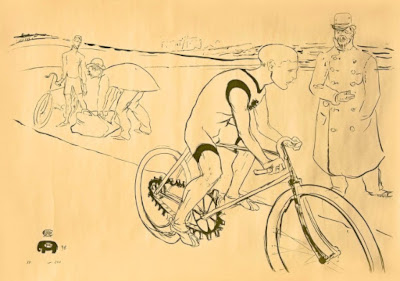
A cyclist leans forward over his handlebars, bringing his head close to a standing man at the right. The bicycle's front wheel runs beyond the lower edge, while smaller figures occupy the distant track. In Cycle Michael, Henri de Toulouse-Lautrec makes the difference between moving and standing bodies the centre of a sporting image. The rider is immediately recognisable, but the bicycle also had a commercial task to perform.
The Phillips Collection explains that Louis Bouglé commissioned the design in 1896 to advertise the Simpson bicycle chain. It identifies the cyclist as Jimmy Michael and the standing trainer as “Choppy” Warburton. The design was rejected because the chain was inaccurately represented. Lautrec's subsequent Simpson Chain composition addressed the same commission through a different racing scene. [1]
At a Glance
- ArtistHenri de Toulouse-Lautrec.
- TitleCycle Michael.
- Date1896.
- Mediumlithograph.
- Advertising purposea Simpson bicycle-chain commission arranged by Louis Bouglé.
- FiguresJimmy Michael and trainer “Choppy” Warburton, according to the Phillips Collection.
- Outcomethe original advertising design was rejected; printed impressions circulated separately. [1]
This work across Henri de Toulouse-Lautrec’s career
Contents
- The cyclist's body supplies the main diagonal
- A standing figure measures the action
- Wheels and open space
- Why the advertisement was rejected
- Printed impressions have their own identities
- A second solution to the cycling commission
The cyclist's body supplies the main diagonal
The rider bends sharply at the hips, bringing his back towards the horizontal. His arms reach down and forward to the handlebars, and his bent legs connect the seated body to the pedals. This compact arrangement makes the figure readable through a few emphatic changes of direction. We do not need a densely shaded body to understand its purpose or the effort concentrated within it.
A particularly strong dark accent runs through the upper clothing near the shoulder and back. Below, the leg is more lightly described. The uneven emphasis draws the eye towards the rider's forward inclination before we inspect the bicycle's frame. Body and machine are closely fitted together, but they are not described in exactly the same way: flesh and clothing form broader shapes, while the frame depends on narrow structural lines.
The head's position also gives the image a direction. It projects towards the standing figure, while the bicycle's front wheel carries the movement down towards the right. The cyclist seems to continue beyond the space available on the sheet. That impression comes partly from cropping: the wheel's incomplete circle makes the machine feel larger than the printed rectangle that contains it.
A standing figure measures the action
The trainer's upright body creates a firm contrast with the cyclist. His long coat falls almost vertically, and the repeated buttons make a sequence down its front. The figure remains comparatively still, with the rider's curved back and bent arms passing beside him. One body is organised around forward reach; the other establishes a steadier vertical measure.
The difference makes the relationship easy to grasp even without a detailed background. The standing man belongs to the activity, but his role is observational rather than visibly propulsive. The Phillips Collection's account describes the trainer timing Michael. That identification gives the encounter a practical meaning while the visual contrast remains available to anyone looking at the print. [1]
Their proximity is important. The two heads come close within the upper right of the composition, yet the bodies occupy different systems of lines. The cyclist spreads across a wheel, frame and diagonal limbs; the trainer gathers into the longer shape of the coat. Lautrec can make the sporting relationship legible through these distinct silhouettes without supplying an elaborate narrative of the race.
Wheels and open space
The wheels are among the most delicate parts of the design. Their large circular forms are described with comparatively thin marks, while the body above them receives darker emphasis. This balance prevents the bicycle from becoming a rigid diagram. We register its structure, but the rider remains the most animated element.
The open area inside and around the wheels is equally useful. It allows the bicycle's frame to cross the paper without being lost against a dark road surface. The mechanical shape depends on intervals: spaces between bars, between the legs and around the turning circles. The print makes those openings part of the image rather than treating the machine as a single solid object.
At the back, a long boundary line separates the nearer action from smaller figures along the track. The change of scale introduces distance with very little descriptive detail. The distant figures do not compete with the rider, but they place him within a sporting environment. The picture therefore works at two levels: a close study of a particular cyclist and a more abbreviated suggestion of the setting in which cycling takes place.
Watch: Toulouse-Lautrec
Choose an artist introduction, a film about graphic design or a closer look at At the Moulin Rouge.
Why the advertisement was rejected
An image can succeed at making a rider memorable while failing to represent the product its client wants to sell. That is the practical problem documented here. According to the Phillips Collection, Bouglé rejected the design over its rendering of the chain. The record does not require us to invent a technical diagnosis of individual links or gears: the essential distinction is between the vivid sporting scene and the client's demand for accurate product representation. [1]
Looking at the composition makes that distinction understandable. The rider, coat and large wheel shapes attract attention first. The chain occupies a much smaller area within the machine. For an admirer of Lautrec's drawing, that distribution may seem entirely effective. For an advertiser whose product is the chain itself, it creates a different test of success.
The rejection also changes how we understand the work's survival. A rejected commercial proposal need not disappear or cease to have artistic interest. The design could be printed and valued as a sporting image while remaining unsuccessful for its initial advertising purpose. Its history is therefore more specific than a simple story in which a famous artist makes a poster and the client accepts it.
Printed impressions have their own identities
The lightly drawn appearance should not lead us to call the reproduced work a unique pencil sketch. Cycle Michael is a lithographic design. Christie's describes an olive-green impression in an edition of 200 and identifies Wittrock's only state. Those are useful print-catalogue facts, but the particular paper, colour and dimensions of one auction sheet should not be transferred indiscriminately to every impression. [11]
The distinction matters when comparing reproductions. Paper tone, lighting and the density of the printed ink can change how emphatic a line appears on screen. The central arrangement remains recognisable through the cyclist, standing trainer and cropped wheels. An individual impression adds a physical history to that design; it does not replace the need to distinguish the shared image from the particular sheet.
The Phillips account likewise records the printing of 200 impressions for cycling enthusiasts. Its explanation connects the design's rejected advertising role with a continuing audience for the image. We need not assume that a collector looking at the print was primarily interested in the chain. The contrast of bodies, equipment and sporting observation offers another reason to attend to it. [1]
A second solution to the cycling commission
The later Simpson Chain design treats racing through a larger moving group. It should remain a separate composition, not another title for Cycle Michael. The Phillips Collection presents it as the successful second attempt at the commission. The contrast shows that a commercial problem could require a new arrangement rather than a minor adjustment to an otherwise unchanged image. [1]
Compared with Lautrec's entertainment posters and prints, Cycle Michael has an unusually concrete relationship to a machine. A performer can be promoted through a striking bodily sign; a technical product also demands that the represented equipment meet the client's expectations. This image brings those two demands into the same small field.
Return finally to the rider's back and the trainer's coat. Their contrasting directions make the encounter readable almost immediately. The wheels and track extend that encounter into space, while the work's history reminds us that the most visually compelling part of an advertisement may not be the part its client considers decisive. That tension gives Cycle Michael a distinct place among Lautrec's commercial designs.
Toulouse-Lautrec artworks directory
Browse 84 identified works and publications in this researched selection. Dates and titles follow the individual records; this is not a complete catalogue of the surviving oeuvre. Print impressions remain attached to their designs. Some listed works do not have a dedicated article. The Drawings guide also contains nine illustrated studies consolidated from former articles.
Discussion
Look again at the images and ideas explored in Cycle Michael by Henri de Toulouse-Lautrec. These editorial prompts invite your observations.
Reader Insights
How does the rider’s bent body contrast with the standing trainer?
What does cropping the front wheel do to the sense of movement?
Which part of the image would matter most to a chain manufacturer?
Join the Conversation
Share a detail, comparison or question about Cycle Michael by Henri de Toulouse-Lautrec below.
References
- The Phillips Collection, “Toulouse-Lautrec and Cycle Michael”, 19 April 2017: commission, figure identifications, rejection, printing and the separate Simpson Chain design. View source.
- Autoportrait, 1880 (in French). View source.
- ALBERTINA: Der Schimmel Gazelle,GE123DL. View source.
- Franka Blok, Portrait of Vincent van Gogh, 2024. View source.
- Art Institute of Chicago: Moulin Rouge, La Goulue. View source.
- Art Institute of Chicago: At the Moulin Rouge. View source.
- Jane Avril, 1893. View source.
- Au Salon de la rue des Moulins (in French). View source.
- Colta Ives, Toulouse-Lautrec in The Metropolitan Museum of Art, 1996. View source.
- Maurice Joyant (in French). View source.
- Christie's, Cycle Michael, Graphic Century, lot 166: the catalogued olive-green lithographic impression, edition and state. Individual impression details are not generalised to every sheet. View source.
 Henri de Toulouse-Lautrec.jpg)