



 by Tom Gurney
Tom Gurney BSc (Hons) is an art history expert with over 20 years experience
Published on June 19, 2020 / Updated on November 3, 2026
Email: tomgurney1@gmail.com / Phone: +44 7429 011000
May Milton: Toulouse-Lautrec's Dancer against Blue: Introduction
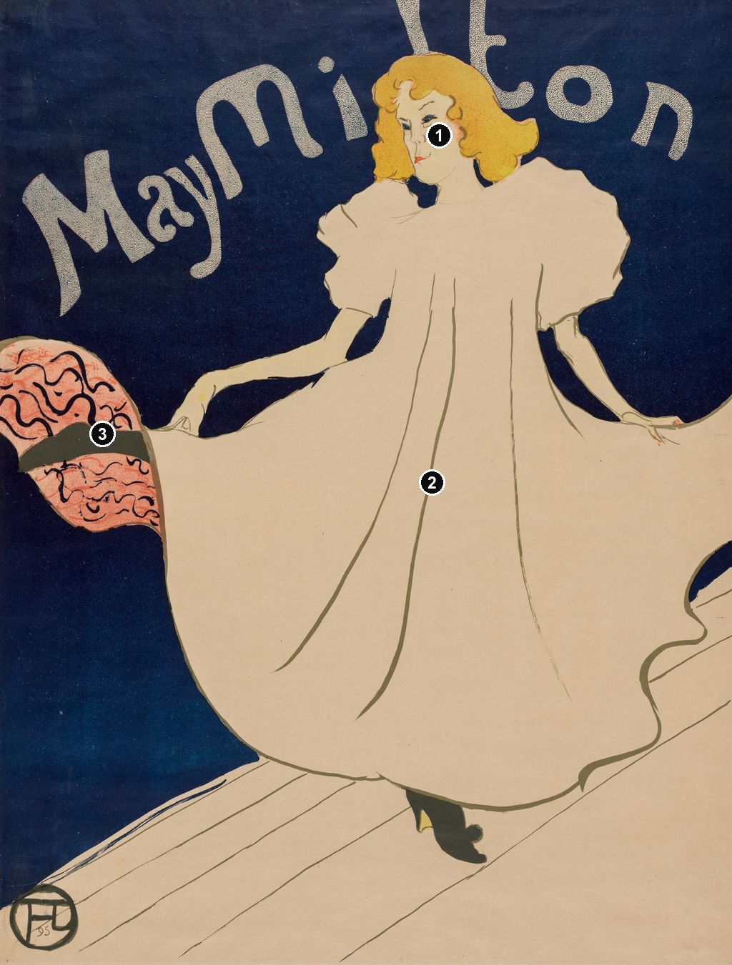
A pale dress expands across almost the whole width of Henri de Toulouse-Lautrec's May Milton. Above it, a yellow-haired head interrupts the dancer's own name; below, a small dark shoe makes the enormous garment seem momentarily airborne. The blue surrounding her is so continuous that the figure registers before the setting does. Only a few diagonal lines at the bottom tell us where she stands. This is an 1895 colour lithographic poster, a printed advertisement whose striking economy remains visible even in a small reproduction. [1]
Milton was an English dancer, distinguished in Colta Ives's account from the Irish singer May Belfort, whom Lautrec portrayed in another poster that year. [2] Here he gives a performer a public identity through the relationship between a name, a face and an expansive dancing silhouette. The result rewards looking beyond its immediate contrast of blue and white.
At a Glance
- ArtistHenri de Toulouse-Lautrec.
- Title and dateMay Milton, 1895. [1]
- Mediumcolour lithograph; Chicago's 2005 checklist specifies blue, olive-green, yellow, red and black, with a transferred screen. [3]
- Subjectthe English dancer May Milton. [2]
- An identified impressionArt Institute of Chicago, 1948.451; primary support 80.4 × 61.9 cm. Its image measurement, including registration marks, is 80.3 × 60.1 cm. [1]
- Purposepublicity for a planned United States tour; the Philadelphia Museum of Art cautions that the tour may not have taken place. [4]
This work across Henri de Toulouse-Lautrec’s career
Contents
- How the blue makes the figure appear
- A dance carried by the hem and the shoe
- The face inside the name
- A performer and a proposed American audience
- One design, several surviving objects
- A separate portrait, and a poster inside Picasso's room
- Annotated details
How the blue makes the figure appear
The blue occupies the upper corners and runs down the left side of the figure, connecting the space behind the name with the space beside the skirt. It provides no descriptive scenery. There are no spectators, tables or recognisable fittings to place the dancer in a particular establishment. Its continuity concentrates attention on the dress: each change in the pale silhouette becomes visible against the surrounding darkness.
That arrangement makes the empty areas active. A thin wedge of blue separates the left forearm from the garment. On the opposite side, another opening distinguishes the right arm from the body before the hand meets the spreading skirt. These small intervals keep the arms legible inside an otherwise enormous pale shape. Cover those openings mentally and the figure becomes much less articulate. Lautrec gives the eye just enough separation to reconstruct the action.
The blue also changes the apparent weight of the dress. At the shoulders, the sleeves swell into irregular puffs, presenting broad pale surfaces against the dark field. Lower down, the skirt opens towards both edges of the sheet. Its right-hand boundary is cut off, while the lifted section at the left reveals a patterned underside. The garment therefore exceeds the space comfortably available to it. The image feels full without a crowded scene.
Look next at the floor. A sloping pale area enters from the lower left and rises towards the right, where it almost merges with the hem. A few narrow diagonal lines identify boards or the direction of a stage surface. They give the eye a route beneath the dancer, but they do not build a deep, reassuring box of space. The figure remains close to the picture plane. Blue field, pale costume and shallow floor divide the rectangle into large, easily grasped areas.
This is why calling the design simply a white figure on blue leaves much unexplained. Its force comes from the unequal shapes of the intervening spaces, the way the skirt presses against the edges, and the contrast between the name's upward curve and the floor's diagonal. The blue is neither a neutral background nor a detailed image of a darkened theatre. As a visual reading, it functions as the continuous surface against which the performer can become unmistakable.
A dance carried by the hem and the shoe
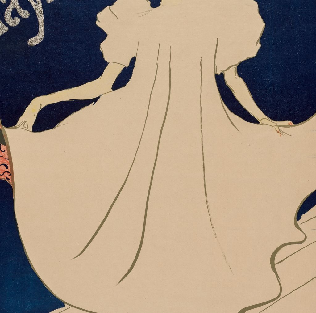
The hands hold the costume outwards, making its breadth part of the action. On the left, the arm extends in a long, relatively straight line from the puffed sleeve. On the right, the elbow bends and the forearm falls more steeply. The two sides avoid mirror symmetry. The dress may initially resemble a broad bell, but its supporting gestures pull it in different directions.
Very little internal drawing is needed to make the fabric move. Long lines descend from the bodice, bending as they approach the hem. They suggest folds without covering the pale surface in descriptive shading. Their length matters: a single uninterrupted curve can carry the eye through much of the figure. At the lower right, the contour changes into a series of rounded waves. Those shorter turns suggest the hem's local movement against the slower sweep of the larger garment.
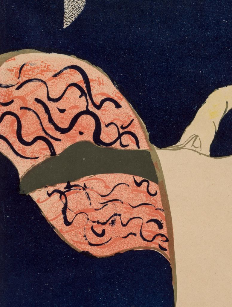
The lifted section at the left introduces another kind of mark. Its reddish underside is covered with dark, curling strokes and crossed by a much thicker black band. This compact patch of pattern sits beside a huge area of relative stillness. The contrast makes the turn of the fabric conspicuous. The Philadelphia Museum of Art also draws attention to the revealed patterned lining and to the leg emerging from beneath the dress. [4]
At the bottom, the dark shoe is disproportionately important to understanding the stance. Most of the body is hidden by cloth, and the dress has little modelling that would disclose the position of hips or knees. The foot supplies a sharp directional accent beneath the curved hem. Together with the raised fabric, it converts what could have been a static costume display into a dancing figure. The outline suggests an instant within movement without explaining the complete sequence of a step.
Ives approaches Lautrec's performer images through the enlargement of gesture by stage conditions. On the page introducing May Milton, she connects his concentrated studies with faces sharpened by makeup and gestures made conspicuous by footlights. She describes rapid observation and the transformation of that observation into crayon, spatter and colour. [2] Her account helps explain the economy of the poster: it retains distinctive signals of performance rather than cataloguing every bodily transition. The visible pose does not, by itself, identify a named dance or establish exactly what Milton performed on a particular evening.
Annotated Details from May Milton: Toulouse-Lautrec's Dancer against Blue
The numbered points identify visible features discussed in this article. Return from each detail to the whole composition. Henri de Toulouse-Lautrec, May Milton, 1895. Colour lithograph, Cleveland Museum of Art, 1952.10, sheet 79.5 × 61.5 cm. This impression has no additional musician remarque. The Cleveland Museum of Art, Mr. and Mrs. Lewis B. Williams Collection,1952.10. Image source. CC0 / Public domain. Resized only; native appearance preserved.
Details from MAY MILTON: TOULOUSE-LAUTREC'S DANCER AGAINST BLUE
Compare the cropped details with the complete images above. Notice how their colours, shapes and positions contribute to the larger compositions.
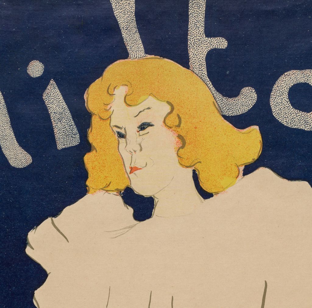
The pale face
The pale profile and yellow hair stand out against blue.
The spreading costume
The wide pale dress dominates the poster’s silhouette.
Patterned lining
Pink patterning at the lifted edge contrasts with the largely unprinted pale dress.
The face inside the name
The face occupies very little of the sheet, yet it prevents the pale expanse from becoming an anonymous costume. The hair forms a yellow shape with a scalloped outer edge and smaller curls across the forehead. Within it, sparse marks distinguish the eyes, nose, mouth and chin. The head turns towards the left, interrupting the broad frontal presentation of the dress. That small change of direction gives the upper body an orientation which the garment alone would not provide.
Colour is concentrated unevenly. Yellow makes the hair a separate mass; the mouth provides a tiny warm accent; the eyes and brows depend on much finer marks. The blue has greater area than any of these details, but the face has greater descriptive concentration. The design asks the viewer to move between two scales of attention: the silhouette that can be grasped immediately and the particular features that reward a closer look.
The lettering participates in this movement. “May Milton” rises from the left and bends across the upper field. Its letters change size and angle, and the taller strokes extend towards the top edge. They behave less like a caption placed beneath an illustration than like large shapes inhabiting the same space as the performer. Milton's hair overlaps parts of her surname, joining the person to the announcement while slightly interrupting its reading.
There is also a useful difference between the scale of name and face. The name is large enough to compete with the dress, while the face remains small enough to require attention. The poster offers recognition through repetition of a professional name and through a particular arrangement of features. Neither substitutes for the other. Without the lettering, the figure would still be striking; without the figure, the name would lose the action that makes it memorable.
The compressed face should not be treated as a verdict on Milton's personality or ability. The poster establishes how Lautrec represented her, not what she thought about the likeness or how an audience judged her dancing. Those questions require documents of their own. Its strong shapes can be analysed closely without turning a drawn mouth or a sideways glance into an unsupported biography.
Watch: Toulouse-Lautrec
Choose an artist introduction, a film about graphic design or a closer look at At the Moulin Rouge.
A performer and a proposed American audience
The surviving scholarship gives a brief outline of Milton's Parisian career. Wolfgang Wittrock's entry in MoMA's 1985 catalogue calls her an English dancer, records a single season on a small rue Fontaine stage, and states that she subsequently went to the United States. Ives places her among performers at the Cabaret des Décadents and identifies the poster in her checklist as publicity for the dancer's United States tour. [13] [2]
The purpose of an advertisement and the fulfilment of its promise are different historical matters. Philadelphia's current account explicitly says the proposed tour may never have happened. [4] The poster can securely be described as publicity for a planned American tour. That does not establish an itinerary, a successful engagement or an American street-posting campaign. The sheet supplies a name and an image; it contains no list of American theatres or performance dates from which such a journey could be reconstructed.
This makes its spareness particularly interesting. The image can introduce a performer without requiring the viewer to recognise a Paris venue. Name, costume and gesture travel together. That is a reading of its promotional structure, rather than proof of where particular impressions were distributed. Lautrec gives the advertisement a remarkably self-contained identity, while the surviving evidence leaves the intended journey less certain.
A brief comparison with May Belfort clarifies how individually those identities were constructed. Ives discusses the two performers and their posters together. [2] Belfort's design centres a red dress, a bonnet and a black cat held against the torso; her name sits along the bottom. Milton's pale dress spreads laterally, and her name sweeps above her head. One figure gathers attention towards something held close; the other opens out across the sheet. The shared date and related publicity setting do not make the acts interchangeable.
One design, several surviving objects
The apparent simplicity of May Milton rests on a specific printed construction. Chicago's 2005 exhibition checklist describes its impression as a lithograph with transferred screen, printed in blue, olive-green, yellow, red and black. The limited number of inks should not be confused with the number of visually distinct areas: the pale garment, fine contour, hair and surrounding field perform different jobs within the same design. [3] The broader workshop history belongs to Lautrec's prints and posters; here the important point is how little shading is needed to articulate such a large figure.
Surviving impressions also preserve differences within that design. MoMA's 1985 catalogue places a trial proof beside a colour poster identified as Wittrock P17/B and Delteil 356, second state. Ives's checklist distinguishes a twenty-five-impression issue from an issue of one hundred. Her illustrated Met example, numbered 5/25, includes a small additional dancing musician at the lower right, absent from the version reproduced in MoMA's entry. [13] [2] The main dancer remains recognisable across those differences, but the individual sheets are not interchangeable evidence for every detail.
Measurements likewise belong to particular objects. Chicago records both the primary sheet and a larger secondary support, as well as an image dimension that includes registration marks. The distinction explains why a single unqualified “size” can be misleading. An impression is a physical printed example with its own edges, mounting and history, rather than simply another occurrence of the same picture. [1]
The 2026 Hiroshima exhibition provides a further example. Its bilingual checklist lists May Milton as entry 043, 795 × 611 mm, in the Suntory Poster Collection deposited at the Nakanoshima Museum of Art, Osaka. The checklist's conventions specify sheet measurements for prints unless otherwise stated; those figures should therefore not be relabelled as image dimensions or transferred to Chicago's impression. [14] Museum records let the familiar design regain its material scale: these are substantial paper objects, with differences that a small digital reproduction can conceal.
A separate portrait, and a poster inside Picasso's room
May Milton is also the title of a different Chicago work, dated 1895 and made in oil and pastel on cardboard. Its accession is 1949.263, whereas the poster is 1948.451. [15] [1] The portrait shows the sitter in a dark, high-necked costume with an elaborate head ornament. Blue linear marks describe much of the upper body against the exposed brownish support. It offers a useful contrast with the poster's great pale costume and continuous surrounding blue, without establishing a documented preparatory sequence between them.
The title identifies a person more easily than it identifies an object. The portrait's 66.1 × 49.4 cm measurements belong to the cardboard work, not to the advertisement. [15] Looking between the two reveals the range of Lautrec's representations: one builds the sitter through a network of visible strokes, while the other concentrates her public appearance in a few large shapes. The different purposes become clearer when neither is allowed to stand in for the other.
A further transformation occurs in Pablo Picasso's The Blue Room, painted in 1901. On the rear wall, above the bed, Milton's pale dress and yellow hair remain recognisable within a much smaller blue rectangle. The Phillips Collection identifies the depicted poster and interprets its presence as an homage to Lautrec, who died in September that year, shortly before Picasso made the painting. [16] The visible quotation demonstrates how readily the poster could retain its identity when translated into another artist's picture.
Its new surroundings change the encounter. The public advertisement becomes one object among furnishings and other pictures in a room; its flat blue field sits within Picasso's more varied blue interior. The Phillips identifies the setting as Picasso's boulevard de Clichy studio. [16] That museum account supports the connection with his working space, while the painting itself preserves a specific act of looking: another artist selected this design, reduced it, and retained enough of the figure to make it recognisable. The small foot, spreading dress and yellow head continue to carry the image even when its large lettering recedes.
Toulouse-Lautrec artworks directory
Browse 84 identified works and publications in this researched selection. Dates and titles follow the individual records; this is not a complete catalogue of the surviving oeuvre. Print impressions remain attached to their designs. Some listed works do not have a dedicated article. The Drawings guide also contains nine illustrated studies consolidated from former articles.
Frequently Asked Questions
Yes. It appears on the rear wall of The Blue Room, 1901, in the Phillips Collection. The museum reads it as an homage to Lautrec. [16]
Discussion
Look again at the images and ideas explored in May Milton: Toulouse-Lautrec's Dancer against Blue. These editorial prompts invite your observations.
Reader Insights
Which contributes more to your sense of movement: the skirt's spread, the lifted lining or the small dark shoe? Compare their directions before choosing.
In Picasso's The Blue Room, what remains recognisable when the poster is reduced to a picture on a wall? Consider how much of Milton's identity the silhouette carries. [16]
Join the Conversation
Share a detail, comparison or question about May Milton: Toulouse-Lautrec's Dancer against Blue below.
References
- Art Institute of Chicago, May Milton, 1895, colour lithograph, accession 1948.451, institutional API record, medium and separate image, primary-support and secondary-support measurements. View source 1. View source 2.
- Colta Ives, Toulouse-Lautrec in The Metropolitan Museum of Art, 1996, pp. 46, 48–49 and 67: performer distinctions and paired publicity context; stage observation; fig. 54; May Milton checklist entries for 32.88.3 and 63.663.6. View source.
- Art Institute of Chicago, Toulouse-Lautrec and Montmartre, exhibition checklist, 2005, cats. 64 and 201–203; especially cat. 202, transferred screen, five inks and measurements for 1948.451. View source.
- Philadelphia Museum of Art, May Milton, 1895, collection interpretation, costume details and qualification concerning the planned United States tour. View source.
- Autoportrait, 1880 (in French). View source.
- ALBERTINA: Der Schimmel Gazelle,GE123DL. View source. (in German).
- Franka Blok, Portrait of Vincent van Gogh, 2024. View source.
- Art Institute of Chicago: Moulin Rouge, La Goulue. View source.
- Art Institute of Chicago: At the Moulin Rouge. View source.
- Jane Avril, 1893. View source.
- Au Salon de la rue des Moulins (in French). View source.
- Maurice Joyant (in French). View source.
- Wolfgang Wittrock, “Catalogue of the Exhibition,” in Riva Castleman and Wolfgang Wittrock, eds., Henri de Toulouse-Lautrec: Images of the 1890s, Museum of Modern Art, 1985, p. 241, cats. 274–277, drawing, trial proof, second-state poster and biographical note. View source.
- Hiroshima Prefectural Art Museum, Toulouse-Lautrec and Mucha—Ten Years in Paris, exhibition checklist, 2026, introductory measurement and collection conventions; entry 043, May Milton (in Japanese and English). View source.
- Art Institute of Chicago, May Milton, 1895, oil and pastel on cardboard, accession 1949.263, institutional API record, medium, measurements and accession; compare the 2005 checklist, cat. 64. View source 1. View source 2.
- The Phillips Collection, Pablo Picasso, The Blue Room, 1901, object 1554, collection image and interpretation of the studio setting and the May Milton poster as an homage. View source.
- Splash image, Henri de Toulouse-Lautrec, May Milton, 1895. Colour lithograph, Cleveland Museum of Art, 1952.10, sheet 79.5 × 61.5 cm. This impression has no additional musician remarque. The Cleveland Museum of Art, Mr. and Mrs. Lewis B. Williams Collection,1952.10. Image source. CC0 / Public domain. Resized only; native appearance preserved.


 Henri de Toulouse-Lautrec.jpg)