



 by Tom Gurney
Tom Gurney BSc (Hons) is an art history expert with over 20 years experience
Published on June 19, 2020 / Updated on October 14, 2023
Email: tomgurney1@gmail.com / Phone: +44 7429 011000
Chalk Cliffs on Rügen: Introduction
Chalk Cliffs on Rügen is one of Caspar David Friedrich's brightest and most disquieting paintings. Three figures occupy a grassy foreground at the edge of a white chalk cliff. Beyond them, the Baltic Sea opens into luminous blue distance. A narrow cleft cuts through the foreground, chalk spires rise sharply from the coast, and small boats move far out on the water. The scene seems clear and even cheerful at first, but its clarity is unstable. Friedrich turns a celebrated coastal view into a painting about attention, risk and the different ways people stand before nature.
The work is usually dated 1818 and is held by Kunst Museum Winterthur, Stiftung Oskar Reinhart. [1] [2] cdfriedrich.de records it as oil on canvas, 70 by 90 cm, and identifies it as one of Friedrich's major works while emphasizing how little reliable information is actually known about its origin. [1] Kunst Museum Winterthur's digital collection records the work as Chalk Cliffs on Rügen, dated 1818, acquired for the Stiftung Oskar Reinhart in 1930. [2]
The painting has often been linked with Friedrich's marriage to Caroline Bommer and a journey to Western Pomerania and Rügen in 1818. [1] [2] That biographical connection is plausible enough to matter, but not secure enough to turn the painting into a simple honeymoon picture. The three figures have prompted proposed identifications, including Friedrich, Caroline and Friedrich's brother Christian, yet the cdfriedrich.de object text warns that such proposals are limited by the way the figures are shown from behind or in lost profile. [1] Friedrich gives us people at the cliff edge, but he does not give us portrait certainty.
What he does give us is a carefully organized problem of looking. The woman and one man attend to the near abyss, vegetation and cliff edge; the standing man on the right looks calmly outward over the sea. [1] The viewer is placed between these possibilities. We can be drawn downward into the cleft and the danger of the rocks, or outward into the bright distance of the Baltic. The painting's subject is not merely Rügen as scenery. It is the question of where attention goes when nature offers beauty and danger at once.
At a Glance
- ArtistCaspar David Friedrich
- TitleChalk Cliffs on Rügen
- Dateusually dated 1818, though the exact year is not fully secure. [1]
- Mediumoil on canvas
- Dimensionscdfriedrich.de records 70 x 90 cm; Kunst Museum Winterthur records work dimensions as 90.8 x 70.6 cm. [1] [2]
- CollectionKunst Museum Winterthur, Stiftung Oskar Reinhart. [1] [2]
- AcquisitionStiftung Oskar Reinhart, purchase, 1930. [2]
- Key settingthe chalk cliffs of Rügen, especially the Stubbenkammer motif. [1]
- Key issuethree figures offer different modes of looking at the same landscape
Contents
- Object Facts
- Annotated Details
- Rügen and the Chalk-Cliff Motif
- A Landscape Made from Separate Views
- The Three Figures and Three Acts of Looking
- The Cliff Edge and Pictorial Risk
- Color, Clarity and the Limits of the Sublime
- Marriage, Travel and Biographical Caution
- Old-German Dress and Political Attention
- Close-Looking Notes
- The cliffs from below and from above
- A coastal motif can travel without the cliffs
- From Winterthur to Greifswald
Object Facts
Chalk Cliffs on Rügen is a painting by Caspar David Friedrich in the Kunst Museum Winterthur, Stiftung Oskar Reinhart. [1] [2] The museum's digital collection identifies the artist as Friedrich, gives the title in English and German, dates the work to 1818, records oil on canvas, and lists the inventory number OR 165. [2]
The dimensions need careful handling because sources present them differently. cdfriedrich.de gives 70 by 90 cm. [1] The Kunst Museum Winterthur digital collection gives a work measurement of 90.8 by 70.6 cm. [2] These are not a reason to doubt the object, but they show why object facts should follow named sources rather than being smoothed into false precision.
The dating also requires caution. cdfriedrich.de states that even the year of origin has not been firmly established, although the painting is often assumed to have been made around 1818, shortly after Friedrich's marriage to Caroline Bommer. [1] A drawing made in Stralsund on August 6, 1818, may have supplied the model for the more distant sailboat, making a date before 1818 unlikely. [1] A later date cannot be ruled out, and the object text raises the possibility that this was the painting Carl von Voss saw in Friedrich's studio in July 1822. [1]
The Winterthur record is therefore useful as a holding and object anchor, while the cdfriedrich.de text is especially useful for interpretive caution. [1] [2] Both kinds of evidence matter here: what the museum record can confirm, and what the painting still withholds.
That uncertainty is productive. It prevents the painting from being reduced to a neat episode in Friedrich's life. The likely 1818 context matters, but the work's meaning also depends on composition, figure placement, source studies and the tension between near danger and open sea.
Annotated Details from Chalk Cliffs on Rügen
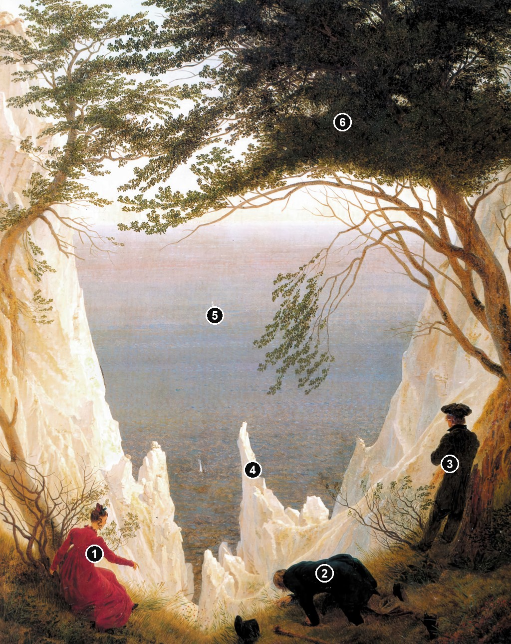
This annotated close reading follows six visible details in Friedrich's Rügen cliff scene: the seated red figure, the kneeling figure at the edge, the standing figure under the right tree, the chalk cleft and spires, the Baltic opening with distant sails, and the enclosing tree frame. The notes keep figure identity cautious and avoid turning the painting into generic tourism or generic Romantic landscape symbolism.
Details from CHALK CLIFFS ON RÜGEN
These details use the metadata-clean high-resolution Chalk Cliffs image prepared for this page while preserving the article's conservative source and reuse caution.
Seated figure in red
The red-clothed figure sits low at the left, making looking a bodily act at the edge of the chalk landscape rather than a simple scenic view.

Kneeling figure at the edge
The kneeling figure brings caution into the foreground, leaning toward the drop while keeping the viewer aware of risk and attention.

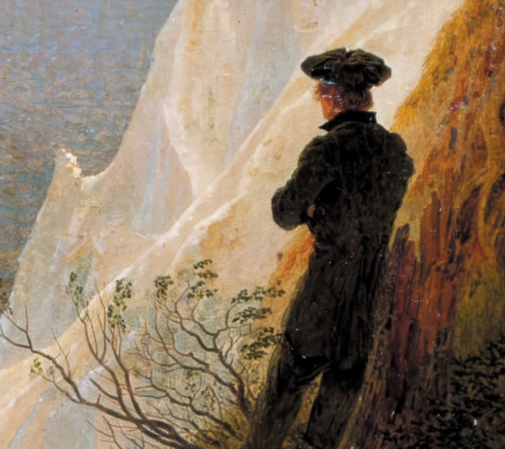
Standing figure under the tree
The dark standing figure at the right looks from beneath the tree, balancing the seated and kneeling figures with a more upright stance.
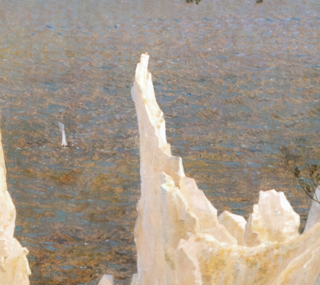
Chalk cleft and spires
The white chalk cleft opens the foreground into depth, turning the bright rock into a structure of approach, gap and descent.
Baltic opening and distant sails
The small sails on the Baltic keep the distant view active, linking the cliff-top foreground to the wide water beyond.

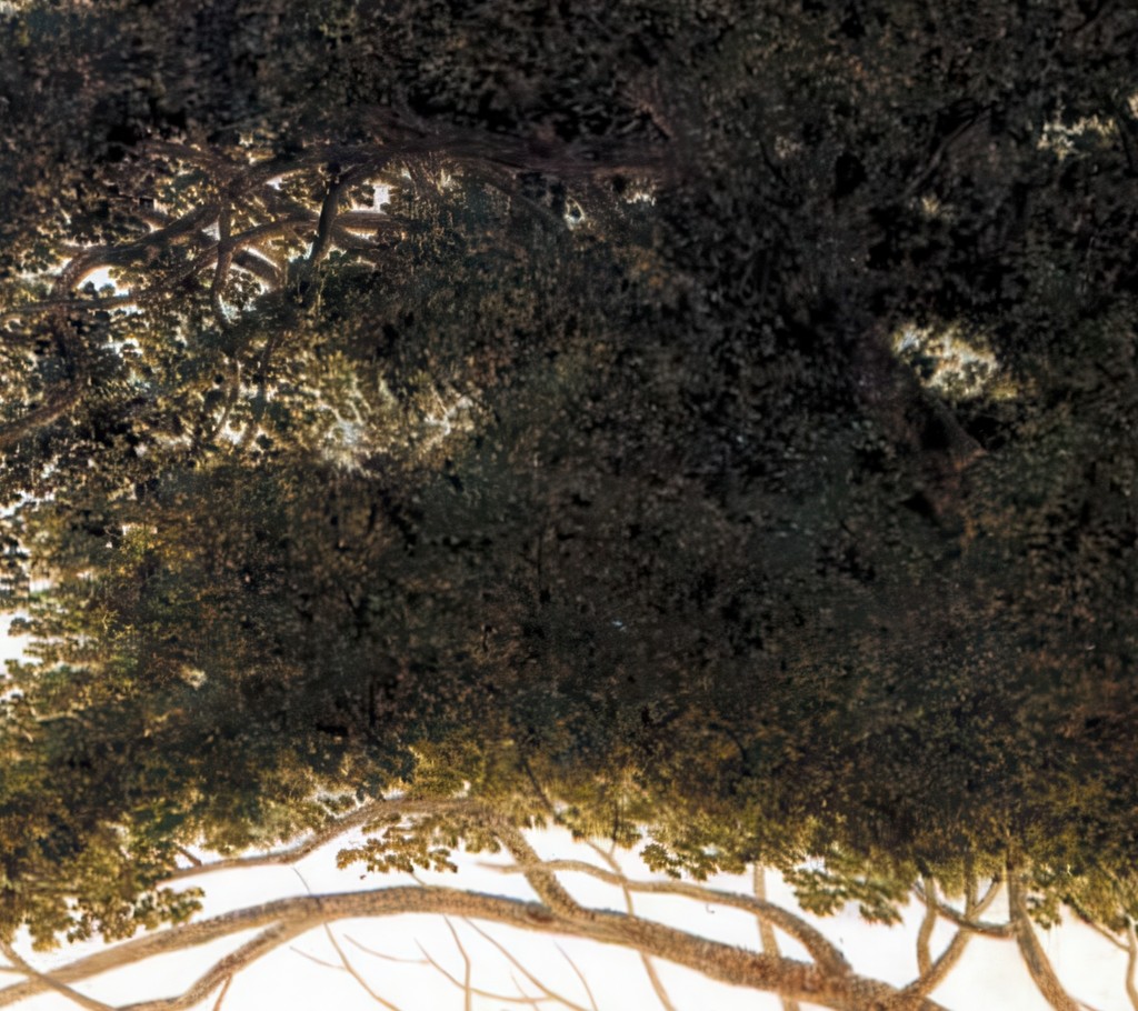
Enclosing tree frame
The overhead tree canopy encloses the sea view, so the landscape is seen through a living frame rather than an open window.
Rügen and the Chalk-Cliff Motif
Rügen was one of the landscapes most closely associated with Friedrich's northern imagination. The island's chalk cliffs, beaches and Baltic views offered forms that could be both topographical and symbolic. Kunst Museum Winterthur's digital text notes that Friedrich, born near the Baltic in Greifswald, knew the rough nature of northern Germany and the nearby island of Rügen, and returned to the region even after moving to Dresden. [3]
The chalk cliffs were already a celebrated sight. Travel writing and poetry had helped establish Rügen as a place of dramatic natural encounter. [1] Friedrich did not ignore that tradition, but he did not simply illustrate it either. cdfriedrich.de suggests that his painting may even criticize contemporary images of Rügen popularized through poems and early travel guides, which emphasized terrifying and sublime natural drama. [1]
That possible critique matters because Chalk Cliffs on Rügen is not as dark or severe as many expected Friedrich works. It is bright, open and filled with color. The sea is not a black abyss like the water in Monk by the Sea. The light is not funereal like The Abbey in the Oakwood. The white cliffs gleam. The vegetation is green. The sea is blue and nuanced. [1]
Yet the painting remains serious. Friedrich's seriousness does not always require darkness. Here he asks how a beautiful view can remain dangerous, how clear air can still produce uncertainty, and how a famous landscape can become a meditation on the act of seeing.
A Landscape Made from Separate Views
Like many of Friedrich's strongest landscapes, Chalk Cliffs on Rügen is not a straightforward record of one viewpoint. cdfriedrich.de states that Friedrich combined two views that are separate in reality: the Kleine Stubbenkammer and the Grosse Stubbenkammer on Rügen. [1] That compositional fact is central to the work.
The painting feels convincing because Friedrich drew from real places. Two surviving study drawings of the Kleine Stubbenkammer relate to the left cliff wall and the striking spike to the right of centre; Friedrich made these studies in situ on August 11, 1815. [1] He then enlarged and transformed the material in the final painting to heighten the effect of the cleft, jagged white rocks and broad sea. [1]
This method places the painting beside Wanderer above the Sea of Fog, where Friedrich also assembled a visionary landscape from observed elements. The point is not deception. Friedrich was not pretending to give tourists a map. He used specific studies to create a stronger pictorial argument than a literal transcript could provide.
The combined view intensifies the painting's double pull. The foreground cleft draws attention downward and inward, toward the risk underfoot. The sea draws attention outward, toward breadth and distance. If the landscape were a simple site record, that tension might be weaker. By combining views, Friedrich makes the place more psychologically active.
The Three Figures and Three Acts of Looking
The three figures are the painting's interpretive centre. They are close to one another, but they do not respond to nature in the same way. Friedrich makes their differences more important than their group identity.
The woman stands or sits near the left side, partly turned, her figure seen in profile or lost profile rather than as a portrait. The kneeling man near the centre leans toward the abyss. The standing man on the right, dressed in old-German clothing, looks outward over the sea. [1] These different positions create different ways of seeing.
cdfriedrich.de describes the woman and the kneeling man as looking toward the abyss or the vegetation near it, while the man on the right calmly looks at the sea. [1] That contrast is the painting's quiet drama. One mode of attention is close, downward and physically risky. Another is expansive, distant and contemplative. The viewer is invited to feel both.
This is why the painting should not be read simply as a group portrait. Scholars have proposed identities for the figures, including Caroline, Caspar David Friedrich and Christian Friedrich, but the source text cautions that such identifications are limited by the way the figures are depicted. [1] Friedrich's choices reduce portrait certainty and increase perceptual meaning.
The figures also differ in posture. The kneeling figure seems awkward, even vulnerable, as he leans toward the drop. The standing man is more composed. The woman mediates between them, positioned near the vegetation and cliff edge. The viewer's eye moves among these bodies before moving into the sea. Looking becomes plural rather than singular.
The Cliff Edge and Pictorial Risk
The cliff edge is not only a represented place. It is a pictorial device. Friedrich places the viewer near a threshold where the foreground seems to open into a dangerous cleft. The effect is different from the high, stable rock in Wanderer above the Sea of Fog. Here the edge cuts into the space that the figures occupy.
The kneeling man makes the risk visible. His body bends toward the drop, and his attention seems absorbed by what lies below or immediately before him. The painting does not need a dramatic fall to create danger. The possibility of falling is built into the composition.
At the same time, the sea beyond the cliffs appears calm and luminous. That contrast creates the painting's special pressure. The foreground suggests rupture; the distance suggests openness. The same landscape offers threat and release.
The white cliffs intensify this ambiguity. Their sharp forms are beautiful, but they are also jagged and unstable. They do not function as gentle scenery. They make the coast appear cut, exposed and precarious. Friedrich gives the viewer a famous natural sight, then asks what kind of looking it demands.
This is where the painting resists tourism writing. A travel account might celebrate the view as a destination. Friedrich treats the view as a test of attention. The viewer is not simply asked to admire Rügen. The viewer is asked to choose between looking down, looking out, looking with the figures or becoming aware of the danger and construction of the view itself.
Color, Clarity and the Limits of the Sublime
Chalk Cliffs on Rügen is unusually bright for a painting so close to danger. The sea's blue distance, the pale chalk and the green foreground create an atmosphere that cdfriedrich.de describes as cheerful, centered especially in the nuanced color of the sea. [1] This brightness has sometimes made the painting seem easier than Friedrich's darker works, but that would be a mistake.
The painting's color changes how the sublime works. In Monk by the Sea, the viewer faces emptiness, dark water and a massive sky. In The Abbey in the Oakwood, winter, ruin and procession create a solemn meditation on death. Chalk Cliffs on Rügen works through light and clarity. The danger is not hidden by darkness; it appears in daylight.
That clarity is unsettling because it refuses melodrama. Friedrich does not need storm clouds, night or shattered ice to make the landscape serious. The abyss is there in clear weather. The figures stand before a beautiful sea. The painting's brightness makes the risk harder to dismiss.
cdfriedrich.de suggests that Friedrich may have been distancing himself from more conventional sublime descriptions of Rügen as terrifying natural drama. [1] If so, the painting does not reject the sublime; it revises it. It replaces theatrical terror with a more complex field of perception. The scene is beautiful, dangerous and contemplative at once.
The color of the sea is especially important. It draws the eye outward and gives the painting its open mood. Yet the sea is also unreachable from the foreground. Between viewer and water are cleft, chalk, height and distance. The beauty is offered across separation.
Marriage, Travel and Biographical Caution
The painting's likely 1818 context has long encouraged biographical readings. Friedrich married Caroline Bommer in January 1818, and they travelled to Western Pomerania and Rügen that summer, accompanied by Friedrich's brother Christian. [1] [2] Because the painting shows two men and a woman, it has often been interpreted in relation to that journey. [2]
That reading has value, but it must remain cautious. cdfriedrich.de explicitly states that proposed figure identifications are limited by the way the figures are shown from behind or in lost profile. [1] The painting does not behave like a documented family portrait. It withholds faces and emphasizes posture, attention and landscape.
Kunst Museum Winterthur's digital text notes that the work has repeatedly been interpreted as a wedding picture, partly because of the three figures and partly because of the touching branches in the upper half of the painting, which have been compared with a motif in Philipp Otto Runge's friendship and love image We Three. [3] The same text cautions that a single interpretation is too narrow for Friedrich's art. [3]
That balance is useful. The marriage journey may help explain why Rügen, three figures and bright color mattered. But Friedrich's painting is larger than that biographical frame. It turns a possible personal context into a broader meditation on nature, attention, companionship and distance.
Old-German Dress and Political Attention
The standing man on the right wears old-fashioned German dress, a detail cdfriedrich.de identifies as politically connoted. [1] This should be handled carefully. The clothing does not turn the painting into a political poster, but it does mean the figure's stance may carry more than private feeling.
cdfriedrich.de suggests that both the composition and the characterization of this standing figure indicate Friedrich's sympathy with his attitude. [1] His way of looking differs from the other figures. He does not lean into the abyss. He looks calmly outward, across the sea.
The political connotation of dress belongs to the post-Napoleonic world in which old-German costume could signal national, cultural or patriotic attitudes. In the painting, however, that meaning remains embedded in a visual scene. Clothing, posture and looking work together. The viewer reads the figure not through costume alone, but through his calm relation to distance.
This is one reason the painting's group dynamic matters. The three figures do not simply share a view. They embody different orientations: toward near danger, toward vegetation and cliff edge, and toward the sea's expanse. The standing man's old-German clothing sharpens that contrast by making his outward-looking stance culturally marked.
Close-Looking Notes
Begin with the cleft in the foreground. It opens the painting from the viewer's side and makes the grass at the cliff edge feel unstable. The figures are not placed safely in front of a distant view; they occupy the dangerous edge of the view itself. That is why the kneeling man's posture matters so much. His body makes the abyss physically legible.
Next, look at the chalk forms. They are brilliant white and visually attractive, but their sharp peaks and broken surfaces are not gentle. cdfriedrich.de emphasizes how Friedrich brought together dramatic features such as the cleft and jagged rocks with the broad prospect of the sea. [1] The painting's beauty depends on that double structure: near rupture and far openness.
The branches at the top also deserve attention. Kunst Museum Winterthur notes that the touching branches have helped support wedding-image interpretations, partly because of comparison with Philipp Otto Runge's We Three. [3] The motif can suggest connection, but it should not force the entire painting into a single biographical reading. The branches frame the upper foreground while the sea pulls the eye beyond the group.
The boats are small, but they help measure distance. cdfriedrich.de notes that a Stralsund drawing from August 6, 1818, may have provided the model for the more distant sailboat. [1] In the painting, the boats are not anecdotal decorations. They mark the sea as a lived space while remaining far beyond the figures' immediate reach.
Finally, notice how Friedrich separates nearness from distance. The foreground is full of bodies, branches, grass and cliff edges. The distance opens into sea and sky. The painting's drama comes from moving between these zones. Each figure makes a different choice about where to look, and the viewer is drawn into the same decision.
That structure explains why the painting remains tense even without storm, night or overt tragedy. Friedrich makes danger a matter of placement rather than incident. Nothing has happened at the cliff edge, yet the bodies, cleft and chalk forms make the possibility of danger active. The sea's calm distance does not cancel that risk; it makes the foreground feel sharper by contrast.
The painting keeps that contrast open, which is why its brightness feels alert rather than merely pleasant.
Its light sharpens attention rather than softening the painting into scenic ease.
The cliffs from below and from above
Friedrich's drawings of the coast preserve more than one way of reaching the cliffs. The anniversary project documents two views of the Königstuhl made from the foot of the chalk cliffs in June 1801. Peter Prange also records a separate drawing of the Kleine Stubbenkammer from 1802, now in Leipzig, that retains the larger dimensions of its original sketchbook leaf. These early works predate the two studies of August 1815 that Johannes Grave associates more directly with forms in the painting. The dates show that the encounter with the terrain extended across several visits.[1] [4] [5]
From below, the height of a cliff can be made apparent through the distance its outline climbs from the ground or water. The painting asks a different question of the spectator. Its grassy brink is already high. It gives us a way to approach the chalk from above, while making the relation between the near grass and the distant water unusually difficult to measure. The lower view belongs to the artist's record of the coast. The higher one in the painting makes the process of estimating depth part of the experience of seeing it.[1] [4]
This comparison helps explain why there is more at stake than matching a particular point on a map. A lower approach and a high one bring different features of the same formations into sight. At the foot of the cliff the rise itself is immediately apparent. From the painted brink, the nearer edge can conceal much of the fall. A visitor trying to find the vantage point may recognize the shape of a chalk face and still discover that the relation between the openings, rock walls and water has been changed. The available studies allow that recognition to become more exact.[1] [4] [5]
A coastal motif can travel without the cliffs
A late sepia called Moonrise by the Sea provides a revealing contrast. The Hamburger Kunsthalle traces its offshore rocks to a Stubbenkammer drawing made in 1801. The chalk cliffs that had been prominent in the early view were left out. The remaining cluster can do a different job in the later sheet, sitting in front of the band of light across the water. This is another way an early visit to Rügen could continue to matter after the particular view was no longer needed as a whole.[6] [7]
In the Winterthur painting, the chalk is the part of the coast the viewer is most likely to recognize. The openness of the water beyond depends on the close, pale forms that interrupt it. In the sepia, the rocks retained from the same region have no tall white wall to compete with and the moon has room to organize a broad expanse of water. Seen across the two works, a recognizably coastal motif can be essential in one composition and dispensable in another. The study offers more possibilities than are required in either finished scene.[1] [6] [7]
The comparison also complicates the tendency to read a familiar subject as a single memory. One drawing can be remembered for the recognizable landmark it records and consulted later for a much smaller part of the terrain. The second use may only become apparent by comparing the shapes. Friedrich's repeated work on Rügen was therefore productive in two senses. It furnished images of a coast viewers might recognize, and it furnished forms that could be carried into a view where the name of the place was less important.[4] [5] [6]
From Winterthur to Greifswald
Kunst Museum Winterthur records the 1930 purchase and gives the painting the inventory number OR 165. Its 2023 exhibition placed the cliffs in a survey of Friedrich and the antecedents of Romanticism. The following year's Places of Longing in Greifswald presented the Winterthur loan with Greifswald Harbour and Eldena Ruin in the Giant Mountains. The change in companions makes it possible to ask what a museum display brings to a familiar view. A history of landscape painting and an exhibition about particular places give spectators different reasons to compare the picture with what hangs around it.[2] [8] [9]
The Greifswald group is especially revealing because the views vary in the kinds of geographical evidence they offer. The harbour brings maritime work and the approach to a city into view. The cliffs put the spectators on a narrow piece of high ground. The Eldena painting brings a Pomeranian ruin into a mountain landscape. Each has a connection to the region through a particular feature, and the three works take very different liberties with how the place appears. At the anniversary exhibition, the return of the painted cliffs to the region where Friedrich found his material gave visitors an occasion to consider those liberties side by side.[9]
Related Friedrich Works
Wanderer above the Sea of Fog is the closest comparison for the back-turned figure as a device of looking. Both paintings ask the viewer to see through, with or around figures who face a landscape.

Monk by the Sea gives a darker and more reduced coastal encounter. The Monk stands before shore, sea and sky, while Chalk Cliffs on Rügen places several figures before a bright but dangerous view.
Moonrise over the Sea offers another version of coastal looking, with figures turned toward ships and a distant horizon.
Meadows near Greifswald shows Friedrich's attachment to northern German place in a different register, away from cliff drama and toward lowland distance.
The biography, paintings and drawings pages give wider context for Friedrich's travel, field studies and repeated transformation of observed places into constructed paintings.
Frequently Asked Questions
Discussion
Reader insights are welcome, especially close-looking observations about the three figures, the cliff edge, the Baltic distance, the Rügen source views and the cautious marriage-context reading.
Reader Insights
Which figure most strongly directs your own looking?
How does the bright cliff edge make danger visible without melodrama?
How does the constructed Rügen landscape differ from simple travel scenery?
Which figure's way of looking most shapes your response to Chalk Cliffs on Rügen: the person absorbed by the edge, the kneeling figure near the abyss, or the standing man looking out to sea?
Join the Conversation
Share a close-reading note or a source-grounded comparison with Friedrich's other coastal paintings.
References
- Chalk Cliffs on Rügen, cdfriedrich.de, Caspar David Friedrich anniversary Chronicle Source
- Caspar David Friedrich - Chalk Cliffs on Rügen, Kunst Museum Winterthur digital collection Source
- Kreidefelsen auf Rügen, Kunst Museum Winterthur digital feature, German-language source. Source
- Staatliche Kunstsammlungen Dresden, View of the Königstuhl from South-East, on two June 1801 drawings made below the cliffs.
- Peter Prange, Seeufer auf Rügen mit zwei Fischerbooten, Hamburger Kunsthalle, on the 1802 visit and the separate Leipzig cliff study.
- Hamburger Kunsthalle, Mondaufgang am Meer, late sepia and its use of the 1801 study.
- Hamburger Kunsthalle, Stony Beach with Anchor and Half-Moon, catalogue discussion of the group of late coastal sheets.
- Kunst Museum Winterthur, Kreidefelsen auf Rügen, OR 165, and 2023 exhibition retrospective.
- Pommersches Landesmuseum, Caspar David Friedrich: Places of Longing, exhibition record, 18 August–6 October 2024.


