 by Tom Gurney
Tom Gurney BSc (Hons) is an art history expert with over 20 years experience
Published on June 19, 2020 / Updated on October 30, 2026
Email: tomgurney1@gmail.com / Phone: +44 7429 011000
Jackson Pollock Posters: Introduction
Choosing a Jackson Pollock poster begins with the painting. A web of overlapping lines, an isolated figure and a field of thick, bright colour offer different things to live with. The useful questions are quite concrete: which composition holds your attention, how much of it will appear on the sheet, and how will its scale change on your wall? Start there, before choosing a frame or matching a colour to a room.
A reproduction can make a painting familiar through daily looking. It also changes the encounter: the image has a new size, a new surface and a surrounding space of its own. Understanding those changes helps you choose a poster for the qualities of the particular artwork.
At a Glance
- FocusReproductions and original works
- Looking closelyTitles, format and reproduction colour
- Related guideOriginal printmaking
Contents
- A reproduction, an exhibition poster or an original print?
- Choose the composition first
- Scale changes the experience
- Image area, margins and orientation
- Read the title and the description closely
- Keep looking at the painting
A reproduction, an exhibition poster or an original print?
The word print needs a little care. A modern poster reproducing a Pollock painting is a newly manufactured image of that painting. Printing it on canvas changes its support; it does not turn it into a painting made by Pollock. An exhibition poster has another purpose, bringing together an image and information about a show. A reproduction of a historical exhibition poster adds a further distinction between the older printed object and its modern copy.
Pollock also worked in printmaking himself. MoMA holds a portfolio of six screenprints from 1951, made by Pollock and his brother Sanford McCoy and published by Pollock. These were based on paintings in his Betty Parsons Gallery exhibition, with small changes and a reduction to roughly one-quarter size. Here the relationship to a painting belongs to an artist's printmaking project. The museum records an edition of twenty-five for this portfolio. [1]
An announcement for the Betty Parsons Gallery exhibition of 26 November–15 December 1951 is a separate object. MoMA identifies its technique as screenprint, its printer as Acme Press in New York, and its edition as unknown. The record dates it to 1951 and specifies that its signature was added in 1954. Those details show why a historical announcement should be described on its own terms, rather than treated as another sheet from the six-print portfolio. [2]
For a picture to display at home, this vocabulary helps you read the description accurately. For the history of Pollock's work on paper, the guide to his prints follows the separate questions of printmaking, editions and later impressions.
Choose the composition first
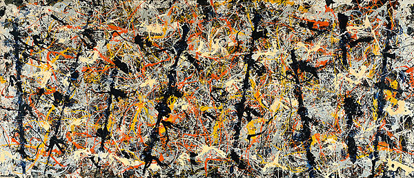
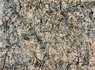
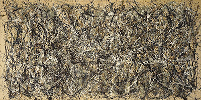
If you are drawn to Pollock's overlapping, allover compositions, One: Number 31, 1950 is a useful starting point. MoMA describes interwoven paint in tans, blues and greys, threaded with black and white. Its account emphasises both the force of the marks and their delicacy. A poster choice can follow either interest: the image as an extensive field, or the smaller relationships between the lines. Consider how much detail you want to follow from your usual place in the room. [3]
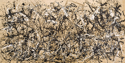
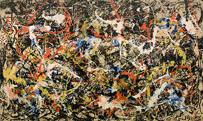
Convergence: Number 10, 1952 offers another way into the layered paintings. Buffalo AKG explains that Pollock began it in black and white, then added colour. That sequence gives the colour a particular relationship to the underlying structure. When comparing reproductions, give yourself time to consider the whole composition as well as the brighter passages that first attract attention. Choosing between One and Convergence can begin with your response to their organisation of paint, rather than with a search for a single accent colour. [4]
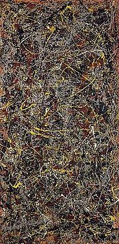
For a more economical arrangement of marks, consider Echo: Number 25, 1951. MoMA contrasts its pared-down approach and hints of figuration with the multidirectional energy of One. Its recorded dimensions, 233.4 × 218.4 centimetres, also establish a nearly square composition, slightly taller than it is wide. If black and white is your starting preference, Echo invites attention to the character and spacing of the drawing. It makes a different choice from an image selected chiefly for a dense spread of colour. [5]
Earlier figurative paintings broaden the possibilities. In The She-Wolf, dated 1943, MoMA describes a wolf drawn with heavy black and white lines, overlaid by abstract marks and patches. The museum proposes a possible connection to the Roman foundation myth of Romulus and Remus while preserving the uncertainty of the subject. For a reproduction, the practical attraction may be that interplay between an animal form and the surrounding marks: there is a figure to return to as well as a complicated painted field. [6]
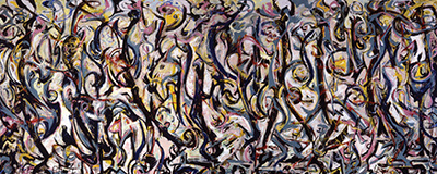
The Moon Woman, from 1942, has a taller format. The Peggy Guggenheim Collection records an oil painting measuring 175.2 × 109.3 centimetres and relates its palette and composition to Picasso. It places the subject among Pollock's early explorations of mythic figures and signs. A reader interested in this side of his work can therefore begin with a particular figurative painting and its upright proportions, rather than assume that every Pollock image will suit a broad horizontal space. [7]
Colour may lead you instead to Shimmering Substance, painted in 1946. MoMA places it among the Sounds in the Grass canvases, with a lighter palette than his earlier work, and describes loops extending to the edges. Its account of paint squeezed from the tube also makes the thick surface central to understanding the original. In reproduction, those marks become a printed description of the paint. Enjoy their shape and colour while keeping that material difference in mind. [8]
Watch: Jackson Pollock
Choose a film about Pollock’s paintings and ways of working.
Scale changes the experience
The original One measures 269.5 × 530.8 centimetres: its width exceeds five metres. MoMA's record describes a wall-size painting whose closely interlaced marks spread across a huge canvas. Shrinking that composition changes the relationship between a painted gesture and your body. A sweeping passage becomes a smaller line that you can take in together with the rest of the image. [3]
A dated example makes the distinction tangible. On 25 October 2026, the MoMA Design Store described its One: Number 31 poster as a paper reproduction measuring 39 inches high by 68 inches wide. These are the listed poster dimensions; the description does not establish a separate measurement for the printed image. Treat them as the sheet size when planning space, and check image dimensions separately if those matter to your choice. [9]
Even a large poster translates the surface. MoMA's conservators describe diluted paints staining the canvas of One, alongside passages of concentrated medium. [10] A printed image can convey the appearance of layers and variations in tone, but its own paper and finish govern how its surface catches the light. It cannot preserve the original paint's physical relief and differing lustre.
Think about where you will actually look at the poster. From a chair across the room you may want to take in the whole field; beside a desk you may spend more time with small passages. Mark out a possible frame's outer dimensions with removable paper, then look from those places. There is no need for a universal size rule when the wall, furniture and viewing positions can be measured directly.
Image area, margins and orientation
Keep three sets of measurements separate: the artwork's original proportions, the printed image, and the outer sheet. A sheet may include a white border, a title or exhibition lettering. Its width-to-height ratio can therefore differ from the original painting without proving that the artwork has been cropped. The question is whether the complete composition fits inside that sheet, and at what size.
Where a description supplies both sheet and image dimensions, use each for its proper purpose. The sheet helps establish the frame opening; the image tells you how large the composition will appear. If only the overall size is given, avoid assuming that paint reaches every paper edge. Look for a clear description of borders and any stated cropping before deciding how to mount it.
The edges deserve attention with an allover composition. A detail enlarged from a painting may be enjoyable in its own right, but it gives you a selected passage. For the whole work, compare the image's full boundaries with the museum's record and establish whether the listing describes a complete reproduction or a detail. Leave room in a mounting plan for the edges you want to see, including any lettering that forms part of an exhibition poster's design.
Plan the finished object as well as the sheet. A mount adds space around the paper, and the frame adds width beyond that. For example, a hypothetical 50 × 70 centimetre sheet with five centimetres of visible mount on each side would occupy 60 × 80 centimetres before the frame is added. That arithmetic helps prevent a familiar mistake: measuring the bare wall for the poster and discovering that the framed object needs more space.
Read the title and the description closely
Pollock's numbered titles can cause confusion. Number 1A, 1948 was earlier shown as Number 1, 1948; MoMA explains that the letter was added to distinguish it from newer work. [11] Number 1, 1950 (Lavender Mist) is a different painting, identified by that title and year by the National Gallery of Art. [12] One: Number 31, 1950 is another distinct composition. [3] Use the full title and year together when comparing listings; the shorthand “Number One” leaves too much unresolved.
Then read what the description says about the object being offered. Does it describe a paper poster, a reproduction printed on canvas, or a reproduction of an exhibition announcement? Does the quoted size refer to the sheet, the image or a framed item? If a signature is visible within a reproduced painting, it may simply be part of the printed image. A signature printed with the composition and an inscription applied to a particular sheet are different descriptions. The wording should make clear which is meant.
Colour and finish also deserve a pause. A screen view, printed paper and canvas reproduction have different surfaces, and room lighting changes your experience of the result. Use descriptions of paper and printing when they are supplied, while leaving unspecified qualities unresolved. A label such as “fine art” alone does not tell you the paper weight, finish or printing method.
A mount can give the composition breathing space; a close-fitting frame can place greater emphasis on its boundary. Consider both against the actual image area. If glazing is part of the frame, think about reflections from windows or lamps and whether those reflections will interrupt the lines you want to follow. These are choices about display and viewing, without a promise that a particular frame will make a reproduction permanent.
Keep looking at the painting
Once the practical decisions are clear, return to the artwork that prompted them. Follow the paintings guide to compare Pollock's changing compositions, or read about his technique to understand the different marks a reproduction translates. A poster becomes more rewarding when its title leads back to a particular painting: its proportions, its material character and the relationships that keep drawing your eye.
Pollock artworks directory
Explore the distinct works discussed in these guides. This selection is not a complete catalogue. Green Silver and Untitled, 1949 are two guides to the same painting.
Discussion
Look again at the images and ideas explored in Jackson Pollock Posters. These editorial prompts invite your observations.
Reader Insights
Which detail in “A reproduction, an exhibition poster or an original print?” changes how you understand this work?
What comparison comes to mind after “Choose the composition first”?
What would you like to discuss about “Scale changes the experience”?
Join the Conversation
Share a detail, comparison or question about Jackson Pollock Posters below.
References
- The Museum of Modern Art, Untitled, 1951, portfolio 1188.1969.1–6. Object record and gallery label for Jackson Pollock: A Collection Survey, 1934–1954, 22 November 2015–1 May 2016. View source.
- The Museum of Modern Art, Exhibition Announcement, Betty Parsons Gallery, Nov. 26–Dec. 15, 1951, 1951, signed 1954, object 1187.1969. Object record. View source.
- The Museum of Modern Art, One: Number 31, 1950, object 7.1968. Object record and excerpt from MoMA Highlights: 375 Works from The Museum of Modern Art, 2019. View source.
- Buffalo AKG Art Museum, Convergence: Number 10, 1952, accession K1956:7. Collection record and interpretive text. View source.
- The Museum of Modern Art, Echo: Number 25, 1951, object 241.1969. Object record and gallery label for Abstract Expressionist New York, 3 October 2010–25 April 2011. View source.
- The Museum of Modern Art, The She-Wolf, 1943, object 82.1944. Collection text, including excerpt from MoMA Highlights, revised 2004. View source.
- Peggy Guggenheim Collection, The Moon Woman, 1942, accession 76.2553 PG 141. Object record and interpretation. View source.
- The Museum of Modern Art, Shimmering Substance, 1946, object 6.1968. Object record and gallery-label text. View source.
- MoMA Design Store, Pollock: One: Number 31 Poster, description, size and material fields. Consulted 25 October 2026. View source.
- James Coddington and Jennifer Hickey, “MoMA's Jackson Pollock Conservation Project: Insight into the Artist's Process”, The Museum of Modern Art, 17 April 2013, section on One and its paint media. View source.
- The Museum of Modern Art, Number 1A, 1948, object 77.1950. Object record and gallery label for Abstract Expressionist New York, 3 October 2010–25 April 2011. View source.
- Alex Dean, “The Energy and Motion of Jackson Pollock's ‘Number 1, 1950 (Lavender Mist)’”, National Gallery of Art, 12 January 2026, artwork caption and introductory text. View source.