
 by Tom Gurney
Tom Gurney BSc (Hons) is an art history expert with over 20 years experience
Published on June 19, 2020 / Updated on October 30, 2026
Email: tomgurney1@gmail.com / Phone: +44 7429 011000
Jackson Pollock Paintings: Introduction
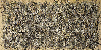
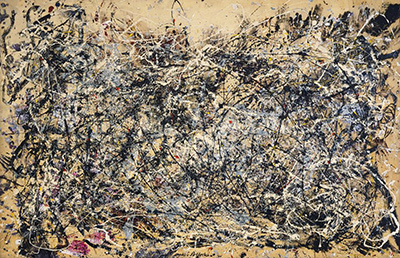
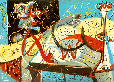
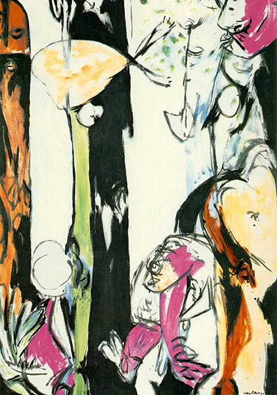
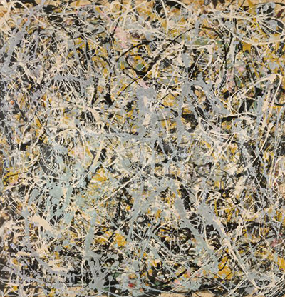
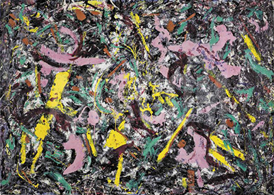
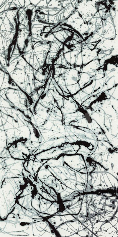
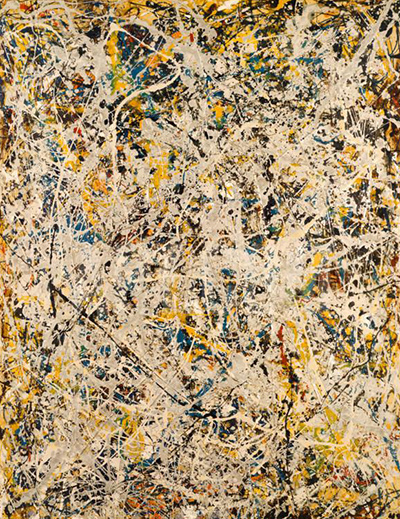
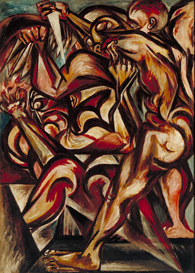
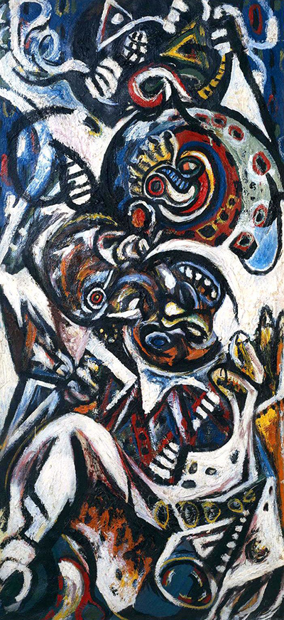
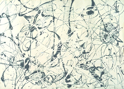
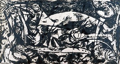
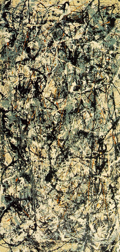
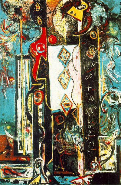
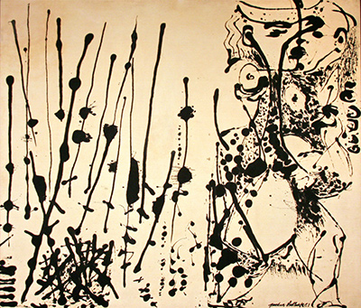
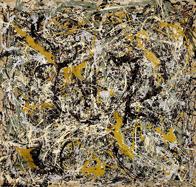
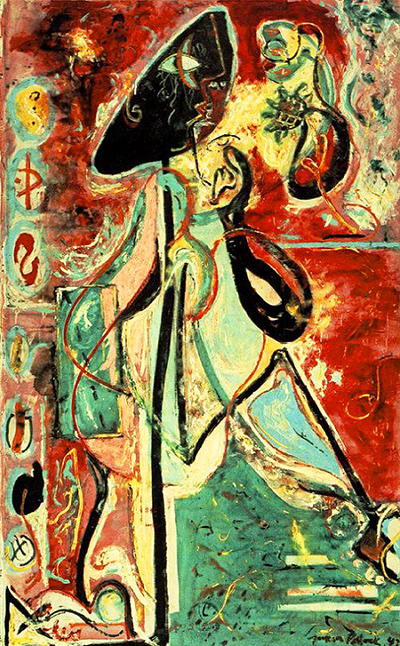
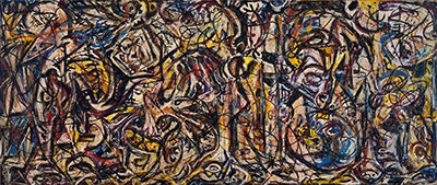
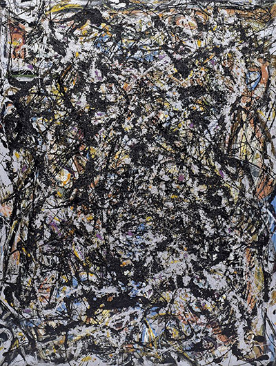
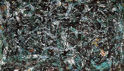
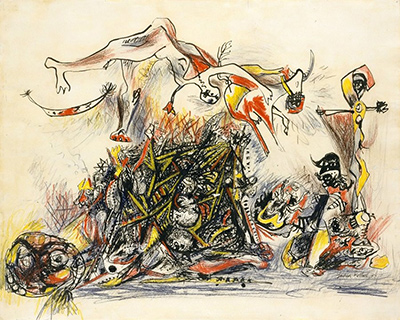
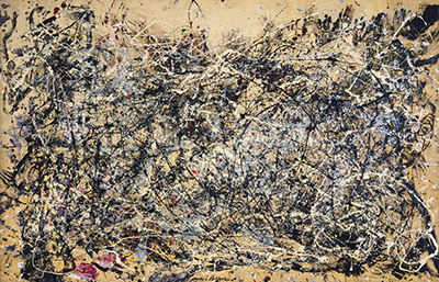
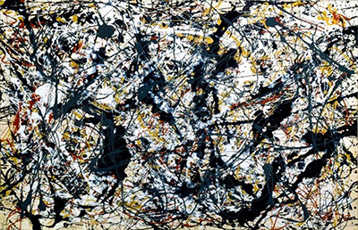
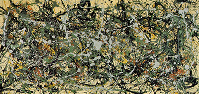
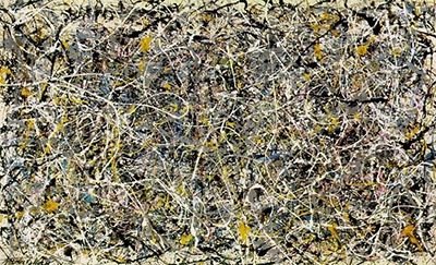
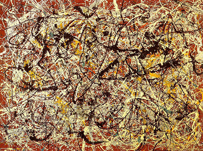
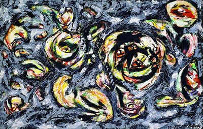
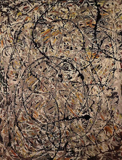
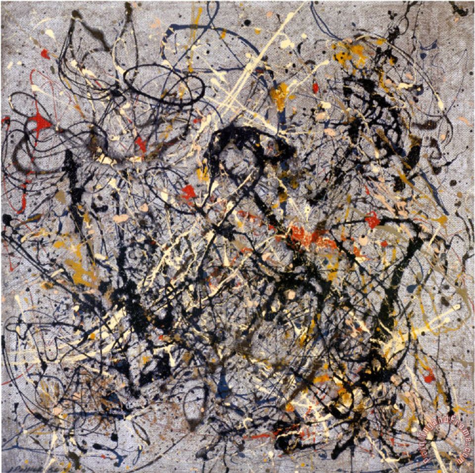
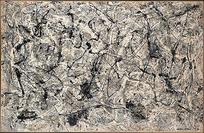
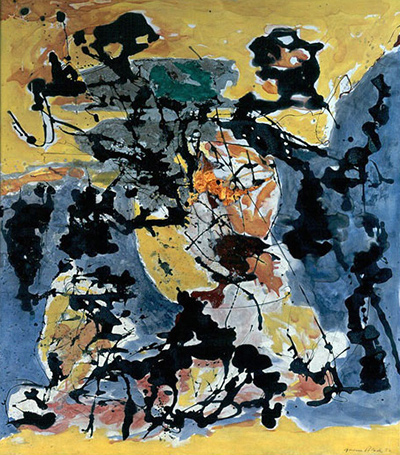
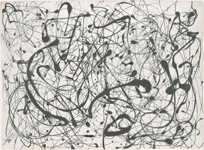
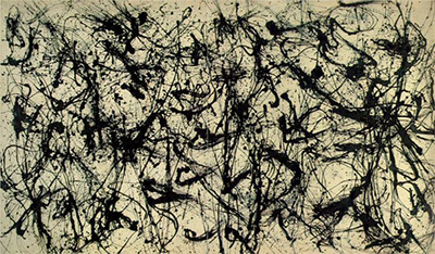
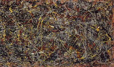
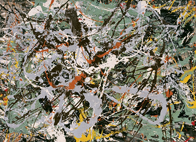
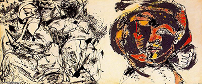
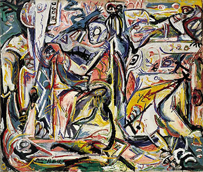
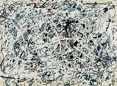
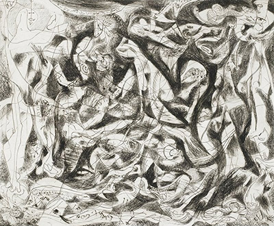
Jackson Pollock’s paintings reward a slower journey than their reputation sometimes allows. A useful beginning is to compare three very different surfaces: the figures and scratchy signs in Stenographic Figure, the broad network of poured paint in One: Number 31, 1950, and the black forms opening into recognisable imagery in Echo: Number 25, 1951. Each asks the eye to move differently. Together they introduce a painter whose changes of method were inseparable from changes in what a picture could hold. [1], [2], [3]
This guide follows selected works through those changes, with links to individual paintings for closer exploration. It also explains the numbered titles, the importance of scale and format, and the differences concealed by the familiar phrase “drip painting.” The selection offers several ways into the work; it is not a complete catalogue.
In his 1998 retrospective essay, the art historian Kirk Varnedoe argues that Pollock’s paintings generated a powerful mythology while continuing to exceed it. Publicity belongs to their history, but cannot exhaust their interest. For the comparisons below, keep a biography or studio photograph beside you, then check each painting’s own material, format, and marks. [4]
At a Glance
- SelectionFigures, poured paintings and later works
- Looking closelyOne: Number 31, 1950
- Related guideTechnique and materials
Contents
- Before the poured paintings
- A larger field, and a changing surface
- Several kinds of poured painting
- What “allover” asks of the eye
- Scale and format around 1950
- How the numbered titles work
- Black paintings, returning figures, renewed colour
- The variety of the late paintings
- Following materials across the collection
Before the poured paintings
Pollock’s training and encounters ranged widely. He entered Thomas Hart Benton’s class at New York’s Art Students League in 1930, encountered José Clemente Orozco’s murals, and participated in David Alfaro Siqueiros’s experimental workshop in 1936. In 1939 he repeatedly studied Picasso’s Guernica and its preparatory work in New York. [5]
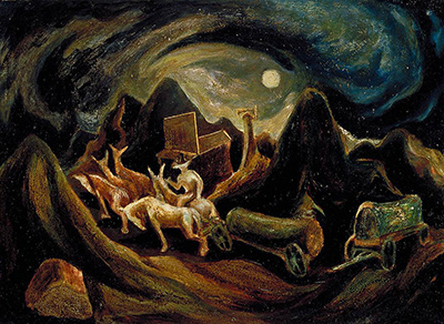
Begin with Going West, dated about 1934–35. Its material and size immediately establish a useful contrast with the later wall-sized canvases: it is oil on fiberboard, measuring 38.3 × 52.7 cm. The Smithsonian American Art Museum records a landscape with figures and animals, and the work entered its collection as a gift from Benton. Here the young painter’s connection with his teacher has a tangible object history as well as a place in his training. [6]
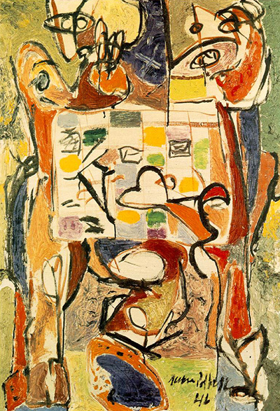
Set that small painting beside Stenographic Figure, about 1942, an oil painting on linen more than a metre high. MoMA describes a bright, relatively open composition completed with scratchy calligraphic lines. It offers alternative readings of the figures: one reclining body, or two more upright presences. The uncertainty is part of the experience. Follow a possible body, then allow the overlaid marks to interrupt the reading. The painting shows how an image can remain available without governing every part of the surface. [1]
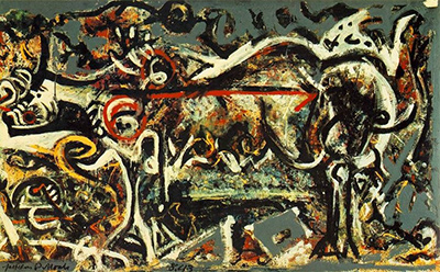
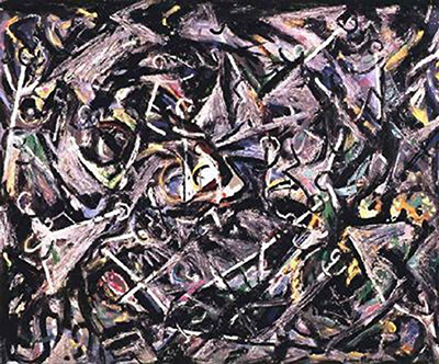
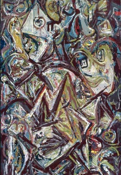
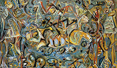
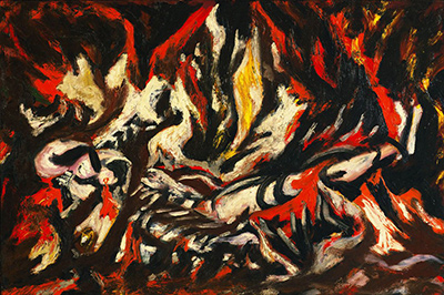
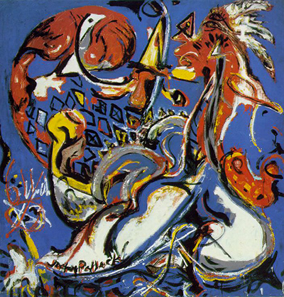
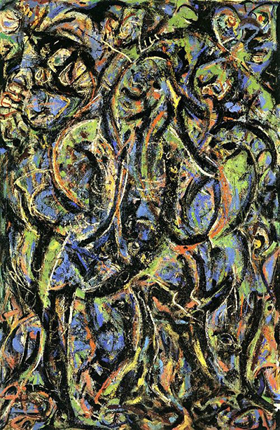
In The She-Wolf, 1943, the problem becomes denser and more materially complex. MoMA records oil, gouache, and plaster on canvas. Its account describes the animal’s heavy contours crossed by abstract lines and patches, so that the figure and its surrounding marks compete for attention. The museum proposes a possible connection with the wolf who nursed Romulus and Remus, while preserving Pollock’s refusal to identify the subject specifically. A mythic title can guide an association without supplying a complete story to decode. [7]
These works are worth seeing as pictures with their own decisions about bodies, space, and marks. Keeping those decisions in view also makes later developments more intelligible: figuration can be overlaid, dispersed, or exposed again, and an energetic line can do more than describe an object.
Explore Pollock artworks

 Jackson Pollock.jpg)

A larger field, and a changing surface
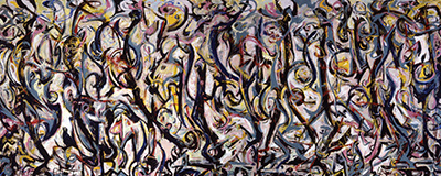
Mural, 1943, changes the physical terms of the encounter. The University of Iowa Stanley Museum of Art lists it as oil and casein on canvas, approximately 2.42 metres high and 6.04 metres wide. Its width asks the viewer to take in a field that extends well beyond the dimensions of a conventional portrait or small landscape. A comparison with Going West should begin with that bodily difference before moving to questions of style. [8]
Its making also complicates the idea that Pollock’s ambition for a large, animated surface depended on painting on the floor. Getty’s research finds strong evidence that the stretched canvas stood against a wall and that most of the paint was applied upright. Technical findings indicate that later layers were added over dried paint, although an initial composition may have developed quickly. The famous one-night account therefore cannot describe the whole process. Mural joins sweeping activity to a surface built in stages. [9]
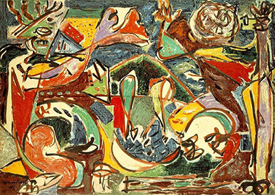
A different step appears in The Key, 1946. The Art Institute of Chicago identifies this oil painting on linen with the Accabonac Creek series and records that Pollock worked on it from all sides on the floor of an upstairs bedroom. The museum retains a suggestion of landscape while emphasising the activity of painting itself. This is a useful work to keep between Mural and the pours: floor working was already available to Pollock while imagery and gesture continued to interact. [10]
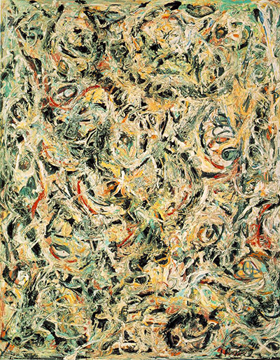
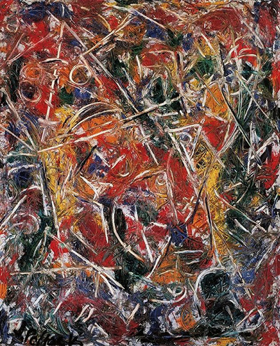
Croaking Movement and Eyes in the Heat, both 1946, offer another route through this transition. The Peggy Guggenheim Collection’s comparative study describes thick paint squeezed from tubes, covering underlying figures. The original technical chapter confirms alkyd binder in orange in Eyes in the Heat, documenting its use in 1946, while identifying alkyd in black and yellow in Untitled, a work on paper of that year, as possible. The development of the poured paintings involved experiments already under way in materials and application. Those findings concern specified paints in specified works; they do not give every painting of the period a single recipe. [11], [12]
Several kinds of poured painting
The year 1947 brings a group of paintings that can look closely related in reproduction but become more distinct when their formats and surfaces are considered. Full Fathom Five is a vertical canvas, 129.2 × 76.5 cm. MoMA describes an underlayer built with brush and palette knife, embedded objects including nails, buttons, coins, and a key, and upper layers of poured paint. Its account traces a move from easel to floor within the making of this work. Density here belongs to the physical accumulation of things as well as to crossing lines. [13]
Alchemy offers a related but distinct material richness. The Venice conservation account describes layered oil paint, enamel, and alkyd resin together with string, sand, and small stones. Its texture gathers thick deposits, splashes, and drips into a complex surface. Remembering that account helps keep a reproduction’s flattened pattern connected to an object with depth and varied substances. [14]
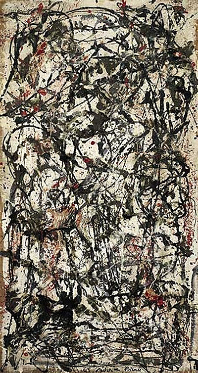
Now turn to Enchanted Forest, also 1947. At 221.3 × 114.6 cm it is a tall painting, with a restricted palette and substantial open white intervals. The Peggy Guggenheim Collection contrasts this openness with the denser layering of Alchemy. It describes lines that become forms in their own right, carrying the eye onward without settling on a dominant focus. The comparison is especially useful: abstraction can depend on the spaces a network leaves available as much as on the quantity of paint it lays down. [15]
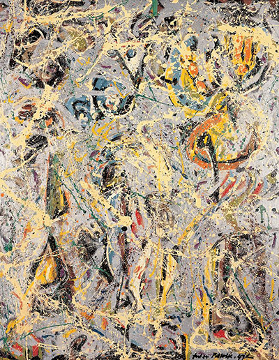
Other works widen the comparison. Joslyn Art Museum records small gravel in Galaxy, while Lucifer combines oil, enamel, and aluminum paint in a markedly horizontal canvas, 104.1 × 267.9 cm. MoMA’s 1998 checklist also records that Galaxy developed through repainting an earlier work, The Little King. A group labelled “1947 pours” therefore contains substantial differences of proportion, material, and revision history. [16], [17]
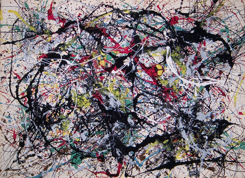
These comparisons suggest a useful habit for browsing. First check the rectangle: tall, broad, or nearly square. Then ask whether paint forms a dense crust or allows the support to remain active between marks. Finally, consider the sequence of contact and pouring described for the particular work. A name for the method becomes more informative when it opens those questions.
What “allover” asks of the eye
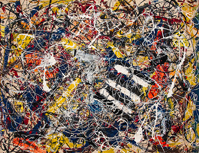
An allover painting distributes attention across its surface. A single central subject no longer provides the necessary starting point for every viewing. The eye may follow a line, lose it at a crossing, notice a pause, and begin elsewhere. That movement can feel open while still depending on the placement, density, and relation of marks. MoMA’s account of One describes an underlying order in a composition without one focal point; the Venice discussion of Enchanted Forest similarly stresses a carefully balanced movement of lines and intervals. [2], [15]
In “My Painting,” published in Possibilities in winter 1947–48, Pollock explained his preference for a resistant wall or floor, his proximity to the work, and his ability to approach it from four sides. He also wrote, “I have no fears about making changes,” describing a period in which he came to recognise the painting. His statement connects physical involvement with a continuing response to what is emerging on the surface. [18]
Try looking twice. On the first pass, take in the field without selecting a subject. On the second, follow a limited passage and notice how its movement is interrupted or redirected. Then return to the whole. This is a way to give a painting time without requiring it to resolve into a hidden image. It also allows differences between paintings to emerge: an open passage can feel consequential because of the surrounding density, and one strong directional mark can change the movement of a much larger area.
Scale and format around 1950
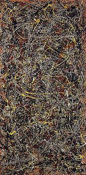
One: Number 31, 1950 is 269.5 × 530.8 cm, according to MoMA’s record. Its interlaced paint, pools, and splashes operate across an expanse wider than five metres. The museum records oil and enamel on canvas and describes a surface that joins forceful movement to delicate detail. At this scale, the relation between an individual mark and the whole field becomes especially demanding: a detail can occupy the eye while the painting continues beyond its immediate reach. [2]
Conservation adds an instructive qualification to its familiar floor-working history. James Coddington and Jennifer Hickey report that One is made largely with industrial paints, with rare yellow artist’s oil. They also infer that controlled rust-brown drips were added very late while the painting hung vertically. Their finding suggests a final stage of local adjustment after the expansive horizontal work. The finished picture carries evidence of more than one working orientation. [19]
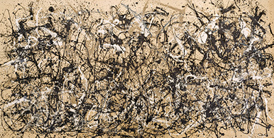
Autumn Rhythm: Number 30, 1950 provides a second wall-sized comparison. The Metropolitan Museum of Art’s current record identifies oil-modified alkyd resin on canvas and gives a width of approximately 5.28 metres. Its interpretation connects the painting’s scale to Pollock’s earlier experience of muralism. For the viewer, the pairing with One is an opportunity to compare how two expansive fields establish continuity and variation, while keeping their separate titles and material records in mind. [20]
Number 32, 1950 supplies a third material and dimensional anchor. Kunstsammlung Nordrhein-Westfalen records Duco lacquer paint on canvas, with picture dimensions of 269 × 457.5 cm. The same year thus contains several exceptionally large paintings without giving them identical sizes or museum medium descriptions. [21]
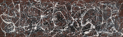
Scale should also be distinguished from elongated format. Number 7, 1950 is only 58.5 cm high but 268.6 cm wide. MoMA describes its rust-orange ground and explains how its narrow proportions oriented Pollock’s movements from end to end. This offers a precise counterpoint to the practice of working around all four sides of a larger canvas. The rectangle helps organise the action. Its long reach is different from the enveloping area of One, even though both belong to the same year. [22]
How the numbered titles work
The number and year should be read together. A number can identify a work without naming a subject, but a bare numeral can lose the distinction between paintings made in different years. Keep the full label attached as you browse: the year and any descriptive name help preserve the identity of the object.
The letter A has a specific exhibition history. In November 1949, Betty Parsons distinguished unsold 1948 paintings shown alongside newer work by adding A to several titles: Number 1, 1948 became Number 1A, 1948. The suffix therefore does not identify a preliminary sketch or a second version. Number 13A: Arabesque belongs to the same title history. [5], [23]
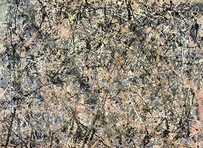
Three names are particularly useful to keep apart. Number 1A, 1948 is the earlier work in that exhibition history. Number 1, 1950 (Lavender Mist) is a different painting, recorded by the National Gallery of Art as oil, enamel, and aluminum on canvas. One: Number 31, 1950 is the large MoMA canvas discussed above: One belongs to its full title, while 31 is its number. The shared word or numeral “one” does not join these objects into one identity. [23], [24], [2]
The National Gallery of Art’s written description of Lavender Mist gives another useful point of entry: faint white handprints appear at the upper corners of its crisscrossing field. A bodily trace survives within a painting associated with paint falling from above. Alex Dean’s accompanying account also places Pollock’s experiments in a wider history, including Siqueiros’s workshop and his encounter with Janet Sobel’s allover abstractions. The work can be approached through those artistic exchanges as well as through the familiar image of an artist alone in his studio. [24]
Descriptive and numerical titles can coexist. Autumn Rhythm accompanies Number 30; Lavender Mist accompanies Number 1. The National Gallery of Australia records that Blue Poles was first exhibited as Number 11, 1952 and received its descriptive title two years later. When browsing, retain the year and the fuller title wherever possible. They carry information that a bare number loses. [20], [24], [25]
Black paintings, returning figures, renewed colour
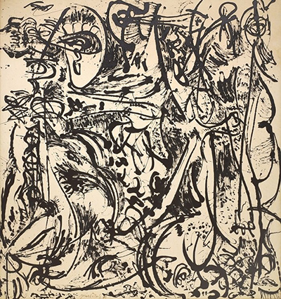
Echo: Number 25, 1951 brings the reader to a different balance between mark and open space. MoMA records enamel on canvas, 233.4 × 218.4 cm, and describes an economical composition that approaches figuration. Its near-square format is itself a useful contrast with the sweeping horizontal proportions of One. Look for the possibility that a mark can function both as an abstract movement and as part of a body. [3]
The method is equally revealing. Coddington and Hickey found evidence in Echo that Pollock applied paint with a baster touching the canvas. They interpret thin central traces and pulsing broader marks as evidence of direct drawing with the tool. Beside their findings about artist’s oils in Full Fathom Five, this observation makes the general phrase “poured painting” more flexible: different tools, paints, and degrees of contact produced different kinds of line. [19]
In a 1969 interview with B. H. Friedman, Lee Krasner described a continuing development from Pollock’s earlier imagery. She distinguished paintings in which figures became veiled from the black works in which they were more exposed, and rejected a shortage of coloured paint as the explanation for the change. Her testimony leaves room for deliberate artistic choice while acknowledging that she could not supply every reason for it. [26]
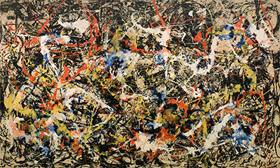
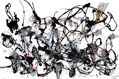
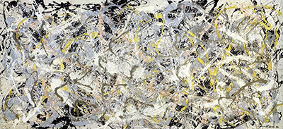
Colour returned in several ways. Buffalo AKG’s account of Convergence: Number 10, 1952 describes a black-and-white beginning to which Pollock subsequently added colour. The painting, oil on canvas with a support measuring 237.49 × 393.7 cm, is a useful reminder that a finished surface may contain a change of direction within its own making. [27]
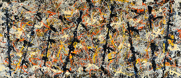
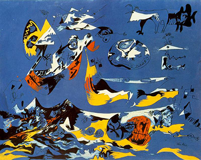
In Blue Poles, 1952, the National Gallery of Australia’s Sarina Noordhuis-Fairfax describes layers allowed to dry as well as colours mixed wet into wet. The eight dark uprights were added late and then crossed by further flung paint. Those substantial directional elements give the viewer something different to follow within the wider network. Compare them with the dispersed attention of Enchanted Forest: a surface can remain active throughout while containing emphatic structures. [25], [15]
The variety of the late paintings
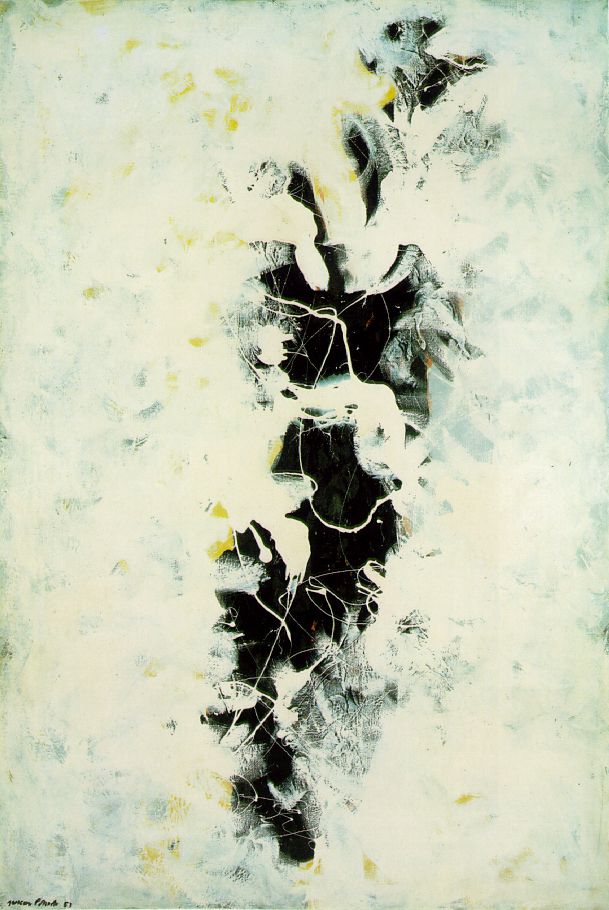
The late paintings open several possibilities at once. In The Deep, 1953, the Centre Pompidou describes a pale, milky expanse interrupted by a fissure revealing dark paint beneath. Olivier Michelon’s catalogue text, reproduced by the museum, treats this as a renewed investigation of background and surface. Its concentrated opening provides a striking comparison with paintings that distribute attention through an extensive network of lines. The encounter can turn on the relation between what covers and what remains exposed. [28]
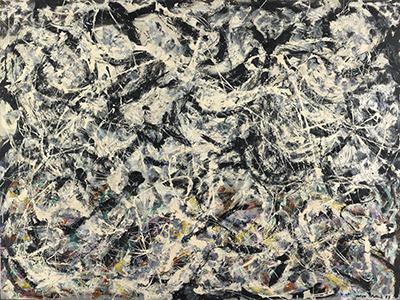
Greyed Rainbow, also 1953, presents another kind of concealment. The Art Institute of Chicago records oil on linen, 182.9 × 244.2 cm. Its description identifies colour partly hidden in the lower third beneath a predominantly black, white, grey, and silver surface. It also traces applications ranging from tube-squeezed masses to fine poured or squirted lines. The title may refer to those obscured colours, as the museum cautiously suggests. Material variety continues within a work whose first impression can be largely monochrome. [29]
Easter and the Totem, 1953, makes a different comparison possible. MoMA discusses its brushed, quasi-figurative forms, bright colours, and expansive spaces, and proposes a relationship to Matisse. Its upright format and large black forms can be considered alongside the more densely interlaced surfaces without assuming that every late work pursues the same end. [30]
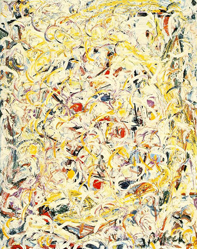
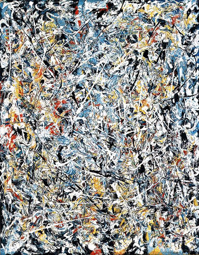
White Light, 1954, returns attention to a compact, heavily worked surface. MoMA records oil, enamel, and aluminum paint on canvas, 122.4 × 96.9 cm. Its account describes paint squeezed directly from tubes and wet passages manipulated with a brush to create marbling. These particular actions matter: the continued use of direct contact and dense paint asks the viewer to recognise several strands of Pollock’s practice within the later work. [31]
Following materials across the collection
The boundary between painting and drawing can be porous. The Centre Pompidou’s Painting (Silver over Black, White, Yellow and Red), 1948, is paint on paper mounted on canvas, measuring 61 × 80 cm. In the museum’s reproduced catalogue discussion, Camille Morineau considers how its layered lines can produce an expansive spatial experience at this smaller scale. A work on paper can share problems with the canvases while retaining its own support and dimensions. The drawings and prints offer further ways to follow those medium-specific questions. [32]
For a first route through the paintings, move from Stenographic Figure to The She-Wolf, then compare Full Fathom Five with Enchanted Forest. That sequence changes the question from how a figure survives among marks to how marks organise a whole field. Follow it with One, Echo, and Easter and the Totem to see that the relation between abstraction and recognisable form remains open to change. The linked work pages give each painting space for its own history and closer discussion.
For another visit, let the supports and proportions determine the route: fiberboard in Going West, the tall canvas of Enchanted Forest, the narrow reach of Number 7, and paper mounted on canvas in Silver over Black, White, Yellow and Red. Keep the dimensions in mind as you move between them. The question becomes how each bounded surface gives paint room to act—and how that room changes what the viewer can notice.
Pollock artworks directory
Explore the distinct works discussed in these guides. This selection is not a complete catalogue. Green Silver and Untitled, 1949 are two guides to the same painting.
Discussion
Look again at the images and ideas explored in Jackson Pollock Paintings. These editorial prompts invite your observations.
Reader Insights
Which detail in “Before the poured paintings” changes how you understand this work?
What comparison comes to mind after “A larger field, and a changing surface”?
What would you like to discuss about “Several kinds of poured painting”?
Join the Conversation
Share a detail, comparison or question about Jackson Pollock Paintings below.
References
- The Museum of Modern Art, Stenographic Figure, c. 1942, object 428.1980; metadata and 2015–16 gallery label. View source.
- The Museum of Modern Art, One: Number 31, 1950, object 7.1968; metadata and institutional interpretive texts, including the 2019 MoMA Highlights excerpt. View source.
- The Museum of Modern Art, Echo: Number 25, 1951, object 241.1969; metadata and 2010–11 gallery label. View source.
- Kirk Varnedoe, “Comet: Jackson Pollock’s Life and Work”, pp. 15–19, in Jackson Pollock, with Pepe Karmel (New York: The Museum of Modern Art, 1998). View source.
- Elizabeth Levine and Anna Indych, chronology, pp. 317–319, 323, 329n32, in Varnedoe, Jackson Pollock (1998). View source.
- Smithsonian American Art Museum, Going West, ca. 1934–1935, object 1973.149.1; artwork details and subject indexing. View source.
- The Museum of Modern Art, The She-Wolf, 1943, object 82.1944; metadata, 2025 gallery label, and MoMA Highlights excerpt. View source.
- University of Iowa Stanley Museum of Art, Jackson Pollock, Mural, object 1959.6; title, date, medium, and dimensions. View source.
- Getty, Jackson Pollock’s Mural, “Researching Technique” and “Recreating Conditions”; and “Getty Completes Conservation of Milestone Painting by Jackson Pollock”, technical findings on initial and later paint layers. View source 1. View source 2.
- Art Institute of Chicago, The Key, 1946, object 1987.261; institutional record, medium and description. View source.
- Peggy Guggenheim Collection, “New Paints for a New Way of Painting”, 2013–15 comparative study summary, particularly the 1946 works and identified alkyd paints. View source.
- Francesca Rosi, Costanza Miliani, John Delaney, Kathryn Dooley, Lena Stringari, Grazina Subelyte, and Luciano Pensabene Buemi, “Jackson Pollock’s Drip Paintings: Tracing the Introduction of Alkyds Through Non-invasive Analysis of Mid-1940s Paintings,” in Science and Art: The Contemporary Painted Surface, ed. Antonio Sgamellotti, Brunetto Giovanni Brunetti, and Costanza Miliani (Royal Society of Chemistry, 2020), pp. 1–18, especially pp. 9 and 13. Original chapter. View source.
- The Museum of Modern Art, Full Fathom Five, 1947, object 186.1952; metadata, 2010–11 label, and 2017 course text. View source.
- Peggy Guggenheim Collection, Alchimia conservation case study, account of analysis and cleaning, 2013–15. View source.
- Peggy Guggenheim Collection, Enchanted Forest, 1947, accession 76.2553 PG 151; metadata and object essay. View source.
- Joslyn Art Museum, Galaxy, 1947, object 1949.164; medium. View source.
- MoMA, Jackson Pollock, 1998 exhibition checklist, Galaxy and Lucifer entries. View source.
- Jackson Pollock, “My Painting,” Possibilities 1 (winter 1947–48), pp. 78–83; in Pepe Karmel, ed., Jackson Pollock: Interviews, Articles, and Reviews (MoMA, 1999), pp. 17–18. Reprint. View source.
- James Coddington and Jennifer Hickey, “MoMA’s Jackson Pollock Conservation Project: Insight into the Artist’s Process”, 17 April 2013; findings on Full Fathom Five, One, and Echo. View source.
- The Metropolitan Museum of Art, Autumn Rhythm: Number 30, 1950, object 57.92; current medium, dimensions, and muralism discussion, reviewed 25 October 2026. View source.
- Kunstsammlung Nordrhein-Westfalen, Number 32, 1950, inventory 1006; material and picture dimensions, distinguished from frame dimensions. View source.
- The Museum of Modern Art, Number 7, 1950, object 719.1993; metadata and 2015–16 gallery label. View source.
- The Museum of Modern Art, Number 1A, 1948, object 77.1950; metadata and 2010–11 label. View source.
- Alex Dean, “The Energy and Motion of Jackson Pollock’s ‘Number 1, 1950 (Lavender Mist)’”, National Gallery of Art, 12 January 2026; title and medium. View source.
- Sarina Noordhuis-Fairfax, “Blue Poles: How Pollock Created a Masterpiece”, National Gallery of Australia; title history and layering sequence. View source.
- B. H. Friedman, “An Interview with Lee Krasner Pollock” (Marlborough-Gerson Gallery, 1969), pp. 7–10; in Karmel, ed., Interviews, Articles, and Reviews (1999), pp. 35–36. Reprint. View source.
- Buffalo AKG Art Museum, Convergence: Number 10, 1952, accession K1956:7; medium, support dimensions, and collection interpretation. View source.
- Centre Pompidou, The Deep (La Profondeur), 1953, inventory AM 1976-1230; object discussion and reproduced Olivier Michelon extract from Collection art moderne (2007). View source.
- Art Institute of Chicago, Greyed Rainbow, 1953, object 1955.494; current medium, unframed dimensions, and description. View source.
- The Museum of Modern Art, Easter and the Totem, 1953, object 425.1980; metadata and 2015–16 gallery label. View source.
- The Museum of Modern Art, White Light, 1954, object 337.1967; metadata, 2015–16 label, and opening 2017 course text on paint application. View source.
- Centre Pompidou, Painting (Silver over Black, White, Yellow and Red), 1948, inventory AM 1972-29; metadata and reproduced Camille Morineau extract from Collection art graphique (2008). View source.