 by Tom Gurney
Tom Gurney BSc (Hons) is an art history expert with over 20 years experience
Published on June 19, 2020 / Updated on October 30, 2026
Email: tomgurney1@gmail.com / Phone: +44 7429 011000
Number 4, 1951: Introduction
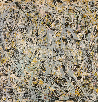
Jackson Pollock’s Number 4, 1951 brings a wide palette into a canvas measuring just 76.5 × 63.5 centimetres. Signed on the reverse, it is catalogued as oil, enamel and aluminium paint on canvas: a compact meeting of colour and fluid line. [1]
At a Glance
This work across Jackson Pollock’s career
The Flame
c.1934–38The She-Wolf
1943Mural
1943Alchemy
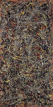
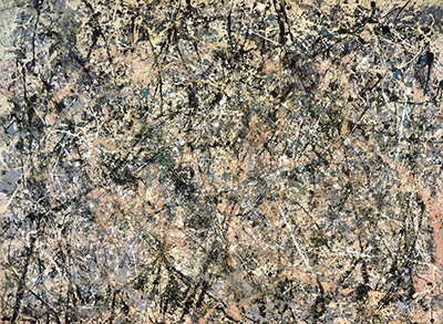
1947Number 1A, 1948
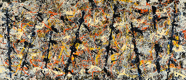
1948Blue Poles
1952The Deep
1953White Light
1954Contents
- Colour alongside the black paintings
- Colour, light and the moving eye
- Freedom and material decisions
- A painting in circulation
Colour alongside the black paintings
The year matters because 1951 is closely associated with Pollock’s black paintings. Kirk Varnedoe’s account traces a passage from black drawings on Japanese paper into black enamel poured on canvas. He also reproduces Pollock’s June letter to Alfonso Ossorio, in which the artist describes earlier images reappearing in his new work. The letter makes this a period of active reconsideration: familiar ways of understanding Pollock could be unsettled by what he was doing next. Paint and drawing offered ways to question what viewers expected from an established artist. [2]
Varnedoe also describes the practical pressures surrounding the new work. The black paintings received additional promotion for the autumn exhibition at Betty Parsons Gallery, including a catalogue and prints, yet important examples failed to find buyers. This gives Number 4 a useful historical setting. Experiment took place amid questions about how to present and sell the work; critical attention and a secure market were different achievements. [2]
The responses to the Parsons exhibition help recover what contemporaries found new. Francis V. O’Connor’s documentary catalogue dates it to 26 November–15 December 1951 and reprints several reviews. Howard Devree noticed a stronger suggestion of heads and bodies. Fairfield Porter discussed the changing relationship between dark marks and surrounding light areas, in which either might carry the figure. James Fitzsimmons likewise described figures emerging with different degrees of clarity. Their accounts present viewers actively negotiating between paint, drawing and recognisable imagery. [3]
These were responses to the exhibition as a whole. They illuminate the questions surrounding Number 4 without supplying a description of this particular canvas. The differences between the critics are themselves revealing: Greenberg emphasised continuity within a turn in direction, whereas others stressed new expressive or associative possibilities. The historical setting therefore offers more than a simple division between colourful abstraction and black figuration. Even the apparently restricted paintings opened several paths for looking and interpretation. [3]
Colour, light and the moving eye
Sotheby’s describes Number 4 through red, blue, yellow, green and ochre, reflective aluminium and a superimposed network of black enamel. Its account emphasises stained colour beneath looping dark lines. This offers a starting point for following relationships between differently behaving materials. [1]
Bernice Rose’s Drawing into Painting offers a broader language for those relationships. She distinguishes colour experienced as a particular hue from colour experienced tonally, through its relative lightness or darkness. In her account, Pollock could make these two kinds of perception operate together. The eye adjusts between distinct colours and the larger atmospheric effect they produce. This is a helpful approach to looking: attention can move between the intensity of an individual mark and its contribution to the surrounding field. [4]
Rose also describes silver as capable of working between colour and tone, reflecting light while participating in the painting’s spatial relationships. Her argument concerns Pollock’s wider practice, rather than a technical examination of Number 4. It encourages a particular kind of patience here: allowing brightness, darkness and reflectivity to register alongside the paths of lines. A palette can organise the eye’s movement as actively as a drawn contour. [4]
Watch: Jackson Pollock
Choose a film about Pollock’s paintings and ways of working.
Freedom and material decisions
Pollock’s interview with William Wright gives another way into this interplay of movement and decision. In the transcript reprinted by the Museum of Modern Art, the artist explains that experience enables him to regulate flowing paint. He has a general sense of what he is pursuing even though the image has yet to be made. His comparison between painting and drawing concerns directness: the work develops on its own surface, rather than following a sequence from preparatory colour sketch to finished canvas. [5]
This helps make sense of freedom as a practised capacity. A liquid material offers possibilities to someone who has learned to work with it, and the developing painting gives those possibilities a direction. Pollock’s concise formulation is that “Technique is just a means of arriving at a statement.” The interview explains his broader approach around this period; it supplies no account of an individual session making Number 4. Its emphasis remains useful: the resulting relationships deserve as much attention as the conspicuous method. [5]
James Coddington’s conservation essay adds substance to that account of choice. Studying selected Pollock paintings, he describes variation within a consistent concern for pictorial structure. Preparing a ground, allowing paint to interact with an earlier layer, and choosing materials with different behaviour could each alter the eventual image. His discussion connects experimentation with an understanding of how a painting is built. It gives material decisions a place alongside the movement of the hand. [6]
The same essay documents combinations of brushed, squeezed and poured applications in other paintings. Those findings expand the useful questions to bring to Number 4: how might one material establish conditions for another, and how do overlapping marks produce a coherent surface? Coddington’s examples cannot establish the small canvas’s particular tools or sequence of application. They do show why Pollock’s technique rewards attention to individual works. The medium description is a beginning; reconstructing a painting’s manufacture requires evidence particular to that object. [6]
A painting in circulation
Sotheby’s provenance runs from Betty Parsons and Dr Ruth Fox through dealers and collectors, including Leo Castelli, Galerie Springer and Stephen D. Paine, to Robert Elkon Gallery. The 2012 seller acquired it there in January 1974. Listed exhibitions took place in Cologne in 1964, Düsseldorf in 1967 and at Elkon in 1972, where its title gave the date as 1950–51. [1]
The auction supplies a later, precisely dated episode. Artprice and Artron’s report for 2012 records Number 4, 1951 selling at Sotheby’s New York on 13 November for US$36 million. The report’s opening methodological note defines its prices as hammer prices before fees. The figure therefore records the winning bid, with the buyer’s additional charges excluded. Preserving that basis makes the historical result intelligible when different accounts of an auction use different totals. [7]
The report also identifies the painting by its modest dimensions, connecting the sale result to the small canvas rather than relying on the number alone. Its appearance in a market survey provides one kind of public history: a work enters the record through a transaction and a monetary figure. Alongside the material and critical perspectives, that evidence adds a specific later encounter with the painting. It is a measure of demand on that occasion, while the colour, surface and changing possibilities of line remain the reasons to spend time with the work. [7]
Pollock artworks directory
Explore the distinct works discussed in these guides. This selection is not a complete catalogue. Green Silver and Untitled, 1949 are two guides to the same painting.
Discussion
Look again at the images and ideas explored in Number 4, 1951. These editorial prompts invite your observations.
Reader Insights
Which detail in “Colour alongside the black paintings” changes how you understand this work?
What comparison comes to mind after “Colour, light and the moving eye”?
What would you like to discuss about “Freedom and material decisions”?
Join the Conversation
Share a detail, comparison or question about Number 4, 1951 below.
References
- Sotheby’s, Number 4, 1951, lot 10, Contemporary Art Evening Auction, 2012. Description, provenance, exhibitions and catalogue note; catalogue raisonné no. 316. View source.
- Kirk Varnedoe, Jackson Pollock, with Pepe Karmel (New York: Museum of Modern Art, 1998), pp. 63–64. View source.
- Francis V. O’Connor, Jackson Pollock (New York: Museum of Modern Art, 1967), pp. 61–63, exhibition chronology and contemporary review extracts. View source.
- Bernice Rose, Jackson Pollock: Drawing into Painting (New York: Museum of Modern Art, 1980), pp. 17–18. View source.
- Jackson Pollock, interview with William Wright, 1950, reprinted in Jackson Pollock: Interviews, Articles, and Reviews, ed. Pepe Karmel (New York: Museum of Modern Art, 1999), pp. 20–23. View source.
- James Coddington, “No Chaos Damn It,” in Jackson Pollock: New Approaches, ed. Kirk Varnedoe and Pepe Karmel (New York: Museum of Modern Art, 1999), pp. 101–106. View source.
- Artprice and Artron/AMMA, The Art Market in 2012: A Dialogue between East and West, pp. 5, 25, 70. View source.