



 by Tom Gurney
Tom Gurney BSc (Hons) is an art history expert with over 20 years experience
Published on June 19, 2020 / Updated on November 1, 2026
Email: tomgurney1@gmail.com / Phone: +44 7429 011000
Fernand Léger’s Prints: Introduction
Fernand Léger’s prints bring drawing, colour and the written word into close contact. An illustrated book can make a reader pause over a single image, then turn the page into an entirely different rhythm. A lithograph can preserve the appearance of a freely drawn line while belonging to an edition. These possibilities make his graphic work a rewarding part of his art in its own right.
The field extends beyond pictures intended to hang on a wall. The Musée national Fernand Léger at Biot preserves autonomous works on paper, preparatory designs and artists’ books within its graphic collection. Its holdings place the book beside the drawing and the model for a larger commission, revealing different purposes for apparently similar sheets. The museum also explains that fragile works on paper appear in temporary exhibitions rather than remaining permanently exposed. [1]
For anyone exploring Léger through prints, the most useful starting question is therefore a material one: what kind of object are we looking at? An original drawing, a colour illustration made with stencils, a lithograph from a book and a recent reproduction of a painting each offer a different encounter with his work.
At a Glance
- ArtistFernand Léger
- SubjectPrints
Contents
- Drawing, stencil and press
- Working with Blaise Cendrars
- A book that moves at the reader’s pace
- Cirque: Léger makes the whole book
- Looking across an open spread
- Editions, individual copies and later publications
Drawing, stencil and press
Lithography transfers an image from a prepared printing surface to paper. In the traditional method, the design is drawn with greasy chalk on stone. Water wets the unmarked areas; oily printing ink adheres to the greasy design. Pressure then transfers that inked image to the sheet. The National Gallery’s explanation makes clear why drawing and printing can remain closely connected within this process. [2]
That connection is useful when looking at a print whose marks appear spontaneous. A printed line may retain the character of drawing without being a unique pencil or ink mark made directly on that particular sheet. The distinction concerns how the object was produced; it does not decide how expressive the line can be.
Pochoir involves a different action: colour is applied through stencils. Lauren Rosati identifies the colour illustrations in Léger and Blaise Cendrars’s La Fin du monde as pochoirs. Stencil-applied colour and an image transferred through a lithographic press should consequently be distinguished, even when both contribute to an illustrated book. [3]
Nor must the processes be mutually exclusive within a single work. A particularly clear example is Léger’s Matinée d’ivresse, the plate on page 67 of Arthur Rimbaud’s Les Illuminations, published in 1949. MoMA describes this sheet as a lithograph with pochoir. Its record identifies Éditions des Gaules, associated with Louis Grosclaude in Lausanne, as publisher, and Roth & Sauter as printer. [4]
Such descriptions invite us to consider the separate contributions of line and colour. They also help us read the word “print” more precisely. It can identify an artistic medium, a particular impression or, in everyday use, almost any reproduced image. A good description tells us which meaning applies.
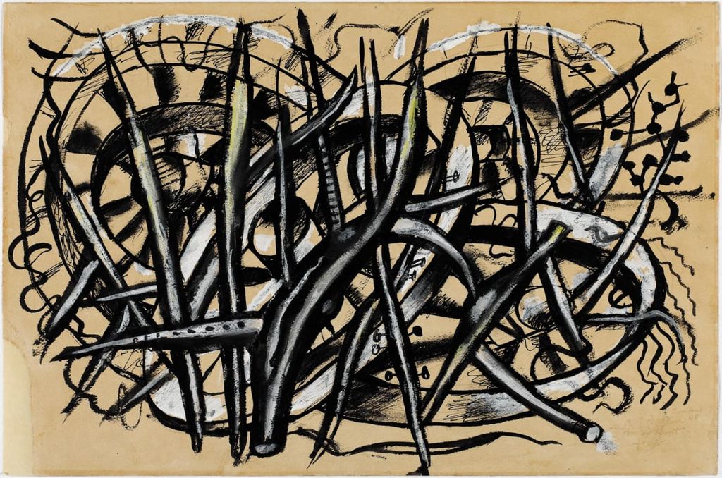
Fernand Léger, The Wheels, 1945. Gouache, India ink and graphite on paper. A work on paper permits comparison between a drawn mark and a printed one; this sheet is not a lithograph. Image source. Public domain.
Selected print
Working with Blaise Cendrars
Léger’s first book collaboration with Cendrars was J’ai tué, published on 8 November 1918, just before the Armistice. Christopher Green identifies five drawings by Léger, made that summer at Vernon. Their next illustrated book, La Fin du monde filmée par l’Ange N.-D., appeared on 15 October 1919. [5]
The relationship involved the practical work of publishing as well as friendship between painter and poet. For La Fin du monde, Frazier-Soye handled typesetting and printing in black; Richard’s colour workshop produced the pochoirs. Green cautions that Léger’s precise share in the typography remains uncertain and finds evidence that Cendrars made most or all of its detailed decisions. He also connects these workshop encounters with Léger’s paintings of typographers: book production entered his larger conception of modern work. [5]
Those credits matter because a printed book gathers several kinds of expertise on the same page. The artist devises images, the writer shapes language, and workshops turn designs into repeatable objects. Reading their names restores some of that shared labour to a work easily presented under the artist’s name alone.
The two books also establish an important sequence. The 1918 collaboration belongs to the immediate end of the war; the more expansive colour project followed in 1919. Keeping them distinct allows the development of the partnership to emerge, rather than treating every early illustrated page as an interchangeable example of Léger’s modern style.
A book that moves at the reader’s pace
Rosati approaches La Fin du monde as a form of paper cinema. The reader advances its visual action by turning pages, creating a relationship between the printed sequence and moving pictures. This is a way to understand a book’s operation without pretending that it is itself a film. [3]
A page turn has its own expressive possibilities. It hides an image, reveals another and leaves the previous one in memory. A reader can hesitate, return or skip ahead. Unlike a projected sequence with a fixed running time, a book lets each person decide how long an encounter lasts. Its physical structure gives that freedom a shape.
Caroline Levitt’s study of the collaboration adds a material distinction. The Met’s luxury copy differs from the more accessible standard issue and includes unique preparatory material. She also observes that La Fin du monde was bound when published, including in its luxury edition, whereas the French artist’s book was often issued as loose sheets that collectors could arrange or frame. [6]
Binding changes the relationship between an individual image and its neighbours. Encountering a page within a volume encourages comparison with what comes before and after. An isolated sheet offers another experience: its edges become the limits of attention, and its former place in a sequence may be difficult to recover. Neither encounter exhausts what the work can offer, but they ask different things of the viewer.
This makes the preparatory model, or maquette, especially revealing. The Met’s research project distinguishes its published deluxe copy from Léger’s original mock-up bound into the same volume. A printed page and a unique working design can thus share one binding while retaining different identities. [7]
Cirque: Léger makes the whole book
With Cirque, published in 1950, Léger was both author and book designer. Tériade published the volume in Paris, and Mourlot printed it. MoMA’s record for its copy, object 890.1964.1–83, describes eighty-three lithographs including the front and back wrappers, and an edition of 300. Its pages measure approximately 42.3 by 32.3 centimetres: this is a substantial volume, with room for images and writing to command the reader’s attention. [8]
According to the Musées d’Argentan, Léger’s gouache models preceded his text, which he wrote by hand. The images helped establish the work to which his writing would respond, giving the illustrations a formative role in the book. [9]
That order encourages us to give the illustrations time before searching for a verbal explanation. What does a figure’s pose suggest? Where does a heavy black shape carry the eye? How does an open area of paper affect the space around a body? These are questions a reader can pursue without reducing the picture to a captioned event.
The different institutional descriptions of Cirque need some care. Argentan gives sixty-five lithographs, thirty-one in colour, while MoMA counts eighty-three including the wrappers. These are the figures supplied by those particular records. They should accompany their stated scopes rather than becoming a single supposedly universal total. [8][9]

Fernand Léger, Acrobats and Clowns from Le Cirque. The colour lithograph belongs to Cirque, where image and written page work together.
Looking across an open spread
In Argentan’s reproduction of pages 58–59, two costumed figures appear above lines of cursive writing. The left figure has a largely solid black torso and legs, with narrow, looping shapes around the waist. On the right, heavy black areas alternate with outlined limbs and a patterned skirt. The spread lets the eye compare the two bodies across the central fold. [9]
Below them, the handwriting creates a second kind of movement. Its connected strokes carry the eye sideways beneath the figures, while the bodies lead attention upward and around. Image and text occupy different zones, yet their marks share the same open surface. [9]
This is one reason to look at a spread as a whole before extracting a single figure. The fold establishes a pause and a comparison. The two pages belong together, but the separation between them remains visible. A reproduction cropped to one performer would preserve the pose while losing this arrangement of looking and reading.
The pleasure lies partly in moving between speeds. A body can register quickly as an energetic silhouette; a pattern asks for closer inspection; the writing requires a slower passage through words. The book accommodates all three. Reading an artist’s book can therefore mean attending to the tempo of its marks as much as identifying its subjects.
Editions, individual copies and later publications
An edition describes a publication’s planned group of impressions or copies. The contents of an individual copy may require a more detailed account. MoMA’s Les Illuminations record, for example, lists the illustrated book’s fifteen lithographs, ten with pochoir, alongside a supplementary suite of fifteen lithographs and one further supplementary lithograph. It records an edition of 375. [4]
This distinction helps explain why a catalogue may list a book, a suite and an individual plate separately. A repeated design can occur in different material settings. The title of an image alone does not tell us whether we are seeing a page in a volume, an accompanying impression or a later reproduction. The wider description supplies the context.
Publication also continued after Léger’s death in 1955. Toledo Museum of Art records Mes voyages as a 1960 book published by Les Éditeurs Français Réunis, with Louis Aragon credited as author. Mourlot Frères printed the lithographs and Jacques London the text. The museum describes twenty-seven lithographs, twenty-one in colour. [10]
The 1960 date belongs to that publication. It should not be silently turned into the date when Léger personally drew or printed every image. An account of a posthumous edition should separate the date of its source design, when established, from the dates of printing and publication. Where the design date remains unknown, leaving that distinction open is more informative than supplying a false precision.
Attribution can be just as specific. Toledo’s record for the 1960 Derrière le miroir, numbers 121–122, distinguishes a colour lithograph after Léger from photomechanical reproductions elsewhere in the publication. A single volume can contain objects made through different processes and with different relationships to an artist’s original work. [11]
For a modern decorative print of a Léger painting, the relevant questions concern the reproduced painting, the reproduction process, its dimensions and its presentation. For an editioned graphic work, the printer, publisher, publication date and relationship to a book or suite become central. Clear identification lets both kinds of object be understood on their own terms.
Léger’s books make these distinctions tangible. Their pages offer images that can be shared through printing while retaining a carefully composed relationship to paper, scale and sequence. Looking closely at a single sheet is rewarding; discovering what happens when it meets the next page opens another part of his art.
Léger in video
Explore abstraction, monumental painting and cinema through films from MoMA and the Centre Pompidou. These videos offer context for Léger’s wider work; the restoration film is in French.
1913 | “Contrast of Forms” by Fernand Léger
MoMA looks at its own 1913 Contrast of Forms, including the painting’s rough surface. This is a different canvas from the Beyeler work covered in this cluster. English.
Watch on YouTubeFernand Léger artworks directory
Works covered in these articles and further documented works. Studies and finished works have separate entries; alternate titles share an entry. This is not a catalogue raisonné.
| Name | Date | Medium |
|---|---|---|
| Acrobats and Clowns from Le Cirque | 1950 | |
| Adieu New York | 1946 | Painting |
| Ballet mécanique | 1924 | Film |
| Big Julie | 1945 | Painting |
| Builders with Aloe | 1951 | Painting |
| Charlot cubiste | 1924 | Sculpture |
| Chimneys on Rooftops | 1911 | Painting |
| Cirque (artist’s book) | 1950 | |
| Composition | 1929 | Painting |
| Composition (Study for Nude Model in the Studio) | 1912 | Drawing |
| Composition of Three Figures | 1932 | Painting |
| Composition with Two Parrots | 1935–39 | Painting |
| Construction Workers Final State | 1950 | Painting |
| Contrast of Forms | 1913 | Painting |
| Derrière le miroir, nos.121–122 (posthumous publication, includes a lithograph after Léger) | 1960 | |
| Drawing for The Card Game | 1917 | Drawing |
| Drawing for The Staircase | 1913 | Drawing |
| En attendant le départ | 1914 | Drawing |
| Grand Parade with Red Background | 1953 | Painting |
| J’ai tué (illustrated book) | 1918 | |
| La Cocarde, l’avion brisé | About 1916 | Drawing |
| La Couseuse | about1910 | Painting |
| La Fin du monde filmée par l’Ange N.-D. (illustrated book) | 1919 | |
| Les Femmes au bouquet (Women with a Bouquet) | 1921 | Painting |
| Man and Woman | 1921 | Painting |
| Man in Profile with Rope: Study for The Constructors | 1950/1 | Drawing |
| Man in the Blue Hat | 1937 | Painting |
| Matinée d’ivresse, from Les Illuminations | 1949 | |
| Mechanical Elements | 1918–23 | Painting |
| Mechanical Elements (Metropolitan Museum) | 1920 | Painting |
| Men in the City | 1919 | Painting |
| Mes voyages (posthumous illustrated book) | 1960 | |
| Mona Lisa with the Keys | 1930 | Painting |
| Nude Model in the Studio | 1912–13 | Painting |
| Nudes in the Forest | 1909–1911 | Painting |
| Propellers Second State | 1918 | Painting |
| Reading | 1924 | Painting |
| Soldier with a Pipe | 1916 | Painting |
| Soldiers Playing Cards | 1917 | Painting |
| Soldiers Playing Cards (front drawing) | 1916 | Drawing |
| Standing Nude, Rear View | 1911 | Drawing |
| Still Life with a Beer Mug | 1921–2 | Painting |
| Still Life with Tankard | 1921 | Drawing |
| Study for The Aviator | 1920 | Drawing |
| The Acrobat and his Partner | 1948 | Painting |
| The Acrobats in the Circus | 1918 | Painting |
| The Alarm Clock | 1914 | Painting |
| The Chalices and the Sponge, stained-glass model | 1950 | Drawing |
| The City | 1919 | Painting |
| The Disks in the City | 1920 | Painting |
| The Mechanic | 1920 | Painting |
| The Railway Crossing | 1919 | Painting |
| The Three Musicians | 1944, after a 1924–25 drawing | Painting |
| The Wheels | 1945 | Drawing |
| Three Women | 1921–22 | Painting |
| Two Women Holding Flowers | 1954 | Painting |
| Umbrella and Bowler | 1926 | Painting |
| Verdun, dessin du front | About 1915 | Drawing |
| Woman with a Book | 1923 | Painting |
| Woman: Costume Design for La Création du monde | c.1922–23 | Drawing |
Discussion
Look again at the images and ideas explored in Fernand Léger’s Prints. These editorial prompts invite your observations.
Reader Insights
What becomes easier to notice in Prints when you compare it with Acrobats and Clowns from Le Cirque?
Where does the comparison with The Wheels reveal the clearest change in Léger’s approach?
Which detail would you follow first when returning to the work, and why?
Join the Conversation
Share a detail, comparison or question about Fernand Léger’s Prints below.
References
- Musée national Fernand Léger, “Collections”, particularly “La collection d’arts graphiques et le fonds d’ouvrages illustrés”. French institutional text, consulted 31 October 2026 in local capture. View source.
- National Gallery, London, “Lithographs”, complete glossary entry, consulted 31 October 2026. View source.
- Lauren Rosati, “Léger’s Paper Cinema”, Metropolitan Museum of Art, 3 June 2026, opening discussion of the artist’s book and page turning, consulted 31 October 2026. View source.
- Museum of Modern Art, Matinée d’ivresse, page 67 from Les Illuminations, 1949, object 421.1958.8, medium and publication metadata, consulted 31 October 2026. View source.
- Christopher Green, “La Fin du monde in Context”, Metropolitan Museum of Art, 3 June 2026, introduction and relevant passages in “The Typographer as intermediary between La Fin du monde and Léger’s painting, 1918–20”, consulted 31 October 2026. View source.
- Caroline Levitt, “‘People of the Book’: Léger, Cendrars and the Livre d’Artiste”, Metropolitan Museum of Art, 3 June 2026, discussion of material editions and bindings, consulted 31 October 2026. View source.
- Metropolitan Museum of Art, La Fin du monde: A Modernist Book, project introduction identifying published copies and preparatory material, consulted 31 October 2026. View source.
- Museum of Modern Art, Cirque (Circus), 1950, object 890.1964.1–83, complete short object metadata, consulted 31 October 2026. View source.
- Musées d’Argentan, “Cirque, Fernand Léger”, MFL.2019.8.1, complete short entry and reproduced pages 58–59, consulted and image inspected 31 October 2026. View source.
- Toledo Museum of Art, Fernand Léger: Mes voyages, 1960, object 1984.672, publication and medium fields, consulted 31 October 2026. View source.
- Toledo Museum of Art, Derrière le miroir: Maeght Éditeur, 1960, numbers 121–122, object 1997.121, publication and medium fields, consulted 31 October 2026. View source.


