



 by Tom Gurney
Tom Gurney BSc (Hons) is an art history expert with over 20 years experience
Published on June 19, 2020 / Updated on November 1, 2026
Email: tomgurney1@gmail.com / Phone: +44 7429 011000
Contrast of Forms: Introduction
Three dark openings lead the eye down Fernand Léger’s Contrast of Forms. Each seems to belong to a cone or a hollow cylinder, yet the surrounding bands of blue and white keep pulling these rounded shapes apart. Red planes press in from the left. Smaller fragments crowd the edges. The painting offers the weight and presence of solid things without giving us an object we can name with confidence.
This upright canvas is Léger’s Contraste de formes of 1913 in the Fondation Beyeler, Riehen/Basel. Painted in oil on canvas, it measures 81 by 65 centimetres and carries the inventory number 90.6. Its signature and date are on the reverse. Léger used the title for other compositions too; the arrangement of stacked openings makes this particular painting recognisable. [1]
At a Glance
This work across Fernand Léger’s career
Nudes in the Forest
1909–1911 [2]The Mechanic
1920 [4]Three Women
1921–22 [5]Contents
- Following the central forms
- Red planes and striped volumes
- Light without a single viewpoint
- What abstraction makes visible
- Between Cubist figures and mechanical forms
- A later painter’s response
Following the central forms
Begin near the top, where a broad dark shape narrows downwards between pale sides. Its upper edge seems to open towards us. One side catches a strip of white, while the other falls into blue-black shadow. It has the persuasive solidity of a funnel or a section of pipe. But its connections are uncertain: another curved piece crosses beside it, and small diagonal bands prevent its contour from remaining independent for long.
Move down to the broad form around the middle of the picture. Here, light and dark meet along a sharper, almost vertical division. A pale strip swells against a dark face, making the surface seem rounded. To its left, a blue band runs across a wider pale area; to its right, another series of stripes appears to turn away. For a moment we can read a connected volume. Then a black edge or an abrupt change of direction divides it into separate pieces.
The lower opening tilts more noticeably. Its oval mouth turns across the upright format, while the pale surface beneath it curves towards a point. It seems close enough to touch. Nearby shapes lean in different directions, however, so that its position cannot be fixed within a room or on a tabletop. Léger supplies local sensations of depth, one rounded surface at a time, while withholding a single view that would explain the whole assembly.
These three openings make a loose vertical chain rather than a rigid central column. They vary in width, angle and emphasis. The upper one draws us inward; the middle one spreads across the picture; the lower one tips sideways. Following them gives the composition a sequence, but there is always a competing route. A sloping blue band can carry the eye out towards the right, or a red edge can return it to the left.
Look away from the middle and the scale changes. Around the perimeter, thinner strips and smaller curved segments are packed into narrow spaces. Some disappear beyond the canvas edge. The large central forms gain prominence through this surrounding compression. Their apparent closeness owes as much to overlap and contrast in size as to shading. There is no clear horizon against which to measure them, and no continuous floor supporting the pile.
Red planes and striped volumes
The reds provide a different kind of presence. At the upper left, a tall red shape widens and bends as it descends. Below it, another red area stretches diagonally across the lower left quarter. Their relatively continuous colour offers a resting place beside the blue-and-white divisions. Their tilted edges then push the eye back towards the central forms.
On the right, a narrower red passage appears between overlapping pieces. This echo matters: red does not belong exclusively to one side of the canvas. Its recurrence allows the composition to answer itself across the crowded centre. Yet the red areas are unequal in size and visibility. They establish a balance that feels adjusted through pressure and counterpressure, with none of the reassuring regularity of a symmetrical pattern.
The blue and white behave differently. They recur so frequently that they can seem like stripes painted on solid objects. In places, a band follows a curve and strengthens our impression of a cylinder. Elsewhere, a band stops against a dark line or changes direction too abruptly to describe one continuous surface. The same colours therefore help to build volume and to interrupt it.
White is especially mobile. A bright patch can read as a highlight on a rounded surface, a pale cut edge, or a flat interval between dark forms. When the eye moves from one patch to another, these functions change. The painting does not allow white to become a single, stable category. Its brilliance depends on what touches it: deep blue makes it flash, while a warmer surrounding passage softens its edge.
Black lines add another rhythm. Some outline a shape firmly; others look thinner, broken or entangled with neighbouring marks. They can give an individual piece a crisp boundary, then lose it in a junction of several contours. This unevenness helps preserve the sensation of a painted construction. The forms look forceful without becoming the perfectly smooth components of a manufactured diagram.
Light without a single viewpoint
The dark openings suggest depth most strongly because they seem to receive less light than their rims. Yet the light passages across the canvas do not readily combine into one consistent illumination. A white strip appears where a rounded piece needs emphasis; elsewhere, the next bright patch pulls our attention in another direction. Shading becomes part of the picture’s pattern as well as a means of describing surfaces.
MoMA’s discussion of its own, different Contrast of Forms is useful here. Its 2012–13 gallery text describes the series through repeated geometric solids, roughly handled colour and highlights separated from a coherent light source. This provides a comparison, rather than an account of the Beyeler painting’s materials or individual brushstrokes. [9] In the canvas here, the repeated alternation of dark and pale passages is visible throughout the central stack.
The colour also has an irregular, worked appearance. Small warm intervals remain visible between stronger marks, and the edges of blue passages are sometimes ragged. These details temper the apparent hardness of the cones. They make the difference between looking at a group of imagined solids and looking at the brushwork that makes those solids possible. The warm gaps also interrupt the densely painted areas, giving the surface small breathing spaces among the overlapping solids.
Try following only the pale passages. They form a broken path from the top edge through the central openings and down into the lower cluster. Then follow the darkest passages instead. A different network emerges, one that joins shadows to outlines and makes unexpected connections between distant forms. Neither route is the complete picture. Their coexistence gives the composition much of its restless energy.
What abstraction makes visible
The title directs attention towards relationships within the painting. A curved surface presses against an angular plane; a narrow stripe answers a broad patch; a pale edge gains force beside a dark opening. These contrasts can be experienced before we decide whether anything resembles a familiar object. The funnels and pipes are useful visual comparisons, but the painting keeps their identities open.
Léger gave this approach a theoretical basis. In his lecture of 5 May 1913, reproduced in excerpt by the Centre Pompidou, he argued that a painting’s realism could exist independently of imitation. He located it in the simultaneous organisation of lines, forms and colours. Read through that museum transcription, his argument helps explain why this abstract canvas can feel so substantial: its reality lies in the relationships it establishes before our eyes. [10]
This gives us a way to explore the central stack. We can ask how one edge makes another appear to turn, or why a red plane feels flatter than a blue-and-white cone. The sense of solidity remains important. Léger allows us to test it repeatedly, finding that a form can look convincing in isolation while belonging to an impossible larger space.
Between Cubist figures and mechanical forms
The 2008 Beyeler gallery guide places this painting beside La femme en bleu of 1912. It describes Léger’s use of coloured, spatially suggestive wedges as a means of constructing both figures and abstract compositions. The guide emphasises a pictorial space visibly assembled through stacking and overlap. [11] That observation fits the experience of moving around this canvas: every apparent recess results from a meeting of painted pieces.
The Centre Pompidou also presents the broader experiments of 1912–14 as a continuing exchange between abstraction and recognisable subjects. Its example, Le Réveille-matin of 1914, brings identifiable objects back into the language of contrasting forms. [10] Here the rounded pieces remain unnamed, making their construction the principal event.
They can certainly look mechanical. The rims, banded curves and strong divisions of light and shadow suggest hard components. But there are no visible joints explaining how a machine would function, and no task for the assembly to perform. Its activity is perceptual: one part makes another advance, flatten or turn. The resemblance to machinery arises from these forms and surfaces, without requiring us to invent a particular device behind them.
The date matters to that distinction. The Beyeler canvas belongs to 1913, before Léger’s wartime service. [1] [10] Its volumes already show how much could be achieved through a restricted stock of curved and angular shapes. Later images of bodies, equipment and urban life could make use of such relationships, but this picture rewards attention as a complete experiment in its own right.

Fernand Léger, Nude Model in the Studio. The studio painting shows recognisable forms approaching the threshold of abstraction.
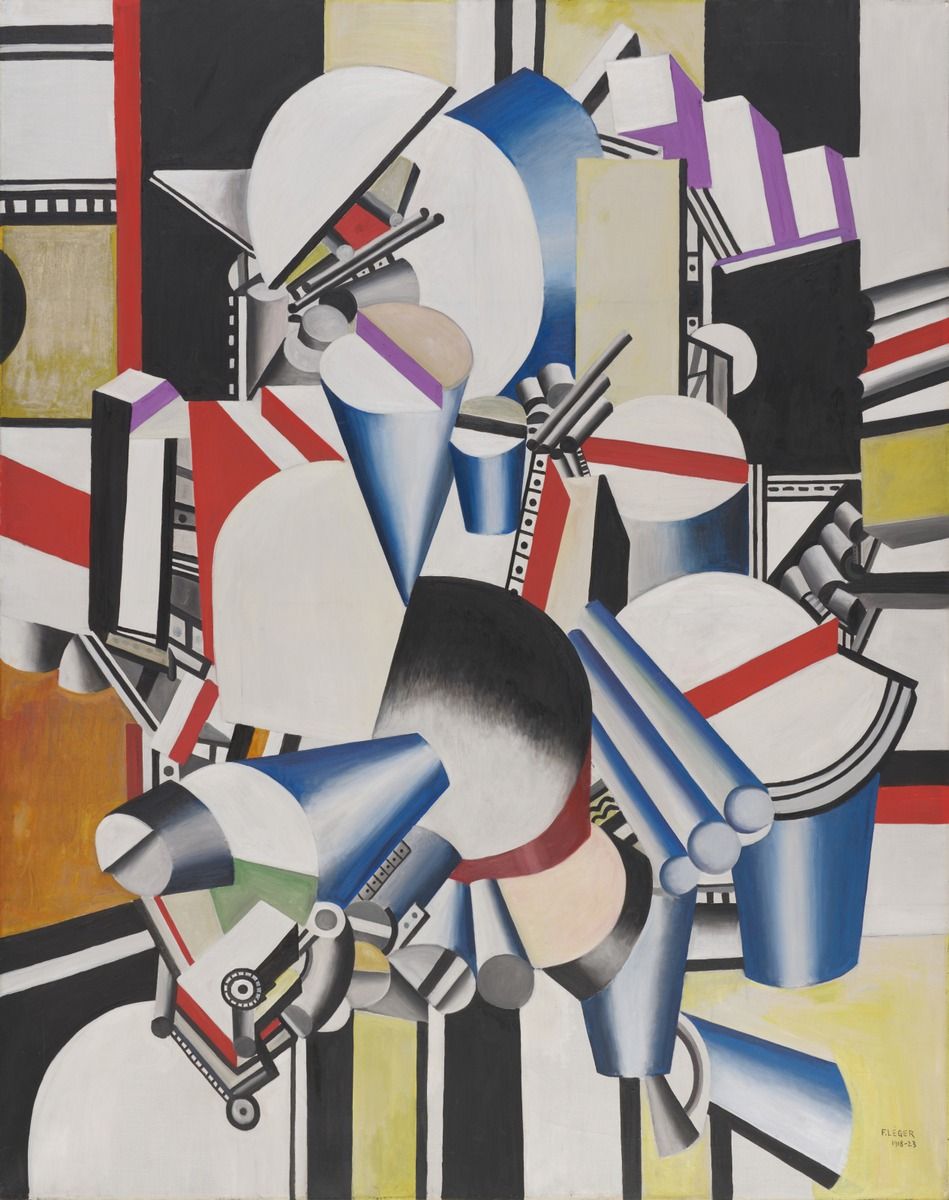
Fernand Léger, Mechanical Elements. The later mechanical picture restores suggestions of objects without becoming a description of a working machine.
A later painter’s response
In Fernand Léger: Paris–New York, held at the Fondation Beyeler in 2008, the curators paired Contraste de formes with Al Held’s Phoenicia VI of 1969. Their gallery guide connected Held’s later painting with the rhythmic density and constructed space of Léger’s early abstractions. It presented his response as a reworking of that pictorial approach within the larger scales of American painting. [11]
The comparison draws attention to a quality easily missed when the cones are treated merely as unusual objects. This canvas makes space seem assembled and contestable. One shape occupies a position because another overlaps it, darkens its edge or tips away beside it. The 2008 pairing offered a way of recognising the continuing interest of that problem. It need not make every shared curve evidence of a direct borrowing.
Return finally to the three central openings. They provide enough repetition to orient us, yet each changes the terms of the encounter. Their mouths tilt, their bright edges widen, and their dark passages meet different neighbours. Around them, red planes and striped fragments keep interrupting any settled reading. Contrast of Forms holds together through these changing relationships: a compact arrangement that makes the act of looking feel continually productive.
Léger in video
Explore abstraction, monumental painting and cinema through films from MoMA and the Centre Pompidou. These videos offer context for Léger’s wider work; the restoration film is in French.
1913 | “Contrast of Forms” by Fernand Léger
MoMA looks at its own 1913 Contrast of Forms, including the painting’s rough surface. This is a different canvas from the Beyeler work covered in this cluster. English.
Watch on YouTubeFernand Léger artworks directory
Works covered in these articles and further documented works. Studies and finished works have separate entries; alternate titles share an entry. This is not a catalogue raisonné.
| Name | Date | Medium |
|---|---|---|
| Acrobats and Clowns from Le Cirque | 1950 | |
| Adieu New York | 1946 | Painting |
| Ballet mécanique | 1924 | Film |
| Big Julie | 1945 | Painting |
| Builders with Aloe | 1951 | Painting |
| Charlot cubiste | 1924 | Sculpture |
| Chimneys on Rooftops | 1911 | Painting |
| Cirque (artist’s book) | 1950 | |
| Composition | 1929 | Painting |
| Composition (Study for Nude Model in the Studio) | 1912 | Drawing |
| Composition of Three Figures | 1932 | Painting |
| Composition with Two Parrots | 1935–39 | Painting |
| Construction Workers Final State | 1950 | Painting |
| Contrast of Forms | 1913 | Painting |
| Derrière le miroir, nos.121–122 (posthumous publication, includes a lithograph after Léger) | 1960 | |
| Drawing for The Card Game | 1917 | Drawing |
| Drawing for The Staircase | 1913 | Drawing |
| En attendant le départ | 1914 | Drawing |
| Grand Parade with Red Background | 1953 | Painting |
| J’ai tué (illustrated book) | 1918 | |
| La Cocarde, l’avion brisé | About 1916 | Drawing |
| La Couseuse | about1910 | Painting |
| La Fin du monde filmée par l’Ange N.-D. (illustrated book) | 1919 | |
| Les Femmes au bouquet (Women with a Bouquet) | 1921 | Painting |
| Man and Woman | 1921 | Painting |
| Man in Profile with Rope: Study for The Constructors | 1950/1 | Drawing |
| Man in the Blue Hat | 1937 | Painting |
| Matinée d’ivresse, from Les Illuminations | 1949 | |
| Mechanical Elements | 1918–23 | Painting |
| Mechanical Elements (Metropolitan Museum) | 1920 | Painting |
| Men in the City | 1919 | Painting |
| Mes voyages (posthumous illustrated book) | 1960 | |
| Mona Lisa with the Keys | 1930 | Painting |
| Nude Model in the Studio | 1912–13 | Painting |
| Nudes in the Forest | 1909–1911 | Painting |
| Propellers Second State | 1918 | Painting |
| Reading | 1924 | Painting |
| Soldier with a Pipe | 1916 | Painting |
| Soldiers Playing Cards | 1917 | Painting |
| Soldiers Playing Cards (front drawing) | 1916 | Drawing |
| Standing Nude, Rear View | 1911 | Drawing |
| Still Life with a Beer Mug | 1921–2 | Painting |
| Still Life with Tankard | 1921 | Drawing |
| Study for The Aviator | 1920 | Drawing |
| The Acrobat and his Partner | 1948 | Painting |
| The Acrobats in the Circus | 1918 | Painting |
| The Alarm Clock | 1914 | Painting |
| The Chalices and the Sponge, stained-glass model | 1950 | Drawing |
| The City | 1919 | Painting |
| The Disks in the City | 1920 | Painting |
| The Mechanic | 1920 | Painting |
| The Railway Crossing | 1919 | Painting |
| The Three Musicians | 1944, after a 1924–25 drawing | Painting |
| The Wheels | 1945 | Drawing |
| Three Women | 1921–22 | Painting |
| Two Women Holding Flowers | 1954 | Painting |
| Umbrella and Bowler | 1926 | Painting |
| Verdun, dessin du front | About 1915 | Drawing |
| Woman with a Book | 1923 | Painting |
| Woman: Costume Design for La Création du monde | c.1922–23 | Drawing |
Discussion
Look again at the images and ideas explored in Contrast of Forms. These editorial prompts invite your observations.
Reader Insights
What becomes easier to notice in Contrast of Forms when you compare it with Nude Model in the Studio?
Where does the comparison with Mechanical Elements reveal the clearest change in Léger’s approach?
Which detail would you follow first when returning to the work, and why?
Join the Conversation
Share a detail, comparison or question about Contrast of Forms below.
References
- Fondation Beyeler, Contraste de formes, Fernand Léger, current collection record, Inv.90.6: date, medium, dimensions, collection and signature on reverse. Consulted 31 October 2026. View source.
- Kröller-Müller Museum, Nus dans la forêt / Nude Figures in a Forest, collection record KM 101.045. Current date, medium, identifier, curatorial sections “Distinctive cubist style”, “Geometric shapes” and “‘Battle of volumes’”, and museum reproduction. View source.
- Philadelphia Museum of Art, The City, 1919, collection record and interpretation; A. E. Gallatin Collection, 1952-61-58. View source.
- National Gallery of Canada, The Mechanic, 1920, accession 14985, collection details and interpretive paragraph; French collection record, Le mécanicien. View source.
- The Museum of Modern Art, Fernand Léger. Three Women. 1921–22, collection record, object 189.1942: artwork image, metadata, 2021 gallery label, publication excerpt, installation history and provenance. View source.
- Musée national Fernand Léger, La Joconde aux clés, collection record and museum commentary (French): object data, owning museum image, artist recollection, sardine tin and symbolic interpretations. The artist’s recollection is consulted as reproduced by the museum; the page does not date it. View source.
- Musée national Fernand Léger, “Les années 50, les constructeurs”, complete Les Constructeurs (définitif) entry and accompanying museum image: title, 1950 date, oil on canvas, 300 × 228 cm, inventory MNFL 94001, 1969 donation and museum-mediated Renault-canteen recollection. View source.
- Musée national Fernand Léger, La Grande Parade sur fond rouge, complete object record and displayed reproduction: 1953, oil on canvas, 114.5 × 156.2 cm, inventory MNFL 96006; donation of Nadia Léger and Georges Bauquier. View source.
- Museum of Modern Art, Contrast of Forms, Fernand Léger, 1913, object 103.1958, collection commentary and gallery label for Inventing Abstraction, 1910–1925, 23 December 2012–15 April 2013. A different painting, used here only for comparative discussion of the series. Consulted 31 October 2026. View source.
- Vanessa Morisset, Centre Pompidou, Fernand Léger, teaching dossier, April 2008, updated 2010: introduction, “Les contrastes de formes” and “Textes de référence.” The last section reproduces an excerpt from Léger’s lecture “Les origines de la peinture contemporaine et sa valeur représentative,” delivered 5 May 1913, as printed in Fonction de la peinture, revised and expanded edition (Gallimard, 2004), pp. 25–26. Lecture consulted through the dossier’s transcription; the volume itself was not consulted. Accessed 31 October 2026. View source.
- Fondation Beyeler, Fernand Léger: Paris–New York, gallery guide, exhibition 1 June–7 September 2008, curator Philippe Büttner; texts by Philippe Büttner, Raphaël Bouvier and Daniel Kramer. Introduction and entries 1–2, first PDF page; entry 2 pairs Contraste de formes (1913) with Al Held’s Phoenicia VI (1969). German text consulted in the saved museum guide, 31 October 2026. View source.


