 by Tom Gurney
Tom Gurney BSc (Hons) is an art history expert with over 20 years experience
Published on June 19, 2020 / Updated on October 14, 2023
Email: tomgurney1@gmail.com / Phone: +44 7429 011000
White-White (Weiss-weiss) by Wassily Kandinsky: Introduction
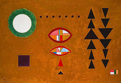
The name White-White seems surprising when the painting comes into view. Most of Wassily Kandinsky's small horizontal composition is a warm, ochre-brown field. A white disc sits within a green ring at the upper left, while two pale divided ovals float nearer the centre. Small dots and triangles repeat across the surface, especially in two darker chains at the right. The title directs attention to selected white forms rather than describing the whole ground. A Christie's catalogue identifies the work as Weiss-weiss, painted in November 1929, oil on board, 49.5 × 71 cm. [1].
The auction record offers unusually firm evidence for a work outside a public museum. It describes Kandinsky's K29 monogram and date on the front and a reverse inscription giving the title and his own number 472. It also cites the oil-painting catalogue raisonné as no. 916. Those particulars tie the image to a specific object; the public record does not establish its present owner. The painting belongs to Kandinsky's Bauhaus years in Dessau, but it should be read as its own experiment in colour, repetition and interval rather than as a generic diagram of geometric abstraction. [1]; [2].
Watch: Wassily Kandinsky
Five museum videos about Kandinsky’s art, sources of inspiration and the relationship between colour and music.
Vasily Kandinsky: Around the Circle
Curator Megan Fontanella introduces Kandinsky and the Guggenheim collection.
Watch on YouTubeAt a Glance
- Artist and documented title:Wassily Kandinsky, Weiss-weiss (White-White).
- Date:November 1929, according to the Christie’s catalogue; front monogram/date K29 and reverse K 1929 inscription are recorded.
- Medium and size:Oil on board, 49.5 × 71 cm (19¼ × 28 inches).
- Artist's number:472 in the inscription and handlist cited by Christie’s; catalogue raisonné no. 916 in its literature list.
- Visible arrangement:Ochre-brown ground; white disc inside green ring; dots, divided ovals, small coloured triangles and dark triangular sequences.
- Documented provenance:Galerie Maeght, Paris, and Galerie Beyeler, Basel, in the auction record. Present ownership is not publicly established there.
- Different works:This is not Kandinsky's On White II of 1923 or MoMA's White—Soft and Hard of 1932.
Where this work sits in Kandinsky’s career
The Blue Rider
1903Composition VII
1913Composition VIII
1923Several Circles
1926Sky Blue
1940Contents
- Looking across the ochre field
- Title, signature and object identity
- Kandinsky in the Bauhaus years
- What the title can and cannot explain
- Frequently asked questions
- References
Looking across the ochre field
The image opens with a strong contrast. The pale circle at upper left is surrounded by a textured green ring, and both stand out against the warm ground. The disc is large enough to anchor the composition, yet it is not the centre of every relationship. A line of small dark dots continues across the upper middle. Below it, two red-edged ovals are divided into white, red, yellow and blue sections. Their repeated shape offers a quieter rhythm than the separate, pointed triangles at the right. [1]; [3].
The right-hand groups look almost like two vertical sequences of dark triangles. They are not identical stacks: points aim alternately up or down, and spacing makes them feel like separate beats. Small red and blue accents near the middle and lower right interrupt the dark pattern. On the left, a darker square gives the eye a pause between the large ring and the central ovals. Kandinsky distributes simple elements so that a viewer must move among them rather than read a single emblem. [3].
The ochre field is part of that movement. Its brushy variation keeps the background from behaving like flat drafting paper. Pale forms become especially sharp in contrast, while the dark triangles absorb some of the ground's warmth. The title may therefore be understood as drawing attention to white accents within a coloured environment. It does not mean the board is white-on-white in the sense of a monochrome picture. This is an observation about the visible work, not a documented explanation Kandinsky gave for the title. [1]; [3].
Near the centre, the two ovals seem to answer one another. Each has a bright outline and subdivided interior, but they occupy different widths and heights. A small red triangle below them leads into blue and dark marks. The succession from larger ovals to smaller triangles can feel almost like a descending scale. Across the top, the evenly spaced dots introduce a different measure. Kandinsky brings several rhythms into one board without making them converge at a single point. [3].
Title, signature and object identity
The sale catalogue records the title on the reverse of the board as “Weiss-weiss”, with the artist's number 472. It also describes a monogram and date at the lower left of the front. These are more secure identity markers than a translated caption on a reproduction. The painting is November 1929, oil on board, and 49.5 × 71 cm in that record. It is a compact horizontal object, not a large canvas. [1].
Christie's cites Kandinsky's handlist IV, no. 472 and the Roethel and Benjamin catalogue raisonné of the oil paintings, vol. II, no. 916. Those citations place the work in two scholarly systems, but the auction page does not reproduce the handlist or catalogue essay. The public claim that can be checked here is that these references are attached to this lot. They should not be made to support invented meanings for the shapes. [1].
The lot record lists Galerie Maeght in Paris and Galerie Beyeler in Basel in its provenance. It also records exhibition appearances at Galerie Maeght in 1965 and Marlborough-Gerson Gallery in New York in 1966. These facts show that the painting circulated in major Kandinsky presentations after his death. They do not prove that either gallery still owns it, nor does the public lot page state where the work is now. “Private collection” may appear on secondary reproduction sites, but a current holder is not established by the cited primary catalogue. [1].
Kandinsky in the Bauhaus years
By 1929, Kandinsky had taught at the Bauhaus for several years. Guggenheim educational materials place his Bauhaus teaching from 1922 onward and describe his continuing interest in circles, triangles and linear forms. White-White contains all three, but its warm ground and irregularly spaced repetitions keep the image from looking like an exercise sheet. It shows how a limited vocabulary can still make contrasting visual experiences. [2]; [1].
The 1966 exhibition title Kandinsky: The Bauhaus Years, which Christie’s lists for this work, confirms that later curators placed it within that phase of his career. It does not make the painting a demonstration of a specific classroom lesson. The artist was free to use pale discs, strict triangles, floating coloured sections and a textured ochre surface in ways that did not reduce to a rule. Here the contrast between white and brown is as important as the categories of shape. [1]; [2].
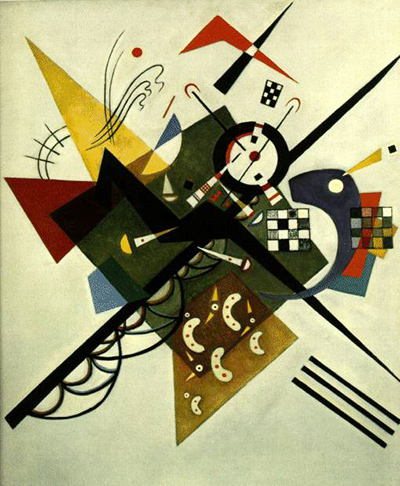
The picture can also be placed beside other Kandinsky works with white in their titles without conflating them. On White II belongs to 1923 and has a very different surface and scale; MoMA's White—Soft and Hard is dated March 1932. Similar title words do not imply shared ownership, materials or visual programme. The reverse inscription and handlist number make Weiss-weiss specific. [4]; [5]; [1].
What the title can and cannot explain
The repeated word “white” may make viewers search for pairs: the left disc and pale sections within the two middle ovals, or other bright fragments. That search is useful because it sends the eye through the painting. Yet no located statement by Kandinsky explains exactly which two whites he meant. A literal count may miss how white works against the ochre ground and coloured dividers. It is better to let the title sharpen observation than to assign a fixed symbolic key without a source. [1]; [3].
The simple marks change character through their neighbours. A dot in the upper row can read like a beat; a red-edged oval like a lens; a chain of triangles like a directional signal. Those comparisons describe possible experiences of the shapes, not established subjects. Kandinsky's painting does not identify a place, person or story in its title. Its meaning can be approached through repetition, scale, colour contrast and the movement of attention across the board. [1]; [3].
White-White is distinctive precisely because its name and appearance resist an easy match. The brown surface makes the small whites important; the dot row and triangle chains bring regularity, while divided ovals add more intricate colour. Its dated and numbered inscriptions hold the object firmly in November 1929, even though its present location is not established in the public auction catalogue. Looking closely at the work reveals more than any shortcut description of it as a “white” Kandinsky painting. [1].
Kandinsky artworks directory
Frequently Asked Questions
Christie's dates Weiss-weiss to November 1929 and records K29 on the front and K 1929 on the reverse. [1].
No. A warm ochre-brown field covers most of the board. White appears in selected circular and oval forms, making the title a prompt for closer looking rather than a description of an all-white surface. [1]; [3].
It is oil on board, measuring 49.5 × 71 cm. Christie’s catalogues its artist's number as 472. [1].
The auction catalogue transcribes No. 472 on the reverse and cites handlist IV, no. 472. It is an object-identification number associated with Kandinsky's record of his work, not an edition number for prints. [1].
No. On White II is a different Kandinsky work from 1923. Weiss-weiss is the November 1929 oil on board documented by Christie’s. [4]; [1].
The cited public auction record gives earlier galleries and exhibitions but does not establish a present owner or display location. It should not be presented as a museum holding. [1].
Discussion
What do you notice first in White-White (Weiss-weiss)? Share a close observation or a question about the evidence for this work.
Comments are for comparing what we see and what the cited sources establish.
Reader Insights
Where do the white forms first stand out against the ochre field?
How do the dot row and triangle chains create different rhythms?
What can the reverse inscription establish that the painting’s title alone cannot?
Join the Conversation
Add your observation below and tell us which part of the artwork led you to it.
References
- Christie's, Weiss-weiss, lot 2411386: object details, inscriptions, provenance and literature. View source.
- Guggenheim Museum, Kandinsky Bauhaus context in permanent-collection teaching materials. View source.
- Artothek, Christie’s identified image listing for Weiss-weiss. View source.
- Centre Pompidou, Kandinsky monograph including the distinct On White II. View source.
- MoMA, distinct White—Soft and Hard, 1932. View source.