 by Tom Gurney
Tom Gurney BSc (Hons) is an art history expert with over 20 years experience
Published on June 19, 2020 / Updated on October 14, 2023
Email: tomgurney1@gmail.com / Phone: +44 7429 011000
On White II by Wassily Kandinsky: Introduction
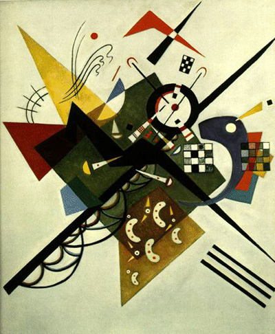
Wassily Kandinsky's On White II sets a dense knot of lines, angles, circles and small patterned areas against a broad pale ground. Dark diagonals push outward from a busy centre; yellow, red and blue forms interrupt and redirect them. The picture can seem like an explosion of geometry, yet its parts are held in a deliberate balance. The Centre Pompidou in Paris owns the oil on canvas, catalogued by its German title Auf Weiss II and French title Sur blanc II. Kandinsky made it in Weimar between February and April 1923, during his first Bauhaus years. A documented 1922 watercolour study helps show how the design moved from paper to canvas. [1]; [2].
Watch: Wassily Kandinsky
Five museum videos about Kandinsky’s art, sources of inspiration and the relationship between colour and music.
Vasily Kandinsky: Around the Circle
Curator Megan Fontanella introduces Kandinsky and the Guggenheim collection.
Watch on YouTubeAt a Glance
- Artist:Wassily Kandinsky.
- Title:On White II; German Auf Weiss II, French Sur blanc II.
- Date:February–April 1923, made in Weimar.
- Medium:oil on canvas.
- Size:105 × 98 cm.
- Collection:Centre Pompidou, Musée national d'art moderne, Paris, inventory AM 1976-855; donated by Nina Kandinsky in 1976.
- Related work:a separate 1922 watercolour and ink study, Centre Pompidou AM 1976-1324.
Where this work sits in Kandinsky’s career
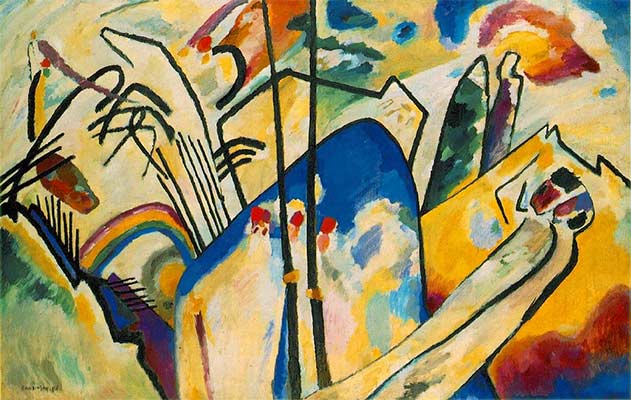
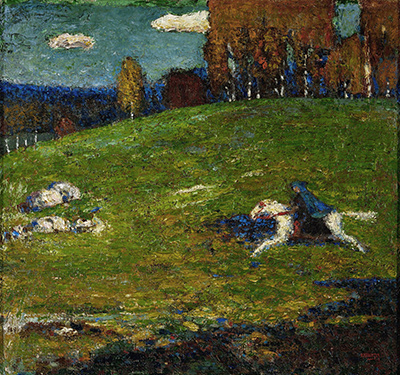
The Blue Rider
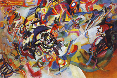
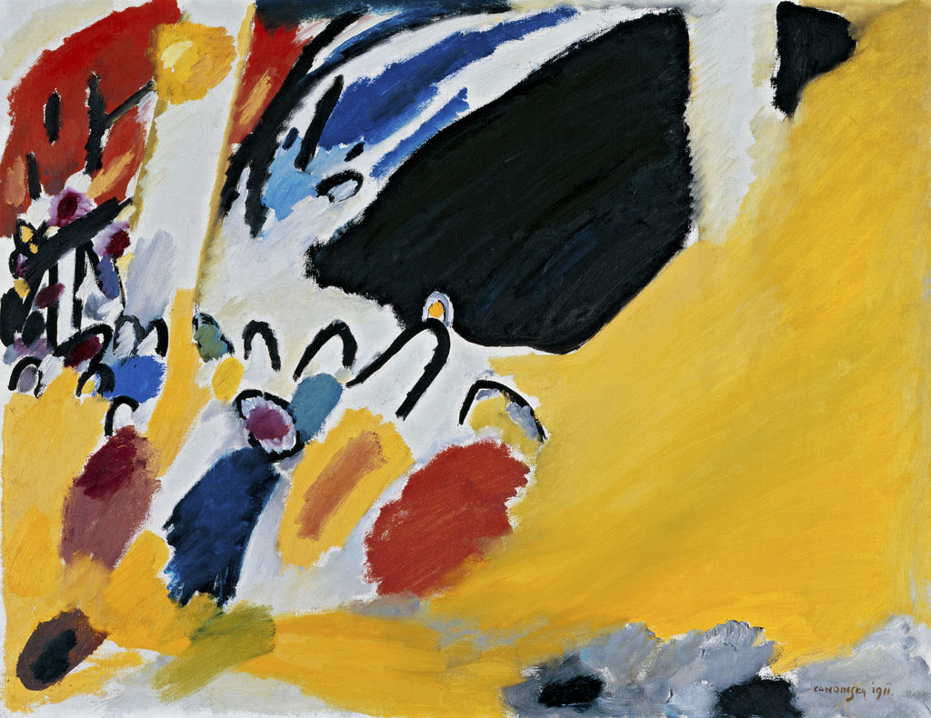
1903Composition VII
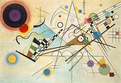
1913Composition VIII
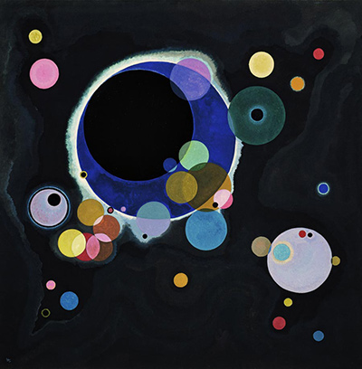
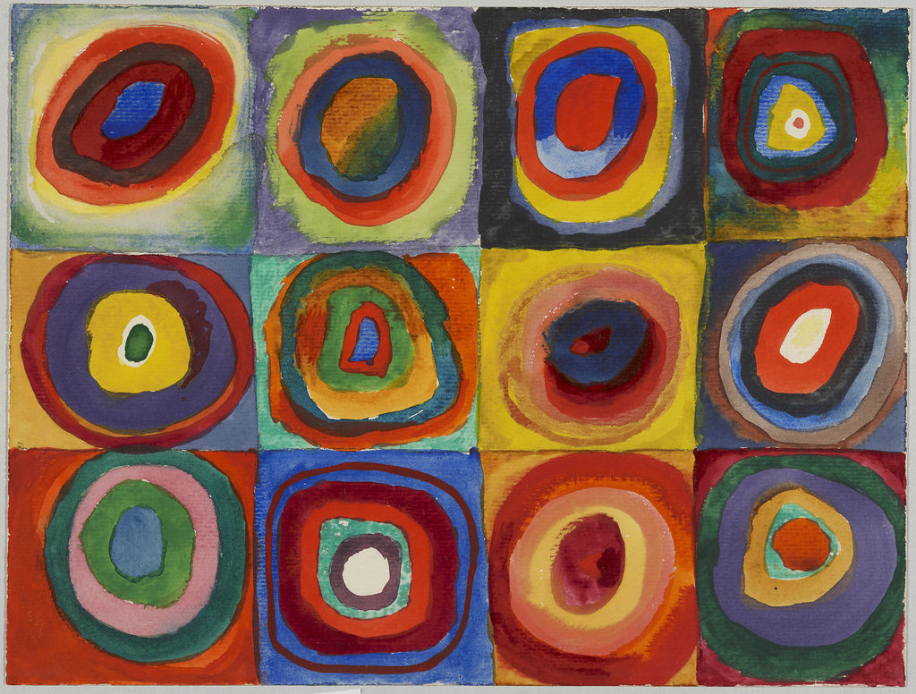
1923Several Circles
1926Sky Blue
1940Contents
- First look: a centre under pressure
- Why is white in the title?
- The diagonals and the almost-square canvas
- Sharp geometry and resistant curves
- The 1922 study: what it establishes
- Two objects, two kinds of evidence
- Made in Weimar, later seen in Dessau
- Suprematism as a comparison, not a replacement name
- White is an active space
- On White II and Composition VIII
- How to read the patterned details
- Collection history and later display
- A practical comparison with the study
- Why On White II matters
- Frequently asked questions
- References
First look: a centre under pressure
The white ground gives the coloured and dark forms an unusually exposed setting. A heavy diagonal drives from the lower left towards the middle and beyond. Another dark thrust moves across it from a different direction. Between and around them, blocks, arcs, checkerboard-like passages and small pointed accents compete for space. The central area is crowded, but it does not spread evenly over the whole canvas. Pale margins remain, making the centre feel pressed and active.
Begin by following one dark line. It may take the eye into a group of overlapping forms and then appear to continue on the other side. Another line interrupts that course, so a direct passage across the painting becomes a sequence of changes. The Centre Pompidou describes sharp contours and acute angles pulled along diagonals. That institutional reading helps identify the larger movement without turning every part into an arrow. [1].
Colour changes the weight of the geometry. A yellow wedge at upper left can feel broad and light at once; red accents are smaller and more abrupt; blue and violet passages cool areas beside the strongest black shapes. A curved violet or dark blue form to the right seems to gather some of the energy into a slower bend. The museum specifically points to a violet curve that appears to resist the outward movement. This is a useful description of tension within the canvas, not evidence that the form stands for a particular object. [1].
Why is white in the title?
Auf Weiss II means “On White II”. The words call attention to the ground on which the other elements appear. The white is not a passive absence of paint. It leaves intervals between forms, throws dark diagonals into relief and lets coloured shapes change their apparent force. A black line against white can appear decisive even when it is thin; a larger dark plane can seem to cut a hole in the open field. The ground participates in how every shape is read.
The title does not say that the painting is only about white. Kandinsky gives the viewer a way into the design, then asks the eye to notice what happens on that field. Some areas remain open; others are densely covered. Even the nearly empty margins are unequal. They keep the central form from becoming a sealed emblem and allow the diagonal movements to feel as if they reach beyond the cluster.
The “II” should not be treated as proof that this page reproduces a second version of the documented 1922 watercolour. The owner identifies the watercolour as a study for Auf Weiss II and the canvas as the 1923 painting. The numbering in the title belongs to Kandinsky's naming of works, while the study has its own catalogue identity. A reader who searches by title should check the medium, date and accession before assuming two images show the same object. [1]; [2].
The diagonals and the almost-square canvas
A diagonal can turn a static area into a direction. Here several directions intersect, and none controls the whole picture for long. The eye may move up from the lower left, be caught by a black plane, then turn towards a patterned region or a blue curve. A different starting point can make a different diagonal seem dominant. This instability gives the work a sense of action without the depiction of figures moving through a scene.
The support measures 105 × 98 cm, close to square. A square-like field could suggest evenness, but the intersecting diagonals cut across that expectation. They create unequal triangular spaces and make the centre feel off balance before other shapes restore a more complicated equilibrium. The picture does not achieve balance by placing identical weights on opposite sides. It holds a strong thrust against curves, colour and a varied distribution of smaller forms.
Centre Pompidou's earlier English educational account emphasizes tension between two diagonals. That is a helpful broad reading, but the surface contains more than two lines. Small arcs and parallel strokes bend or echo the main movements, and dark blocks have their own weight. The two-diagonal structure is a starting point for looking, not a complete explanation. [4].
Sharp geometry and resistant curves
The painting's straight-edged pieces differ in scale and direction. A yellow triangle-like wedge rises in the upper-left half; a red angular form near the top punctuates the pale ground; black planes overlap near the centre. Checkerboard-like areas introduce small repeated units beside larger blocks. These variations make the image feel constructed, but not like a plan for a building. The parts do not resolve into one measurable object.
Curves counter the straight edges. Small arcs appear inside the busy area, while a larger blue-violet sweep to the right bends back towards the centre. The Centre Pompidou identifies a violet curve as a form that seems to withstand the outward force of the diagonals. The description captures a visible opposition. It should not be stretched into a fixed narrative in which one colour or form always “wins”. The painting keeps the forces in relation. [1].
The eye can compare a broad triangle with a slender arc, or a thick black shape with a fine dark stroke. Each pair changes the sense of scale and pace. A form with a pointed end may seem urgent; a curve may delay attention. Yet the colours complicate those impressions. A warm area can feel light, and a cool curve can carry considerable mass. This is why a label such as “geometric abstraction” identifies the vocabulary but not the particular experience of this canvas.
The 1922 study: what it establishes
The Centre Pompidou holds a separate sheet titled Étude pour Auf Weiss II. It is dated 22 December 1922, made with watercolour and India ink on paper mounted on cardboard, and measures 45.4 × 40.4 cm. Its inventory number is AM 1976-1324. The sheet carries an artist monogram and date, and its cardboard support has a pencilled Auf Weiss title and 1922 notation. These details make the relationship to the later canvas a documented one rather than a visual guess based on resemblance. [2].
The museum's painting record says the finished canvas follows the 1922 watercolour closely. Its French analysis describes the watercolour as an unusual case of a Kandinsky sheet serving as a near-direct preparation for a painting. “Closely” does not mean that paper and canvas are interchangeable. Watercolour and ink have different ways of spreading, darkening and meeting at an edge than oil paint. The change of scale—from a roughly 45-centimetre sheet to a canvas over a metre high—also changes how the viewer encounters the design. [1]; [3].
The study clarifies planning. On White II may look volatile, as if forms were thrown together in an instant. The recorded sheet shows that Kandinsky had tested the arrangement before painting the large oil. It does not prove that every decision was fixed in December or that the canvas was copied mechanically. A full comparison would require clear reproductions of both objects and attention to changes of medium and size. The secure conclusion is that a dated preliminary work exists and that the owner recognizes its close relation to the final painting.
Two objects, two kinds of evidence
The 1923 oil and 1922 watercolour share a collection and a family of titles, but their records answer different questions. The painting record fixes the finished work's date, place of production, medium, size and later collection history. The study record gives an earlier dated moment in the design's development and notes inscriptions on its support. Neither should be used to overwrite the other. A date of December 1922 attached to the study does not move the oil canvas back a year. [1].
The medium distinction matters for interpretation too. On paper, a thin line can be made rapidly in ink and a colour field can remain light where water meets the sheet. In oil on canvas, a comparable line has thickness and may meet other paint differently. The larger dimensions demand another bodily scale from the painter and the viewer. Even if the main arrangement remains recognisable, the work is not identical across media.
The existence of a study also guards against a false opposition between spontaneity and thought. Kandinsky could test a design in advance and still allow the canvas to feel forceful. A painting does not have to look cautious simply because it was prepared. Here the diagonal collisions and irregular intervals keep the finished image alive. The documentary history supports a more precise claim than “the picture was improvised”: it was developed through at least one securely identified study and then realised as a separate oil. [3].
Made in Weimar, later seen in Dessau
The owner dates the canvas to February–April 1923 in Weimar. Kandinsky had joined the Bauhaus there in 1922. When the school later moved to Dessau, the painting hung in the Kandinskys' dining room. These are different moments in its history: the place where it was made and a later domestic setting in which it was displayed. A short biography might merge them into “a Dessau painting”, but the object record gives a clearer sequence. [1]; [3].
The dining-room detail is valuable because it reminds us that the canvas was not only a published example of a style. Kandinsky lived with it. Its scale is large enough to be felt in a room yet small enough to hang in a domestic interior. The white ground, strong black forms and colour accents would have changed with the room's light and the viewer's movements. The owner does not provide enough here to reconstruct the exact hanging height or surrounding furniture, so the claim should remain at the level the source supports.
The Weimar Bauhaus offered Kandinsky a setting for teaching about visual elements while he continued to make paintings and works on paper. The geometry of On White II can be related to that context, and the Centre Pompidou sees links to Suprematism. Yet the canvas is a particular construction, not an illustration of a classroom chart. Its curved resistance, layered dark centre and uneven white intervals give it a character that general movement labels cannot supply. [1].
Suprematism as a comparison, not a replacement name
The Centre Pompidou calls On White II one of Kandinsky's more Suprematist works. The comparison points to clearly bounded geometric forms and to an interest in what they can do without depicting familiar things. Kandinsky had worked amid debates about abstraction in Russia before returning to Germany; the forms here can be seen within that wider conversation. The museum's wording is an interpretation of affinity, not a reattribution or a statement that the painting belongs to another artist's project. [1]; [3].
The comparison is useful when it sharpens observation. The white ground allows sharply edged forms to appear separate and mobile. Some shapes seem to float; others collide. But Kandinsky adds fine curving marks and irregular clusters alongside large straight-edged forms. The picture's centre is unusually crowded for a simple arrangement of isolated geometric pieces. Its contrasts of black, colour and white need to be traced in this work, rather than inferred from a movement name.
A viewer need not know a complete history of Russian abstraction to see the issue. Ask whether the forms behave like stable units or seem to break and recombine. Ask what the curved right-hand area does to the straight diagonal. These questions turn an art-historical analogy into a way of looking. They also leave room for Kandinsky's own varied practice before and after 1923.
White is an active space
The white ground is easiest to overlook where dark forms are busiest. Step back and notice how the pale areas differ. Near some borders, white opens broadly and lets the eye rest. Beside a black diagonal, it becomes a sharp contrast that seems to cut into the form. In small gaps within the central cluster, it can look like a sliver of light rather than a neutral background. The same colour performs different work according to its location.
The title emphasizes “on white”, but that preposition does not force all shapes to lie flat like stickers. Overlap and changes of weight can suggest depth. A dark band may appear in front of a coloured plane; a fine line can seem to cross a gap. The white field holds those relationships without becoming a horizon or a floor. The picture offers space without a conventional depicted place.
This is one reason the canvas is more interesting than a diagram. A diagram might show how lines intersect. Kandinsky's painting makes each intersection feel different by changing colour, width, angle and surrounding space. A viewer's path across the white ground is not entirely prescribed. Attention can begin with the yellow wedge, the central black structure, the violet curve or the lower bars and still arrive at a coherent, if different, sense of the whole.
On White II and Composition VIII
Kandinsky painted Composition VIII later in 1923, and the Guggenheim owns that wider canvas. Both works use circles, lines and angled forms on a light ground, yet their spatial organisation differs. Composition VIII spreads forms across a broad horizontal field and gives many of them room to stand apart. On White II gathers much of its activity into a tighter central conflict on a near-square support. Comparing them shows Kandinsky testing related elements under different conditions rather than repeating a single formula. [1]; [5].
The two pictures also differ in the force of their diagonals. In On White II, long dark thrusts seem to cut through a central mass. In Composition VIII, long lines participate in a field of distinct geometric events, with a large disk high at one side. The difference changes how the eye moves. One painting repeatedly returns the viewer to its busy middle; the other makes the viewer travel among more widely spaced parts.
Neither comparison settles which picture is more “Bauhaus” or more expressive. Both were made during Kandinsky's teaching years and both depend on decisions about colour, form and the interval between marks. The value of placing them side by side lies in seeing distinct solutions to related problems. The same artist did not have to choose one permanent way to make geometry act.
How to read the patterned details
Small grid or checkerboard-like areas punctuate the broad shapes. They bring a different scale of repetition into the painting. A large black plane can be taken in quickly; a cluster of little squares slows the eye. The pattern also complicates the idea of pure, simple geometry. A square may be simple in outline, but a group of alternating dark and light units becomes visually busy and can change the weight of a nearby curve or diagonal.
Look at where patterned detail gathers rather than treating it as decoration sprinkled over the whole. Near the central intersection, small units can make the crossing feel more crowded. To the right, another passage creates a local accent beside the curved dark form. The pattern links areas without making them identical. A viewer who notices only the largest black diagonals may miss this finer rhythm.
The existing reproduction supports a broad account of these patterns, but it is not a technical record of their paint layers. Do not infer a particular stencil, pigment or order of application from small pixels. Their compositional role is enough to examine: they interrupt broad planes, add scale contrast and give the eye points at which to pause before it follows another major direction.
Collection history and later display
The Centre Pompidou identifies the painting as inventory AM 1976-855 and records Nina Kandinsky's 1976 donation. The painting and its 1922 study entered the same national museum collection under distinct inventory numbers. The museum's ownership gives the page a secure reference for title, date and material. It also explains why a researcher can compare the two object records without assuming one is a loose image copied from the other. [1]; [2].
The object record's note about the Dessau dining room gives the painting a personal history before its museum accession. It does not establish every stage of ownership between 1923 and the 1976 donation. A responsible account leaves that gap open. Nor should the museum's current temporary exhibition location be treated as a permanent home: the collection, not a travelling display, anchors the work's identity.
The museum's title appears in German and French, while an English site often says On White II. These are translations of a documented work, not new paintings. Keeping the German title alongside the English one makes it easier to find the exact owner record and the related study. It also avoids confusing this canvas with Kandinsky's other paintings that use white as a prominent field or title.
A practical comparison with the study
Start the comparison by reading each museum caption before looking for differences. The watercolour and ink sheet belongs to 1922, is smaller than half the canvas's height, and has a paper-and-cardboard support. The oil belongs to 1923 and was made in Weimar on canvas. This first step sounds administrative, but it prevents a common mistake: presenting a photographed study as a preliminary version of the same physical painting. The names are related; the objects are separate. [1]; [2].
Next choose one relationship that appears in both, such as the meeting of two diagonals or the placement of a coloured plane beside dark geometry. Ask whether its position and visual weight seem to change when the design grows. A form that is only a small accent on paper may command more attention on canvas because its surrounding white interval is physically wider. Conversely, an ink line that looks forceful in a sheet may become one part of a heavier painted network. Such observations should be tested against good images; they are questions for comparison, not claims that every change is known in advance.
Finally ask what the survival of the study tells us about decision-making. It proves Kandinsky had formulated much of the arrangement by late December 1922. It does not prove that he saw the work as finished then. The owner dates the oil to the following February–April, leaving a period of months in which scale and material could be reconsidered. A close final resemblance can itself be a meaningful choice: an artist may preserve a tested structure because it works, while exploring how it behaves in a new medium. The painting's energy need not come from unplanned strokes to be real.
This sequence of caption, comparison and limitation is useful beyond this single work. Many Kandinsky pages show an image labelled “study” without explaining whether it is a separate sheet, an oil draft or a later copy. Here the owner gives unusually exact information. Using it well means preserving both the continuity of the design and the identity of each object.
Why On White II matters
On White II makes the white ground an active partner in a drama of diagonals, curves, blocks and patterned details. Its documentary record is unusually instructive: a precisely dated 1922 sheet survives, the 1923 canvas has a clear place of production and inventory number, and the owner records its later display in Kandinsky's Dessau home. Together those facts let a viewer distinguish artistic planning, finished object and later life of the painting. [1]; [2].
The picture also resists a quick summary as cool geometry. Its forms collide, interrupt and curve back, while white space changes their apparent force. The Centre Pompidou's comparison with Suprematism and its description of outward movement are useful ways to begin. The painting remains Kandinsky's particular answer to how coloured and dark forms can act on a pale, almost square canvas. A close look can start with one diagonal, but it should end by asking how that line is changed by all the elements it meets.
Kandinsky artworks directory
Frequently Asked Questions
The Centre Pompidou dates the oil canvas to February–April 1923 and records its place of production as Weimar. Kandinsky later hung it in his Bauhaus apartment in Dessau. [1].
It belongs to the Centre Pompidou's Musée national d'art moderne collection, inventory AM 1976-855. Temporary exhibition loans can change its display location. [1].
The owner records the oil on canvas as 105 × 98 cm, close to square. [1].
No. The 22 December 1922 sheet is a separate watercolour and ink study on paper mounted on cardboard, 45.4 × 40.4 cm, inventory AM 1976-1324. It is closely related to the finished 1923 oil. [2].
The pale field is the setting against which the dark diagonals, coloured planes, curves and small patterns act. The title draws attention to that active ground without assigning a single literal subject to the painting. [4].
The Centre Pompidou describes a strong affinity with Suprematist geometry. That is an interpretive comparison about its sharply defined forms and abstract space; the work remains Kandinsky's 1923 oil, made in Weimar. [1].
Discussion
What do you notice first in On White II? Share a close observation or a question about the evidence for this work.
Comments are for comparing what we see and what the cited sources establish.
Reader Insights
Where does the white ground most change the force of a dark diagonal?
What can the dated 1922 study establish about the 1923 canvas?
Which difference between watercolour and oil would you most like to inspect directly?
Join the Conversation
Add your observation below and tell us which part of the artwork led you to it.
References
- Centre Pompidou, Auf Weiss II (Sur blanc II) painting record. View source.
- Centre Pompidou, Étude pour Auf Weiss II study record. View source.
- Centre Pompidou, French analysis of the 1922 study and Bauhaus context. View source.
- Centre Pompidou, English Kandinsky educational essay. View source.
- Solomon R. Guggenheim Museum, Around the Circle press kit, Composition 8 record. View source.