
 by Tom Gurney
Tom Gurney BSc (Hons) is an art history expert with over 20 years experience
Published on June 19, 2020 / Page Updated on November 5, 2026
Email: tomgurney1@gmail.com / Phone: +44 7429 011000
Introduction
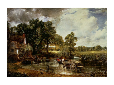
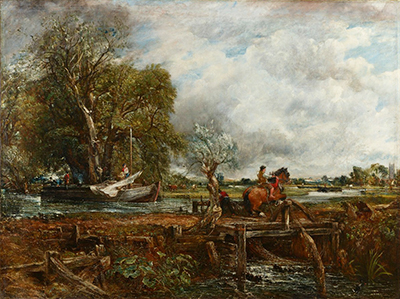
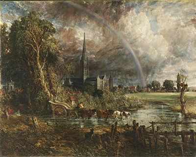
John Constable's prints are not simply reproductions of famous paintings. They belong to one of the most revealing projects of his later career: the attempt to translate his landscape art into mezzotint with the engraver David Lucas. That project, usually known as English Landscape or by its longer title, Various Subjects of Landscape, Characteristic of English Scenery, brought together paintings, drawings, oil sketches, memory, theory and public ambition. It was Constable's effort to make his art travel beyond the exhibition room without surrendering the weather, depth and tonal drama that mattered most to him.
The prints also complicate the familiar story of Constable as a painter attached mainly to private feeling and local truth. He did care intensely about Suffolk, Hampstead, Salisbury and the English countryside. Yet the print series shows him thinking about audience, sequence, publication, collaboration and legacy. The project cost him money, patience and peace of mind, but it remains one of the clearest statements of what he believed landscape art could do.
At a Glance
- ArtistJohn Constable (1776–1837)
- CollaboratorDavid Lucas, mezzotint engraver [2]
- Project begun1827 [1]
- Central seriesEnglish Landscape
- Full titleVarious Subjects of Landscape, Characteristic of English Scenery
- MediumMezzotint: tone shaped from dark toward light [1]
- First editionIssued in parts, 1830–1832 [5]
- Plate countTwenty-two mezzotints [5]
- Second edition1833 [7]
- Later volumeForty mezzotint leaves in the 1855 Bohn edition [8]
Contents
- Introduction
- Why Constable Turned to Print
- David Lucas and Mezzotint
- English Landscape
- The Prints as Argument
- Proofs, Corrections and Touch
- East Bergholt and Self-Portrait by Place
- Editions and Afterlife
- Commercial Disappointment
- What to Look for in Constable Prints
Why Constable turned to print
Constable began work on the print project in 1827, at a point when his reputation still felt insecure despite major achievements as a painter. The Metropolitan Museum of Art describes the series as an undertaking that occupied him for the last seven years of his life and was intended as a summary of his achievement.[1] That ambition is important. Constable was not merely commissioning engravings to advertise individual paintings. He wanted a gathered account of his landscape art.
Print offered reach. A painting might be seen at the Royal Academy, in a private collection, or by visitors admitted to a particular house. A print could circulate more widely. It could be owned, studied, bound, handled, given as a gift or compared with other plates in a sequence. For an artist who felt that landscape painting was still not properly understood, this mattered. Prints gave Constable a way to argue for his art in a form that could move through the culture more easily than a single canvas.
The project also belonged to a period when landscape publication had a substantial audience. Topographical views, illustrated tours, engraved books and portfolios shaped how many viewers encountered places they might never visit. Constable entered that world, but he wanted to do more than provide neat views. He wanted local scenery to carry feeling, weather, artistic judgement and seriousness.
That makes the prints a useful bridge between private studio labour and public explanation. Constable knew that many viewers came to landscape with habits formed by travel prints, polite albums and engraved views. He accepted the broad form of a printed series, yet used it to propose something more demanding: a landscape art grounded in actual places but animated by changing conditions of light, air and memory. The prints therefore belong both to the market for reproducible images and to Constable's larger campaign for the dignity of rural landscape.
David Lucas and mezzotint
The key collaborator was David Lucas, a younger British printmaker who became closely associated with Constable's late work. Lucas had trained in the circle of Samuel William Reynolds, a major mezzotint engraver, and by 1829 he was working with Constable on prints that led toward the English Landscape series.[2] The relationship was collaborative but unequal in authorship: Lucas made the prints after Constable, while Constable supervised, corrected and pressed for particular effects.
Mezzotint suited Constable because it is a tonal process. Rather than building an image mainly from line, it works through gradations of dark and light. The Met notes that the medium was especially apt for Constable's wish to illustrate the chiaroscuro of nature, because its velvety tonal range could move from darkness into illumination.[1] That made it particularly useful for skies, rain, shadows, water, tree masses and the shifting weather effects that run through his art.
This does not mean mezzotint could reproduce everything Constable valued in paint. Colour, broken surface and the freshness of oil handling could not pass directly into black and white. But the prints could carry another essential part of his art: the drama of light entering dark weather, the structure of shadow across land, the depth of trees and cloud, and the emotional pressure of atmosphere. In that sense the limitation became a strength. Print forced Constable to state his art through tone.
English Landscape
The central publication was Various Subjects of Landscape, Characteristic of English Scenery, from Pictures Painted by John Constable, R.A., commonly shortened to English Landscape. The first series contained twenty-two mezzotints after Constable's paintings, oil sketches, drawings and watercolours. The Milwaukee Art Museum's recent display of a complete initial-publication set summarises the chronology clearly: the first edition appeared between 1830 and 1832, and a second edition followed in 1833.[5]
The series was not a tidy, effortless enterprise. The British Museum's detailed record for a Lucas print after Constable describes changing plans, shifting numbers of plates, several intended additions, and the eventual structure of twenty-two plates issued in parts.[2] That unsettled development matters because it shows the project as alive and difficult. Constable was making artistic, practical and financial decisions while the work was underway.
The subjects drew from the range of his landscape career. They included Stour Valley views, Hampstead subjects, coastal scenes, Salisbury material and other motifs shaped by his long practice of observation and studio transformation. This breadth made the series retrospective without being merely nostalgic. Constable was gathering evidence of what his art had been about: rural England, changeable weather, local knowledge and the expressive force of light and shade.
The format encouraged comparison. A viewer could move from one plate to another and notice how Constable altered mood through tonal design: a bright opening after storm, a darker bank of trees, a wide sky over heathland, a broken coastal atmosphere, a cathedral seen through weather. In a gallery, works are often separated by ownership, date or exhibition circumstance. In the print series, Constable could arrange a conversation among his own subjects. The project let him think in sequence.
The prints as argument
Constable's prints were an argument about landscape. They insisted that English rural scenery could sustain serious art, not because it was grand in the conventional sense, but because it held endless variety of tone, weather, association and human presence. A lock, heath, seabeach, mill, dell or cathedral landscape could carry meaning if the artist understood how to organise atmosphere and place.
The Museum of Fine Arts, Houston describes the portfolio as a translation of imagery into black and white from works across different stages of Constable's career.[4] That act of translation was interpretive. A print after a painting is never a neutral copy. It selects what can survive in another medium. In Constable's case, the printed version often emphasises tonal structure: where the eye enters, where dark masses gather, where clouds open, where weather breaks into light.
This is why the series should not be read only as a failed commercial venture. It was also a portable theory of landscape. Through repeated examples, Constable could show how ordinary English places became pictorially powerful when treated through chiaroscuro, atmosphere and feeling. The prints became a kind of visual lecture, making the case that landscape could be studied as seriously as figure painting or historical subject matter.
Proofs, corrections and touch
The collaboration between Constable and Lucas depended on proofing. Lucas produced impressions; Constable examined them, altered them, and pushed the tones toward the effect he wanted. The MFAH account notes that Lucas submitted proofs to Constable and that the artist refined printed images with touches of grey and white wash, while the final appearance also depended on inking, wiping and printing.[4] This means the project remained close to Constable's hand even when Lucas was the engraver.
Proofs are especially revealing because they show the print as a working object. A state before letters, an unfinished sky, a corrected tone or a retouched impression records a decision still in motion. The British Museum's A Heath is a progress proof from the series, dated 1831, with the sky still in a developing state.[3] Such works make visible the conversation between painter and engraver: not a simple transfer from canvas to plate, but a search for a printed equivalent.
The word equivalent is useful. Constable could not ask Lucas to reproduce paint exactly. He needed him to find a comparable sensation in another language. Mezzotint supplied darkness, bloom, softness and depth. Constable's corrections sharpened those qualities toward his own aims. The best prints therefore feel neither mechanically reproductive nor independent in the usual sense. They are collaborative translations.
East Bergholt and self-portrait by place
The frontispiece to English Landscape made Constable's local identity explicit. The National Galleries of Scotland's record for the East Bergholt frontispiece explains that Constable chose an image of his birthplace and family home, a subject tied to both origin and artistic memory.[9] That choice framed the series before any single landscape subject was encountered. It told viewers that the project came from place, recollection and personal attachment.
This was not mere sentimentality. Constable's art had always depended on the depth that comes from knowing a landscape over time. East Bergholt and the Stour Valley were not picturesque discoveries gathered on tour; they were landscapes of childhood, family, labour and repeated observation. By placing that origin at the front of the series, Constable connected print culture to autobiography.
The frontispiece also helped define what was distinctive about the project. Many landscape publications offered views of notable places. Constable offered places made meaningful by long attention. The difference is subtle but important. The prints did not ask viewers to admire scenery as a list of destinations. They invited viewers to think about how a familiar landscape could become art through memory, weather and tonal design.
Editions and afterlife
The first edition of English Landscape appeared in parts between 1830 and 1832. A second edition followed in 1833, with a revised arrangement and altered presentation. The Morgan Library & Museum's record for the 1833 edition identifies twenty-two mezzotint plates, publication by Constable in London and sale through Colnaghi, with a copy annotated by Constable himself.[7] Such surviving copies show that the series existed not only as an abstract project, but as a set of physical objects handled, revised, gifted and preserved.
Plans for additions continued. The British Museum records that Constable discussed an appendix and further subjects, some of which were shelved during his lifetime and issued only after his death.[2] The later history is complicated: posthumous plates, reissues, illustrations connected with Leslie's memoir, Lucas's later series and the 1855 Bohn edition all extended the life of the imagery beyond Constable's direct control. The Morgan's 1855 English Landscape Scenery record describes a later volume of forty mezzotint leaves, combining the original twenty-two with additional plates.[8]
This afterlife matters because it changed how the prints were encountered. What began as an artist-supervised series became, over time, a broader printed memorial to Constable's art. Later editions made the imagery more available, but also moved it further from the immediate pressure of his supervision. The prints therefore sit between two histories: the intensely controlled collaboration with Lucas, and the wider posthumous circulation of Constable's reputation.
Commercial disappointment
Constable hoped the print series would bring his art to a larger audience, but it did not deliver the success he wanted. The British Museum's history of the series records financial strain, unsold stock and the sale attempt after Constable's death, while MFAH similarly emphasises the burden and limited commercial return.[2][4] It is tempting to see this simply as failure. That would be too narrow.
The disappointment was real. The project consumed time and money, and its shifting structure suggests the difficulty of matching artistic ambition to the economics of print publication. Yet the series also preserved a concentrated account of Constable's ideals. It gathered his subjects, clarified his tonal thinking and kept his landscapes before later viewers in a form that could survive beyond the exhibition season.
In hindsight, the commercial weakness can even sharpen our sense of the project's seriousness. Constable pursued it despite the burden because it mattered to him as an artistic statement. He wanted viewers to understand the expressive structure of landscape, not just recognise attractive views. If the market did not respond as he hoped, the prints still carried his argument forward.
There is a human awkwardness in that gap between ambition and response. Constable wanted the series to be useful, admired and sustaining; instead it became one more late burden. Yet the mismatch also shows how far ahead of immediate taste his concerns could be. The prints ask for slow looking at tone, atmosphere and rural association. They are quiet in format but ambitious in purpose, and their value becomes clearer when seen beside the later respect granted to his studies, sketches and full-scale landscapes.
What to look for in Constable prints
When looking at a Constable-Lucas print, begin with tone. Notice how dark areas hold the image together, how light enters through sky, water or distant fields, and how the composition depends on contrasts rather than colour. Mezzotint can make a cloud feel heavy, a tree mass dense, a rainstorm active, or a gap of light almost theatrical. These are not decorative effects. They are the structure of the image.
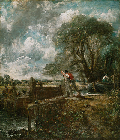
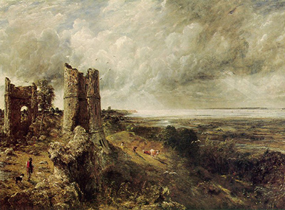
Next, consider the source. Some prints derive from finished paintings, others from smaller sketches or works on paper. The Milwaukee display highlighted subjects such as Hadleigh Castle, A Lock on the Stour, Spring, A Dell, A Seabeach and Yarmouth, showing how varied the series was in subject and mood.[5] Seeing several together makes clear that Constable was not repeating one formula. He was testing the tonal possibilities of different kinds of English landscape.
It also helps to remember the hand of Lucas. These are not autographic prints made directly by Constable, but neither are they routine reproductions detached from him. Lucas's skill made the translation possible; Constable's supervision gave it direction. Their finest prints hold both identities at once: the engraver's command of mezzotint and the painter's insistence on natural effect.
Prints and Constable's reputation
The print project now occupies a different place from the one Constable imagined. It no longer has to win him recognition in the immediate London market. Instead, it helps modern viewers understand how deliberately he thought about landscape. It shows an artist who wanted his work interpreted, studied and carried into the hands of others. It also shows how central black, white and tone were to a painter famous for colour, surface and sky.
The V&A's recent display, John Constable and David Lucas: A Unison of Feeling, confirms the continuing importance of this collaboration by placing paintings and related prints together in a modern museum context.[6] That pairing is exactly what the series invites. The prints are best understood not as substitutes for paintings, but as another form of Constable's thinking.
Constable's prints ask us to look at landscape through light and dark. They transform familiar subjects into tonal dramas, preserve the artist's ambitions in portable form, and reveal how seriously he wanted English scenery to be understood. They may have disappointed him commercially, but they did not fail artistically. They remain one of the most concentrated expressions of his belief that landscape, even at its most local and modest, could carry the full weight of art.
Frequently Asked Questions
Discussion
What makes the Constable–Lucas prints most convincing: tonal drama, collaboration, sequence or their argument for English landscape?
Reader Insights
Where does mezzotint translate atmosphere most effectively without relying on colour?
Which qualities feel most clearly directed by Constable, and which reveal Lucas's command of the medium?
Does seeing the subjects as a sequence change the meaning of any single landscape?
Join the Conversation
Share your reading below.
References
- Metropolitan Museum of Art, David Lucas after John Constable, A Mill, https://www.metmuseum.org/art/collection/search/680811
- British Museum, David Lucas after John Constable, Hampstead Heath, with St Paul's in the distance, https://www.britishmuseum.org/collection/object/P_1842-1210-61_1
- British Museum, David Lucas after John Constable, A Heath, https://www.britishmuseum.org/collection/object/P_1842-1210-128
- Museum of Fine Arts, Houston, Various Subjects of Landscape, Characteristic of English Scenery, from Pictures Painted by John Constable, R.A. Engraved by David Lucas, https://emuseum.mfah.org/catalogues/the-stuart-collection/objects/162709/various-subjects-of-landscape-characteristic-of-english-sce
- Milwaukee Art Museum, “Light and Shadow: John Constable's English Landscapes in Print,” https://mam.org/exhibitions/light-and-shadow/
- Victoria and Albert Museum, “John Constable and David Lucas: A Unison of Feeling,” https://www.vam.ac.uk/exhibitions/john-constable-and-david-lucas-a-unison-of-feeling
- Morgan Library & Museum, Various subjects of landscape, characteristic of English scenery, principally intended to display the phenomena of the chiar'oscuro of nature, https://www.themorgan.org/printed-books/268410
- Morgan Library & Museum, English landscape scenery, https://www.themorgan.org/printed-books/312375
- National Galleries of Scotland, Frontispiece to Mr Constable's English Landscape, https://www.nationalgalleries.org/art-and-artists/133549