 by Tom Gurney
Tom Gurney BSc (Hons) is an art history expert with over 20 years experience
Published on June 19, 2020 / Updated on October 27, 2026
Email: tomgurney1@gmail.com / Phone: +44 7429 011000
Tower Falls, Yellowstone: Introduction
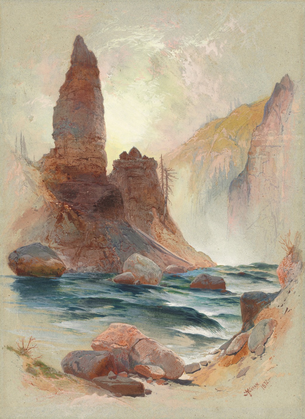
Thomas Moran represented the Tower Falls area through several kinds of image. His Tower at Tower Falls, Yellowstone, dated 1872, concentrates on the remarkable rock formations and the water below them. A separate chromolithograph, Tower Falls and Sulphur Mountain, Yellowstone, gives the waterfall a prominent place in a broader landscape. Looking at both shows how one location could support markedly different pictures. [1]
The distinction matters to the experience of the images. The first asks us to look upwards at a rock tower, then down into a channel between boulders. The second opens a view across a wooded valley, with falling water on the left and a light mountain beyond. They share a subject area without offering an interchangeable account of it.
At a Glance
- ArtistThomas Moran
- Paper workTower at Tower Falls, Yellowstone
- Date1872
- MediumWatercolour and gouache over graphite on blue laid paper
- Dimensions36.2 × 26.4 cm
- CollectionNational Gallery of Art
- Object number2012.93.1
- CreditFlorian Carr Fund
- Separate printTower Falls and Sulphur Mountain, Yellowstone, circa 1875
- Print publisherL. Prang & Co.
Where this work sits in Moran’s career
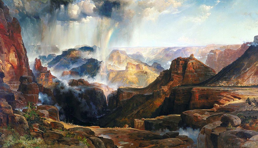
The Chasm of the Colorado
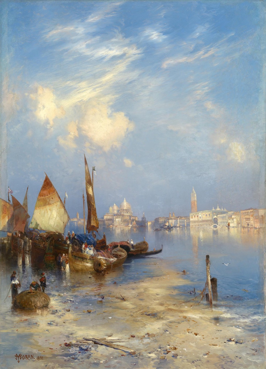
1873–1874; completed in 1874A View of Venice
1891Point Lobos, Monterey, California
1912, signed and datedContents
- The 1872 study of the towers
- Water below the stone
- Warm rock, cool water and a light distance
- The waterfall in the Prang print
- Two arrangements of the same subject area
- Towers in the nineteenth-century imagination
- Yellowstone through more than one image
The 1872 study of the towers
The National Gallery identifies the paper work as watercolour and gouache over graphite on blue laid paper. Its date is supported by the inscription with Moran's monogram at the lower right. The sheet is substantially taller than it is wide, a format suited to the upward movement of the rock formations. [1]
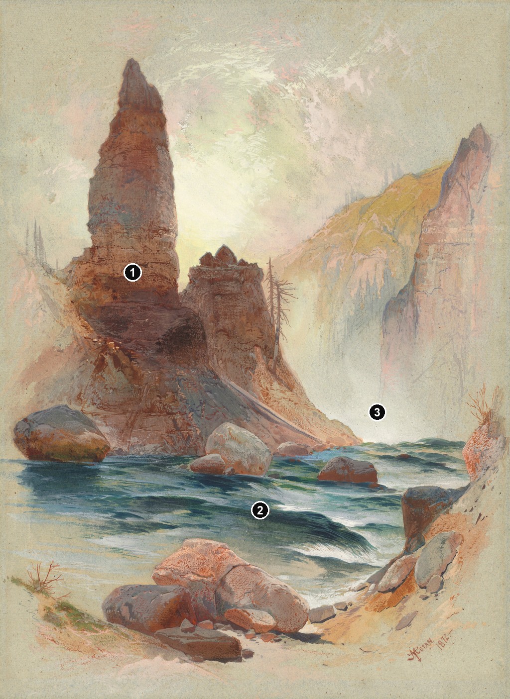
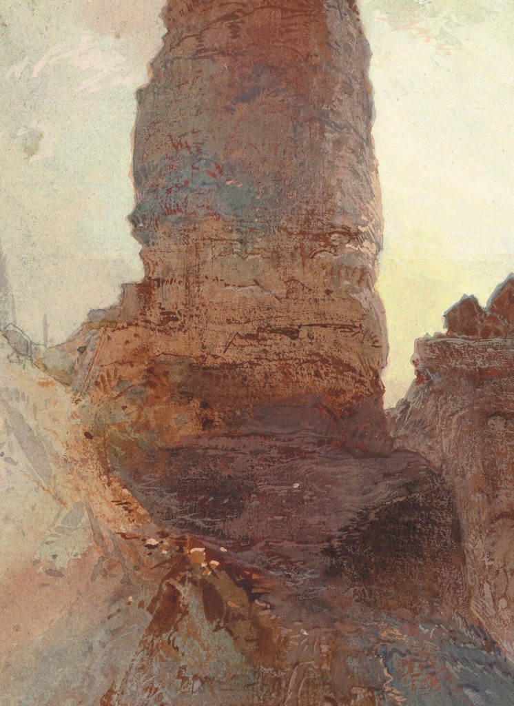
The most commanding tower rises on the left. Its warm surface contains several changes of direction rather than one smooth face. Narrow projections and darker interruptions make the rock seem irregular and deeply divided. Its outline remains readable against the lighter atmosphere even where details within it are difficult to separate.
Near the centre, a lower formation has a flatter summit. The contrast between the two shapes prevents the towers from becoming a repeated decorative pattern. One appears tall and sharply broken; the other gives the eye a broader stopping place. Their relationship establishes a varied skyline before attention moves towards the distance.
A slender conifer stands near the right edge. Its trunk and sparse branches provide another upright, but with a much lighter structure than the rock. We can see through parts of the tree. That openness makes the adjacent stone seem denser, while also carrying the landscape upwards without adding another heavy mass.
Annotated Details from Tower Falls, Yellowstone
Compare these details with the full composition. The numbered overview and crops come from the same original image.
Details from TOWER FALLS, YELLOWSTONE
Open a detail to see it more closely.
The 1872 study of the towers
The National Gallery identifies the paper work as watercolour and gouache over graphite on blue laid paper. Its date is supported by the inscription with Moran's monogram at the lower right. The sheet is substantially taller than it is wide, a format suited to the upward movement of the rock formations. [1]
Water below the stone
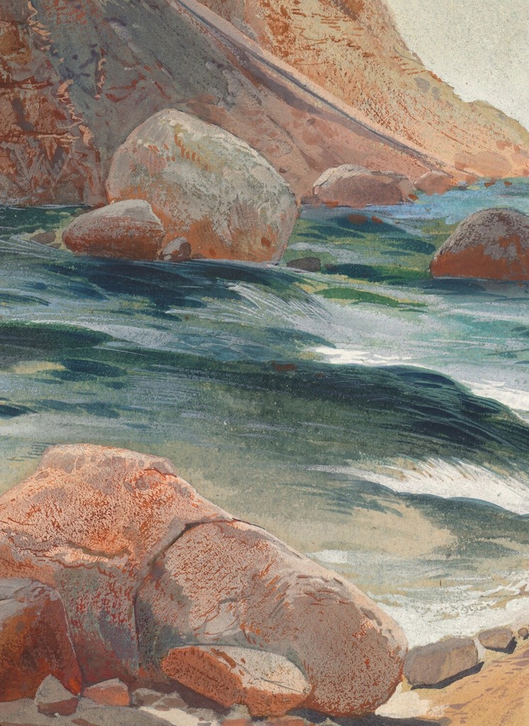
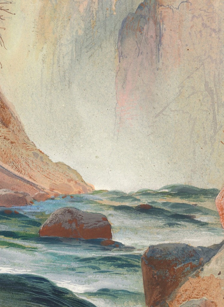
The lower part of the image introduces blue-green water moving between boulders. Pale touches interrupt its darker passages, and the channel changes direction as it disappears behind the rock. The water is a relatively small part of the whole sheet, yet its cool colour gives it considerable visual importance.
Warm rock, cool water and a light distance
The warm ochres and reddish passages in the towers stand against cooler water and a pale background. These relationships are stronger than any single isolated patch of colour. The left formation appears especially substantial because its warmer surface is framed by lighter, less definite surroundings.
Water below the stone
The lower part of the image introduces blue-green water moving between boulders. Pale touches interrupt its darker passages, and the channel changes direction as it disappears behind the rock. The water is a relatively small part of the whole sheet, yet its cool colour gives it considerable visual importance.
This is not a complete view of the principal waterfall. The picture's attention lies with the towers and the nearer channel. The title identifies the locality while allowing the rock formation to remain the main subject. Searching for a large cascade in the centre would overlook the arrangement Moran actually made.
Foreground boulders help connect the moving water with the tall formations above. Their edges are broken and angular, but they do not all receive equal emphasis. Some are brightly exposed; others dissolve into deeper tones. The eye finds a succession of small obstacles before reaching the much larger tower.
That succession produces a feeling of restricted access. We cannot simply walk visually up a clear road into the distance. Water and stone interrupt the route. The viewer must move between openings, following the channel while also responding to the vertical force of the rocks. Scale is felt through those contrasting movements.
Warm rock, cool water and a light distance
The warm ochres and reddish passages in the towers stand against cooler water and a pale background. These relationships are stronger than any single isolated patch of colour. The left formation appears especially substantial because its warmer surface is framed by lighter, less definite surroundings.
Further away, a warm cliff on the right is softened by atmosphere. It repeats something of the nearer rock's colour without competing with its sharpest edges. The repetition connects the landscape across depth. The change in clarity tells us that those related colours belong to different distances.
The background also gives the trees room to register. Dark branches become clear where they cross a light passage, then harder to distinguish where they meet darker forms. A single tree therefore changes in visibility along its height. Moran uses its surroundings to control which parts receive attention.
The result is a balance between solidity and uncertainty. The towers have emphatic outlines, but the world beyond them is less fully described. That contrast allows a small sheet to suggest a much larger landscape. The viewer encounters definite objects while remaining aware of space continuing beyond the immediately visible forms.
The waterfall in the Prang print
The Library of Congress print record, reproduced with its public-domain image at Wikimedia Commons, identifies Tower Falls and Sulphur Mountain, Yellowstone as a chromolithograph published by L. Prang & Co., circa 1875. Its broad format and title distinguish it from the National Gallery's upright study. [2]
Here the white fall descends on the left. It establishes a strong vertical within a picture that otherwise spreads across the landscape. Darker rock around the falling water makes the bright stream easier to follow. The waterfall is one of the clearest passages in the print, even when the image is viewed at a modest size.
Rock spires occupy the central area, while trees gather more heavily on the right. A pale mountain rises beyond them. The arrangement creates several successive layers: nearby ledges and vegetation, the fall and towers, then the more distant mountain. The broad view makes their relationship available at once.
Small figures near the base of the fall supply another measure of scale. Their presence encourages us to imagine the height of the descending water through comparison with a human body. They also introduce a possible place of observation within the scene. The landscape can be contemplated from inside as well as from outside the picture.
Fallen wood and uneven ground complicate the foreground. They make the near landscape less orderly than the clean outline of the mountain beyond. This contrast brings a sense of physical difficulty into a view that might otherwise appear comfortably panoramic. The composition offers breadth while retaining roughness close to the spectator.
Watch: Thomas Moran
Choose a film to explore the artist’s work, its interpretation and its wider setting.
The painting that inspired a National Park
A close discussion of Moran’s landscape and its relationship to the idea of Yellowstone.
Watch on YouTube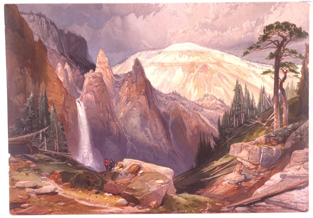
Two arrangements of the same subject area
The upright watercolour makes the left tower an immediate presence. Its top is comparatively close to the upper edge, and its base joins the more crowded lower part of the sheet. The broad print permits greater separation among waterfall, trees and distant mountain. Each form has a different amount of surrounding space.
These differences change how the eye moves. In the paper work, attention repeatedly travels up and down, between tower and water. In the print, the waterfall becomes one stage in a movement across the width. The mountain supplies a further destination, beyond the middle-distance rocks.
The two images also give different roles to vegetation. The solitary, spare tree in the watercolour works as a delicate companion to the rock. The more substantial wooded area in the print forms a dark side to the valley. Trees can indicate scale, frame a view or create weight, depending on their placement.
The comparison does not require the print to be a literal reproduction of this particular sheet. Their compositions are visibly different. It is more useful to recognise the flexibility with which Moran's Yellowstone subjects were represented than to force two separate objects into a single original-and-copy relationship.
Towers in the nineteenth-century imagination
The letterpress accompanying Prang's western portfolio, transcribed in the National Gallery's 1997 catalogue, describes the Tower Falls formations through comparisons with minarets and Gothic spires. Its discussion links their shapes to erosion and their changing colours to light. Those architectural comparisons show how unfamiliar scenery could be explained through familiar forms. [3]
The analogy is easy to understand when looking at the 1872 sheet. Tall projections seem to rise from a larger mass, with abrupt changes of height along their tops. Yet the rock's irregular surfaces resist the symmetry of a built structure. Moran allows a suggestive resemblance without making the formations look manufactured.
The historical text also belongs to a period when pictures and descriptive writing worked together to introduce western scenery to distant readers. Moran's images were part of that wider circulation. A publication could supply names and comparisons, while the picture gave viewers relationships of colour, scale and space to examine for themselves.
Prang's major portfolio was issued in 1876 from specially prepared watercolours. That publication date should be kept separate from the dates attached to individual sheets or prints. Nor does a shared publisher prove that every view of Tower Falls belongs to precisely the same plate or edition. [3]
Yellowstone through more than one image
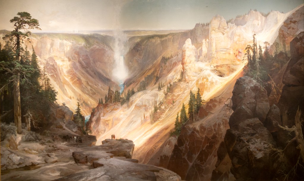
The Tower Falls works can be set beside Moran's The Grand Canyon of the Yellowstone. In the large painting, an expansive canyon becomes a commanding public image. The smaller tower study brings attention much closer to particular rocks, water and vegetation. Different formats make different experiences of the place possible.
Summit of the Sierras offers another useful comparison. Its upright paper composition also places nearer trees against a mountainous distance. The Tower Falls study, however, gives a warm rock formation more immediate prominence. The comparison shows how a vertical format can support different balances between foreground and horizon.
These works belong within Moran's wider practice of translating observed landscapes into finished pictures and published images. The Yellowstone and Hayden expedition provides their broader historical setting. The individual images still reward separate attention: one asks us to approach a tower; another makes falling water part of a more extensive view.
Artworks directory
Selected documented works and distinct versions. This directory is not a comprehensive catalogue raisonné. Dates and media retain the distinctions explained in the articles and museum records.
| Name | Date | Medium |
|---|---|---|
| An Arizona Sunset near the Grand Canyon | Date not securely established | Oil painting |
| Autumn Afternoon, the Wissahickon by Thomas Moran | 1864 | Oil on canvas |
| Cascade Falls, Yosemite | Commonly catalogued as 1905 | Catalogued as oil on canvas |
| The Chasm of the Colorado | 1873–1874; completed in 1874 | Oil on canvas, currently mounted on aluminium |
| Children of the Mountain | 1866 in the current museum title; 1867 in the 1997 National Gallery catalogue | Oil on canvas |
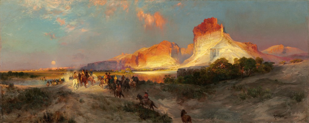
| Cliffs of Green River | 1874 | Oil on canvas |
| Cliffs of the Upper Colorado River, Wyoming Territory | 1882 | Oil on canvas |
| East Hampton, Long Island , also captioned Easthampton, L.I | 1897 | Oil on canvas laid on board, according to the reproduction record |
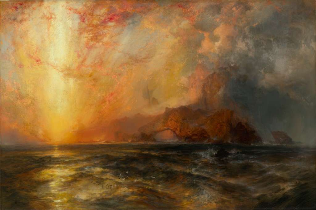
| Fiercely the red sun descending, Burned his way along the heavens | 1875–76 | Oil on canvas |
| Forest Scene | 1870 | Oil on canvas |
| Grand Canyon of the Colorado River | 1892 and 1908 | Oil on canvas |
| Green River Cliffs, Wyoming | 1881 | Oil on canvas |
| Green River, Wyoming | 1878 | Oil on panel |
| The Juniata, Evening | 1864 | Oil on canvas |
| Mosquito Trail, Rocky Mountains of Colorado | 1875 in the 1997 National Gallery exhibition catalogue | Watercolour |
| Mountain of the Holy Cross | 1875 | Oil on canvas |
| The Much Resounding Sea | 1884 | Oil on canvas |
| Point Lobos, Monterey, California | 1912, signed and dated | Oil on canvas |
| Shoshone Falls on the Snake River | 1900 | Oil on canvas |
| Summit of the Sierras | 1872/75, as catalogued by the Art Institute of Chicago | Gouache over graphite on cream laid paper |
| The Teton Range | 1897 | Oil on canvas |
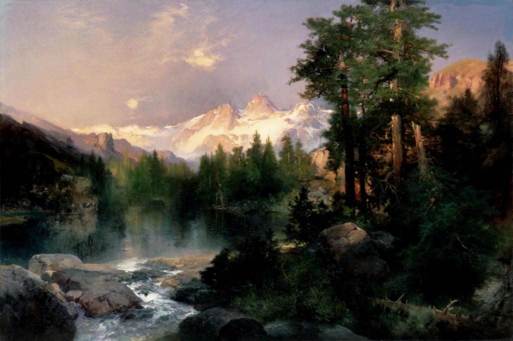
| The Three Tetons | 1895 | Oil on canvas |
| Tower Falls, Yellowstone | 1872 | Watercolour and gouache over graphite on blue laid paper |
| A View of Venice | 1891 | Oil on canvas |
| The Grand Canyon of the Yellowstone | 1872 | Oil on canvas, currently recorded as mounted on aluminium |
| Mountain of the Holy Cross, Colorado (etching) | 1888 | Etching, roulette and aquatint |
| The Resounding Sea (etching) | 1880 | Etching |
| The Much Resounding Sea (later etching) | 1886 in heading; 1888 on plate | Etching, drypoint and roulette |
| Tower Falls (Prang print) | c. 1875; portfolio issued 1876 | Chromolithograph |
| Shoshone Falls (early watercolour) | 1874 | Watercolour |
| Venice (watercolour) | 1888 | Watercolour over graphite |
Frequently Asked Questions
No. It centres on the rock towers and a nearer water channel rather than a full view of the principal fall.
Watercolour and gouache over graphite on blue laid paper.
It is a separate chromolithograph, Tower Falls and Sulphur Mountain, Yellowstone, circa 1875, with a broader composition.
The National Gallery of Art, accession 2012.93.1, acquired through the Florian Carr Fund.
They refer to different things: the National Gallery paper work, the separately catalogued print, and the issue of Prang's major western portfolio.
Discussion
Compare the tower's position near the top of the upright sheet with the waterfall's position in the broad print. How does the surrounding space change the apparent size and importance of each feature?
Reader Insights
Editorial prompts for close looking and discussion.
Compare the tower's position near the top of the upright sheet with the waterfall's position in the broad print. How does the surrounding space change the apparent size and importance of each feature?
Which source or image helps you assess the interpretation?
How does this page compare with the related works linked above?
Join the Conversation
Share your reading of this page below.
References
- National Gallery of Art, Tower at Tower Falls, Yellowstone, 1872, object record, 2012.93.1.
- Library of Congress, Tower Falls and Sulphur Mountain, Yellowstone, circa 1875, print record and image reproduced at Wikimedia Commons, LC-USZC4-3246.
- Nancy K. Anderson and contributors, Thomas Moran, 1997, selected Prang discussion, pp. 318–319, and appendix transcription, “The Towers of Tower Falls”, p. 342.
- Splash image source.
Tower at Tower Falls, Yellowstone, 1872. This is the rock-formation study, distinct from views centred on the waterfall. National Gallery of Art, Florian Carr Fund. Image source. Public domain; NGA Open Access. Resized only; complete source image retained.
- Splash image source.
Tower Falls and Sulphur Mountain, Yellowstone, chromolithograph, circa 1875. Thomas Moran / L. Prang & Co. / Library of Congress, LC-USZC4-3246. Image source. No known restrictions on publication; public-domain print. Resized only; complete source image retained.
- Splash image source.
Tower at Tower Falls, Yellowstone, 1872. This is the rock-formation study, distinct from views centred on the waterfall. National Gallery of Art, Florian Carr Fund. Image source. Public domain; NGA Open Access. Numbered circles added to the overview; details cropped from the original reproduction. No colour adjustment or sharpening.
- Splash image source.
The Grand Canyon of the Yellowstone, 1872. Wuselig / Wikimedia Commons, CC BY-SA 4.0; U.S. Department of the Interior Museum painting. Image source. CC BY-SA 4.0; also marked PD-Art. Outer museum frame cropped; resized. Painted composition retained; photographic perspective unchanged. This image derivative is available under the same licence.
- Splash image source.
The Chasm of the Colorado, 1873–1874. U.S. Department of the Interior Museum; faithful reproduction via Smithsonian American Art Museum / Wikimedia Commons. Image source. Public Domain Mark; faithful two-dimensional reproduction. Resized only; complete source image retained.
- Splash image source.
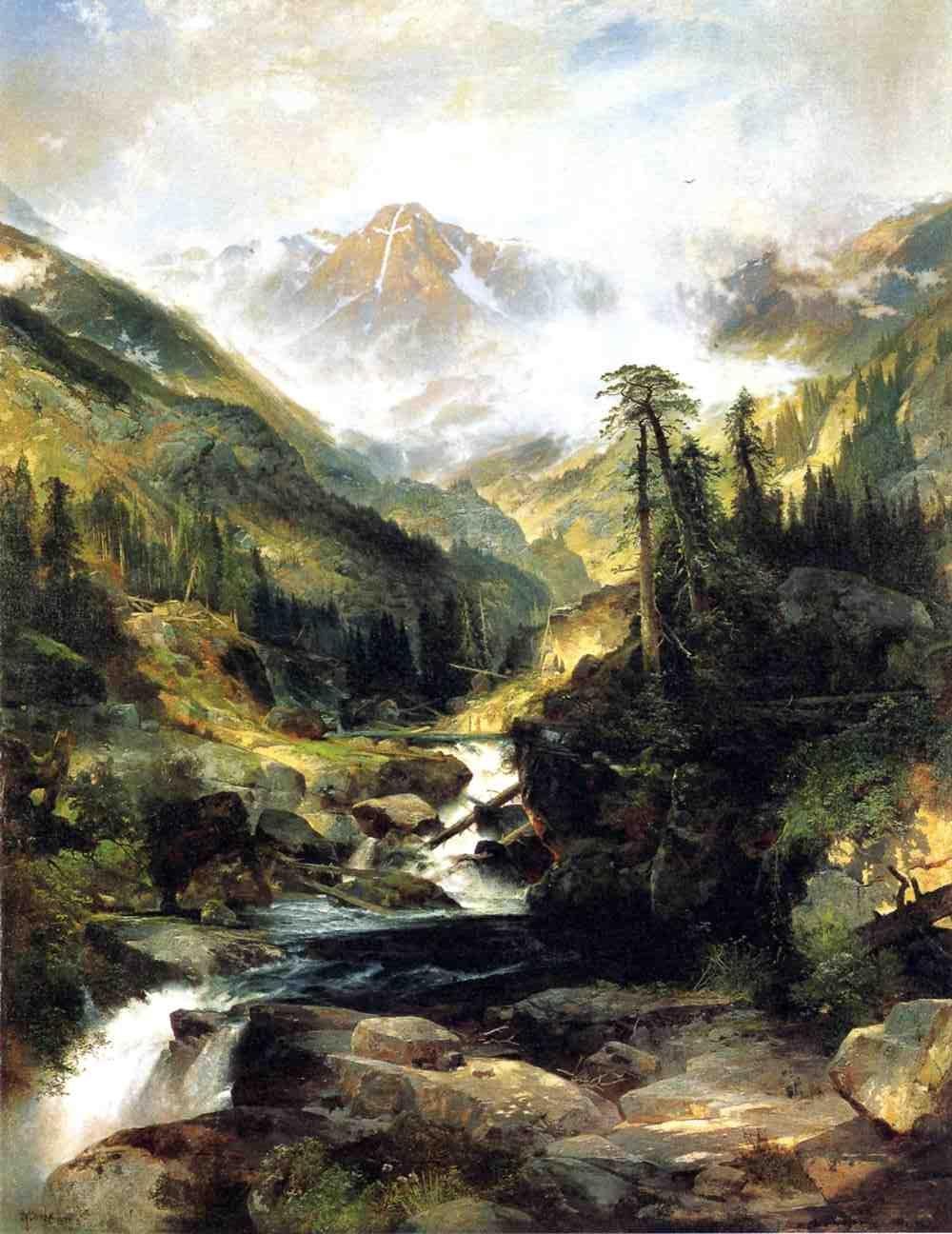
Mountain of the Holy Cross, 1875. Autry Museum of the American West; faithful reproduction via Wikimedia Commons. Image source. Public Domain Mark; faithful two-dimensional reproduction. Resized only; complete source image retained.
- Splash image source.
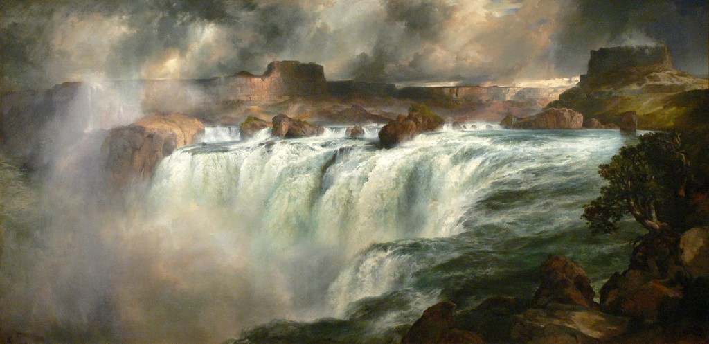
Shoshone Falls on the Snake River, 1900. Wolfgang Sauber / Wikimedia Commons, CC BY-SA 3.0; Gilcrease Museum painting. Image source. CC BY-SA 3.0; also marked PD-Art. Resized only; complete source image retained. This image derivative is available under the same licence.
- Splash image source.
Green River Cliffs, Wyoming, 1881. National Gallery of Art, Gift of the Milligan and Thomson Families. Image source. Public domain; NGA Open Access. Resized only; complete source image retained.
- Splash image source.
A View of Venice, 1891. Smithsonian American Art Museum, Transfer from the U.S. Department of the Interior, National Park Service, 1968.120.1. Image source. Free to use; Smithsonian Open Access. Resized only; complete source image retained.
- Splash image source.
The Three Tetons, 1895. The White House Collection, Gift of C. R. Smith; faithful reproduction via Wikimedia Commons. Image source. Public Domain Mark; faithful reproduction of a two-dimensional public-domain work. Resized only; complete source image retained.