


 by Tom Gurney
Tom Gurney BSc (Hons) is an art history expert with over 20 years experience
Published on June 19, 2020 / Updated on November 6, 2026
Email: tomgurney1@gmail.com / Phone: +44 7429 011000
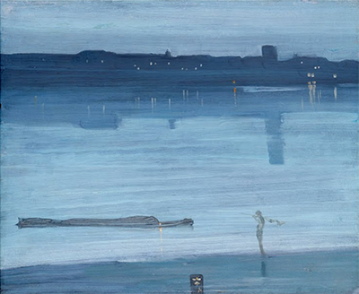
Nocturne: Blue and Silver—Chelsea is one of James McNeill Whistler's earliest London night paintings, but it did not begin with the word “nocturne.” The Dudley Gallery showed it in 1871 as Harmony in Blue-Green—Moonlight. Its later name records a change in Whistler's vocabulary as well as the changing appearance and reception of the painted panel.[1][4][8]
The work is YMSM 103, Tate T01571. It shows a Thames shore, a low barge, a small figure, distant buildings and a tower reduced to bands, silhouettes and reflections. What seems almost immaterial is built from a carefully prepared hardwood panel, sequenced brushwork, a precisely limited pigment system and a frame designed as part of the colour harmony.[1][3][5]
At a Glance
- CatalogueYMSM 103
- Date1871
- SupportOil on thin hardwood panel, probably mahogany
- Dimensions50.2 × 60.8 cm
- SignatureButterfly and “71” on cartouche
- First titleHarmony in Blue-Green—Moonlight
- Preferred titleNocturne: Blue and Silver—Chelsea
- FrameOriginal 1871 Flat Whistler with seigaiha; later redecoration probable
- CollectionTate, T01571
- DisplayOn display at Tate Britain; verify the current object page
Contents
- At a glance
- What does the Chelsea nocturne show?
- Is the figure a fisherman?
- The barge and its light
- Which side of the Thames are we seeing?
- Why the site remains unresolved
- Anna Whistler's evening account
- Is Anna describing this exact panel?
- The one-sitting story does not hold
- From “moonlight” to “nocturne”
At a glance
- Artist: James McNeill Whistler (1834–1903).[1][5] - Date: 1871.[1][2][5] - Medium: oil on wood.[1][3][5] - Support: thin, warp-free hardwood panel, probably mahogany.[3][11] - Dimensions: 50.2 × 60.8 centimetres; 19 3/4 × 24 inches.[1][5] - Catalogue identity: YMSM 103.[1] - Tate accession: T01571.[5] - Signature and date: stylised butterfly with “71” in a rectangular cartouche near the lower centre.[1][3] - First exhibited title: Harmony in Blue-Green—Moonlight, 1871.[1][4][8] - Preferred title: Nocturne: Blue and Silver—Chelsea.[1] - Frame: original 1871 Flat Whistler frame with painted seigaiha waves and butterfly.[3][13] - Current display: Tate's object-page metadata states that it is on display at Tate Britain, checked 25 August 2026.[5]
What does the Chelsea nocturne show?
A dark bank crosses the foreground at a shallow diagonal, rising from lower left towards the right. Near the right edge stands a lone figure carrying a pole over one shoulder, with material that may be a net or flag draped from it.[1]
At the left, a long lighter or small barge rides low beside the shore. One light near its bow generates a narrow reflection. Beyond, buildings form a compressed silhouette beneath the sky.[1]
A square tower rises at the right and throws a long vertical reflection into the river. The tower looks decisive inside the design, yet its real identity and even the direction of the view remain unresolved.[1]
Is the figure a fisherman?
Tate and catalogue commentary have called the foreground person a fisherman; the 1871 Times review used “mudlark.” The pole and hanging material can support a net-reading, but the paint does not secure occupation, name or action.[1][9]
The figure's formal role is clearer. A slender upright interrupts the low shore, provides human scale and counters the tower's distant vertical. Whistler offers just enough information for bodily presence without developing anecdote.[1][3]
Calling the person a fisherman is therefore acceptable as a conventional description when qualified. It should not grow into a story about a documented individual returning from work.[1]
The barge and its light
The long vessel at left sits so low that it nearly merges with the water. Its horizontal profile extends the motion established by Whistler's full-width brush sweeps.[1][3]
A small pale point towards the bow and its reflection give the craft a location in depth. The accent is tiny compared with the broad blue-grey field, but it prevents the river from becoming empty abstraction.[1]
Barge, light and figure were laid over the water in thinner paint. They belong to a later descriptive stage rather than to the first uninterrupted horizontal field.[3][11]
Which side of the Thames are we seeing?
If Anna Whistler's letter describes this panel, the family returned to the Chelsea house and the artist looked across towards Battersea on the south bank. That reading makes the foreground Chelsea and the distant silhouette Battersea.[1][2][6]
The square tower creates difficulty. St Mary's Church at Battersea has a tower with a small spire and does not match the painted block closely. Whistler may have increased the height of a warehouse or shifted a feature to strengthen the design.[1]
An alternative puts the viewpoint on the Battersea shore looking back towards Chelsea, where Old Chelsea Church might supply a tower. Whistler usually showed its clock, however, and that feature is absent here.[1]
Why the site remains unresolved
Both directions explain part of the evidence and fail part of it. Anna's account favours a Chelsea studio origin; the possible church shape can encourage the reverse view.[1][2]
The painting was never meant to function as a cadastral survey. Factories, chemical works, timber yards, mills and wharves lined the Battersea side, but Whistler suppressed most identifying detail.[1]
The safest description is a Thames view associated with Chelsea, containing a transformed riverside silhouette. Exact tower, bank and compass direction remain open rather than errors waiting for a confident guess.[1]
Anna Whistler's evening account
Anna Matilda Whistler wrote to her sister Kate Palmer on 3–4 November 1871. One summer afternoon she had not felt strong enough to continue sitting for her own large portrait, so James took her on an excursion along the Thames.[2][6]
They returned about an hour before sunset. Anna remembered the river glowing with rare transparency and said Whistler rushed upstairs carrying easel and brushes. She followed with the tubes he requested.[2][6]
As she watched his “magic touches,” the moon appeared at the window. Anna urged him to make a moonlight of the Thames while enough light remained to see.[2][6]
Is Anna describing this exact panel?
Her letter names no catalogue number and does not reproduce the composition. It does say that the resulting “Moonlight” appeared at the Dudley Gallery alongside a sunset, which connects it strongly with YMSM 103 and Variations in Violet and Green, YMSM 104.[2][6][14]
YMSM accepts the identification, and the signed 1871 date fits. The association is therefore more than loose legend, but it should retain the wording “considered to be” rather than becoming an inscriptional fact.[2]
The distinction protects both sources. Anna documents an evening of inception; object analysis documents the panel's longer material construction.[2][3][6]
The one-sitting story does not hold
The inherited page says Whistler completed sunset and moonlight in a single sitting. Anna says only that he began a picture and worked as daylight yielded to moon. She does not state that he finished the object that night.[2][6]
Technical examination reveals front and reverse preparation, a dark imprimatura, blocked shores, horizontal campaigns for sky and water, superimposed figure and barge, lights applied to just-dry paint, wiping, retouching and varnish.[3][11][12]
The evening can still be decisive. It supplied the visual impulse and perhaps a rapid first stage, but a vivid origin story is not a stopwatch for the whole painting.[2][3]
From “moonlight” to “nocturne”
The 1871 catalogue called the work a harmony and moonlight. At the Grosvenor Gallery in 1879 it was Nocturne in Blue-Green. Goupil's 1892 retrospective used Nocturne, Blue and Silver—Chelsea.[1][4]
Whistler adopted “nocturne” after Frederick Leyland suggested the musical association for his night scenes. The term moved attention from a literal moon towards an artistic category of tone, mood and interval.[15][16]
The title history matters because the current wording was not painted into the 1871 object. It is a later interpretive frame, just as “silver” became materially clearer after yellow varnish was removed.[1][3]
Was this Nocturne No. 1?
Whistler eventually listed this early panel as first in a series, but only in 1884. Other works received numbers at different dates, and no secure record fills every supposed place.[1][15]
YMSM warns that little reliance can be placed on the numbering. “No. 1” may express retrospective ordering rather than a plan established when the panel was begun.[1]
It is reasonable to call YMSM 103 an early or foundational London moonlight. It is misleading to claim an uninterrupted numbered sequence designed from the outset.[1][15]
The panel matters
The support is a very thin piece of stable hardwood, probably mahogany. Its smooth surface lacks the pronounced weave of canvas and allows long brush ribbons to travel with limited interruption.[3][11]
Raking light reveals the grain beneath the paint, showing how little material separates wood from image. Yet “thin” does not mean technically unprepared or physically careless.[3]
Whistler treated both faces. The reverse coating helped maintain a balance of moisture response that contributed to the panel remaining flat rather than warping into a concave shape.[3][11]
The prepared reverse
A light-grey oil-based layer covers the back. Analysis identifies lead white, bone black, vermilion and an unidentified blue pigment.[3][11]
Townsend considers it possible that Whistler applied this mixture because it resembles preparations he used elsewhere. The attribution remains likely rather than proved by a signature or invoice.[3][11]
This hidden coating is functional as well as chromatic. Sealing the reverse reduced the imbalance created by paint on only one side of a thin wooden sheet.[3]
Commercial priming on the front
The visible face first received glue size and a thin white oil priming based on lead white. This more conventional layer was probably present when the panel was sold.[3][11]
Whistler added a thin, fairly dark grey imprimatura over it. That grey is a crucial participant in the finished effect because it cools the blues laid above and remains active between translucent strokes.[3]
Preparation therefore proceeds in stages: sized panel, white priming, artist's dark field, blocked land and later image. The nocturne is not blue paint brushed directly onto bare mahogany.[3][11]
Blocking the shores
The foreground bank, and probably the distant one, were marked more densely with paint related to the grey imprimatura. These blocked shapes established the composition before water and sky were worked around them.[3]
Whistler diluted this material heavily with turpentine. In places it ran down the panel's sides, physical evidence of low viscosity even though the finished horizontal strokes remain controlled.[3][11]
The later sky, water and clouds extend up to and slightly over the darker shore forms. Edges were negotiated through overlap rather than cut around after the atmospheric fields were completed.[3]
Long horizontal brush sweeps
Water is built from ribbons of thin creamy paint drawn across almost the entire width. A fairly stiff brush left tracks in the material.[3][11]
The direction alternates. One stroke sweeps left to right, the next returns, producing a succession of inward movements rather than repeated passes from the same edge.[3]
Walter Sickert admired this horizontal sweep in 1892. Later scholars have noted how the brush's physical track both displays virtuosity and alludes to river currents.[3]
Are the strokes realistic ripples?
They do not diagram individual waves. Their slight wavering evokes water while remaining unmistakably the record of a brush moving laterally.[3]
This double identity is central to Whistler's modernity. Paint can mime a river without concealing its own manufacture, and a technical procedure can carry spatial feeling.[3][9]
The strongest effect depends on repetition across the panel. A short isolated mark would become descriptive detail; the long sweep makes the water and act of painting coincide.[3]
Horizontality as structure
Nearly every large element reinforces lateral extension: panel shape, river, banks, sky bands, barge and brush tracks. The tower and its reflection provide the strongest vertical interruption.[1][3]
This opposition gives the sparse image tension. Without the upright at right, the painting could disperse into parallel strips; without the long horizontals, the tower might dominate as topographical landmark.[1]
Whistler balances the two directions without centring either. The result feels broad despite the panel's modest cabinet scale.[3][8]
Cabinet scale and concentrated looking
At roughly half a metre high and three-fifths of a metre wide, YMSM 103 is far smaller than Whistler's major portraits. Dudley presented it among cabinet pictures intended for comparatively close viewing.[1][8]
Close range reveals brush ridges, wood grain, wiped lamps and the cartouche. A few steps back condense those material facts into river atmosphere.[3][11]
The original broad frame enlarges the object and regulates that transition. Its decorated gold makes a small panel hold more wall space without converting its restrained image into spectacle.[3][13]
Blue, green and silver
The early “blue-green” title corresponds to cobalt in the water, Prussian blue in the sky, red-lake adjustments and the former yellow varnish. “Silver” better describes the cool light recovered after cleaning.[1][3][12]
Neither word names a single pigment. Blue and green are effects created by mixtures, ground contrast and coating; silver is a tonal metaphor rather than metallic paint.[3][11]
Title colour therefore operates between material analysis and perception. Scientific findings explain variation without reducing the nocturne to a formula.[1][3]
Industry reduced but not removed
The far bank belonged to a working riverside of factories, yards, wharves and mills. Whistler compressed that industrial density into a dark strip and a few elevations.[1]
Reduction can aestheticise labour and pollution, but it does not create a rural river. Barge, shore figure, bow light and built horizon retain enough working infrastructure to resist pure pastoral reading.[1][9]
The nocturne's tranquillity is therefore made from metropolitan material. Whistler selected atmospheric relations within industry rather than travelling beyond it.[1][4]
Observation, recollection and adjustment
Anna's account ties the beginning to an extraordinary visible evening. Technical evidence shows later stages that required drying, superimposition and revision.[2][3][6]
The panel need not be assigned wholly to direct sight or wholly to memory. Whistler could begin from the window, retain the colour impression and adjust tower, shore, figure and light in the studio.[1][3]
This mixed process explains why site identification is difficult without making the scene imaginary. The river was observed; its painted organisation was chosen.[1][2]
Sky, water and distant shore
X-radiography shows marginally more paint in sky and water than elsewhere, though the differences remain slight. Infrared and raking light clarify how these broad fields crossed the blocked edges.[3][11]
Clouds are quiet variations inside the sky rather than separately outlined masses. The distant buildings form a high dark boundary against which the pale water opens.[1][3]
No earlier picture appears in X-ray or infrared. Unlike several reused Whistler canvases, this panel does not disclose a prior composition beneath the nocturne.[3]
Details added over the river
The long barge, foreground person and butterfly cartouche sit over the water in paint thinner and more watercolour-like than the broad ribbons.[3]
Their sequence matters. Whistler first established atmosphere and shore relations, then introduced the limited signs that allow viewers to name place and scale.[3][11]
Abbreviation is thus designed, not evidence that he lacked the ability to draw. The 1871 Times critic made the same point by referring readers to Whistler's etchings.[9]
Lights applied to just-dry paint
The distant lamps and vertical reflections were made with a long, soft brush after the underlying paint had become just dry. Many marks were wiped after application.[3][11]
Although small, these accents contain more paint than most of the panel. Their local body lets light sit forward against the matte, diluted field.[3]
Wiping adjusted length, strength and integration. A reflected light that looks momentary is the result of placing and modifying a stroke, not necessarily one untouched gesture.[3]
What is in the paint medium?
Analysis of the palest blue water detected linseed oil and a trace of beeswax or paraffin wax. Heating and ultraviolet behaviour also suggested natural resin and heat-treated oil.[3][11][12]
Whistler probably combined large quantities of turpentine with a modifier that restored some body or gloss. Possible mastic and copal components derive from comparison with other works because this layer is too thin to preserve every ingredient detectably.[3][11]
The wax was probably a commercial tube-paint additive intended to improve shelf life, not a special substance Whistler deliberately selected for the nocturne.[3]
A page-specific pigment map
Lead white and bone black occur throughout. Smaller amounts of vermilion, madder and a dull red ochre contribute to the neutral and warm adjustments.[3][11]
The grey-blue imprimatura includes synthetic ultramarine, Prussian blue and madder. Prussian blue appears alone among the principal blue pigments in the sky.[3]
Water combines cobalt blue with a distinct madder red lake, producing a relatively greener blue. These different mixtures explain why the painting is not one uniform blue wash.[3][11]
The distant lights
Pale lamps across the far shore contain lead white and yellow ochre with red lake and transparent red ochre. Analysis raises the possibility of gamboge, a transparent yellow more familiar from watercolour practice.[3][11]
“Possible” matters. The evidence does not establish gamboge beyond doubt, and no unmodified tube paint remains visible anywhere on the work.[3]
The lights may have received turpentine without the same megilp-like modifier as other passages. Their fine orange-peel texture records how the mixture dried.[3][11]
Whistler's fingerprints
Fingerprints survive along the panel's short sides, now lightly filled with dirt. They indicate that Whistler handled the support before its paint had fully dried.[3][11]
These traces are direct evidence of studio movement, but they do not prove the exact duration of painting or identify which stage he had just completed.[3]
The fingerprints also remind viewers that the framed nocturne began as a small portable wooden object held at its edges, not an immaterial vision detached from work.[3]
Early and later retouching
Small losses at the right of the sky, a vertical scratch near the water's centre and paint over a knot in the lower foreground were all retouched with similar material. Townsend considers these adjustments likely to be Whistler's.[3][11]
Those interventions had yellowed by the 1990s and were retouched again after varnish removal so that they no longer distracted. Additional small damages at the panel edges came from framing and were probably repaired after Whistler's lifetime.[3]
Artist adjustment, aged artist retouch and modern conservation are three distinct categories. Combining them into a generic statement that the painting was “restored” would erase the sequence.[3][12]
The yellow varnish problem
An old natural-resin-type varnish may have remained on the panel until the 1990s. It had yellowed heavily and its brushed application created uneven streaks.[3][12]
That coating altered the title's apparent colour logic. Under yellow varnish, blue passages shifted towards green, making the early Blue-Green wording seem more appropriate than “silver.”[3]
Stephen Hackney removed the coating at Tate. The treatment recovered cooler relations in water and sky without claiming to remake the work from new.[3][12]
The present varnish
After cleaning, Tate applied Paraloid B-71, a synthetic resin selected for greater resistance to yellowing. No further conservation treatment has been required since.[3][12]
The new coating allows the thin paint to read without the former amber veil. It remains a modern material layer, not a return to an entirely unvarnished 1871 state.[3]
Condition history belongs to interpretation because “blue,” “green” and “silver” were not perceived independently of coatings. Titles, photographs and physical surface interact.[1][3]
Why colour reproductions can mislead
Late twentieth-century film often failed to register the separate contributions of Prussian and cobalt blues. Reproductions could look too uniform and too reddish.[3][11]
Digital images improve access but still depend on capture, display and colour management. A single screen image cannot replace the page-specific pigment evidence or an in-person view.[3]
The apparent simplicity of the palette is therefore deceptive twice over: the actual mixtures vary, and reproduction technologies tend to collapse their differences.[3][5]
The original frame survives
The panel remains in an 1871 Flat Whistler frame measuring 68.5 × 82.5 × 4.5 centimetres. Its wood construction combines oak over pine with oil gilding.[3][13]
An 11.4-centimetre frieze carries painted decoration. Because frame and panel were conceived together at the first exhibition, the surround is unusually important evidence for Whistler's early integrated presentation.[3]
The frame does not merely protect the picture. Gold, blue pattern and butterfly continue its tonal and authorial system beyond the painted river.[3][9][13]
What is seigaiha?
Seigaiha is an overlapping-wave pattern with a long history in Japanese design. Whistler painted a version in blue over the gilded frieze.[3][13]
The colour has discoloured towards brown, making the present pattern warmer and less visibly continuous with the river's cool tones. Early critics described faint greens and moonlit blues across the gold.[3][9]
This is concrete Japanese influence: not a vague claim that the scene is “Oriental,” but a named decorative structure that connects picture, frame and cartouche.[9][13]
Was the frame redecorated?
Evidence of another pattern beneath the gilding suggests that Whistler had the frame altered. The exact order and date are not fully resolved.[3][13]
The present wave system may be described as an early surviving state, but “untouched” should not imply that no redesign occurred. Original material and subsequent artist-directed change can coexist.[3]
Such revision parallels the panel's working method. Whistler treated the boundary as a changeable component of the artwork rather than a neutral furnishing chosen after completion.[3][13]
Who made and painted the frame?
Frederick Fox may have constructed the frame. Whistler's 1871 letter implies that Fox had difficulty with related orders and that Foord & Dickinson might handle future frames.[3][7][13]
Walter Greaves sometimes painted Whistler's frame patterns, so he is a possible decorator. Neither role is sufficiently documented to convert possibility into firm maker attribution.[3][13]
Whistler supplied the design logic and supervised effects even when craftsmen or assistants performed work. Authorship of the presentation is broader than personally cutting wood or painting every wave.[7][13]
The irregular inner slip
An original gilded liner remains directly beside the panel. Its right and left strips are wider than the top and bottom.[3][13]
Whistler asked Greaves whether Dudley Gallery staff had fitted a small gold flat correctly and whether too much of the butterfly had been covered. The uneven insert may be the result of preserving visibility of the lower cartouche.[3][7]
The explanation is plausible rather than proved. What is secure is Whistler's close attention to the transition between image and frame, even while he was away from London.[7][13]
The Dudley Gallery debut
The Fifth Winter Exhibition of Cabinet Pictures in Oil listed the panel as number 265, Harmony in Blue-Green—Moonlight, at £210. William Cleverly Alexander bought it from the exhibition.[4][8]
It appeared beside Variations in Violet and Green, a separate 1871 panel. Anna later wrote that the family's friendship with Alexander and his household developed after his purchase of the moonlight.[4][6][14]
The sale gave the work a stable owner from its first public display. It did not remain in Whistler's studio for later renaming campaigns.[4]
A poor hanging and strong admiration
Edward Poynter apologised that he had arrived too late to help with installation. He thought the moonlight badly placed but admired its poetic treatment more than any other moonlight he knew.[4]
Whistler asked Walter and Henry Greaves how the two pictures stood their ground amid a crowded exhibition. Their favourable report prompted him to say that the harmonies looked “swell.”[4][7]
These letters show that experimental colour did not remove practical concern about height, crowding, liner and signature. Display conditions were part of how the work could succeed.[4][7]
The Athenaeum and chromatic harmony
Anna sent her sister the Athenaeum review, which praised the moonlight's exquisite chromatic harmony, though she thought the sunset deserved equal credit.[2][6][10]
Her response is valuable because it places family observation, criticism and the two companion works in one contemporary account. She did not describe herself as co-painter; she assisted and witnessed.[2][6]
The review also confirms that the painting's limited object count did not prevent sympathetic viewers from recognising deliberate colour organisation in 1871.[4][10]
Tom Taylor's unusually perceptive review
The Times related Whistler's colour to music, arguing that painting could stir imagination through ordered tonal combinations rather than incident, history or literal record.[4][9]
It described the faint river, high horizon, scarcely intelligible barge and dim mudlark while insisting that the avoidance of precise delineation was deliberate. Whistler's etchings proved his drawing ability.[9]
Taylor also carried the theory into the frame, noting pale patterns on gold and a Japanese-style coloured cartouche tuned to the painting. Few early reviews treated panel and surround so completely.[3][9]
Japanese influence without vagueness
The economical line, high horizon, asymmetrical small figures and cartouche all invite comparison with Japanese prints. The seigaiha frame provides a directly named Japanese decorative motif.[1][9][13]
No locked source identifies one ukiyo-e sheet copied for the composition. Influence operates through selection, spacing, boundary design and the translation of signature into coloured emblem.[9]
This precise account replaces the inherited page's broad claim that the work merely “appears to have influences from Oriental art.”[18]
Hostile criticism in 1871
Not every reviewer accepted the experiment. The Morning Advertiser dismissed Whistler's two panels as eccentric productions and smudges, while the Examiner called them wonderful experiments in colour.[4][10]
The contrast demonstrates the risk of reducing description. What one critic saw as disciplined economy, another read as insufficient work.[4][9][10]
Whistler later used such attacks strategically, reproducing hostile phrases beside the painting in retrospective contexts where its reputation had strengthened.[4]
The Grosvenor Gallery in 1879
Eight years later the panel appeared as Nocturne in Blue-Green. A satirical cartoon reduced it almost entirely to horizontal lines, removing recognisable features.[4][10]
Other writers called it poetic and beautiful while framing that praise through Whistler's recent fame, Ruskin trial and bankruptcy. Reception could not be separated from his public persona.[4]
The satire unintentionally identified a real feature: horizontal sweeps are central. Its distortion lay in treating abstraction as emptiness rather than a structured river effect.[3][4]
Duret and the tonal argument
Théodore Duret described a numbered blue nocturne as an image in which a general scale of silvery blue, light and shadow carried the moonlit impression more than fixed contour. The description probably concerns this panel.[4]
Object identity remains qualified because Whistler's numbering and exhibition titles shifted. The passage is best used as a close contemporary explanation of nocturne practice, not unquestionable catalogue proof.[1][4]
Duret's account reinforces the distinction between lack of contour and lack of perceptual force. Air and tone can remain powerful when objects are reduced.[4]
Possible Paris and Brussels exhibitions
A Nocturne en bleu et argent shown at Galerie Georges Petit in 1883 may be YMSM 103, but another work could fit. A small blue-and-silver nocturne sent to Les XX in Brussels in 1884 probably is this panel, again without absolute certainty.[4]
Brussels criticism described a vision seen through moonbeam-woven gauze, tender and fluid. The language belongs to the possible identification and should be presented accordingly.[4]
Exhibition histories are not strengthened by deleting uncertainty. Probable appearances can remain useful when their limits are explicit.[4]
Goupil's 1892 retrospective
Whistler showed the work as Nocturne, Blue and Silver—Chelsea, close to today's preferred title. He paired it in the catalogue with hostile statements accusing nocturnes of dirt, absurdity and unfinished composition.[1][4]
The physical painting and its photograph invited visitors to judge those claims against a work now praised for pale-night charm.[4][10]
This was active reputation management. Whistler did not suppress criticism; he reframed it as evidence that earlier reviewers had failed to see controlled composition.[4]
William Cleverly Alexander
Alexander, a banker and important Whistler patron, bought the panel in 1871 and kept it for the rest of his life. The purchase preceded Whistler's mature “nocturne” label.[4]
His family's relationship with the artist expanded beyond this work. Whistler later painted Alexander's daughter Cicely and negotiated presentation with the same intense concern for frame and hanging.[4][13]
The Chelsea panel therefore entered a durable patronage network rather than passing repeatedly through dealers.[4]
From the Alexander daughters to Tate
When William Cleverly Alexander died in 1916, the nocturne passed to his daughters Rachel and Jean Ingelow Alexander.[4]
They bequeathed it in 1972 to the National Gallery. The work was transferred to the Tate Gallery in the same year and received accession T01571.[4][5]
This direct family-to-public chain is unusually clear: exhibition purchase, forty-five years with the buyer, more than half a century with his daughters, then national collection.[4]
Is it on view now?
Tate's current object-page metadata states that Nocturne: Blue and Silver—Chelsea is on display at Tate Britain. The museum's 2026 Whistler exhibition also places it within a major assembly of nocturnes.[5][17]
Display status can change independently of ownership, so the accession number remains the stable lookup key. Visitors should confirm T01571 with Tate before travel.[5]
The local route's generic location silence is replaced here with a dated, object-specific record rather than an assumed permanent room.[5][18]
Why this moonlight matters
YMSM 103 joins an intimate documentary moment to a sophisticated material process. Anna's clear evening can remain the catalyst without becoming a myth of instant completion.[2][3][6]
The panel also shows Whistler integrating support, paint, signature and frame earlier than a reproduction suggests. Dark ground, horizontal sweeps, seigaiha waves and tuned cartouches carry the same design across boundaries.[3][9][13]
Finally, its first critics already articulated the dispute that would follow Whistler: whether reduction represented poetic calculation or unfinished smudging. The surviving object supports the former through evidence, not reputation alone.[3][4][9]
Route and image status
The retained route is `/james-whistler/nocturne-blue-and-silver-chelsea/`. It is live, canonical, present in the sitemap and linked from the Whistler paintings hub.[18]
Its resolved local reproduction is `Nocturne Blue and Silver Chelsea James Abbott McNeill Whistler.jpg`. It remains a later implementation candidate subject to final rights and quality review.[18]
The inherited 410 words are rejected. Their fixed August story, single-sitting completion, unqualified viewing direction and generic Japanese claim do not survive the object evidence. No live HTML, image, canonical, sitemap or link file has changed.[18]
Frequently Asked Questions
It belongs to Tate as accession T01571. Tate's current object metadata says it is on display at Tate Britain; visitors should recheck before travelling.[5]
Discussion
How does Whistler turn an observed Chelsea evening into a layered, deliberately constructed moonlight?
Trace the foreground shore, barge, figure, distant lights, tower reflection and long water strokes, then compare Anna's inception story with the panel's multi-stage technical evidence.
Reader Insights
How do the long brush ribbons organise the water without literally drawing each ripple?
Which small lights or reflections keep the reduced landscape spatially legible?
How does the original seigaiha frame extend the painting's pattern and colour?
Join the Conversation
Share a close observation or an object-history question.
References
- Margaret F. MacDonald and Grischka Petri, “Nocturne: Blue and Silver—Chelsea,” YMSM 103, subject and titles record, The Paintings of James McNeill Whistler: A Catalogue Raisonné, University of Glasgow, 2021. https://www.whistlerpaintings.gla.ac.uk/catalogue/display/?mid=y103&xml=sub
- MacDonald and Petri, “Nocturne: Blue and Silver—Chelsea: Date,” YMSM 103, University of Glasgow, 2021. https://www.whistlerpaintings.gla.ac.uk/catalogue/display/?mid=y103&xml=dat
- MacDonald and Petri, “Nocturne: Blue and Silver—Chelsea: Technical Description,” YMSM 103, University of Glasgow, 2021. https://www.whistlerpaintings.gla.ac.uk/catalogue/display/?mid=y103&xml=tec
- MacDonald and Petri, “Nocturne: Blue and Silver—Chelsea: History and Bibliography,” YMSM 103, University of Glasgow, 2021. https://www.whistlerpaintings.gla.ac.uk/catalogue/display/?mid=y103&xml=his
- Tate, “Nocturne: Blue and Silver—Chelsea,” T01571, object and current display record. https://www.tate.org.uk/art/artworks/whistler-nocturne-blue-and-silver-chelsea-t01571
- Anna Matilda Whistler to Catherine Jane Palmer, 3–4 November 1871, GUW 10071, The Correspondence of James McNeill Whistler, University of Glasgow. https://www.whistler.arts.gla.ac.uk/correspondence/recno/display/?cid=10071
- James McNeill Whistler to Walter Greaves, November/December 1871, GUW 11496, University of Glasgow correspondence edition.
- Dudley Gallery, Fifth Winter Exhibition of Cabinet Pictures in Oil, London, 1871, cat. 265.
- Thomas Taylor, “Dudley Gallery—Cabinet Pictures in Oil,” The Times, 14 November 1871, p. 4.
- Athenaeum, 28 October 1871; Examiner, 28 October 1871; Morning Advertiser, 10 November 1871; and later reviews assembled in YMSM 103.
- Joyce H. Townsend, Tate Britain technical report on T01571, 2017, published in the YMSM 103 technical record.
- Stephen Hackney, “Colour and tone in Whistler's nocturnes and harmonies 1871–72,” Burlington Magazine, 1994; Hackney and Townsend in Paint and Purpose, Tate, 1999.
- Sarah L. Parkerson Day, Whistler frame report, 2017, published in YMSM 103 and University of Glasgow frame research.
- MacDonald and Petri, “Variations in Violet and Green,” YMSM 104, University of Glasgow. https://www.whistlerpaintings.gla.ac.uk/catalogue/display/?mid=y104
- MacDonald and Petri, YMSM 117, 118 and 140 title and sequence records, University of Glasgow.
- Whistler and Frederick Leyland correspondence on the “nocturne” term; Whistler, The Gentle Art of Making Enemies.
- Tate, “James McNeill Whistler” exhibition and guide, Tate Britain, 21 May–27 September 2026. https://www.tate.org.uk/whats-on/tate-britain/whistler/exhibition-guide
- James McNeill Whistler Waterhouse+ route, sitemap, hub, image, carryover, inherited-prose and protected-live inventories, frozen 25 August 2026.


