


 by Tom Gurney
Tom Gurney BSc (Hons) is an art history expert with over 20 years experience
Published on June 19, 2020 / Updated on November 6, 2026
Email: tomgurney1@gmail.com / Phone: +44 7429 011000
Overview
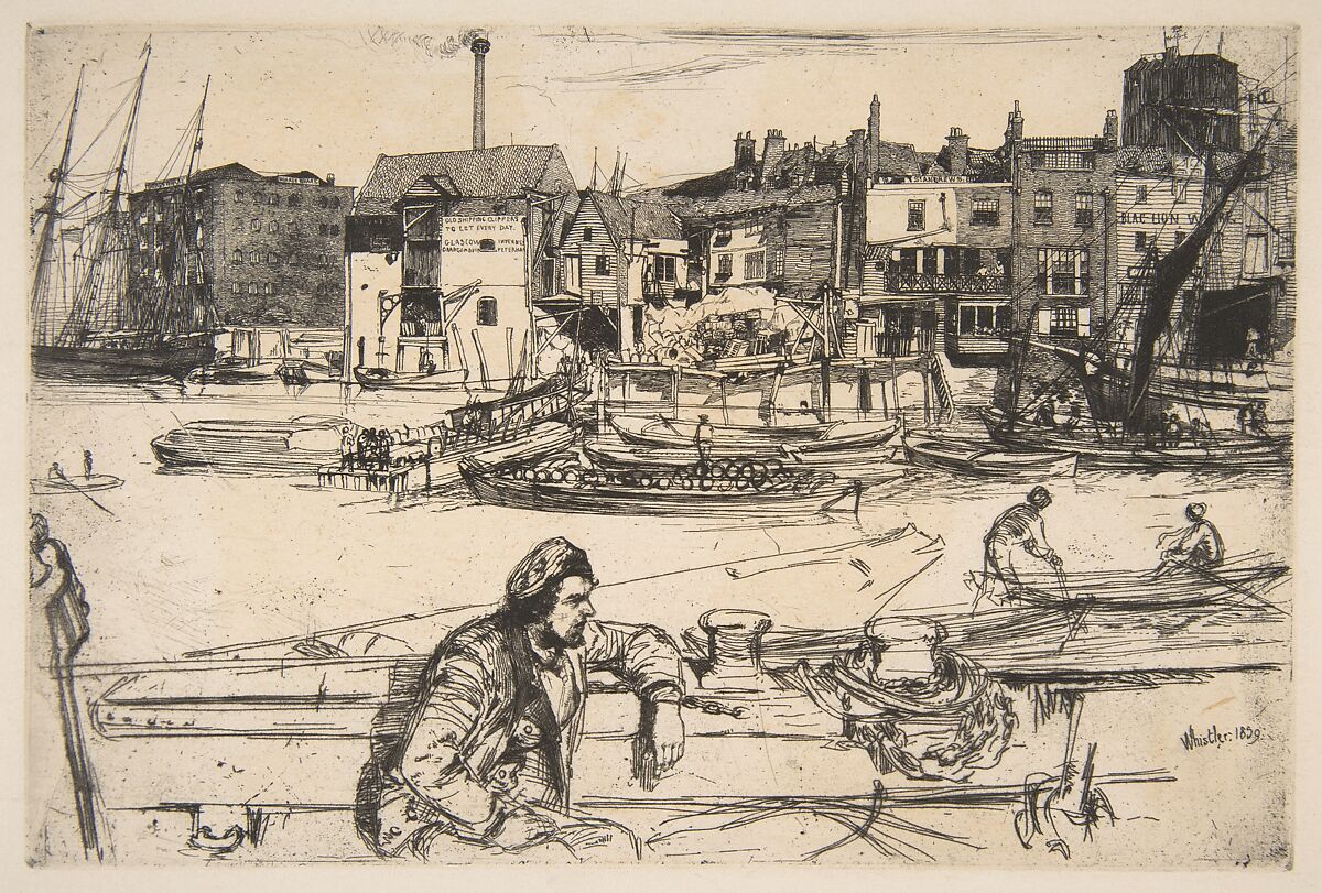
James McNeill Whistler was one of the nineteenth century's most searching printmakers. Across almost fifty years he used etching, drypoint, occasional mezzotint, lithography and lithotint to investigate line, tone, paper, pressure and repetition. A copper plate or lithographic stone allowed an image to be printed more than once, but repetition did not guarantee sameness. Whistler altered matrices, changed ink and wiping, selected papers and worked with specialist printers so that two impressions of the same subject can differ materially and visually. [1][4][5]
That variability is the beginning of understanding his prints. The etched plate is not the printed sheet. A state records a stage in the matrix's development. An impression is one pull from that state. An edition is an organised group of impressions, sometimes made over a long period and sometimes supplemented after Whistler's death. Titles and catalogue numbers identify the design, while paper, ink, signature, dimensions, printer, provenance and condition identify the particular object in front of us.
Whistler's print career crosses several familiar geographical groups. The French Set emerged from travel in 1858. Thames plates made around 1859–61 brought working London and Chelsea into exact linear structures before publication as a set in 1871. Venice, beginning in 1879, transformed both plate work and printing through small canals, doorways, palaces, shop interiors and lagoon atmosphere. Amsterdam and late European subjects returned to dense architecture with extraordinary freedom. Lithography, first explored around 1878, opened another route through transfer drawing, tonal wash, domestic interiors and collaboration with the Way printing firm. [4][5][6]
Prints also expose the weakness of a paintings-only account of Whistler. Etching stood near the start of his professional formation and remained active through his last decades. Lithographs include intimate images of Beatrix Whistler, family and friends as well as streets, coasts and publication designs. The printed oeuvre is not a secondary stream of illustrations after oils. It is a changing body of original objects in which drawing, manufacture and connoisseurship meet.
At a Glance
- CareerAlmost fifty years of printmaking
- IntaglioEtching, drypoint and occasional mezzotint
- Planographic mediaLithography, lithotint and colour lithography
- Etching catalogueGlasgow G numbers
- Lithograph catalogueSpink, Stratis and Tedeschi numbers
- Key distinctionMatrix, state, impression and edition are separate
- Major groupsFrench, Thames, Venice and Amsterdam
- Printing variablesInk, wiping, pressure, paper and printer
- Key objectBlack Lion Wharf, G.54, state IV/IV [7]
- AuthenticationExact impression evidence, not a signature alone
Contents
- Original Print or Reproduction?
- The Vocabulary of a Whistler Print
- Etching, Drypoint and the Copper Plate
- Ink, Wiping and the Printed Surface
- Paper, Chine Collé and the Shape of the Sheet
- The French Set: Travel, Realism and Publication
- The Thames Set and the Working River
- Venice: Plate, State and Impression as Creative Fields
- Amsterdam and the Late Etchings
- Lithography: Drawing for a Different Matrix
Original Print or Reproduction?
An original Whistler print comes from a matrix involved in his artistic production: an etched or drypointed copper plate, a lithographic stone, or a transfer drawing moved to stone under a documented process. The resulting sheet belongs to a plate or lithograph history. A modern poster, giclée, photograph or canvas copy reproduces the appearance of another object. It may be useful or attractive, but it is not an original etching or lithograph by Whistler.
The distinction does not rest on quantity. An original lithograph can have a published edition of thousands, as The Doctor did in a periodical context, while a later photographic reproduction may be limited artificially to a small numbered run. Conversely, some Whistler lifetime proofs survive in very few impressions. Edition size can affect rarity, but it does not decide whether the image was created as a print. [4][11]
Language on sales pages often obscures this boundary. “Art print”, “museum-quality print” and “limited edition” can describe reproductions without naming the process or matrix. A reliable record identifies etching, drypoint, lithograph or lithotint; gives a catalogue number and state; describes ink and paper; supplies sheet and matrix dimensions; and traces the impression's history. If those fields are absent, a familiar title or butterfly mark is not enough.
Digital images add another layer. A museum scan of an authentic impression is a reproduction of that impression, not a new example of the original edition. It can reveal line and inscriptions exceptionally well, but it cannot reproduce paper weight, plate indentation, ink relief, scale or all tonal variation. The original object and its accessible image should be related without being confused.
Whistler himself cared intensely about printing quality and presentation. That care makes generic reproductions particularly misleading when they flatten plate tone, enlarge a small image or whiten a warm sheet. The issue is not that reproductions are forbidden. It is that their function must be stated honestly.
The Vocabulary of a Whistler Print
The matrix is the prepared surface that carries the printable image. In intaglio processes, ink sits in incised or bitten recesses of a metal plate and transfers under strong pressure to dampened paper. In lithography, greasy drawing material and chemical preparation make image and non-image areas respond differently to ink on a flat stone or related surface. The two systems can produce superficially similar black lines, but their manufacture is fundamentally different.
A plate can change. Whistler might add line, deepen an area, remove material, alter a signature or otherwise revise copper between printings. Each documented configuration is called a state. State numbering belongs to a catalogue system and may change when research identifies a previously unknown sequence. A statement such as “fourth state of four (Glasgow)” is therefore more exact than “final state”. [1][7]
An impression is the individual printed sheet. It records the state of the matrix at one printing but also carries choices made at the press: ink colour and consistency, wiping, residual tone, paper, moisture and pressure. Two impressions printed from an unchanged plate can still look different. Provenance, inscriptions, trimming and condition continue their divergence after printing.
A proof is an impression used or retained outside a formal published edition, often to test or demonstrate the image. The term does not guarantee superior beauty or that Whistler printed it personally. A published edition is a production and distribution event, not just a number written on paper. Later or posthumous printings need separate dates and printers even when they use an original matrix.
Census evidence matters. The Glasgow etchings catalogue lists located impressions in public and private collections, while the Art Institute's lithograph catalogue records known sheets, states, papers, printers and publication contexts. A count is always a count of what has been found and accepted, not proof that no other impression survives. [1][4]
Etching, Drypoint and the Copper Plate
For an etching, the copper plate receives an acid-resistant ground. The artist draws through that ground with a needle, exposing metal without necessarily cutting deeply into it. Acid bites the exposed lines. After cleaning, the plate is inked; its surface is wiped while ink remains in the recessed network; damp paper and heavy press pressure draw the image from those recesses.
Etching can combine quick drawing with delayed revision. A line scratched through ground may feel immediate, but biting, proofing, stopping out, reworking and printing unfold across stages. Whistler could begin before a motif, develop the plate later and use states to adjust emphasis. The method offered both mobility and control. [1][5]
Drypoint dispenses with acid for the drawn line. A sharp tool cuts directly into copper and raises a burr along the incision. That burr holds ink, producing a softer, richer edge than a clean etched groove. Pressure at the press gradually wears it, so early and later impressions can differ even if the design is not deliberately changed. Whistler used drypoint alone and with etching, particularly for figures, portraits and tonal accents. [1][5]
The medium line should follow the exact record. Calling every incised Whistler print an etching erases the behaviour of drypoint. Calling a combined plate pure drypoint loses the bitten structure beneath its softer additions. Mezzotint and roulette appear more rarely and should be named only where catalogue examination supports them.
The plate mark—the indentation made as plate and paper pass through the press—can help identify intaglio, but it is not an authenticity certificate. A sheet may be trimmed inside or close to the mark. Photomechanical processes can imitate edges. Condition or mounting can make the indentation hard to see. Catalogue, image, paper, dimensions and provenance must agree.
Ink, Wiping and the Printed Surface
Inking determines how the engraved network becomes visible. The printer pushes ink into the recesses, then wipes the plate's surface. A clean wipe leaves line against the paper. Selective residual ink creates plate tone, veils, darkness or transitions that are not cut into copper. Whistler increasingly used wiping as an expressive resource, especially in Venice. [1][5]
Plate tone is neither dirt nor automatically the artist's hand. It can be deliberate, accidental or altered by later handling. Catalogue descriptions and comparison among impressions reveal whether a pattern recurs or changes. Where documentation identifies a printer, that person's judgement belongs to the production history, even if Whistler directed the desired effect.
Ink colour also matters. Black, warm black, brownish black and other recorded tones shift the relation to paper. A warm ink on ivory Japanese paper creates a different field from sharp black on bright wove stock. Digital photography often neutralises those distinctions. Exact holder descriptions provide a safer starting point than screen colour alone.
Wiping can make a print approach the singularity of a monotype, but the comparison has limits. The plate still carries repeatable incisions. Whistler's varied inking changes the atmosphere and emphasis of each pull without dissolving its relation to the matrix. The combination of fixed and variable information is central to his achievement.
Pressure and moisture complete the event. Damp paper becomes flexible enough to enter the recesses. Too much or too little pressure affects transfer and embossing. Paper surface changes how ink sits and spreads. Printing is therefore not a neutral release button after the artist has finished drawing.
Paper, Chine Collé and the Shape of the Sheet
Whistler chose papers for colour, texture, weight and association. He valued old laid sheets and Japanese papers whose warm tones and fibres altered the print's atmosphere. Watermarks can help identify batches or dates, but a watermark alone does not authenticate an impression. The paper may predate printing by decades, or the same stock may be used at different times. [4][8]
Laid paper shows the linear pattern created by its mould; wove paper has a more even network. Japanese papers vary greatly in thickness, fibre and colour rather than forming one uniform category. Very thin sheets can take delicate lines with extraordinary clarity. Their material description should be retained instead of compressed to “paper”.
Chine collé uses a thin printing sheet attached to a larger support during the press operation. It can provide a smooth or coloured image field while the backing gives strength. The French Set contains examples printed on coloured chine. The composite object should not be mistaken for later mounting merely because one sheet sits upon another. [5]
Whistler sometimes preferred old papers with stains, foxing or patina that printers considered defective. His choices reveal how age and irregularity could become aesthetic resources. They also create conservation and authentication problems: genuinely old paper does not prove a Whistler printing, while subsequent discolouration can be confused with intended tone. [8]
Venice impressions were often trimmed close to the plate line, leaving a small tab for the pencilled butterfly. This presentation concentrates attention on image and paper colour. It is characteristic rather than universal. A full untrimmed sheet is not automatically wrong, and a tabbed counterfeit is not automatically right. [5]
The French Set: Travel, Realism and Publication
Whistler learned practical etching during the 1850s, after exposure to mapping and plate work at the United States Coast Survey. In 1858 he travelled through northern France, Luxembourg and the Rhineland, drawing directly onto copper plates and biting them under improvised conditions. The resulting Douze eaux-fortes d'après nature, or Twelve Etchings from Nature, became known as the French Set. [1][5]
The group combines weathered buildings, streets, landscapes and portraits. Its claim to be “from nature” does not mean automatic copying. Whistler selects façades, crops views and uses line density to distinguish material. Workers and local inhabitants connect the plates to contemporary Realism, while the variety of subjects prevents the set from becoming a single travel panorama.
Auguste Delâtre printed the first sets in Paris and then worked with Whistler and Francis Seymour Haden in London on further impressions. Printer, paper and publication therefore belong inside the history. The prints established Whistler's professional identity before his mature oil style was secure. [5]
The set also demonstrates why plate date and impression date differ. A plate made in 1858 can be printed in a later campaign, from a later state or on different paper. An institution's object record describes its own sheet; it should not be copied as if every impression shares those characteristics.
The Thames Set and the Working River
After moving to London in 1859, Whistler worked around the wharves and warehouses of the Pool of London. Rigging, balconies, shop signs, brick, timber and people fill the early plates. The density belongs to an international commercial river rather than a picturesque retreat. Quieter Chelsea subjects later broadened the group. [1][5]
Many plates date from 1859–61, but the portfolio of sixteen Thames scenes and other subjects did not appear until 1871. Calling every sheet an “1871 etching” confuses production with set issue. Exact plate and impression records preserve the longer history.
Black Lion Wharf provides a precise example. The Met's impression is an etching printed in black ink on extremely fine cream Japan paper, the fourth state of four in the Glasgow system. The plate dates to 1859, while the Thames Set publication followed in 1871. Its plate measures 15 by 22.1 centimetres; the surviving sheet is larger. [7]
The composition combines detailed distant warehouses with broadly treated nearer forms. Cropping and spatial divisions have been compared with Japanese prints and photography. Such comparisons are useful when anchored in the plate's exact arrangement; they should not replace the social and architectural specificity of the wharf. [5][7]
Whistler later included an image of Black Lion Wharf on the wall in Arrangement in Grey and Black, No. 1. That self-reference connected printmaking, collecting and portrait interior. It did not transform the etching into a preliminary study for the oil. [7]
Venice: Plate, State and Impression as Creative Fields
The Fine Art Society sent Whistler to Venice in September 1879 expecting twelve etchings after a short stay. He remained for roughly fourteen months and made about fifty plates. He chose not only celebrated monuments but bead-stringers, doorways, minor canals, dark interiors, palace fronts and lagoon distances. The city became a structure of thresholds, reflections and human scale. [1][5]
The First Venice Set, Venice, a Series of Twelve Etchings, was published by the Fine Art Society in 1880. The Second Venice Set, A Set of Twenty-six Etchings, was issued by Dowdeswell and Thibaudeau in 1886 and included some English subjects. Neither set equals the whole Venetian plate corpus, and the number of plates made must not be used as the edition size. [1][5]
Whistler revised many plates through numerous states. The Doorway, for example, has an exceptionally extended sequence in the Glasgow catalogue. Figures, shadows and architectural emphases change, making state a record of thought rather than a ladder towards one inevitably superior finish. A collector needs the state of a specific impression before discussing what Whistler included.
Inking creates further variation. Selective plate tone can darken an interior, float a façade in haze or distribute reflection across water. A richly wiped impression and a cleanly printed one from the same state may support different visual readings. Neither should be used to describe the entire plate without qualification.
Whistler printed Venice plates over a prolonged period as he worked to fulfil editions. A set gathered today may contain impressions printed at different times, and a museum can own several examples of one state. The edition is thus a production history, not one simultaneous event.
The 1883 exhibition of Venetian etchings, designed as an arrangement in white and yellow, joined trimmed sheets, slender frames, wall colour and spacing. Presentation asked viewers to approach small differences closely. The prints' material refinement and the room's Aesthetic design reinforced one another without making every impression visually identical. [5][13]
Amsterdam and the Late Etchings
Whistler continued to etch after Venice, finding subjects in London, Brussels, Paris and coastal towns. Shopfronts, doorways and narrow streets retained his interest in thresholds and built surfaces. The later plates are not an afterthought to the famous sets. They test how dense line and selective tone can coexist with the economy of his mature work. [1][5]
In 1889, after his marriage to Beatrix, Whistler worked in Amsterdam. Canal houses offered patterned brick, windows, water and interior glimpses at close range. Plates such as The Embroidered Curtain develop layered surfaces without returning simply to the descriptive density of the early Thames. Detail is organised into a shifting screen through which space remains active.
The Amsterdam works often survive in multiple states and differently wiped impressions. Whistler considered them major achievements, but his own enthusiasm is historical evidence rather than an instruction that every viewer rank them above Venice. Their importance can be demonstrated through the matrices, sheets and decisions rather than reputation alone. [1][5]
Late printing also raises chronology questions. A plate may have been drawn during travel, altered elsewhere and printed across later years. Titles can shift with exhibitions or catalogues. Location and plate date should therefore be separated from impression date and publication history.
The Hunterian's preserved copper plates make this extended process unusually tangible. A plate is an object with scratches, corrosion risks, cancellations and wear, not merely a transparent carrier of the image. Comparing matrix and impression can show both what intaglio reverses and what wiping adds. [2]
Lithography: Drawing for a Different Matrix
Lithography works through the incompatibility of grease and water on a flat prepared surface. The artist draws with greasy crayon or tusche; chemical processing establishes image and non-image areas; the dampened stone rejects oily ink outside the drawing while accepting it where intended. Paper receives the ink under pressure without the recessed plate mark characteristic of intaglio.
Whistler began experimenting with lithography around 1878–79. The medium suited his ability to draw rapidly, but production required materials and expertise distinct from etching. He worked especially closely with Thomas Way's London firm, where Thomas Robert Way supervised much printing and later catalogued the lithographs. Their knowledge of stones, papers, transfer and presswork was integral to the results. [4][6][9]
The word “original” does not mean Whistler alone performed every operation. He could create the image and direct its development while a printer prepared, transferred and pulled it. Authorship in printmaking includes collaboration under documented artistic control. Erasing the printer makes the object harder to understand; treating the printer as a mechanical servant is equally misleading.
Direct lithography is drawn on the stone. Transfer lithography begins on specially prepared paper and moves the greasy image to stone. Transfer paper allowed Whistler to work away from a printing shop—in a hotel, domestic room or street-facing interior—then send the drawing to Way. The transferred mark could be revised on the stone, so the original drawing and printed image are related but not necessarily identical. [4][9][10]
The paper's surface affected the printed line. Coarse-grained transfer stock could simulate the texture of a stone; smooth transparent paper allowed delicate marks and tracing. Material supply and correct transfer were technical problems, not invisible preliminaries. A catalogue entry that names the transfer paper preserves part of the drawing process. [4][9][10]
Lithotint, Tone and Colour
Lithotint uses liquid tusche and related wash methods to create tonal fields on the stone. Its appearance can resemble watercolour, but it is a printed lithographic process. Scraping, stopping and manipulation of the ground can establish lights and textures. The final impression is ink on paper, not the original wash drawing. [4][6]
Whistler used lithotint for nocturnal, foggy and interior effects whose broad tone differs from crayon line. The printer had to preserve delicate gradations through processing and printing. Paper absorbency and ink load could strengthen or lose the lightest veil. Collaboration with the Ways was especially important where a tonal image risked collapsing into flat darkness.
Colour lithography required multiple stones or matrices aligned in register. Each colour introduced another printing and another opportunity for misalignment. Draped Figure, Standing went through four states and uses changing coloured inks, registration marks and work by the printer Belfond. A colour lithograph is therefore not a hand-coloured black print unless its catalogue specifically says so. [12]
Whistler's colour lithographs remain relatively limited in number, but they demonstrate his willingness to let process alter composition. A new state can expand the image field, add colour or adjust relations rather than merely repair a mistake. Exact state descriptions are essential when reproductions combine or mislabel variants.
Lithotint and colour also complicate the idea that printmaking is primarily black line. Whistler treated monochrome, tone and separate colours as different systems. The shared goal was not imitation of oil or watercolour but control of relation within the possibilities of the printed sheet.
Transfer, Proof and Publication
The Art Institute's digital catalogue reveals how varied a lithograph's production could be. Kensington Gardens, catalogue 140, was drawn in 1896 on white transfer paper with a grained-stone texture. It has one state, was printed by Way and survives in rare lifetime impressions. After Whistler's death, Frederick Goulding printed a further group in 1904 before the stone was erased. Lifetime rarity and posthumous quantity therefore belong to different statements. [10]
The Doctor, catalogue 110, exposes another distinction. Whistler drew it on thin transparent transfer paper. Way printed proofs, but the image also appeared in The Pageant with a large-paper edition of 150 and a regular edition of about 3,000. A signed proof and a periodical impression belong to the same design while differing in paper, context, rarity and sometimes handling. [11]
An “only state” does not mean only one impression. It means the printable image is not known to have undergone a catalogued change. Conversely, several states do not tell us how many sheets were pulled from each. Catalogue entries separate state, impression counts attributed to Way, located examples and later editions precisely because these are different kinds of evidence. [4][10][11]
Publication can give a print a new audience. An image issued in a book or periodical circulates differently from a proof sold through a gallery. Trimming, inscriptions and surrounding typography may change. The publication itself should be identified rather than treating every sheet as an isolated fine-art proof.
Stones could be erased and copper plates cancelled to prevent further printing, but the timing must be documented. A posthumous printing from an uncancelled original matrix remains materially different from a photographic reproduction, yet it is not a lifetime impression. Clear terminology makes that distinction without pretending all posthumous pulls have the same quality.
Portraits, Interiors and Travel in Lithography
Whistler's lithographs extend the intimate side of his work. Figures read, sew, rest by a fire or sit during illness. Beatrix Whistler and Rosalind Birnie Philip appear within a production history that includes domestic observation, transfer papers, correspondence with printers and exhibition. These images deserve biographical care without being reduced to illustrations of private life. [4][9]
Interiors suit lithographic tone. Firelight, bed curtains, walls and shadow can emerge from crayon or wash without a complete inventory of furniture. Transfer paper made it possible to work near the subject, while the later stone and proof introduced distance and revision. Apparent intimacy is produced through an industrial chain.
Travel subjects include streets, gardens, coasts and market towns. Kensington Gardens probably originated from the view near Whistler and Beatrix's London lodging. Other transfer lithographs were drawn in Lyme Regis, Brittany or France. The ability to carry paper rather than stone expanded the geography of the medium. [4][10]
Publication brought a further set of relations. A lithograph within a magazine might sit beside poetry, essays or decoration. Whistler designed flags and catalogues for print exhibitions, connecting individual sheets to public presentation. The boundaries among fine print, illustration and graphic design were negotiated rather than fixed.
The domestic subjects also correct the heroic image of solitary manufacture. Printers, publishers, sitters, family members, dealers and paper suppliers all leave evidence in the catalogue. Whistler's decisions remain central, but they happened through people and materials.
Signatures, Butterflies and Authentication
Whistler's butterfly can be drawn in the image, printed from the matrix, added in pencil on a tab or used on a mount. Its form changed, and some impressions are unsigned. A genuine butterfly helps document presentation when it matches the work's history; it does not validate a sheet by itself.
Pencil signatures require examination of placement, handwriting, paper and provenance. Dealers, collectors and later hands also wrote on prints. An inscription may record a gift, printer, state or title without being by Whistler. Catalogue and collection records distinguish these layers wherever possible.
Trimming deserves similar restraint. Venice impressions cut close to the plate line with a signature tab are strongly associated with Whistler's chosen presentation. Yet not all authentic prints were treated that way, and later owners may have altered margins. Plate and sheet dimensions should be compared with a specific state and known impressions.
Paper age, watermark, plate mark, edition number and a familiar image are pieces of evidence, never a stand-alone test. Authentication may require connoisseurship, fibre or watermark study, comparison with catalogued states and a defensible chain of ownership. A general article cannot certify an object from a photograph.
Collectors should also distinguish authenticity from quality and condition. An authentic late impression from a worn drypoint plate may lack the burr of an earlier pull. A richly inked sheet may have stains or repairs. A beautiful impression can be unsigned. These judgements intersect but should not be collapsed.
Collections, Condition and Responsible Comparison
Large public collections make impression-level comparison possible. The National Gallery of Art indexes hundreds of works by Whistler across media, while the Hunterian preserves prints alongside copper plates and studio materials. The Met and Art Institute publish precise object and catalogue records. No one collection supplies every state or printing, so research often depends on moving among their records. [1][2][3][4]
Institutional breadth should not be mistaken for uniform online detail. One record may specify ink, watermark and state; another may give only process and dimensions. A catalogue raisonné can add plate history, but the current holder remains the authority for accession, ownership and the condition of its sheet. If the two sources use different titles or state systems, both descriptions and their dates need reconciliation.
Condition changes how an impression reads. Drypoint burr can be worn at printing, then weakened further by abrasion. Paper may be foxed, stained, bleached, backed, washed or trimmed. Tears and losses can be repaired so skilfully that a digital image hides them. Ink can appear colder or warmer under different lighting. A comparison of “best impressions” is unreliable unless condition and photography are considered.
Mounting has its own history. Hinges, pasted corners and old collector mounts can preserve provenance while causing distortion or staining. Removing a print from a historic album may reveal a verso mark but destroy evidence of sequence. Museum conservation balances access, stability and documentary value rather than returning every sheet to an imagined pristine state.
Online comparison is still transformative. A researcher can place several states beside one another, enlarge fine changes and trace impressions across collections. The method works best when images remain tied to record fields. Downloading pictures into an unlabeled folder recreates the very confusion that catalogues solve.
For private ownership, attribution and valuation require specialist examination. A general visual resemblance cannot identify paper, distinguish a lifetime impression from a later pull or establish that ink belongs to the claimed state. Auction language should be checked against the current catalogues, and material claims should be supported by direct examination rather than optimism.
Responsible comparison is therefore descriptive before it is competitive. State what each sheet is, how it was printed, what has happened to it and what remains uncertain. Only then compare line, tone, paper and effect. Whistler's variability rewards that discipline because difference is often the artistic evidence.
Collector marks can strengthen this history. A small stamped device on the verso may connect a sheet to a documented owner, sale or institutional transfer. The mark is evidence of custody, not part of Whistler's printed design, and it can itself be copied or misread. Exhibition labels and old inventory numbers work similarly. When recorded together, these traces may explain why an impression appears in an early catalogue, disappears into a private collection and later reaches a museum. They can also reveal that photographs published under one title represent a different sheet from the example now being discussed. Provenance is most persuasive as a continuous, checked sequence rather than a list of prestigious names.
How to Look at a Whistler Print
Start with the exact object, not the subject name. Confirm the process, catalogue number, state, date of matrix, probable printing date, ink, paper, plate or image dimensions, full sheet dimensions, printer, signature and accession. If the record provides only “print”, the identification is incomplete.
Next find the fixed information. In an etching, follow bitten line; in drypoint, look for softer burr where it survives. In lithography, distinguish crayon texture from wash-like lithotint. Compare the exact state with another if the catalogue illustrates the sequence.
Then examine printing variables. Is the plate wiped clean or left with tone? Does ink collect at an edge or form a veil? How does warm, thin or textured paper modify contrast? The same design can support different atmospheres through these choices.
Read the margins and reverse. A tab, pencil butterfly, printer's annotation, collection stamp, watermark or old hinge can help trace history. None should be isolated from the whole record. Damage and later mounting may obscure original presentation.
Finally, view at actual scale if possible. Online enlargements make minute plates look monumental and can exaggerate line thickness. Whistler's prints often reward close physical attention because their tones and paper differences are small. Dimensions restore the relation between eye, hand and sheet.
A Route Through Whistler's Prints
Begin with the Coast Survey and French Set to see etching used for formation, travel and Realist subject matter. Compare clean line, chine collé and Delâtre's printing across different impressions. This establishes that original printing was collaborative from the start.
Move to the Thames Set through Black Lion Wharf, The Lime-Burner and related plates. Separate dates of plate making from the 1871 publication, and compare working wharves with quieter Chelsea reaches. Cropping and spatial division become more legible when the physical river remains present.
Venice should be explored by plate and then by impression. Use the First and Second Sets as publication histories, not containers for all Venetian work. Compare states of The Doorway and differently wiped pulls of lagoon or palace subjects to see how fixed line and variable tone interact.
Continue to Amsterdam and late streets for dense pattern, then change process. In lithography, compare crayon transfer, lithotint and colour. Kensington Gardens, The Doctor and Draped Figure, Standing demonstrate three very different relations among drawing, edition, printer and state.
End with paper and provenance. The route from matrix to current museum is part of the work. A print becomes clearer when design, manufacture, distribution, collecting and conservation are read together.
Frequently Asked Questions
A state is a documented stage in a plate or lithographic image after a physical change to the matrix. Several impressions can be printed from one state, and their inking and paper may still differ.
An impression is one printed sheet. An edition is an organised group printed for issue, sometimes across a long period. A design can also survive in proofs, later editions and posthumous printings.
It may be printed from an original matrix, which distinguishes it from a photographic reproduction, but it was not made during Whistler's lifetime. Printer, date, edition and matrix condition must be stated rather than hidden.
No. Butterflies can be printed, drawn or added in pencil, and genuine impressions may be unsigned. Authentication depends on catalogue agreement, state, paper, dimensions, provenance and expert examination.
Usually not unless they can be tied to a documented original matrix and recognised printing history. A numbered digital or photomechanical reproduction remains a reproduction even when its edition is small.
Discussion
Which material difference most changes how you read a Whistler print?
Consider state, wiping, ink, paper, scale, printer or condition.
Reader Insights
Which marks belong to the plate or stone?
Where do wiping and paper make this sheet distinctive?
Which catalogue and provenance fields identify the object?
Join the Conversation
Share a close observation or a question for other readers.
References
- Margaret F. MacDonald, Grischka Petri, Meg Hausberg and Joanna Meacock, James McNeill Whistler: The Etchings, a Catalogue Raisonné, University of Glasgow. https://www.etchings.arts.gla.ac.uk/catalogue/
- The Hunterian, University of Glasgow, “Whistler Collection”. https://www.gla.ac.uk/whistler/hunterian/
- National Gallery of Art, Washington, “James McNeill Whistler”. https://www.nga.gov/artists/1974-james-mcneill-whistler
- Nesta R. Spink, Harriet K. Stratis and Martha Tedeschi, The Lithographs of James McNeill Whistler: The Digital Edition, Art Institute of Chicago. https://publications.artic.edu/digitalwhistler/reader/lithographs
- Constance C. McPhee, “James McNeill Whistler (1834–1903) as Etcher”, Heilbrunn Timeline of Art History, The Metropolitan Museum of Art. https://www.metmuseum.org/essays/james-mcneill-whistler-18341903-as-etcher
- Douglas W. Druick, “Art from Industry: James McNeill Whistler and the Revival of Lithography”, Art Institute of Chicago. https://publications.artic.edu/whistlerart/sites/publications.artic.edu.whistlerart/files/file_assets/Whistler-theRevivalofLithography.pdf
- The Metropolitan Museum of Art, “Black Lion Wharf”, 17.3.35. https://www.metmuseum.org/art/collection/search/372506
- Art Institute of Chicago, “Whistler's Papers: Their Appearance, Selection, and Use”. https://publications.artic.edu/digitalwhistler/reader/lithographs/section/570
- Art Institute of Chicago, “Whistler, Way, and Wellington Street”. https://publications.artic.edu/digitalwhistler/reader/lithographs/section/339
- Art Institute of Chicago, “Kensington Gardens”, catalogue 140. https://publications.artic.edu/digitalwhistler/reader/lithographs/section/504
- Art Institute of Chicago, “The Doctor”, catalogue 110. https://publications.artic.edu/digitalwhistler/reader/lithographs/section/472
- Art Institute of Chicago, “Draped Figure, Standing”, catalogue 46. https://publications.artic.edu/digitalwhistler/reader/lithographs/section/404
- H. Barbara Weinberg, “James McNeill Whistler (1834–1903)”, Heilbrunn Timeline of Art History, The Metropolitan Museum of Art. https://www.metmuseum.org/essays/james-mcneill-whistler-1834-1903


