
 by Tom Gurney
Tom Gurney BSc (Hons) is an art history expert with over 20 years experience
Published on June 19, 2020 / Updated on November 6, 2026
Email: tomgurney1@gmail.com / Phone: +44 7429 011000
Overview
James McNeill Whistler's works on paper are not a shadow archive behind the oil paintings. They include quick notations, sustained figure studies, designs, records sent in letters, preparations for other works and sheets conceived for exhibition and sale. Pencil, ink, chalk, charcoal, Conté crayon, coloured pencil, pastel, watercolour and gouache could appear alone or in combination. The support might remain largely visible or carry several layers of colour. “Drawing” is therefore a useful route name, but not a sufficient description of the objects gathered within it.
The University of Glasgow's online resource lists more than 1,700 watercolours, pastels and drawings alongside its catalogue of about 550 oil and mixed-media paintings. That scale changes the familiar image of Whistler. A career dominated in popular memory by a few portraits and nocturnes becomes one sustained by portable sheets, sketchbooks, coloured papers and experiments across media. The online list updates Margaret F. MacDonald's 1995 catalogue raisonné, retains its numbers and adds or corrects records as evidence develops. [1][2]
Works on paper also demand a different kind of looking. A passage left untouched can be an active colour and shape rather than an omission. A rough brown paper can grip pastel and provide the middle tone of a Venetian view. Transparent wash may sink into a light sheet, while opaque gouache places a figure or highlight over it. A dark support can make a few pale marks unusually forceful. Scale matters: some sheets concentrate a complete pictorial relation within an area smaller than a book page.
At the same time, economy should not be romanticised. Not every sparse drawing is a finished masterpiece, and not every mark that appears spontaneous was the product of seconds. Catalogue identity, purpose, material sequence, exhibition history and condition are necessary before deciding what “finished” means. Whistler's art benefits from close attention precisely because its apparent ease is often the result of selection.
At a Glance
- Catalogue scopeMore than 1,700 works on paper [1]
- Catalogue prefixM.
- MediaGraphite, ink, chalk, pastel, watercolour and gouache
- PaperColour, texture and tooth actively shape the image
- Venice pastelsFinished exhibition works, 1879–1880 [9]
- Key objectLady in Gray, M.0933 [5]
- ConservationLight exposure and friable media require care
- ScaleOften small, portable and materially concentrated
- Primary catalogueUniversity of Glasgow [1]
- Related practicePainting, etching and lithography
Contents
- What the Works-on-Paper Catalogue Records
- Early Drawing and the Discipline of a Line
- Study, Record, Design or Independent Work?
- Paper Is Part of the Image
- Pastel: Colour Held on the Surface
- Venice and the Pastel as an Exhibition Work
- Watercolour, Gouache and the Strength of a Small Sheet
- *Lady in Gray*: A Work on Paper, Not an Oil
- Figures, Drapery and Movement
- Landscape, Coast, Street and Shopfront
What the Works-on-Paper Catalogue Records
MacDonald's catalogue numbers are the most dependable keys for this part of Whistler's work. They distinguish sheets whose titles changed, subjects recur or media descriptions resemble one another. The Glasgow summary catalogue records date, collection, medium, support, size, lifetime exhibitions, updated provenance and a concise bibliography. Added works may receive letters after a number so that the established sequence remains usable. [1][2]
This system is related to the YMSM numbers used for paintings, but it is not interchangeable with them. YMSM identifies the authors of the foundational paintings catalogue; the drawings, pastels and watercolours use MacDonald's separate numbering. The distinction matters when a subject exists in several forms. A figure may appear in pencil, pastel, watercolour, print and oil, each with its own physical history. Shared subject matter does not turn those objects into versions of one catalogue entry.
Titles need equal care. Whistler and exhibition organisers used notes, harmonies and colour combinations across media. A historical title may describe costume or effect rather than identify a sitter. Later cataloguers sometimes supplied descriptive titles when none was secure. Search results can then place two similarly named sheets together without proving that they represent the same person, site or moment. Number, image, dimensions, medium, support and holder should be compared before a title is trusted.
A sheet may also have two active sides. Recto and verso descriptions are not incidental when Whistler reused paper or explored different subjects on opposite faces. Mounting can hide one side; an older catalogue or photograph may record a state of access that has since changed. A responsible object page says which face it discusses and does not silently treat the entire sheet as a single frontal image.
Collection history affects what can be studied. The Hunterian holds more than 800 artworks by Whistler, including over one hundred pastels, about 120 drawings and watercolours and fourteen sketchbooks, as well as materials and tools. That concentration comes largely through Rosalind Birnie Philip's gifts and bequest from Whistler's estate. It allows sheets, studio materials and documentary evidence to be examined together, but it does not make Glasgow the only authority. The Freer, National Gallery of Art, Metropolitan Museum, Frick and other collections preserve different strengths and current object records. [3][7]
Early Drawing and the Discipline of a Line
Drawing entered Whistler's formation before his permanent move to Europe. Childhood instruction in Saint Petersburg, classes connected with the Imperial Academy and later teaching at West Point gave him different versions of disciplined observation. At the United States Coast Survey he encountered mapping, measured information and reproductive processes. None of these settings predetermined his mature style, but they made line a practical instrument as well as an artistic one. [14]
Early sheets can therefore be evidence of education, travel or working method without being autonomous exhibition pieces. Copies after other artists record acts of study. Topographical drawings test the placement of buildings, shorelines and vessels. Figure studies examine pose, weight or costume. Compositional sketches may isolate a relation later developed in an oil. Their value does not depend on pretending that Whistler intended every one to be displayed.
The line itself changes according to task and material. Graphite can be light, erasable and precise. Pen and ink produces a more decisive edge and may combine writing with image. Chalk or charcoal permits broader pressure, rubbing and tonal mass. Coloured pencil and crayon can locate an accent without building a complete field. The word “drawing” names an activity that crosses these behaviours, not one uniform appearance.
Whistler's early Realist interests also complicate the later legend of pure atmosphere. Drawings made around French and Thames subjects attend to irregular buildings, working sites, clothing and individual bodies. Detail may be abbreviated, but it is selected from material circumstances. The same artist who later placed a few strokes across a wide sheet had first learned to organise dense visual information.
Sketchbooks preserve this process in sequence. A bound book links pages through movement, return and opportunity even when the subjects vary. Removing one leaf from that sequence can make it appear more self-contained than it was. Conversely, the presence of a drawing in a sketchbook does not make it aesthetically negligible. A turn of the page can reveal an exact decision about contour or interval that a larger work expands.
Study, Record, Design or Independent Work?
The old division between preparatory drawing and finished painting is particularly unhelpful for Whistler. Some works on paper clearly prepare a pose, composition or decorative element. Others record an existing painting, perhaps for a letter or practical discussion. Still others test a butterfly signature, catalogue cover, flag, frame or exhibition device. Watercolours and pastels could be shown and sold as complete works. These functions overlap, and the physical sheet has to arbitrate among them.
A direct visual resemblance to an oil is not enough to call a drawing its study. Dates may not align; the drawing may copy the painting afterwards; or both may develop from a separate observation. Catalogue research uses provenance, inscriptions, paper, technique, letters and exhibition history to establish the most plausible relation. When that relation remains uncertain, “related to” is more accurate than “preparatory for”. [1][2]
Whistler also used drawing within communication. Small sketches in letters could explain a work, mock a critic, direct an installation or enliven a personal message. Their union with handwriting is part of their meaning. Cropping the image away from the document can erase addressee, date and rhetorical purpose. The drawing may still be visually inventive, but it should not be detached from the exchange that produced it.
Design crosses another boundary. Whistler's butterflies, title-page devices, invitations and exhibition graphics translate drawn form into reproducible or environmental use. Their small scale can carry a surprisingly strong claim to authorship. A butterfly may be decorative, a signature and a character commenting on the surrounding text. Variations in its shape and sting resist using it as a simple year-by-year dating chart.
The most useful question is not whether a sheet is “only a sketch”. Ask what work it performed. Did it retain an observation, organise another object, travel through correspondence, guide production, advertise an exhibition or present itself as the completed object a collector would buy? One sheet can have more than one answer over its lifetime.
Paper Is Part of the Image
Paper is not a neutral carrier. Its fibre, manufacture, surface, colour, thickness, sizing and previous use affect every medium placed upon it. A smooth sheet permits a different line from a fibrous one. Absorbent paper changes the edge of a wash. A rough surface catches particles from a pastel stick. Dark brown paper can become both shadow and atmosphere, allowing the artist to add only lighter or stronger notes.
Current technical research into Whistler's pastels has found a preference within the examined group for straw-rag paper. This inexpensive nineteenth-century material contains straw and probably cotton-rag fibres, often with visible inclusions and an uneven texture. Its low manufacturing quality did not make it artistically useless. The rough tooth could hold pastel effectively, while its brown tone supplied a ready-made field. Whistler also used better papers, so the finding should not be turned into an exclusive rule. [10][12]
Choice of colour is compositional. On grey-brown paper, a black outline can establish structure while red, blue, yellow or pale marks create light and local emphasis. The artist need not cover the support to make it active. In a watercolour on white paper, unpainted reserve may instead serve as brightness. Gouache can restore opacity over transparent passages or place small details after a broad wash has dried.
Paper scale governs gesture. Whistler's coloured sheets are often small enough to be handled close to the body. A narrow upright format can make a standing figure appear taller; a low horizontal can stretch a lagoon or shore. These effects are not miniature imitations of canvas. The viewer's proximity, the visibility of fibre and the relation between individual marks and the whole are different.
Mounts and frames add another material history. A coloured window can alter the apparent hue of the sheet. Adhesives can stain or distort it. Earlier mounting may have covered an edge, signature or verso. Glazing protects vulnerable surfaces but creates reflections that change viewing. Digital images remove some of those obstructions while flattening texture and scale. Object records and conservation notes are therefore essential companions to reproduction.
Pastel: Colour Held on the Surface
Pastel is dry colour, but Whistler's use of it involved more than choosing sticks from a box. Technical examination considers pigment particles, fillers, binders, hardness, layering, rubbing and the interaction of the drawing medium with paper. Because pastel remains at or near the surface, its colour can be remarkably direct. It can also be physically insecure. The material's brilliance and vulnerability belong to the same object. [10][12]
Whistler commonly began pastels on brown or grey-brown paper with a dark outline. Researchers have identified pencil, charcoal, black chalk or pastel, Conté crayon and lithographic crayon among the possible drawing media. Coloured touches then work with the support instead of sealing it. Otto Bacher, who observed Whistler in Venice, described a careful outline followed by selected colour; his account is valuable testimony, though it cannot prove that every pastel followed one fixed sequence. [11]
The outline is easily overlooked when colour receives the attention. It controls proportions, architecture and the placement of reflections. In some areas the coloured material does not adhere fully over the underlying line, leaving the construction visible. Elsewhere rubbing or layering softens an edge. Pastel cannot be mixed on a palette in quite the manner of oil, so tonal harmony depends on the selection and adjacency of marks, optical relation and the support beneath them. [11][12]
Whistler's pastel subjects include landscapes, Venetian architecture, portraits, designs, dancers, standing or reclining nudes with drapery, mothers and children and studies connected with other works. The categories are useful for navigation but do not describe one chronology of finish. Pastels related to paintings occur especially in the 1860s and 1870s. The Venice sheets of 1879–80 mark a decisive public use of the medium as an independent exhibition practice. Later figure subjects test movement, cloth and the body without necessarily preparing oils. [10]
Sparse application should be read materially. A blue stroke on brown does more than denote blue cloth or sky: its saturation and edge interact with the surrounding support. A pale mark can bring a shoulder forward because the rest of the figure remains in outline. Empty-looking areas keep the paper's middle tone continuous. The result may appear immediate, but its balance can be exact.
Venice and the Pastel as an Exhibition Work
Whistler went to Venice in 1879 under commission from the Fine Art Society to make etchings. He stayed for roughly fourteen months and worked in several media. The etched plates have their own states, impressions and printing histories; the pastels are separate objects. They emerged from the same city and period, but one should not be described as a coloured version of the other. [14]
Venice allowed Whistler to exploit tinted paper, linear architecture, open water and sudden colour. He often avoided the grandest conventional viewpoint or reduced it to an unusual interval. Doorways, small canals, palaces, figures and reflections could be established with an outline and a limited group of pastel notes. The support carried atmosphere while the marks retained the specificity of place.
The Church of San Giorgio Maggiore at the National Gallery of Art provides a secure anchor. Dated 1880 and catalogued by MacDonald as number 805, it is pastel and Conté crayon on brown wove paper. The sheet measures 20 by 29.69 centimetres. Those facts clarify both intimacy and material sequence: the image is neither an oil nor a print, and the coloured support is part of its construction. [8][9]
The Venice pastels were made to be seen as completed works. Whistler exhibited a large group at the Fine Art Society in 1881 in a carefully controlled setting. Their sale and display did not erase their economy; it made economy a public standard of finish. Visitors had to judge whether a few chosen lines and colours could constitute a picture rather than a private memorandum.
That challenge was professional as well as aesthetic. Whistler returned from bankruptcy needing to rebuild a market and reputation. Portable coloured sheets let him present a substantial body of new work without imitating the cost or scale of academic oils. His arrangement of the room, spacing and catalogue treated exhibition design as part of reception. The pastels' delicacy was not an apology but a demand for another pace of looking.
Later histories sometimes turn Venice into the single origin of Whistler's pastels. He had used the medium earlier. What changed was its concentration, autonomy and exhibition role. Research into the larger corpus shows studies connected with the Leyland family and other subjects before Venice, then extensive figure work after it. The 1880 sheets are pivotal without being the whole story. [2][10]
Watercolour, Gouache and the Strength of a Small Sheet
Whistler began to work more extensively in watercolour around 1880. The medium accompanied travel and allowed him to respond to coasts, rivers, streets, shopfronts, interiors and figures without transporting a canvas. Portability, however, does not mean that every watercolour was a field sketch completed before the motif. Some were developed through distinct wet and dry stages, combined with opaque colour or reconsidered later. [4][5][6][13]
Watercolour descriptions require precision because “watercolour” can conceal a compound technique. Transparent washes permit light from the paper to remain active. Gouache, traditionally called bodycolour, contains or uses pigment opaquely enough to cover what lies below. Graphite or another drawing medium may establish structure before either. Gum, scraping, blotting or later accents can change the surface. A museum record that says “watercolour and gouache on paper” preserves evidence lost when the work is labelled simply a drawing.
Scene on the Mersey at the Metropolitan Museum demonstrates a staged method. Whistler saturated white wove paper with broad, free washes, allowed them to dry and then defined a lighthouse and figures with fine gouache detail. The sheet combines expansiveness with control: broad wet movement does not prevent a pointed final intervention. Its date remains a matter of scholarly judgement because the technique relates to work of 1883–84 while Whistler visited the Mersey at different periods. [6]
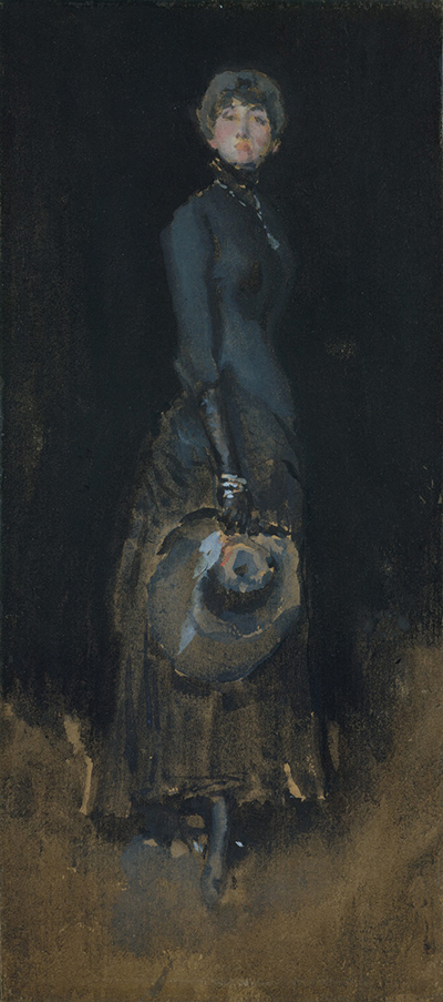
Dark paper produces another relation. Transparent colour cannot create luminosity in the same way when the support absorbs or visually lowers it; opaque gouache and selected pale touches become more important. In Lady in Gray, watercolour and gouache bring a standing figure out of dark brown wove paper. The medium description explains why the work can resemble a small oil in reproduction while remaining materially different. [4][5]
Glasgow's collaborative watercolour research treats these sheets as objects of historical and technical inquiry. Work with the Hunterian and Freer collections examines materials and context rather than assuming that the apparent fluidity tells the whole story. Watercolour boxes, bottles of gouache, papers and related studio materials can help establish what Whistler had available, although survival in the estate does not prove use in every individual work. [3][13]
By the late career, watercolour was not limited to one subject or degree of finish. Shopfronts and coastal views could be reduced to firm bands and accents; domestic figures could depend on quiet tonal transitions; copies or records could serve documentary needs. The category contains both immediate observation and considered pictorial construction.
*Lady in Gray*: A Work on Paper, Not an Oil
The Metropolitan Museum's Lady in Gray is one of the clearest examples of why medium controls matter. Catalogued by MacDonald as M.0933 and by the museum as 06.312, it dates to about 1883. It is watercolour and gouache on dark brown wove paper, measuring 28.6 by 12.7 centimetres. Those facts identify an unusually narrow, small sheet whose effect depends on the coloured support. [1][2][5]
The standing woman is established through dark dress, pale face and selected costume details rather than a fully covered field. Her verticality responds to the sheet's proportions. The brown paper is not simply a background colour painted to resemble darkness; it is the physical surface from which the figure emerges. Gouache supplies body where transparent wash alone would be subdued.
The sitter has not been identified securely. Proposed names should remain possibilities, not captions presented as fact. This uncertainty does not prevent interpretation of dress, stance or colour, but it limits biographical conclusions. Whistler's title itself directs attention towards the grey relation rather than guaranteeing identity. [5]
Its finish also challenges hierarchy. The Met has described the watercolour as refined enough to stand comparison with Whistler's canvases. That does not mean it is an oil in miniature. Paper, water-based colour, scale and the balance between opaque and transparent passages create a different object. The comparison is useful only when difference remains visible. [4][5]
The sheet will eventually merit an independent object page. On this medium-wide route it establishes a rule: familiar appearance cannot override catalogued material. The inherited site once grouped the image with paintings; the corrected route places it among watercolours while preserving links to portraiture and Whistler's female figure studies.
Figures, Drapery and Movement
Whistler's works on paper provide a much larger range of bodies and poses than the best-known oil portraits suggest. Women stand, lean, bend, dance, recline, sleep, hold children or adjust drapery. Some sitters can be named through records and comparison; others remain unknown. The sheets can register studio work, social relation, costume and movement without becoming formal commissioned portraits.
In the 1870s, pastel portraits of members of the Leyland family and related studies sometimes connect to painted projects. After Venice, nude and draped figures became a sustained field in their own right. Whistler tested the way cloth falls around a moving or resting body and how a few coloured strokes can distinguish skin, fabric and ground. Direct links to later oils should be claimed only when catalogue evidence supports them. [2][10]
Dancers intensify the problem of selection. A pose changes before a detailed drawing can stabilise it, so contour, direction and weight become more important than anatomical inventory. A lifted arm or turn of the hip may be carried by one line. Pastel can then mark the colour and motion of drapery without enclosing every edge. The resulting economy belongs to the observed movement, not to a lack of interest in the figure.
Mother-and-child subjects from the 1890s move differently. Their forms often overlap, and the intimacy of the small sheet matches a domestic rather than monumental encounter. Identifying a model or child requires documentary support. It is safer to describe what a sheet establishes than use tenderness as evidence for a particular family narrative.
The history of modelling also needs caution. Joanna Hiffernan, Maud Franklin, Beatrix Whistler, the Pettigrew sisters and other women occupied different personal and professional positions. A medium-wide article cannot settle every identification, and Whistler's correspondence may be selective. Object pages should combine catalogue, provenance, inscriptions and relationship evidence instead of treating a red-haired profile or garment as conclusive.
Landscape, Coast, Street and Shopfront
Works on paper let Whistler carry his art into places where a large easel would have altered the encounter. Venice is the most concentrated example, but Britain, France, the Netherlands and other travels produced river, coast, town and shop subjects. The sheet could be held or supported close to the motif, then retained, revised or exhibited later.
Landscape does not mean untouched nature. Harbours, shopfronts and streets join weather to commerce and building. A low tide exposes sand and structural bands; a fruit shop offers coloured units inside a dark opening; a beach distributes figures across pale space. Whistler selects from a lived environment even when narrative incident is minimal.
Watercolour can establish weather with washes whose edges remain mobile. Pastel can set a bright stroke against brown paper without losing the surface beneath it. Graphite or charcoal can hold architecture while colour remains selective. Different media answer different aspects of the motif, and a combined description is more informative than a generic claim that the work is atmospheric.
Late coastal sheets also resist the assumption that smallness equals decline. They belong to an artist managing health, travel and changing markets, yet many make scale into an advantage. A compact field brings every interval into relation. Sparse marks can appear exposed because there is no heavily worked surface to absorb an uncertain decision.
Titles such as notes, harmonies or colour arrangements connect these sheets to Whistler's wider language, but place can still matter. A named coast or shop should not be dissolved into pure tone. Catalogue research can locate sites, travel periods and owners, allowing formal economy and historical specificity to coexist. [1][2][13]
Colour, Surface and the Myth of Effortlessness
Whistler encouraged viewers to value the artist's knowledge rather than count visible hours. Works on paper made that argument especially provocative. A few pastel marks or watercolour washes could look easy beside densely modelled academic work. Critics and collectors had to decide whether selection itself constituted labour and finish.
Material examination complicates every simple story of speed. Pastel may begin with a careful underdrawing, receive separate touches and be left for later work. Watercolour can require a wash to dry before gouache detail is added. A drawing may be revised, rubbed or continued on the reverse. Even a genuinely rapid observation draws on habits developed across years. [6][10][11][12]
This does not mean immediacy is an illusion. A mark can preserve the pressure and pace of application. Water spreads under conditions that cannot be reconstructed exactly once dry. Pastel catches on surface texture in a direct physical event. Whistler's skill lay partly in allowing those events to remain visible without surrendering overall relation.
Colour operates differently in each medium. Oil can be blended wet, layered, scraped and glazed on a prepared support. Pastel puts dry particles beside or over one another, with limited adhesion and unusually direct saturation. Transparent watercolour uses the support's light; gouache supplies opacity. Comparing their results is productive only when their material mechanisms are not collapsed.
The untouched support is the crucial common element. Whistler often trusted a paper colour to do pictorial work that another artist might have painted. Leaving it visible demands anticipation: the unmarked area cannot easily be restored once covered. Restraint is therefore a positive allocation of the surface.
Fragility, Fading and What We See Now
Works on paper change. Light can fade pigments and alter the paper's colour. Pastel particles can be displaced by vibration, touching or an unsuitable mount. Water damage, foxing, acidity, tears, creases and adhesives may transform a sheet. Abrasion can remove a fine line; previous framing can expose one area while protecting another. Present appearance is a history, not an untouched delivery from the studio. [10][12][13]
Pastel's friability makes glazing and spacing important. The surface should not press against glass, and a conventional fixative can darken or redistribute colour. Historical treatments may already have altered an object. Current research tests for media and condition because an assumed pastel recipe or universal preservation history would obscure those differences. [10][12]
Paper discolouration is interpretively serious. If a support has darkened or a pigment has faded, today's tonal balance may differ from Whistler's. That does not authorise digital recolouring by intuition. Technical images, protected margins, contemporary descriptions and comparison among related sheets can provide evidence, but conclusions must remain proportionate.
Digital access brings great advantages. High-resolution images reveal strokes, fibres and inscriptions that glazing or display distance can hide. Open-access records allow works in Washington, New York and Glasgow to be compared. Yet the screen normalises size, emits its own light and may strengthen colour. Dimensions and medium should be read before a thumbnail is interpreted.
Display schedules may be short because light exposure is cumulative. “Not on view” does not mean a museum no longer holds the work or considers it minor. It may reflect conservation policy. Current-holder pages should be checked before a visit, and responsible writing should distinguish ownership from display status.
Exhibiting and Collecting Works on Paper
Whistler did not leave reception to chance. His exhibitions coordinated wall colour, frames, spacing, catalogues and titles. Coloured works on paper benefited from rooms that prevented stronger surroundings from overwhelming them. The Venice pastel exhibition of 1881 made this environmental control part of the claim that small, economical sheets deserved sustained public attention. [10][14]
Mount and frame could extend the work's colour relation without turning paper into canvas. A carefully chosen surround gave visual breathing space and established a transition to the wall. Whistler's concern with such effects links works on paper to his broader activity in frame and exhibition design. The original arrangement may nevertheless be lost or altered, so present framing should not automatically be attributed to him.
Collectors responded to portability and intimacy. A pastel or watercolour could enter a domestic interior differently from a full-length portrait. Charles Lang Freer assembled works across Whistler's media, while Rosalind Birnie Philip preserved the studio residue that later entered Glasgow. Museum acquisition then changed private viewing into a cycle of storage, conservation and temporary display. [3][7]
The category also acquired institutional standing. The Metropolitan's early acquisition of Whistler watercolours helped give American works on paper a place in a major collection. Wider nineteenth-century interest in watercolour and pastel created societies, exhibitions and markets, but Whistler's contribution was distinctive: he made reduction, coloured support and controlled presentation central to their authority. [4]
How to Look at a Whistler Work on Paper
Begin with the full object record. Confirm artist, title, MacDonald number where available, date or range, medium, support, dimensions, recto or verso, current holder and accession. This first step prevents an oil, pastel, watercolour, print and reproduction from being confused simply because they share a subject.
Then identify what the support contributes. Is it white, cream, blue, grey or brown? Is its texture visible? Does the image use untouched paper as light, shadow or atmosphere? A screen can make the support appear like a painted colour, so look for the institution's description and any technical note.
Separate the drawing structure from later colour. Find graphite, charcoal, chalk, Conté or ink lines before following pastel or wash. Notice where a coloured medium crosses, avoids or fails to cover them. In watercolour, distinguish broad wash from opaque detail if the image and record permit it.
Consider purpose without forcing a binary answer. A sheet can be exploratory and complete, related to an oil yet independently exhibited, or made quickly and later adjusted. Provenance and exhibition history can tell whether Whistler sold or displayed it as an autonomous work. Physical sparsity alone cannot.
Finally, account for condition and scale. Read the dimensions and imagine the sheet at actual size. Look for fading, stains, losses, mounting or cropped edges only where evidence supports them. Interpretation should begin from the object that survives, while recognising that survival has changed it.
A Route Through the Works on Paper
Start with early pencil, ink and sketchbook material to see drawing used for study, place and communication. Then compare figure and costume sheets connected with the 1860s and 1870s to the oils without assuming a preparatory relation. This establishes how Whistler could move an idea among media while keeping each object distinct.
The Venice group should be approached as a concentrated exhibition practice. Compare The Church of San Giorgio Maggiore with other architectural and lagoon pastels, attending to brown paper, dark outline and selective colour. Place the etchings nearby in navigation, not inside the same object category.
Next follow watercolour through landscape and urban subjects. Scene on the Mersey shows broad wash and fine gouache detail; later coasts and shopfronts demonstrate other balances of transparency, opacity and reserve. The sequence reveals that a water-based medium can be both fluid and structurally exact.
For figures, use Lady in Gray as an anchor before moving to draped nudes, dancers and mother-and-child sheets. Keep sitter identifications qualified and compare posture, paper tone and the distribution of colour. The eventual object page for M.0933 will hold its full provenance and interpretive history.
End with the physical object: paper fibre, verso, mount, frame and condition. Whistler's works on paper become more—not less—substantial when their delicacy is treated as material evidence rather than as a poetic metaphor.
Frequently Asked Questions
The Glasgow online catalogue includes more than 1,700 works on paper. The figure covers watercolour, pastel, pencil, chalk and other drawing materials, and it can change as records are added or revised. [1]
Contemporary testimony describes outline drawing before selected colour and notes that work might be continued later. Some motives could be rapid, but the evidence does not support one rule for every sheet. [11]
No. The Met identifies it as watercolour and gouache on dark brown wove paper. It is MacDonald M.0933, dates to about 1883 and measures 28.6 by 12.7 centimetres. [5]
Watercolour commonly works through transparent washes that use light from the paper. Gouache is applied more opaquely and can place body colour over or beside those washes. Whistler often combined them, so the full museum medium line matters.
Paper and colour can be sensitive to cumulative light, while pastel surfaces are vulnerable to movement and contact. Museums rotate works to manage exposure and condition. A lack of current display does not change ownership or importance.
Some drawings are preparatory or incomplete, but visible paper can also be a deliberate part of a finished relation. Catalogue purpose, exhibition history, material sequence and the balance of the whole are better guides than the number of marks.
It can reveal valuable detail but cannot reproduce scale, paper texture, reflected light or every colour reliably. Fading and paper discolouration may already have changed the object, while screens introduce another transformation. Use the image with dimensions, medium and conservation evidence.
Discussion
Which material property most changes how you read a Whistler work on paper?
Consider paper tone, line, pastel, wash, scale or condition.
Reader Insights
Where does the paper itself remain part of the image?
When does a sparse mark feel complete rather than unfinished?
How might fading or abrasion alter the relation you see?
Join the Conversation
Share a close observation or a question for other readers.
References
- Margaret F. MacDonald and Grischka Petri, The Paintings of James McNeill Whistler: A Catalogue Raisonné, including the summary catalogue of watercolours, pastels and drawings, University of Glasgow. https://www.whistlerpaintings.gla.ac.uk/catalogue/
- Margaret F. MacDonald, James McNeill Whistler: Drawings, Pastels and Watercolours. A Catalogue Raisonné, Yale University Press, 1995.
- The Hunterian, University of Glasgow, “Whistler Collection”. https://www.gla.ac.uk/whistler/hunterian/
- Kevin J. Avery, “Nineteenth-Century American Drawings”, Heilbrunn Timeline of Art History, The Metropolitan Museum of Art. https://www.metmuseum.org/essays/nineteenth-century-american-drawings
- The Metropolitan Museum of Art, “Lady in Gray”, 06.312. https://www.metmuseum.org/art/collection/search/13245
- The Metropolitan Museum of Art, “Scene on the Mersey”, 17.97.4. https://www.metmuseum.org/art/collection/search/13279
- National Gallery of Art, Washington, “James McNeill Whistler”. https://www.nga.gov/artists/1974-james-mcneill-whistler
- National Gallery of Art, Washington, American Drawings, Watercolors, Pastels, and Collages. https://www.nga.gov/sites/default/files/migrate_images/content/dam/ngaweb/research/publications/pdfs/american-drawings-watercolors-pastels-and-collages.pdf
- National Gallery of Art, Washington, “The Church of San Giorgio Maggiore”, 2014.136.186. https://www.nga.gov/artworks/168823-church-san-giorgio-maggiore
- University of Glasgow, “Research into Whistler's Pastels”. https://whistlerpastels.gla.ac.uk/project/
- University of Glasgow, Whistler Pastels, “Drawing Media”. https://whistlerpastels.gla.ac.uk/drawing-media/
- University of Glasgow, Whistler Pastels, “Influence of Paper”, “Techniques” and “Tonal Harmony”. https://whistlerpastels.gla.ac.uk/influence-of-paper/ ; https://whistlerpastels.gla.ac.uk/techniques/ ; https://whistlerpastels.gla.ac.uk/tonal-harmony/
- University of Glasgow, James McNeill Whistler and Watercolour: Making and Meaning. https://www.whistlerwatercolours.gla.ac.uk/
- H. Barbara Weinberg, “James McNeill Whistler (1834–1903)”, Heilbrunn Timeline of Art History, The Metropolitan Museum of Art. https://www.metmuseum.org/essays/james-mcneill-whistler-1834-1903