



 by Tom Gurney
Tom Gurney BSc (Hons) is an art history expert with over 20 years experience
Published on June 19, 2020 / Updated on November 2, 2026
Email: tomgurney1@gmail.com / Phone: +44 7429 011000
Fruit Displayed on a Stand: Introduction
White paper spreads across almost the entire canvas, folded into shelves, pockets and shallow enclosures. Against it, oranges glow, tomatoes flare red and pale pears carry streaks of pink and green. The fruit seems close enough to choose by hand, yet its abundance is held in a remarkably orderly arrangement. Gustave Caillebotte makes the encounter with a display of produce both immediate and carefully controlled.
Painted about 1881–82, Fruit Displayed on a Stand is an oil on canvas in the Museum of Fine Arts, Boston. At about 76.5 × 100.6 cm, it gives a subject associated with everyday shopping a substantial presence. [1] Lynn Kellmanson Matheny, writing for the National Gallery of Art, places it within Caillebotte’s sustained interest in looking: here the attraction of things offered for sale brings vision into contact with consumption. [2]
Its history introduces a second setting for that attraction. Marie Berhaut’s catalogue records that the painting was intended to decorate the dining room of Caillebotte’s friend Albert Courtier, a notary in Meaux. [3] The picture therefore connects the spectacle of food on display with the room where food would be eaten. Its folds of paper, crowded colours and inviting viewpoint become more interesting when seen between those two worlds.
At a Glance
- ArtistGustave Caillebotte.
- TitleFruit Displayed on a Stand; French title, Fruits à l’étalage. [3]
- DateAbout 1881–82. [1]
- MediumOil on canvas. [1]
- DimensionsAbout 76.5 × 100.6 cm. [1]
- CollectionMuseum of Fine Arts, Boston, accession 1979.196; Fanny P. Mason Fund in memory of Alice Thevin. [1]
- Catalogue numberBerhaut 193. [3]
- Early exhibitionSeventh Impressionist exhibition, Paris, 1882, catalogue no. 4. [3]
This work across Gustave Caillebotte’s career
The Orange Trees
1878 [4]Fruit Displayed on a Stand (current article)
about 1881–82Man at His Bath
1884 [4]Contents
- Looking Down at Abundance
- The Paper Holds the Picture Together
- Colour Makes Each Surface Different
- From a Shop Display to a Dining Room
- Was This an Actual Fruit Stall?
- A Still Life That Stood Out in 1882
- A Useful Comparison: Still Life with Oysters
- From Courtier to Boston
- Annotated details
Looking Down at Abundance
The viewpoint makes the display unusually easy to survey. We look down over the front edge of the stand and across successive groups of produce, with little surrounding space to distract us. Large green and yellow fruits occupy the lower left; yellow pears fill much of the lower right. Behind them, the oranges and red tomatoes form two strong concentrations of colour. Smaller fruit fills the spaces towards the top, while three open boxes establish a route through the middle.
Those boxes are crucial to the sensation of depth. The nearest projects towards the lower edge, its pale front face almost empty beneath a densely filled interior. Farther back, two neighbouring boxes contain dark blue and pale green fruit. Their straight sides draw the eye inward, offering a more definite spatial framework than the overlapping round forms on either side. The display has depth, but it gives up almost none of its surface to an unoccupied floor, wall or passage.
Caillebotte also withholds the familiar signs of a street scene. There is no shopkeeper, no customer and no readable price. No hand interrupts the arrangement. The absence of figures leaves our own act of inspection conspicuous. We can compare one group with another, linger over differences in ripeness or turn from the nearest pears to the distant fruit. The painting supplies the experience of looking over goods without settling into an anecdote about a purchase.
At the top, broad dark leaves close off the view. They bend in several directions, cutting across the white paper and reaching down towards the smaller fruit. Their restless diagonals contrast with the central boxes. At the bottom, a narrow brown edge marks the support, while paper folds spill across it. These two limits hold the abundance between a canopy above and a shallow ledge below. The fruit fills the picture without appearing to float in an indefinite background.
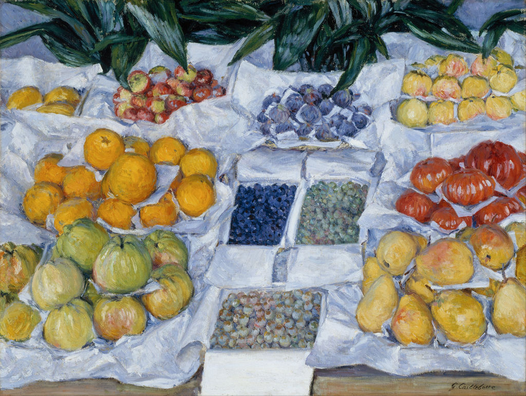
Fruit Displayed on a Stand, about 1881–82; Museum of Fine Arts, Boston. 0wFdiEtsfCY-vw at Google Cultural Institute maximum zoom level. Image source. Public domain. Resized only; source appearance preserved.
The Paper Holds the Picture Together
The white wrapping is as important as the produce. Follow it across the canvas and the composition begins to disclose its structure: a rising edge behind the oranges, a bright division beside the tomatoes, a broad shelf above the central boxes. It separates adjacent groups while linking the entire display through a continuous field of pale colour. Berhaut singled out this arrangement, describing the white edges as a grid within which Caillebotte places his coloured touches. [3]
That grid remains flexible. Paper has been folded around curved objects, tucked under them and turned outward at the edges. Some folds rise sharply; others sag or lie in broad, irregular planes. The resulting arrangement can be read in two ways at once. It organises the produce into distinct offerings, and it gives the painter a succession of angular shapes to set against the fruit’s rounded surfaces.
Look particularly at the difference between the central containers and the paper around them. The boxes have fairly straight borders and comparatively stable faces. The wrapping at the sides turns back on itself, bunches into ridges and opens into broad flaps. A rigid central structure meets a more improvised outer one. This difference keeps the display from becoming a diagram of separate rectangles.
The paper also changes the apparent intensity of the fruit. A yellow pear gains warmth from the cool grey-blue folds beside it. The tomatoes look redder against their pale surroundings, while the darkest central fruit produces a concentrated patch of blue. Without these intervals, the adjoining warm colours could merge into a single crowded mass. The wrapping gives them room to register separately even though there is very little empty space.
Nor is the paper simply white. It contains blue, lavender, grey and warmer cream touches, with darker strokes marking overlaps and hollows. At the front, its broad pale areas carry conspicuous brushwork. The same material that makes the fruit legible is itself a field of colour and texture, asking to be examined as closely as the things it encloses.
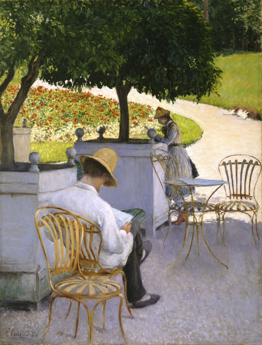
The Orange Trees, 1878; tubs, furniture and a cultivated garden form a different arrangement of colour and everyday objects. 3QHnQ99LLC7m3A at Google Cultural Institute maximum zoom level. Image source. Public domain. Resized only; source appearance preserved.
Annotated Details from Fruit Displayed on a Stand
The numbered points identify visible features discussed in this article. Return from each detail to the whole composition. Fruit Displayed on a Stand, about 1881–82; Museum of Fine Arts, Boston. 0wFdiEtsfCY-vw at Google Cultural Institute maximum zoom level. Image source. Public domain. Resized only; source appearance preserved.
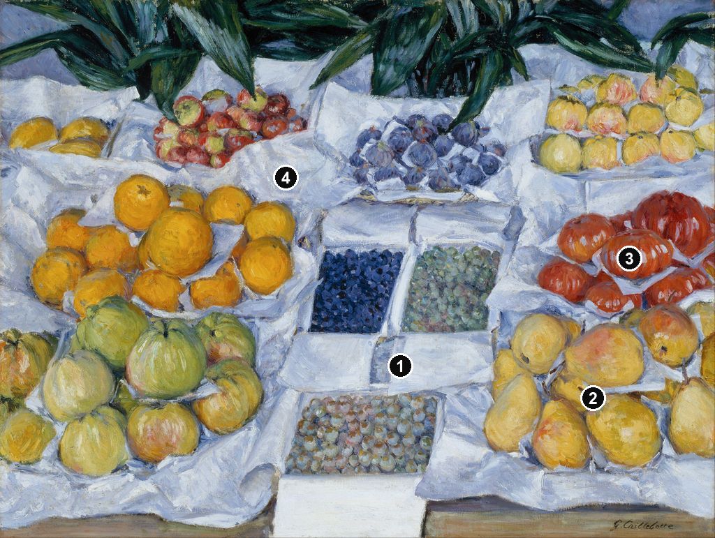
Details from FRUIT DISPLAYED ON A STAND
Compare the cropped details with the complete images above. Notice how their colours, shapes and positions contribute to the larger compositions.
The central boxes
The boxes provide straight edges among the rounded fruit. Their fronts and sides establish a clear recession within the crowded display.
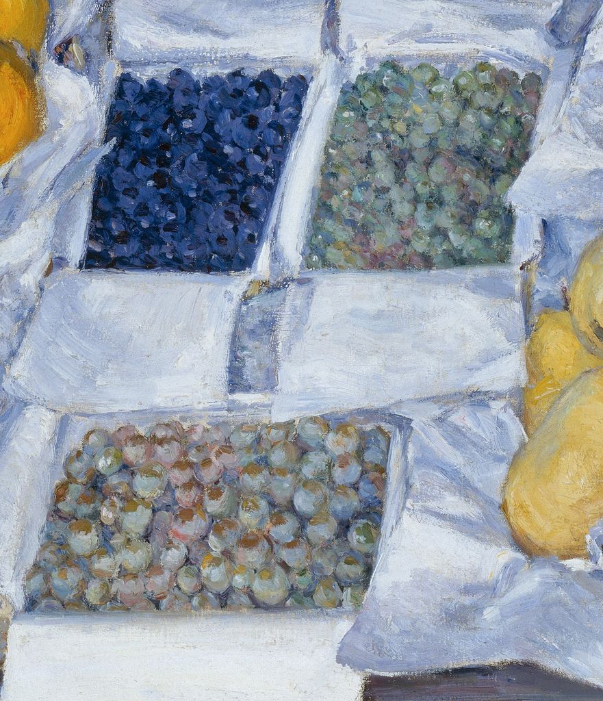
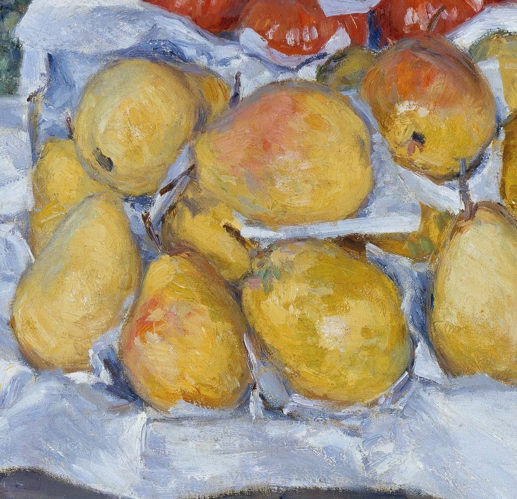
Pears with varied skins
Pale yellow pears carry patches of green, pink and brown. Differences of contour and colour distinguish objects pressed close together.
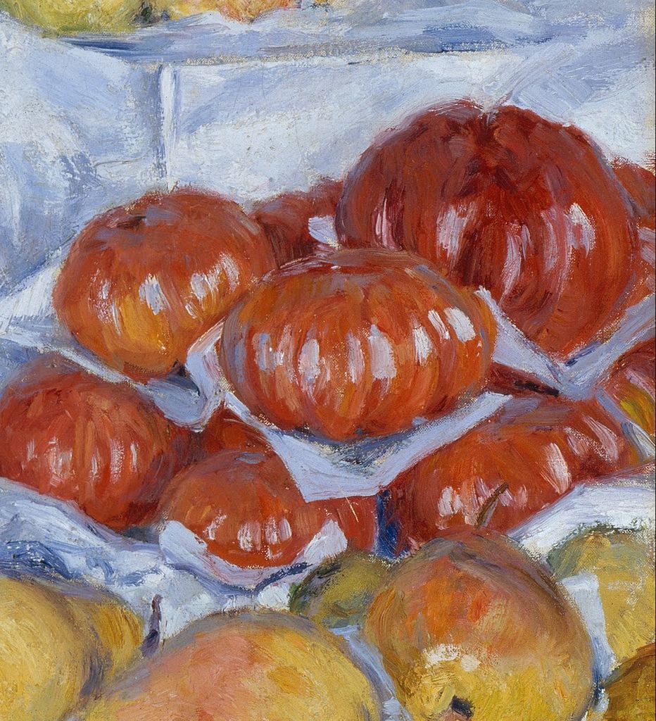
Red fruit against pale wrapping
Bright red forms stand out against cooler folds of paper. Light strokes follow their swelling surfaces while leaving the brushwork conspicuous.
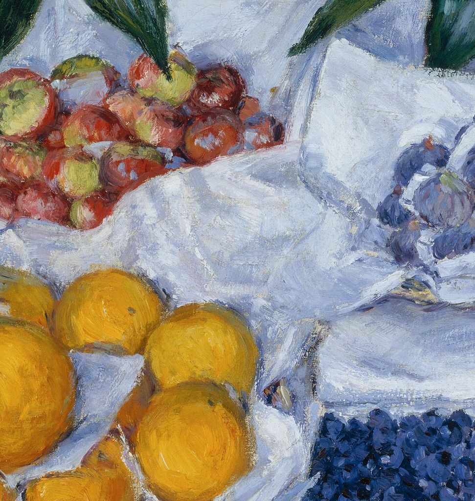
Folded paper between groups
The white paper rises, turns and opens between the groups of produce. Blue-grey and cream touches describe folds that both divide and connect the arrangement.
Colour Makes Each Surface Different
Caillebotte varies the marks within the display rather than describing every object with the same finish. The oranges are built from rounded areas of yellow and ochre, interrupted by darker marks near their tops and edges. Their surfaces feel different from those of the red tomatoes, whose lobed forms are picked out by pale, often near-vertical strokes. The bright accents follow the swelling shapes without concealing the movement of the brush.
The pears offer another kind of variation. Their yellow and green skins include patches of pink, brown and cream. Some are broad at the base and narrow abruptly towards the stalk; others lean against their neighbours so that only part of their outline remains visible. They become individual objects through small changes of contour and colour. Their recognisability does not depend on isolating every fruit against a dark boundary.
The boxes compress this attention into a different scale. Here small rounded touches collect into dense surfaces, with green, pink, grey and blue marks repeatedly interrupting one another. The dark blue box near the centre holds the eye because it is both tightly packed and sharply contrasted with its surroundings. The lighter box beside it is quieter, but its colour is far from uniform. Moving between these areas and the larger fruit makes us continually adjust the scale of our attention.
The dark foliage contains equally visible changes of handling. Long strokes run along the leaves, with lighter blue-green accents crossing deeper green and almost black passages. These extended marks provide a release from the repeated rounded touches below. The painting’s variety therefore comes from the relationship between subjects and strokes: broad paper planes, elongated leaves, swelling pears and small clustered fruit all call for different movements of the eye.
The display can be grasped at a glance, but the local differences slow down a second encounter. A pale stroke might describe a paper ridge in one area and light catching a tomato in another. A deep blue touch can belong to a fruit or to the shadow separating two forms. Recognisable objects emerge from these relations between neighbouring marks, while the broader arrangement remains stable.
From a Shop Display to a Dining Room
Matheny reads Caillebotte’s still lifes of produce, meat and pastries as investigations of commercial display. In her account, attractive presentation encourages the passer-by to become a customer. The arrangement in Fruit Displayed on a Stand makes that reading persuasive: the produce is plentiful, divided into distinct groups and presented against clean, conspicuous wrapping. The painting brings us close to the goods and gives their appearance priority over the surrounding shop. [2]
Gloria Groom develops the connection in her Art Institute of Chicago essay on Caillebotte’s food paintings. She identifies the fruit arrangement with an affluent shopkeeper’s presentation to a prospective consumer, and distinguishes its decorative appeal from the more disconcerting subjects of the artist’s meat still lifes. Her interpretation is valuable because it puts the treatment of the food alongside the choice of food itself. Its staging helps determine how it will be received. [5]
The Courtier history adds a domestic destination to this commercial reading. Berhaut states that the painting was made in Paris, on the boulevard Haussmann, and was intended for Courtier’s dining room. She places Courtier at the beginning of its recorded ownership. [3] This catalogue account supports the intended decorative use; it does not supply the terms of a commission or tell us exactly how the picture hung in the room.
A dining-room setting changes the resonance of the display. Food that might have been selected, bought and carried home has become a lasting image of abundance. The white paper retains the appearance of temporary packaging, yet the painted arrangement is fixed. Its contents will never be depleted. A viewer at a meal could encounter both the pleasures of eating and an image that prolongs the moment before food is chosen or served.
That connection does not make the painting a straightforward advertisement for comfort. Its very proximity can be slightly demanding. There is scarcely anywhere to rest outside the produce and its wrapping, and no attendant figure to establish a polite distance. The picture’s decorative appeal depends on an insistence: look at these surfaces, compare these colours, attend to these ordinary things. Its abundance has been made into a disciplined exercise in seeing.
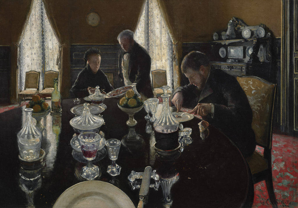
Luncheon, 1876; a separate dining scene, contrasting the presentation of food for a meal with fruit offered for inspection. Gustave Caillebotte; public-domain reproduction via Wikimedia Commons. Image source. Public domain. Resized only; source appearance preserved.
Watch: Gustave Caillebotte
Explore a museum overview and two discussions of Paris Street; Rainy Day. This shared selection offers wider context for the artist’s work.
"Who Is Gustave Caillebotte?" - HD version
An introduction to Caillebotte from the Kimbell Art Museum.
Watch on YouTubeWas This an Actual Fruit Stall?
The commercial reading describes the kind of display evoked by the picture; it does not identify a particular shop. Galina Olmsted discusses an alternative suggestion by Pierre Wittmer, who connected the abundance with the emptying of a storage larder at the Caillebotte family’s Yerres property. Olmsted questions a single seasonal occasion because of the different periods of availability associated with the fruits, and proposes that Caillebotte brought them together in an imagined fruit seller’s display. This remains her reconstruction of the subject, rather than a documented account of the painting session. [6]
The distinction matters because the painting is so convincing as an encounter. Its projecting boxes and drooping folds can tempt us to treat it as an exact record of something briefly seen. Yet the visible naturalism does not establish where all the objects were assembled, whether they were present together or how long the arrangement took to paint. The composition’s effects can be understood without converting a plausible setting into a known address.
The French title, Fruits à l’étalage, usefully directs attention to the act of exhibiting goods. Berhaut catalogues it under that title, while Olmsted notes the simpler title Fruits in the 1882 exhibition catalogue. [3] [6] Whatever practical circumstances lay behind the arrangement, its public identity quickly rested on fruit made visible in a display. That is the experience the painting continues to offer.
A Still Life That Stood Out in 1882
Fruit Displayed on a Stand appeared at the seventh Impressionist exhibition in Paris in 1882. Berhaut identifies it as catalogue no. 4. Olmsted’s reconstruction places it among sixteen paintings and one pastel submitted by Caillebotte, a varied contribution that included landscapes, portraits and interiors. [3] [6] In that company, the still life demonstrated another use for his experiments with viewpoint and arrangement.
Olmsted emphasises its scale and close framing in relation to the still lifes shown by other Impressionists. She sees Caillebotte’s selection as balancing affiliation with distinction: he participated in the group’s shared subjects while choosing a fruit painting whose size and presentation could command separate attention. [6] The historical display thus adds another meaning to the title. An arrangement of goods became a painting placed before the exhibition’s public.
The contemporary critic Joris-Karl Huysmans noticed the distinctive presentation of Caillebotte’s exhibited fruit. In the appendix to L’Art moderne, published in 1883 and discussing the 1882 exhibition, he praised the painter’s variety. His passage refers to fruit in the plural without naming the Boston canvas separately. He described it standing out against “lits de papier blanc” — “beds of white paper”, in translation. He described the pears’ pale golden skins marked with green and pink, and the grapes’ misted surfaces. His praise centred on the fidelity of the tones and the escape from habitual still-life conventions. [7]
Huysmans’s response directs us back to the canvas with a useful distinction. He admired an effect of living, perishable surfaces rather than a generic assortment of beautifully coloured objects. The patches on a pear and the bloom on grapes make particular kinds of fruit perceptible. Their appeal lies partly in the sense of something beneath or upon the skin: juice, ripeness, softness and a powdery veil.
His description also makes the whiteness of the wrapping historically significant. It was already conspicuous in the contemporary reception of Caillebotte’s exhibited still lifes, rather than a background feature recovered only by later analysis. The paper enabled the fruit’s colour to be seen with unusual force. The critic’s attention and our own close looking meet at the same folds, edges and changing surfaces.
A more teasing response survives in a caricature reproduced by Berhaut. It represents Caillebotte as a floor scraper, recalling his earlier subject, while the accompanying text jokes that he now makes still lifes for millionaires. In its extravagant story, he buys up an attractive shop display and has it carried home as a model. The catalogue identifies the originating journal as unknown and suggests a date of 1881 from the caption. Read as satire, the image shows how readily the new still lifes could be connected with Caillebotte’s wealth and the spectacle of abundance. It cannot establish how he actually obtained the fruit. [3]
A Useful Comparison: Still Life with Oysters
Caillebotte’s Still Life with Oysters offers a useful comparison because it presents food at a different stage of its journey towards consumption. In the composition reproduced alongside Fruit Displayed on a Stand in Berhaut’s catalogue, a bottle, glass, plate and folded napkin surround the oysters. These objects establish a place where the food could be served and eaten. The fruit display keeps such dining equipment outside the frame. [3]
The two pictures also give pale materials different tasks. In the oyster painting, the napkin rises among tableware and curved shells. In the fruit display, the wrapping spreads across the entire field, repeatedly dividing one group from another. Both arrangements make colour and texture visible through adjacent light surfaces, but the rhythm differs: a gathering of table objects in one, a broad organisation of produce in the other.
This comparison helps prevent “still life” from becoming too general a category. Caillebotte did not simply repeat food on a table. He investigated the different arrangements through which food enters view: offered for inspection, prepared for a meal or gathered among the objects of dining. The relation between the viewer and the food changes with the setting. In the Boston picture, the decisive action remains the look that precedes selection.
From Courtier to Boston
Berhaut’s ownership history begins with Albert Courtier in Meaux in 1881, followed by Mme Brunet in Paris and a Paris private collection. It then records a sale at the palais d’Orsay in Paris on 22 March 1979, lot 71, and acquisition that year by the Museum of Fine Arts, Boston through the Fanny P. Mason Fund in memory of Alice Thevin. The catalogue identifies the museum accession as 1979.196, matching the later institutional caption. [3] [1]
There is a small but revealing detail in the same entry: Berhaut attributes the signature at the lower right to Martial Caillebotte, the artist’s brother. [3] The visible name therefore should not be treated as evidence that Gustave signed and dated a completed arrangement in a particular year. The approximate date used by the museum sources is the appropriate way to identify it.
Its later exhibition history has helped place this still life within the breadth of Caillebotte’s work. Berhaut records its inclusion in the 1894 retrospective and the Houston–New York exhibition of 1976–77. It also appeared in the National Gallery of Art’s illustrated checklist for Gustave Caillebotte: The Painter’s Eye in 2015, identified as a Boston loan. [3] [8] That exhibition context brings the fruit into conversation with the city views and figure paintings through which many readers first encounter him.
The connection is visible in the picture itself. Looking is organised through a chosen position, emphatic cropping and a structure that appears natural before it reveals its precision. Here the shapes are pears, paper and boxes rather than people or buildings. Their arrangement gives an ordinary act of inspection the sustained attention of a large painting, while preserving the immediate pleasure of colour that first draws us towards the stand.
Catalogue and documented works
This directory brings together 578 entries in the revised 1994 catalogue, 11 further documented records and three groups of study descriptions. It is a directory of records, not a total of authenticated individual works. Albums, print states and surviving decorative panels are grouped. English labels retain the French titles as searchable aliases; dates are supplied only where checked. Numbered entries link to the relevant article or the historical catalogue. Pastels appear under the Drawing filter; original prints remain searchable under All media.
Frequently Asked Questions
It belongs to the Museum of Fine Arts, Boston, accession 1979.196. Its acquisition credit is the Fanny P. Mason Fund in memory of Alice Thevin. [1]
Berhaut’s catalogue states that it was intended to decorate the dining room of Caillebotte’s friend Albert Courtier, a notary in Meaux. The catalogue is the basis for this account of its intended destination. [3]
Discussion
Look again at the images and ideas explored in Fruit Displayed on a Stand. These editorial prompts invite your observations.
Reader Insights
The paper gives the fruit a set of folds, boundaries and contrasts.
Looking down makes abundance appear as an arrangement across the surface.
Which fruit is most clearly separated from the display, and how?
Join the Conversation
Share a detail, comparison or question about Fruit Displayed on a Stand below.
References
- National Gallery of Victoria / Museum of Fine Arts, Boston, French Impressionism: Learning Resource (2021), p. 12, caption for Fruit displayed on a stand: date, medium, dimensions, collection and accession. View source.
- Lynn Kellmanson Matheny, National Gallery of Art, Gustave Caillebotte: The Painter’s Eye exhibition brochure (2015), PDF p. 4, discussion of vision, commercial display and Fruit Displayed on a Stand. View source.
- Marie Berhaut, with Sophie Pietri, Gustave Caillebotte: Catalogue raisonné des peintures et pastels (1994), p. 43, still-life discussion; p. 148, no. 193, Fruits à l’étalage, and illustrated comparison with no. 195, Nature morte aux huîtres; p. 283, caricature and exhibition listing. Digital edition, Wildenstein Plattner Institute. View source. (in French).
- Marie Berhaut with Sophie Pietri; Wildenstein Plattner Institute, Gustave Caillebotte Catalogue raisonné des peintures et pastels, 1994. View source. (in French).
- Gloria Groom, Art Institute of Chicago, “Calf’s Head and Ox Tongue: Curatorial Entry”, in Caillebotte Paintings and Drawings at the Art Institute of Chicago (2015), opening discussion of Fruit Displayed on a Stand and commercial food display. View source.
- Galina Olmsted, Making and Exhibiting Modernism: Gustave Caillebotte in Paris, New York, and Brussels (PhD dissertation, University of Delaware, 2019), printed pp. 220–221 and 226–227: the 1882 selection, title, scale and competing reconstructions of the fruit display. View source.
- Joris-Karl Huysmans, “Appendice: M. Caillebotte”, L’Art moderne (Paris: G. Charpentier, 1883), pp. 262–263 as located in Berhaut’s bibliography; consulted in public French transcription, short translation supplied here. View source. (in French).
- National Gallery of Art, Gustave Caillebotte: The Painter’s Eye, illustrated exhibition checklist (2015), PDF p. 8, cat. no. 31, Fruit Displayed on a Stand. View source.
- Art Institute of Chicago, Caillebotte Paintings and Drawings at the Art Institute of Chicago, 2015. View source.
- Petit Palais / Paris Musées, Portrait de Paul Hugot, original print, PPG2319, current. View source. (in French).
- Paul Perrin, Musée d’Orsay, Transcription de l’entretien commissaire Caillebotte, 2024. View source. (in French).
- Cleveland Museum of Art, Caillebotte collection records: 2020.260, 2009.157 and 2020.105, current. View source.
- Splash image, Fruit Displayed on a Stand, about 1881–82.


