

 by Tom Gurney
Tom Gurney BSc (Hons) is an art history expert with over 20 years experience
Published on June 19, 2020 / Updated on August 29, 2026
Email: tomgurney1@gmail.com / Phone: +44 7429 011000
Introduction
J. M. W. Turner's prints are not an afterthought to the paintings and watercolours. They are one of the main ways his art moved through nineteenth-century culture. A Turner oil might be seen by exhibition visitors or private guests; a finished watercolour might belong to a collector; a printed image could travel through albums, illustrated books, portfolios and domestic interiors. Print culture gave Turner reach, income, collaborators, technical challenges and a public presence far wider than any single canvas could provide.
The National Gallery identifies Turner as an artist whose works include watercolours, oils and engravings, and the Met describes him as mastering watercolour, oil painting and etching.[1][2] That breadth matters. Turner was not simply a painter whose images were later copied. He was deeply involved in the graphic translation of landscape, sometimes as designer, sometimes as etcher, sometimes as supervisor of professional engravers, sometimes as the artist whose work became the basis for later reproductive projects. The phrase "Turner print" can therefore mean several different things: a print designed and partly etched by Turner, a plate engraved by another artist after a Turner drawing, a published illustration from a Turner watercolour, a later print after a famous painting, or an impression from a plate whose state and publication history must be examined carefully.
This complexity is the point. Turner's prints show him working in a world of craft, commerce and technology. The University of Manchester-linked catalogue of J. M. W. Turner's prints presents the field as a major achievement of the nineteenth century, joining art, craft, technology and commerce, and estimates that around 820 prints from his work were made in his lifetime, with more later.[3] Such scale changes the story of Turner. The printmaker, designer and collaborator sits beside the Royal Academician and the painter of light.
Prints also change the social scale of Turner's reputation. His most famous paintings now dominate museum memory, but nineteenth-century viewers often encountered him through mediated images: a steel engraving in a book, a coastal plate issued in parts, a mezzotint after a harbour watercolour, or a later print after a celebrated oil. These objects were not merely substitutes for originals. They taught viewers how to recognise Turnerian weather, architecture, water and distance. They helped create the public Turner.
At a Glance
- Authorship questionDesigner, etcher, engraver, publisher and printer
- Lifetime scaleAround 820 prints from Turner's work
- Direct techniqueTurner sometimes etched essential outlines
- Collaborative techniqueProfessional engravers developed line and tone
- Major projectLiber Studiorum, 1807-1819
- Coastal projectSouthern Coast, issued 1814-1826
- National projectEngland and Wales, issued 1827-1838
- Other channelsPorts, rivers and literary vignettes
- Object sequenceDesign, plate, proof, state and impression
- AfterlifeLater prints after Turner require separate authorship credit
Contents
- Introduction
- What Counts as a Turner Print
- Early Topographical Print Culture
- Design, Plate and Impression
- Liber Studiorum in the Wider Print Career
- Beyond the Liber
- Southern Coast
- England and Wales
- Ports, Rivers and Maritime Series
- Literary Illustration and Vignettes
What Counts as a Turner Print
The first discipline is authorship. A printed work may be "by Turner" in one sense and not in another. He may have made the design, supplied the watercolour, etched the outline, corrected proofs, approved publication, or simply be the artist after whom a later print was produced. Many nineteenth-century records distinguish "after Joseph Mallord William Turner" from "print made by" a named engraver. That distinction is not pedantry. It tells us where artistic responsibility, technical labour and publication authority sit.
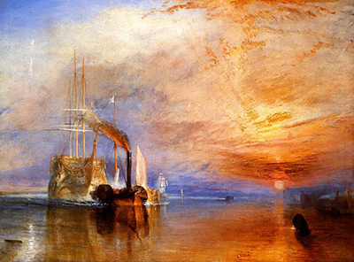
The British Museum's record for a later Fighting Temeraire chromolithograph, for example, identifies the work as after Turner, gives the technique as chromolithograph, notes a circa 1858 production date, and cites Rawlinson's catalogue of engraved Turner work.[4] The printed object is Turner-related, but Turner did not stand over it in 1858. Its value lies in reception and reproduction rather than direct lifetime supervision. It helps show how Turner's imagery continued to circulate after his death, but it is not the same kind of evidence as a lifetime proof or a plate he etched.
States matter too. A print can exist in several forms as a plate is corrected, strengthened, lettered, worn or republished. A proof before lettering may show a different stage of artistic and commercial life from a later published impression. In Turner's case, states can be especially revealing because he cared about tonal effect, legibility and the translation of colour into black and white. A print is therefore not merely an image; it is a material event in a sequence.
The language around print authorship can feel awkward because it has to do several jobs at once. "Drawn by Turner" may refer to the original design; "engraved by" identifies the hand that cut or worked the plate; "published by" places the object in a commercial structure; "printed by" may identify the workshop that physically produced impressions. A full account needs all of this. Without it, Turner is either made too solitary or robbed of his actual role.
The same caution applies to dates. The date of a print may record publication, not the date Turner first visited the subject, made a sketch, completed a watercolour, approved a proof or saw the final impression. For an artist whose travel material could be reworked years later, this distinction matters. A printed date can fix one moment in a longer life of looking, designing and production.
Early Topographical Print Culture
Turner came of age in a market hungry for topographical images. Towns, castles, coasts, estates, cathedrals, rivers and antiquarian subjects could be turned into prints for viewers who wanted recognisable places at a far lower cost than original watercolours. The Manchester print catalogue notes that the young Turner worked in the flourishing topographical publications of the 1790s and that publishers discovered the commercial value of including Turner prints in publications.[3] This was not a lesser apprenticeship. It was one of the environments in which Turner learned how a place could become an image.
Topographical print culture trained Turner in clarity. A design had to hold together after translation into line, tone and reproducible plate work. It needed enough structure for the engraver, enough recognisable subject for the buyer and enough pictorial force to stand apart from routine view-making. This requirement sharpened the young artist's eye for silhouette, architecture, staffage, sky and recession. His later freedom rests partly on the discipline of having made places legible.
The commercial context also shaped his habits of travel. Sketching tours were not only picturesque adventures; they were professional resource gathering. A castle seen in Wales, a harbour in Kent or a river bend in Yorkshire might later become a watercolour, an engraved plate, a published illustration or a compositional memory. Print culture turned travel into a chain of production, and Turner understood that chain early.
Early print work also placed Turner among craftsmen and publishers who understood markets as well as images. That world rewarded reliability: designs had to arrive, plates had to be worked, subscribers had to be satisfied, and series had to maintain momentum. Turner's later reputation for visionary colour should not hide this commercial education. He learned how images were financed, advertised, priced, issued and collected.
There is a useful tension here. Topographical print culture demanded recognisable sites, but Turner increasingly wanted landscape to carry atmosphere, movement and emotion. Instead of choosing one against the other, he learned to make the recognisable place support a more ambitious image. A ruin could still be a named ruin, but weather, light and figures could make it feel historical, vulnerable or sublime.
Design, Plate and Impression
A Turner print usually begins before the plate. It begins with looking, drawing and designing. The design might be a watercolour made specifically for engraving or a work later selected for reproduction. The engraver then had to translate colour, atmosphere and brushwork into line, mezzotint, etching, aquatint or another graphic language. That translation was technical and interpretive. It was never neutral.
The Met's record for The Leader Sea Piece explains the Liber Studiorum method clearly: Turner made brown watercolour designs, etched outlines onto copper plates, and professional engravers generally developed tonal passages under his direction.[5] In that example, Charles Turner added mezzotint to a nautical scene, and the object is identified as etching and mezzotint, first state of three.[5] The record shows why a print must be read through maker, medium and state, not only subject.
The impression is the printed survivor of this chain. Paper, ink, pressure, plate condition and state all affect what a viewer sees. Two impressions from the same design may differ materially. A later impression may be less crisp; a proof may show a stage before text was added; a collector's proof may have been valued for its priority or rarity. Turner print scholarship is therefore a study of objects as well as images.
Different print techniques solved different pictorial problems. Line engraving could make architecture and terrain clear, but atmosphere required delicate tonal judgement. Mezzotint could create darkness, glow and graduated shadow, which made it especially powerful for evening, storm, moonlight and marine subjects. Steel engraving offered durability and fine detail for later publication markets. Turner did not use these media interchangeably. Each one changed what his design could become.
This is why a print after a watercolour is not a transparent window onto that watercolour. It is an interpretation of it. Colour must become tone; brushwork must become marks; a soft wash must become a managed field of line, burr or grain. A successful Turner print is often impressive because it finds a convincing graphic equivalent rather than because it imitates the original medium literally.
Liber Studiorum in the Wider Print Career
Liber Studiorum is Turner's most famous print project, but it should be placed within the wider field rather than made to stand for the whole. It began in 1807 and continued to 1819, combining etching and mezzotint in a self-conscious argument about landscape. The Met describes the series as seventy prints plus a frontispiece and notes six categories: Pastoral, Marine, Mountainous, Historical, Architectural and Epic Pastoral.[2][5] The title deliberately answered Claude's Liber Veritatis, but Turner's project was not merely homage. It was a claim that modern landscape could sustain range, dignity and classification.
The National Gallery of Art's The Straw Yard record gives a compact object example: the work was published in 1808, made by Joseph Mallord William Turner and Charles Turner, and belongs to the Liber Studiorum series as etching and mezzotint, with a Finberg catalogue state recorded.[6] Such data may seem dry, but it is exactly what keeps interpretation grounded. Liber Studiorum was not a vague portfolio of landscapes; it was a structured project of named plates, categories, states, engravers and publication moments.
Turner's hand in Liber Studiorum was unusually direct. He often etched the essential design, while mezzotint specialists developed the tonal richness. This division suited the project. Etching could hold linear skeleton and composition; mezzotint could build dusk, storm, shadow, distance and atmosphere. The result made printmaking serve a painter's argument about light and landscape without simply imitating painting.
The Liber also shows Turner's desire to classify landscape without reducing it. The categories did not function like rigid labels. They created a framework in which a marine subject, a pastoral subject or a historical subject could be measured as part of a serious artistic system. This is why the project belongs to more than print history. It belongs to Turner's lifelong attempt to raise landscape to a status comparable with older prestige genres.
At the same time, Liber Studiorum was materially practical. It required plates, paper, distribution, prices, subscriptions, engraved labour and continued public interest. Its ambition depended on the economics of print. Turner could make a grand claim for landscape precisely through a medium capable of multiplying that claim.
Beyond the Liber
The dedicated Liber Studiorum story is only one part of Turner's print career. The Manchester Original Publications index, structured from Rawlinson and Finberg, makes the wider range plain: early magazine and topographical projects, Oxford material, architectural subjects, Southern Coast, England and Wales, literary annuals, Rogers, Byron, Scott, Rivers, Ports, large engravings, late engravings and later print projects all appear within the catalogue architecture.[7] Turner print culture was not one venture. It was a long ecosystem.
This range helps explain why Turner prints can feel different from one another. Some are ambitious, self-directed landscape arguments; others are designs within illustrated books; others are topographical plates shaped by publisher demand; others reproduce famous oils for later audiences. The shared element is translation. In each case, Turner's art had to pass through another material language.
That translation could clarify or alter the original. A watercolour may supply colour and atmosphere that the engraver must convert into tonal relations. A painting may lose surface and scale but gain portability. A literary vignette may be created in brilliant colour even though the final publication is black and white. The print is therefore not merely a cheaper copy; it is a new object with its own constraints and possibilities.
The wider field also shows Turner's unusual adaptability. He could design for a grand landscape argument, for a coastal series, for a literary annual, for a river publication or for a later engraved gallery of paintings. Each format brought different expectations of scale, finish, subject, price and audience. Turner's print career was not a single style repeated across decades. It was a long negotiation between artistic ambition and available forms of circulation.
Southern Coast
Picturesque Views on the Southern Coast of England shows Turner within a major coastal publication. The Manchester catalogue gives the original title as Picturesque Views on the Southern Coast of England, from Drawings Made Principally by J. M. W. Turner, and Engraved by W. B. Cooke, George Cooke, and Other Eminent Engravers, published in parts from 1814 to 1826.[8] The title itself tells the story: Turner is principal designer, but the engravers and publishers are central to the object.
The Southern Coast subjects gave Turner ports, cliffs, castles, sea entrances and weather. Coastal imagery suited engraving because it combined recognisable locality with atmospheric drama. A harbour or cliff could be topographical, commercial, national and theatrical at once. Turner could bring weather and light into scenes that might otherwise have become mere local description.
Museum Wales preserves another angle on the series through an object record for Picturesque views of the Southern Coast of England, identifying Turner as the artist after whom the work was made, W. B. Cooke and John Murray among production roles, and techniques including etching and intaglio printing.[9] Such records remind us that printed Turner belongs to collections of works on paper, not only to art-historical narrative.
The Southern Coast also demonstrates how collaborative titles can encode publication history. "From drawings made principally by Turner" leaves room for a series in which Turner is central but not isolated. The Cookes and other engravers made the plates possible; publishers made the venture saleable; collectors and subscribers gave it an audience. Turner brought visual invention into a structure already built for circulation.
The coastal subjects helped Turner test a kind of national edge. The shore is boundary, passage, defence, resort, working harbour and weather theatre. In engraved form, those meanings could reach viewers who might never travel to the coast itself. A printed Turner coast therefore did cultural work as well as pictorial work: it helped make Britain's shoreline imaginable.
England and Wales
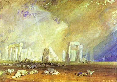
Picturesque Views in England and Wales was one of Turner's great publication enterprises. The British Museum record for Stone Henge identifies the series and notes that ninety-six views were published between 1827 and 1838 from a proposed one hundred and twenty.[10] The Morgan Library's record for the same publication describes it as issued in parts between 1827 and 1838, with engravings executed by a large group of named engravers after drawings by Turner.[11] These details show the scale and collaborative machinery behind the series.
Yale's Barnard Castle, Durham record gives the translation problem in especially clear form. It identifies the watercolour as a study for Picturesque Views in England and Wales, describes the long-running series, and notes how the related print translated Turner's vivid colour into line and tone.[12] The comparison is invaluable because it prevents a simplistic hierarchy. The watercolour and print do different jobs. One works through colour, gouache, scratching out and paper; the other through engraved tonal organisation.
The England and Wales project also shows Turner's manipulation of place. Yale notes that in Barnard Castle he heightened romantic effect by exaggerating the castle's elevation, adding small figures to increase scale and bathing the scene in diffuse golden light.[12] Print culture did not require Turner to become dryly literal. It gave him a reproducible format in which topography could be made more dramatic, legible and memorable.
The series also marks the professionalism of Turner's middle career. A planned set of national views required sustained organisation, not just inspiration. It depended on travel, selection, watercolour design, engraving, publishing finance and a public appetite for high-quality views. Such work made Turner both artist and brand, though the word is modern and should not flatten the nineteenth-century reality. Buyers were purchasing not only a view, but a Turner view: a place reframed through his authority.
The named engravers in the Morgan record also matter because they indicate the scale of expertise needed to carry the project. A single Turner design could enter a workshop culture of specialists, each with habits of line, tone and finish. The resulting print is therefore an index of collective skill. The more one studies Turner prints, the harder it becomes to treat reproduction as merely mechanical.
Ports, Rivers and Maritime Series
The maritime print projects connect Turner's career-long interest in the sea with a broader audience for coastal and harbour imagery. The Met notes that watercolours of English rivers, ports and coastal scenes served as bases for mezzotint and engraving series, including Ports of England from 1826 to 1828.[2] Manchester's Ports of England entry records publication formats and a subject sequence that includes Scarborough, Whitby, Dover, Ramsgate, Sheerness, Portsmouth, Margate, Deal, Sidmouth, Plymouth, Catwater and Falmouth.[13]
Harbour prints are especially revealing because they combine practical and imaginative elements. Ports are sites of trade, travel, naval identity, weather and danger. Turner could make them topographical without making them static. The engraver's task was to preserve enough maritime detail while sustaining the tonal drama that made the image Turnerian.
Rivers posed another problem. A river view requires lateral movement, recession, reflection and built or natural banks. In print, those relations have to be translated into controlled tonal pattern. The Manchester Original Publications list includes Rivers of England and French river publications among Turner's print-related output.[7] Such series show how water, travel and publication were linked across Britain and Europe.
Maritime prints also reveal the difference between subject and medium. A watercolour of a harbour can rely on reserve, wash and colour temperature. An engraving has to rebuild the same sensation through black ink on paper. The effort can make structure clearer: masts, quay walls, buildings, headlands and clouds become organised by tonal rhythm. Turner seems to have understood that this change was not only loss. Print could give his watery subjects a different kind of authority.
The later life of some harbour material also demonstrates how Turner's images could be recontextualised. A design first made for one publication might be known later through another title, another editor or another collector's set. The printed image had a mobility that paintings did not. It could be grouped, excerpted, reframed and republished.
Literary Illustration and Vignettes
Turner's prints also belong to literary culture. He supplied designs for works associated with Rogers, Byron, Scott, Campbell and other publishing ventures. These images are often smaller than the grand topographical plates, but they are not minor in imagination. The vignette format required condensation: a subject had to suggest mood, text, place and atmosphere within a compact visual field.
The National Galleries of Scotland's Turner vignette group makes this translation vivid. Its Campbell collection contains twenty illustrations for The Poetical Works of Thomas Campbell, and the Gallery notes that although the designs were destined for black-and-white engraving, Turner used brilliant ultramarines and reds to indicate light, tone and texture to the engraver.[14] That is a remarkable fact because it reveals colour functioning as instruction as well as beauty. The engraver could not reproduce the colour directly, but the colour guided tonal interpretation.
Literary prints also expanded Turner's imaginative reach. They allowed him to attach landscape to poetry, memory, battle, exile, myth and national feeling. The print becomes a meeting point between text and image. Turner's ability to compress atmosphere into a small design made him especially effective in this culture of illustrated books and keepsakes.
The vignette form is easy to underestimate because it is small. But smallness made special demands. Turner had to create an image that could sit near text, invite close looking and carry atmosphere without the spacious field of a large watercolour. Such designs often depend on concentrated light, framing shapes and suggestive distance. They are miniature acts of translation before they become prints.
The Scottish group also shows how colour could serve a future black-and-white object. Turner used intense colour not because the final engraving would reproduce it directly, but because colour could guide value, emphasis and texture. This is an especially subtle form of collaboration: the watercolour becomes instruction, performance and independent beauty at once.
Engravers, Proofs and States
Turner print culture was collaborative. Charles Turner, Thomas Lupton, Robert Wallis, W. B. Cooke, George Cooke, Edward Goodall, William Miller and many others appear across the records. Collaboration did not reduce Turner's authorship; it made authorship more layered. A print might carry Turner's design, another artist's engraving, a publisher's commercial scheme and a printer's material execution.
The Met Leader Sea Piece record gives one compact example: designed and etched by J. M. W. Turner, engraved and published by Charles Turner, March 29, 1809.[5] The National Gallery of Art Straw Yard record similarly names Joseph Mallord William Turner and Charles Turner together.[6] These records show that precise credit is part of interpretation. The eye should ask not only what the image represents, but who did what to bring it into being.
Turner's supervision could be intense because the translation of atmosphere was difficult. A mist, storm cloud, gleam of water or shaft of light might depend on tiny tonal adjustments. Proofs gave Turner and his collaborators opportunities to strengthen or correct the plate. Such work belongs to the seriousness of the print career. It is slow, technical and commercial, but also deeply artistic.
Proofs and states are where Turner prints become especially alive. A proof can show a stage before the image was fully finalised or before lettering entered the sheet. A state can document changes to the plate. Later impressions can reveal wear, retouching, commercial reissue or posthumous handling. For a painter as attentive to atmosphere as Turner, these differences are not trivial.
The Met's Leader Sea Piece is identified as first state of three.[5] The National Gallery of Art's The Straw Yard record names a Finberg state.[6] The British Museum's Fighting Temeraire chromolithograph record gives a published state and places the object in relation to Rawlinson's catalogue.[4] Such state information helps determine what kind of evidence an impression offers. It may be close to Turner's lifetime supervision, or it may reveal later reception.
The visual difference can be dramatic. A plate darkened too heavily might lose the transparency of a watercolour design. A sky insufficiently graduated might fail to carry atmosphere. Lettering might shift the object's public identity by fixing title, maker, publisher and date. To study Turner's prints is to study how images become public objects in stages.
States also protect us from treating "the print" as a single fixed thing. A plate is worked, printed, altered, issued, sometimes kept, sometimes reprinted. Each surviving impression has its own position in that history. The visible image and the catalogue data must be read together. A beautiful impression may be late; a rough proof may be historically precious; a published impression may tell us more about market presentation than about artistic trial.
Later Prints After Turner
Turner's printed afterlife did not stop in 1851. Famous paintings, studio works and earlier designs continued to be reproduced. Some later prints helped establish public familiarity with images that many viewers could not see directly. Others complicated authorship by placing Turner's name before audiences through media he did not supervise.
The British Museum's Fighting Temeraire chromolithograph is a good caution. It is after Turner, circa 1858, connected with G. P. McQueen according to Rawlinson, and distinct from other engravings of the same subject.[4] It proves the persistence of Turner's imagery after death, but it does not prove Turner's own printmaking decisions. The printed afterlife belongs to reception, commerce and memory.
Later reproduction also shaped how paintings were understood. A print might preserve a detail that has become hard to see in the painting, regularise a composition, popularise a subject or alter colour and tone according to the print technology of its moment. Turner prints therefore belong not only before or beside the paintings, but also after them, in the history of viewing.
This afterlife can be double-edged. Reproduction keeps an image alive, but it can also stabilise one version of it in public memory. A later print may make a painting look cleaner, darker, sharper or more narrative than the original surface. Viewers who know Turner through prints may therefore know a translated Turner. That is not a failure; it is part of how nineteenth-century art lived.
Catalogues and Scholarship
Turner prints require catalogues because the material is vast. Early twentieth-century catalogues by W. G. Rawlinson and A. J. Finberg remain reference points, and the Manchester project explicitly positions itself as a revised and extended digital resource that builds from older printed catalogues while enabling direct visual comparison through high-resolution images.[3][7] This is a field where scholarship is not optional. Without catalogue control, the same subject can be confused across states, engravers, editions and later impressions.
Luke Herrmann's Turner's Prints is important for the modern understanding of the field. The Google Books record describes it as a survey of more than 800 prints based on Turner's paintings, watercolours and drawings, ranging from early topographical engravings through Liber Studiorum, steel engravings, major topographical series and later mezzotints.[15] That summary confirms how central prints were to Turner's working life.
The British Museum's Turner artist record reinforces the scale from a collection angle: its Turner holdings include several hundred impressions connected with his own print production and a much larger group, counted in the thousands, made after his works.[16] Those numbers help explain why Turner print scholarship remains a specialist discipline. It is not a small appendix to the paintings. It is a major body of material.
Catalogues also discipline enthusiasm. They prevent a later reproduction from being mistaken for a lifetime impression, an engraved copy from being treated as Turner's own hand, or a title from one series from being casually transferred to another. For Turner, whose subjects recur across media, this control is essential. Norham, Dover, Margate, Venice, Stonehenge, ports and castles can all exist in several visual lives.
How to Look at Turner Prints
A Turner print should be approached in layers. Start with the object record: title, date, medium, maker, engraver, publisher, state, dimensions and series. Then ask what kind of Turner involvement is documented. Did he design the image? Did he etch the outline? Did another engraver translate a watercolour? Was the print made after a painting during his lifetime, or after his death? The answers change the interpretation.
Next, look at translation. What has happened to colour? How has light become tone? How has water become line or mezzotint? What has been sharpened, darkened, simplified or dramatised? A good Turner print often succeeds not by copying the original medium, but by finding an equivalent graphic structure. The engraver's intelligence matters here.
Finally, look at circulation. Was the print part of a series, a book, a luxury proof issue, a later reprint or a reproductive project after a famous painting? A printed image has a social life. It carries Turner into rooms, collections and reading practices beyond the Academy and the studio. Understanding that life is essential to understanding his reach.
It also helps to ask what the print asks from the viewer. Some Turner prints invite close inspection of tiny figures or architectural detail. Others depend on tonal drama seen at a glance. Some reward comparison with a watercolour design; others make sense as part of a serial rhythm. The viewer's task is not only to identify the subject, but to understand the print's mode of address.
Why the Prints Matter
Turner's prints matter because they show an artist thinking beyond singular objects. They reveal ambition, commerce, collaboration and technology working together. They show how a landscape could become a drawing, a watercolour design, an etched outline, a mezzotint, a steel engraving, a book illustration, a collector's proof or a later memory of a famous painting. They show Turner as a maker of images that could move.
They also deepen the meaning of his paintings and watercolours. Print culture disciplined his compositions, expanded his audiences, complicated authorship and made him visible in forms that did not depend on standing before an original work. The printed Turner is less glamorous than the Turner of sunsets and storms, perhaps, but he is no less important. He is the Turner of plates, proofs, publishers, engravers, buyers and readers: an artist whose vision entered the world through many hands.
Seen this way, Turner's prints are not secondary shadows. They are a major record of how landscape became mobile in the nineteenth century. They show art entering systems of subscription, proofing, collecting, bookmaking and later reproduction. They show Turner adapting ambition to media that could multiply it. And they remind us that even the most individual artistic vision may become powerful through collaboration.
Discussion
What changes when a Turner image moves from watercolour design through another maker's plate into public circulation?
Reader Insights
Which roles belong to Turner, the engraver, publisher and printer?
How do colour and brushwork become line, grain, burr or tonal structure?
What do proof, state, lettering and publication date reveal about one impression?
Join the Conversation
Share a close observation or a source-based question for other readers.
References
- National Gallery, London, "Joseph Mallord William Turner," https://www.nationalgallery.org.uk/artists/joseph-mallord-william-turner
- Metropolitan Museum of Art, Elizabeth E. Barker, "Joseph Mallord William Turner (1775-1851)," https://www.metmuseum.org/essays/joseph-mallord-william-turner-1775-1851
- *J.M.W. Turner's Prints*, University of Manchester-linked catalogue project, https://jmwturnersprints.manchester.ac.uk/
- British Museum, *The Fighting Temeraire*, *The Works of JMW Turner, RA*, https://www.britishmuseum.org/collection/object/P_1893-0612-196
- Metropolitan Museum of Art, *The Leader Sea Piece*, part IV, plate 20 from *Liber Studiorum*, https://www.metmuseum.org/art/collection/search/382923
- National Gallery of Art, Washington, *The Straw Yard*, https://www.nga.gov/artworks/10631-straw-yard
- *J.M.W. Turner's Prints*, Original Publications, https://jmwturnersprints.manchester.ac.uk/original-publications/
- *J.M.W. Turner's Prints*, *Picturesque Views on the Southern Coast of England*, https://jmwturnersprints.manchester.ac.uk/original-publications/24_i_xxiii_cookesouthcoast/
- Amgueddfa Cymru - Museum Wales, *Picturesque views of the Southern Coast of England*, https://museum.wales/collections/online/object/0cee8871-e8d7-3394-9ee6-243fa3dfb211/Picturesque-views-of-the-Southern-Coast-of-England/
- British Museum, *Stone Henge*, *Picturesque Views in England and Wales*, https://www.britishmuseum.org/collection/object/P_1850-0112-15
- Morgan Library & Museum, *Picturesque views in England and Wales*, https://www.themorgan.org/printed-books/312315
- Yale Center for British Art, *Barnard Castle, Durham*, https://collections.britishart.yale.edu/catalog/tms:5477
- *J.M.W. Turner's Prints*, *Ports of England*, https://jmwturnersprints.manchester.ac.uk/original-publications/92_ii_vii_portsengland/
- National Galleries of Scotland, "Turners Vignette Watercolours," https://www.nationalgalleries.org/art-and-artists/collections/thomas-campbell-vignettes
- Luke Herrmann, *Turner's Prints: The Engraved Work of J.M.W. Turner*, Google Books record, https://books.google.com/books/about/Turner_s_Prints.html?id=SxZQAQAAIAAJ
- British Museum, "Joseph Mallord William Turner," https://www.britishmuseum.org/collection/term/BIOG49003