


 by Tom Gurney
Tom Gurney BSc (Hons) is an art history expert with over 20 years experience
Published on June 19, 2020 / Updated on November 6, 2026
Email: tomgurney1@gmail.com / Phone: +44 7429 011000
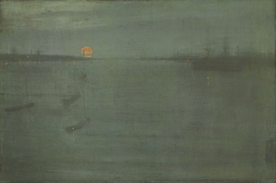
James McNeill Whistler's Nocturne: Blue and Gold—Southampton Water makes a working port seem suspended between visibility and disappearance. An orange moon hangs above the left-hand shore. Small boats drift through the lower-left water; a larger vessel and a forest of faint masts gather farther away. Scattered lamps tremble in short golden reflections, while the sky and harbour merge through closely related blue-greys. The view is sparse, but it is not placeless. It belongs to Southampton Water on England's south coast, where shipping, shore lights and an open passage towards the sea supplied the material that Whistler reordered.[1][2][6]
The painting is an oil on canvas dated 1872, now in the Art Institute of Chicago as 1900.52. The museum's current measurement is 51 by 76.7 centimetres. At the lower right, Whistler placed his butterfly monogram and what technical examination reads cautiously as `[72?]`; the last digit is not perfectly distinct. The canvas is presently off view, according to the Art Institute's collection record checked on 26 August 2026.[1][3][5] These facts distinguish the object from several other nocturnes whose similar colour titles and shifting place names have repeatedly tangled their histories.
At a Glance
- CatalogueYMSM 117
- Date1872
- SupportOil on plain-weave canvas
- Dimensions51 × 76.7 cm
- SignatureButterfly and faint [72?] at lower right
- SiteSouthampton Water, England's south coast
- Preferred titleNocturne: Blue and Gold—Southampton Water
- CollectionArt Institute of Chicago, 1900.52
- DisplayOff view on 26 August 2026; verify the current record
- FrameGrau-style American, after 1900; not securely artist-designed
Contents
- Which Whistler nocturne is this?
- A title that changed colour
- The harbour after sunset
- An orange moon made of several actions
- Stillness without emptiness
- Distance built from interruptions
- Place, memory and selection
- A dark ground beneath blue and gold
- Thin paint, abrasion and return
- What time and treatment have added
Which Whistler nocturne is this?
The secure identity is the conjunction of three records: catalogue number YMSM 117, Art Institute accession 1900.52 and the Southampton harbour image. A title alone is insufficient. Whistler repeatedly used Nocturne, Blue and Gold and Grey and Gold, sometimes changing the description of the same canvas and sometimes applying a similar phrase to a different one. The Chicago painting also spent a short period under the erroneous museum title Battersea, even though its shore and documentary history place it at Southampton.[1][6][8]
It must first be separated from Nocturne in Black and Gold: Entrance to Southampton Water, YMSM 179, in the Freer Gallery of Art. That is a much darker painting, probably made later, although its own date remains difficult. The two objects have been confused in exhibition histories and publications because both concern the entrance to Southampton Water. YMSM 117 must also remain distinct from YMSM 116, an independently catalogued Nocturne in Grey and Gold, and YMSM 118, the unlocated blue-and-silver nocturne shown beside it at the Dudley Gallery in 1872.[6][8][17]
The familiar Thames nocturnes introduce another trap. Chelsea, Battersea, Cremorne and Westminster provided related low horizons, shipping silhouettes and lamps, but they are different sites and physical objects. A reviewer in 1872 mistakenly described the Dudley pair as two effects over the same part of the Thames. That early error became part of the reception history; it is not geographical evidence. Southampton Water is a tidal estuary opening towards the Solent and English Channel, far from the southwest-London location sometimes assigned to the picture in popular summaries.[2][6][8]
A title that changed colour
The earliest likely public identity was Nocturne in Grey and Gold. That title appeared at the Dudley Gallery in 1872 and again at the International Exhibition in South Kensington in 1873. When Whistler sold the painting to Alfred Chapman in June 1874, he called it a “Nocturne in Grey & Gold” and added Southampton Water in parentheses. An 1878 letter even appended “No. 1”, but retrospective numbering cannot turn the nocturnes into a reliably ordered series.[5][6][11]
By the Grosvenor Gallery exhibition of 1879, the work had become Nocturne in Blue and Gold. Whistler still moved between grey-and-gold and blue-and-gold wording afterwards. The colour was not a laboratory classification, and a title change need not mean that the picture itself had been repainted. It records the artist's continuing effort to position an effect within his evolving vocabulary. The modern form emerged in the 1892 Goupil Gallery retrospective, where catalogue number 20 read Nocturne, Blue and Gold—Southampton Water. That printed catalogue provides the basis for the preferred title used today.[6][8][14]
The sequence matters because the title changes how viewers approach the canvas. “Southampton Water” preserves a particular coast and port. “Nocturne” directs attention to a low-light condition and to an analogy with music. “Blue and Gold” identifies a relation between a cool field and scarce warm accents. None of the three components cancels the others. Treating the place as irrelevant loses the shipping history; treating the colour phrase as a literal inventory misses the range of greys, earth colours and blacks found by examination.[2][3]
The harbour after sunset
Whistler divided the horizontal canvas into broad zones rather than constructing a conventional maritime panorama. Sky occupies the upper portion; the water opens below; a compressed shore threads between them. The horizon is not a hard boundary. Its blue-black mass seeps into the atmosphere above and reflections below, allowing land, anchored vessels and buildings to remain uncertain at their edges. This uncertainty makes the harbour feel deep even though the painted surface continually asserts its flatness.[2][3]
At left, a low promontory carries the moon and a string of minute lights. Several small boats sit forward of it. Their hulls are little more than softened dark strokes, but a few masts and warm points keep them from dissolving. Towards the right, taller verticals suggest larger sailing ships moored farther out. A denser band of shore activity closes that side. Between the two banks, the water continues towards the centre distance, turning a nearly empty interval into the route through the composition.[1][2][6]
There is no foreground quay, narrative group or principal ship for the eye to possess. The nearest boat at lower left is subdued enough to be discovered slowly. Its dim mast, hull and reflection act as a measure of the water's breadth. This is not a failure to describe a port. It is a decision about hierarchy: moon, horizon and tonal continuity are immediately apprehensible, while shipping emerges through sustained looking. Victorian maritime painting often made rigging, commerce or incident the organising subject. Whistler instead lets maritime life become the dispersed structure of an atmospheric whole.[2][8]
An orange moon made of several actions
The moon is the painting's most concentrated event. It sits left of centre, large enough to arrest the eye but low enough to remain bound to the harbour. Against the cool field, its orange-gold disk appears luminous. It also contains visible handling: horizontal marks divide its surface, a warmer layer shifts across the top, and its lower edge seems to hover over a narrow reflection. The result is not a mechanically perfect circle. It is a painted light whose construction remains perceptible.[2][3]
Microscopic and technical study reconstruct that construction. Whistler first used relatively thick pale-yellow paint. While it remained slightly soft, he passed a very thin orange-red layer over it with a fairly dry brush, beginning with horizontal strokes and finishing with a diagonal movement over the right third. The warm paint extends beyond the disk into the grey sky in places. A later grey stroke, forming the mast of a vessel below, was drawn through the still-soft moon. The order of application therefore joins distant light and foreground shipping in one material sequence.[3]
Small shore and ship lights repeat the moon at a radically reduced scale. These warmer touches are among the few passages where paint becomes locally thick and brush-marked. Their broken reflections do not form continuous golden columns; they descend as separated flecks, easily lost in the surrounding water. The colour title is realised through distribution as much as hue. Gold occupies very little surface, yet the scarcity of each accent increases its visual weight. The harbour's blue-grey breadth becomes the condition through which warm light can register.[2][3][6]
Stillness without emptiness
The broad water may initially look vacant, but its quiet is carefully differentiated. Horizontal applications cross the canvas in bands of varying translucency. Darker movements gather near the horizon and boats; paler, cooler films open in the middle; slight irregularities in the fabric and paint interrupt any seamless wash. The nearest water is therefore neither a mirror nor a blank field. It is a surface in which current, reflection and the act of painting have been compressed into nearly the same marks.[3][4]
Whistler minimised human activity without erasing the material port. Ships still carry masts; both shores carry lights; vessels occupy different distances. Calm comes from suppressed contrast and softened edges, not from an uninhabited fantasy. The low horizon makes sky and water feel extensive, while the dark land strip provides a hinge between them. Because the two large fields share colours and horizontal handling, the image can be read first as a relation of areas and later as a harbour.[2]
That double reading helps explain why the nocturnes could appear astonishing in the 1870s. They did not require viewers to choose between representation and abstraction, terms whose later opposition can distort the encounter. Southampton Water supplies the moon, banks, boats and shipping lane; Whistler selects how much of each survives. The work's economy asks the eye to become active, testing barely separated values and recovering shapes that no outline guarantees. Its stillness is thus a mode of attention. The longer one looks, the more the supposed emptiness fills with distinctions.[2][8]
Distance built from interruptions
Depth depends on differences that are easily missed. The lower-left boat sits nearer the bottom edge than any other vessel, yet its dark hull is broad and indistinct. Above it, a mast rises through a paler interval of water and stops well below the horizon. Smaller, tighter verticals along the distant shore then establish another scale. The eye reads separation between near boat, middle water and remote shipping even though Whistler supplies almost none of the descriptive modelling expected in a marine picture.[2][3]
Lights reinforce that recession. The left bank carries several tiny marks near the moon, while the right bank gathers a looser sequence of warmer points. Their reflections vary in length and brightness instead of forming a regular pattern. Because they are embedded in the same horizontal films as the water, they seem to flicker at different depths. The moon is larger, denser and higher than those lamps, but its low position binds it to the horizon rather than turning it into a detached emblem.[2][6]
The canvas weave remains visible across all these implied distances. A thread passing through a boat, open water or sky is physically continuous even as the image asks viewers to read separate spatial zones. That productive conflict is central to the work: material flatness does not abolish depth, and the harbour illusion does not conceal the support. Whistler obtains recession from overlap, scale, density and interruption while allowing the painted fabric to stay present. The apparent simplicity is therefore a negotiation between two kinds of seeing rather than an absence of construction.[3][4]
Place, memory and selection
The exact occasion on which Whistler observed this Southampton view is unknown. It is tempting to invent a single moonlit journey or to claim that he knew this particular inlet intimately, but the surviving evidence does not support either story. The painting identifies a real coastal environment while withholding a documentary account of when, where and with whom he saw it. A responsible reading keeps the geographical certainty and biographical uncertainty together.[2][6]
Accounts from Whistler's contemporaries describe a systematic memory exercise used for nocturnes. He would study a scene, turn away and recount its features to a companion, who corrected omissions; repetition trained him to retain the desired arrangement before returning to the studio. Versions of the story differ, and none proves the exact procedure behind every canvas. For the Chicago picture, it offers a plausible context for the combination of recognisable place and severe selection rather than a transcript of its making.[2]
Whistler later explained artistic selection through the analogy of a musician choosing notes and forming chords. His word “Nocturne”, suggested by his patron Frederick Leyland, supported the same argument. In November 1872 he thanked Leyland for a name that poetically said all he wanted without saying more, while also enjoying its power to irritate critics. This was both an aesthetic claim and skilful self-presentation. The object itself provides the stronger test: observation persists in differentiated ships and shores, while memory and studio revision organise them into a continuous tonal surface.[10][15]
A dark ground beneath blue and gold
Technical examination begins below the visible scene. Whistler worked on a plain-weave canvas with an average count of approximately 19.3 vertical by 17.6 horizontal threads per centimetre. The fabric includes nubs and changes in thread thickness that remain perceptible because the paint layers are so thin. Rather than hiding the support, his method makes its texture an active part of the final appearance.[3]
The canvas received a dark-grey preparation, probably after stretching. X-radiography indicates that the ground was laid in broad, sweeping and somewhat uneven movements. On the peaks of threads, bare fabric is exposed. Some exposure may come from abrasion while the ground was prepared; some may belong to later rubbing during painting, so the two stages cannot always be separated. This uncertainty is informative: the surface was produced by additive and subtractive work, not by a single uninterrupted wash.[3][4]
Analysis identifies lead white and a carbon-based black as the main ground components. Relatively large particles of red, yellow, orange and brown iron-oxide or earth pigments are also present. These warm inclusions are mostly beneath the painted scene, yet they prevent the preparation from being a neutral optical base. Their muted warmth mediates between the cool blue-grey films above and the moon's orange-yellow accents. Ground colour was therefore not merely something to cover. It helped unify the picture before individual boats, lamps or clouds were placed.[2][3][4]
Thin paint, abrasion and return
Whistler applied the image in exceptionally thin, fluid layers. Long horizontal strokes build sky and water, but many brush traces almost disappear as liquid paint settles into the canvas. The method is associated with the mixture he called his “sauce”, in which oil, resin and turpentine could produce a mobile consistency. A recipe described for the practice should not be treated as a chemical formula proven in every passage. What the object establishes is the behaviour of the films: they flow, soak, overlap and reveal the weave.[2][3]
Large portions were rubbed or scraped down. The action exposed darker ground and, at times, the tops of canvas threads. Whistler then returned with further thin layers, producing smoother and more continuous passages over the abraded paint. This sequence is central to the effect. Reduction did not simply erase mistakes; it created a mottled depth in which earlier states remain materially present without becoming legible pictures. Fresh films could soften those residues while never restoring an opaque, untouched surface.[3]
Thickness is reserved for particular needs. Streaky light-grey clouds at the upper left carry clearer brush marks. Moon, lamps and reflections rise slightly from the prevailing flatness. The distinction directs light through matter: the luminous elements are literally more substantial in paint, while darkness and atmosphere depend on exposed ground, stain and translucent overlap. Assertions that Whistler merely dashed off a haze miss this alternation between broad reduction and precise return. Speed may have belonged to individual sessions, but the finished surface contains revisions, abrasion and sequenced applications.[3][15]
What time and treatment have added
Today's colour is not identical to the appearance of 1872. The painting carries what conservators estimate to be a natural-resin varnish. Magnification reveals dark deposits in the canvas interstices, possibly remnants of more than one varnishing campaign. The present coating has yellowed, warming the image and contributing to an uneven, darkened aspect. Around the boats at left, lighter patches could result from Whistler's own method or from earlier uneven cleaning; examination cannot confidently choose between them.[3]
The canvas was lined by H. A. Hammond Smith in 1913 using an aqueous adhesive. He also cleaned and varnished it. The original tacking edges were probably removed during this treatment, a common historic intervention that changed the physical margins even as it stabilised the picture. In 1999, conservator Faye Wrubel reinforced tears in deteriorated lining edges with Japanese tissue and reversed the orientation of the lower stretcher bar. Three years later she edge-lined the fragile lining fabric and restretched the work on a custom wooden stretcher.[3]
The original stretcher was preserved separately, retaining evidence that might otherwise have vanished. The lined canvas is now taut and planar. A fine network of age cracks is chiefly visible under magnification, and only a few very small retouchings are recorded. The technical assessment describes the picture as in good condition. That conclusion does not erase change: lining, lost tacking edges, varnish, cleaning and restretching mediate what viewers see. Conservation history helps distinguish Whistler's thinness from later darkening and treatment rather than promising access to an untouched original.[3]
The frame is another historical layer
YMSM records the current surround as a Grau-style American frame, probably made after the painting reached the United States and perhaps around 1919. Its form participates in the modern presentation, but it should not be called Whistler's own design. The possible original frame is poorly documented. Given his practice on nearby nocturnes, it may have been painted or decorated under his direction by 1874, yet there is not enough evidence to reconstruct it securely or to claim that it survives beneath the later frame history.[7]
This distinction matters because Whistler treated frames, walls and catalogue design as parts of presentation. A later sympathetic frame can support the subdued painting without becoming artist-authored. Conversely, the loss or uncertainty of the first frame prevents a complete reconstruction of how Chapman or early exhibition visitors saw the object. The current frame belongs to the painting's American history, just as the yellowed varnish and preserved stretcher belong to its conservation history.[3][7]
The canvas's edges also complicate any imagined original ensemble. Probable removal of the tacking margins during the 1913 lining means that information about stretching and edge handling has been reduced. Technical evidence can describe the surviving object and its successive supports; it cannot restore every feature of its first display. Acknowledging that limit is more informative than attaching a generic “original Whistler frame” label to the work.[3][7]
First exhibitions and divided critics
The Chicago painting was probably at the Dudley Gallery in late 1872 as catalogue number 187, Nocturne in Grey and Gold. “Probably” is essential. Whistler's reused titles and the overlapping language of reviews prevent absolute identification. The description of a golden moon near the left horizon, shipping and dense warm twilight makes YMSM 117 the strongest candidate, while later evidence confirms Southampton Water rather than the Thames.[5][8]
Critics confronted a kind of picture for which their ordinary measures seemed unstable. The Athenaeum admired the subtle arrangement and delicate colour while describing air so dense that it appeared visible. The Builder questioned why nearby craft disappeared in fog while distant masts remained legible. The Times recognised rare truth and beauty in the tonal harmonies, then accused Whistler of building art out of his limitations and suppressing what was conventionally understood as subject. These were mixed, argued responses—not a unanimous burst of ridicule.[8]
The picture was linked more securely with the 1873 International Exhibition through Walter Greaves's later recollection of a Southampton moonlight. Its 1879 Grosvenor appearance as Nocturne in Blue and Gold is confirmed by a caricature in The Mask. John Ruskin's infamous “pot of paint” attack had appeared two years earlier and targeted Nocturne in Black and Gold: The Falling Rocket, not this work. Southampton Water belongs to the wider dispute about finish, value and subject, but assigning Ruskin's exact accusation to it would replace history with association.[2][8][15]
Alfred Chapman and the changing market
On 22 June 1874 Whistler sold the Southampton picture to Liverpool engineer and collector Alfred Chapman. The letter groups it with another nocturne and gives 200 guineas for the transaction, so the entire sum should not be silently assigned to this single canvas. Chapman lent the work to exhibitions and retained it for roughly a quarter of a century. His ownership helped the picture acquire successive public identities without losing its object continuity.[8][11]
By September 1894 Chapman had asked the Goupil Gallery to offer the painting for £400. Whistler wrote to the American collector Alfred Atmore Pope, urging him to consider the two Chapman pictures and calling “Southampton Waters—Blue and Gold” a beauty. The praise is valuable evidence of Whistler's continuing regard for the work, but it was also sales advocacy. Artist, owner, dealer and potential buyer occupied different positions within the same transaction.[8][12]
Chapman eventually sold works through Edward Guthrie Kennedy of H. Wunderlich and Company in New York. In January 1900 Whistler complained to John James Cowan about Chapman's profits and identified the beautiful Southampton nocturne among the pictures Kennedy had acquired. The letter conveys Whistler's resentment at the secondary market, not a neutral price report. It nevertheless corroborates the transfer path immediately before the museum purchase: artist to Chapman, Chapman to the New York trade, and then into Chicago's collection.[1][13]
The first nocturne in a public collection
The Art Institute bought Nocturne: Blue and Gold—Southampton Water from Wunderlich on 5 February 1900 using the Stickney Fund. It was the first Whistler nocturne acquired by a public institution and the only one to enter a public collection during the artist's lifetime. This distinction is more than a collecting footnote. Most nocturnes were still interpreted through private ownership, temporary loans and Whistler's carefully managed exhibitions. Chicago turned one of the earliest examples into a durable public reference object.[1][2][8][16]
The acquisition also placed the painting in an American setting where Whistler's reputation was still being negotiated. Subsequent loans and displays carried the canvas through memorial exhibitions and later accounts of Aestheticism, Tonalism and modern painting. The catalogue bibliography records the expanding scholarly trail that accompanied those displays. Its institutional history helped later audiences see the qualities that early viewers had disputed: a maritime subject concentrated into colour, a smooth surface made through repeated material action, and a nocturnal image poised between observation and formal independence.[2][9][16]
The current record continues that public history even when the picture is not hanging in a gallery. It supplies an open image, technical studies, provenance, exhibition documentation and a digital scholarly catalogue. Off-view status should therefore be understood as a practical condition, not disappearance from the collection. For a visit, the museum's live record should always be checked anew. For interpretation, the object remains unusually accessible through the combined evidence of image, canvas structure, letters and catalogues.[1][3]
Frequently Asked Questions
It belongs to the Art Institute of Chicago as accession 1900.52, purchased with the Stickney Fund in 1900. The museum's live collection data reported it off view on 26 August 2026, so prospective visitors should check the current record before travelling.[1]
The evidence does not support that simple claim. Thin fluid passages may have been applied rapidly, but examination reveals broad rubbing or scraping followed by further layers, plus a sequenced construction of the moon and mast. Whistler's statements about speed must be read beside those revisions.[3][15]
The Art Institute's technical catalogue describes it as in good condition, with a taut lined canvas, a very fine crack network and few tiny retouchings. Its present appearance is nevertheless affected by yellowed varnish and by documented lining, cleaning and restretching treatments.[3]
Discussion
How does one orange moon organise an otherwise restricted blue-grey harbour?
Trace the two shores, boats, masts, lights and reflections, then compare the apparent stillness with the rubbed-down ground, returned layers and local impasto revealed by technical study.
Reader Insights
How do the moon's layered colour and intersecting mast keep it inside the harbour rather than above it as an emblem?
Where does abrasion make the dark ground participate in sky and water?
Which details preserve Southampton as a working port despite atmospheric reduction?
Join the Conversation
Share a close observation or an object-history question.
References
- Art Institute of Chicago, “Nocturne: Blue and Gold—Southampton Water,” artwork 56905, accession 1900.52, current collection record and public API, checked 26 August 2026. https://www.artic.edu/artworks/56905/nocturne-blue-and-gold-southampton-water https://api.artic.edu/api/v1/artworks/56905
- Stephanie L. Strother, “Cat. 16 Nocturne: Blue and Gold—Southampton Water, 1872: Curatorial Entry,” in Jay A. Clarke and Sarah Kelly Oehler, eds., Whistler Paintings and Drawings at the Art Institute of Chicago, Art Institute of Chicago, 2020. https://publications.artic.edu/whistlerart/reader/paintingsanddrawings/section/84
- Kimberley Muir, “Cat. 16 Nocturne: Blue and Gold—Southampton Water, 1872: Technical Summary,” in Whistler Paintings and Drawings at the Art Institute of Chicago, 2020. https://publications.artic.edu/whistlerart/reader/paintingsanddrawings/section/84/84_anchor/p-84-12
- Kimberley Muir, “Ground and Atmosphere: Observations on Whistler's Painting Supports,” in Whistler Paintings and Drawings at the Art Institute of Chicago, 2020. https://publications.artic.edu/whistlerart/reader/paintingsanddrawings/section/24
- Margaret F. MacDonald and Grischka Petri, “Nocturne: Blue and Gold—Southampton Water: Date,” YMSM 117, The Paintings of James McNeill Whistler: A Catalogue Raisonné, University of Glasgow, 2021. https://www.whistlerpaintings.gla.ac.uk/catalogue/display/?mid=y117&xml=dat
- MacDonald and Petri, “Nocturne: Blue and Gold—Southampton Water: Subject and Titles,” YMSM 117, University of Glasgow, 2021. https://www.whistlerpaintings.gla.ac.uk/catalogue/display/?mid=y117&xml=sub
- MacDonald and Petri, “Nocturne: Blue and Gold—Southampton Water: Technical Description,” YMSM 117, University of Glasgow, 2021. https://www.whistlerpaintings.gla.ac.uk/catalogue/display/?mid=y117&xml=tec
- MacDonald and Petri, “Nocturne: Blue and Gold—Southampton Water: History,” YMSM 117, University of Glasgow, 2021. https://www.whistlerpaintings.gla.ac.uk/catalogue/display/?mid=y117&xml=his
- MacDonald and Petri, “Nocturne: Blue and Gold—Southampton Water: Bibliography,” YMSM 117, University of Glasgow, 2021. https://www.whistlerpaintings.gla.ac.uk/catalogue/display/?mid=y117&xml=bib
- James McNeill Whistler to Frederick Richards Leyland, 2–9 November 1872, GUW 08794, The Correspondence of James McNeill Whistler, University of Glasgow. https://www.whistler.arts.gla.ac.uk/correspondence/recno/display/?cid=08794
- James McNeill Whistler to Alfred Chapman, 22 June 1874, GUW 11251, University of Glasgow correspondence edition. https://www.whistler.arts.gla.ac.uk/correspondence/recno/display/?cid=11251
- James McNeill Whistler to Alfred Atmore Pope, 19 September 1894, GUW 09343, and David Croal Thomson to Whistler, 19–20 September 1894, GUW 05814, University of Glasgow correspondence edition. https://www.whistler.arts.gla.ac.uk/correspondence/recno/display/?cid=09343 https://www.whistler.arts.gla.ac.uk/correspondence/recno/display/?cid=05814
- James McNeill Whistler to John James Cowan, 6 January 1900, GUW 00739, University of Glasgow correspondence edition. https://www.whistler.arts.gla.ac.uk/correspondence/recno/display/?cid=00739
- James McNeill Whistler and Goupil Gallery, Nocturnes, Marines & Chevalet Pieces: Small Collection Kindly Lent by Their Owners, London, 1892, Smithsonian Libraries, DOI 10.5479/sla.880959.39088020308615. https://library.si.edu/digital-library/book/nocturnesmarine00whis
- High Court of Justice, Whistler v. Ruskin transcript and witness papers, 25 November 1878, GUW 11991; James McNeill Whistler, The Gentle Art of Making Enemies, enlarged 1892 edition. https://www.whistler.arts.gla.ac.uk/correspondence/recno/display/?cid=11991 https://www.gutenberg.org/files/24650/24650-h/24650-h.htm
- Sarah Kelly Oehler, “Foreword,” Whistler Paintings and Drawings at the Art Institute of Chicago, 2020. https://publications.artic.edu/whistlerart/reader/paintingsanddrawings/section/67
- MacDonald and Petri, “Nocturne in Black and Gold: Entrance to Southampton Water,” YMSM 179, University of Glasgow, 2021. https://www.whistlerpaintings.gla.ac.uk/catalogue/display/?mid=y179


