 by Tom Gurney
Tom Gurney BSc (Hons) is an art history expert with over 20 years experience
Published on June 19, 2020 / Updated on September 28, 2026
Email: tomgurney1@gmail.com / Phone: +44 7429 011000
About the painting
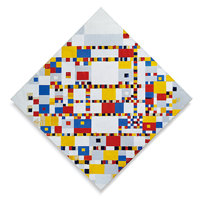
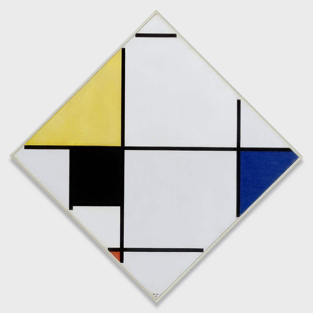
Piet Mondrian's Lozenge Composition with Yellow, Black, Blue, Red, and Gray turns a square canvas so that a corner points upward. The black divisions remain vertical and horizontal, while the outer edge runs diagonally. Yellow fills a large area near the upper left, blue reaches the right point, a black block anchors the lower left, and a very small red area lies near the bottom. The result is precise without being symmetrical. The Art Institute of Chicago dates the painting 1921, records it as oil on canvas, and identifies it as a 1957 gift of Edgar Kaufmann Jr. RKD assigns it catalogue number B127 and the museum accession is 1957.307.[1][2]
At a glance
- ArtistPiet Mondrian (Piet Mondriaan, 1872–1944)
- TitleLozenge Composition with Yellow, Black, Blue, Red, and Gray
- Date1921
- MediumOil on canvas
- Dimensions60 × 60 cm as stated in the Art Institute's current record; the diagonal display makes the point-to-point height greater than the side length
- Catalogue numberRKD / Joosten B127
- Museum and accessionArt Institute of Chicago, 1957.307
- CreditGift of Edgar Kaufmann Jr.[1][2]
Chicago B127 and a later lozenge
Contents
- What does the painting show?
- Why is it called a lozenge composition?
- How do colour and balance work together?
- Where does B127 fit in Mondrian's work?
- How did the painting reach Chicago?
What does the painting show?
The canvas has four pointed outer corners. Inside that diamond-shaped outline, Mondrian's long black lines run straight across or up and down rather than following the sloping edges. A horizontal black line stretches from the left point toward the right, passing below the broad yellow field. Near the right edge, a shorter vertical separates a brilliant blue triangle from the paler centre. On the left, a dense black area sits under the yellow, while a small red section interrupts the lower part of the structure. Most of the canvas is pale, although the title reminds us that the near-white and grey passages deserve attention too.
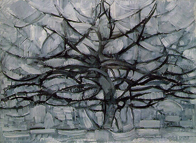
 The Red Tree Piet Mondrian.jpg)
These unequal colour areas do different jobs. Yellow is relatively broad and high; blue is narrow but reaches the outer point; black is both a painted field and the colour of the dividing lines. Red is tiny. Its scale makes it easy to overlook at first, yet once seen it alters how the lower point relates to the upper yellow and right blue. Mondrian did not distribute four equal coloured squares around a centre. He used their unequal sizes and positions to set up a changing visual balance.
The verticals and horizontals are not a continuous grid laid evenly over the whole surface. Several stop before an edge. One line above the blue reaches the slanted boundary. The Art Institute draws attention to this detail because it suggests a structure that could continue outside the canvas, even while other black lines seem to contain areas within it. That push between enclosure and continuation is central to the museum's reading of the work.[2]
The central pale region is large but not empty in effect. Its breadth lets the surrounding coloured blocks and dark lines register separately. The angled boundary cuts the internal rectangles into unexpected shapes at the perimeter. What would look like a stable arrangement in an upright square becomes more active when the square is presented on a point. Looking closely, the work depends on the particular placement and length of each line rather than on a generic recipe of primary colours.
Why is it called a lozenge composition?
“Lozenge” describes the square canvas displayed diagonally, with its four corners facing up, down, left and right. The support has not become a rhombus with unequal sides. It is the orientation of the square that gives the work its diamond-shaped profile. The Art Institute describes the resulting tension between the straight internal architecture and the diagonal outer edge. The museum's fuller interpretation asks how the contents of a painting relate to the thing containing them.[2]
That distinction matters when viewing a reproduction. An image file is usually rectangular, with spare background at its corners; the painted support is the tilted square inside it. Its point-to-point height is therefore greater than the 60 cm length of a side. The Art Institute's current object data gives 60 × 60 cm. A rounded dimension on the museum-supplied Google Arts & Culture artwork also gives 60 × 60 cm. These describe the square canvas, not the dimensions of the rectangular digital file.[2][3]
The choice of a lozenge does not turn the black lines into diagonals. They still cross at right angles. The contrast between their orientation and that of the outer edge gives the piece much of its energy. The blue wedge at the right and the narrow region near the upper point owe their shapes to where straight internal boundaries meet a slanting perimeter. Mondrian made the edge an active part of the composition rather than a neutral frame around it.
Watch: Piet Mondrian
See his studio, the move toward geometric abstraction and the rhythms of his New York paintings.
Piet Mondrian: Abstract Painting as We Know It
Curator Michael White explores the paintings and Mondrian’s studio as an abstract space.
Watch on YouTubeHow do colour and balance work together?
The painting uses yellow, blue and red, with black, grey and pale fields. It does not give each colour the same share of the canvas. The large yellow upper-left area could pull the eye strongly to one side, but the blue at the right point, the black lower-left block and the small red accent distribute emphasis across the entire diamond. The apparent lightness of the broad central field also matters: it gives those accents room to act without making the picture feel crowded.
Mondrian's divisions create a series of unequal intervals. The gap between the upper point and the short black line is narrow. The central pale area is expansive. The blue field meets the right point, while the red mark appears low and close to another line. A viewer can move around these relationships in several directions. One path follows the long central horizontal; another starts with yellow, descends through black, reaches red, then turns across toward blue.
This is a reading of visible relationships, not a claim that Mondrian assigned fixed meanings to individual colours. The Art Institute describes the work as a repeated search for balance and harmony, while its longer text emphasises the tension between contained fields and apparent extension beyond the canvas. Those are useful ways to look, but the painting does not require one compulsory route for the eye.[2]
The white and grey should not be treated as a blank background behind the “real” composition. They are areas with shape and weight of their own, defined by the black lines and the canvas edge. One reason the tiny red accent remains effective is that it enters a largely pale lower region. Colour and uncoloured-looking space depend on each other here.
Where does B127 fit in Mondrian's work?
RKD places B127 among Mondrian's 1920–21 Paris compositions, between other works that explore the relation of coloured areas and black divisions. That catalogue placement identifies this painting precisely, but it does not mean the neighbouring B numbers are studies for it. In the same RKD group, B126 and B128 are both called Tableau I, while B129 is Tableau II. Their shared year and abstract vocabulary can make titles confusing, so the B127 number and Chicago accession 1957.307 are useful identifiers.[1]
The 1921 date is supported by both RKD and the Art Institute. Its early lozenge format belongs to a wider set of Mondrian's experiments with the square on a point. The Art Institute describes the act of placing the square off axis as a way to reconsider the relation between painting and wall. Its account says Mondrian hung some diagonal paintings well above eye level so that the wall around them became part of the viewing experience. That is interpretive context, not evidence for the exact height at which B127 first hung.[2]
This painting should also remain separate from the site's Tableau No. IV; Lozenge Composition. The National Gallery of Art dates that much larger work circa 1924–25, identifies it as B156, and gives a different colour arrangement and accession 1971.51.1. Its related form makes comparison valuable, but its title, date, scale and museum are not B127's.[4]
How did the painting reach Chicago?
The Art Institute's provenance begins with a 1921–22 consignment to Galerie de L'Effort Moderne in Paris. It next names Jakob and Maaike von Domselaer in the Netherlands, with a question mark attached to 1922 and a range ending around 1940–45. Subsequent recorded holders include John Rädecker, John L. Senior Jr. and the Sidney Janis Gallery. The museum records Edgar Kaufmann Jr. acquiring the painting in March 1957 and giving it to the Art Institute that year. These are the museum's documented steps; the tentative dates should stay tentative.[2]
The work had been exhibited before entering the museum. The Art Institute lists a 1935 Wadsworth Atheneum exhibition and later presentations at the Stedelijk Museum, MoMA and the Art Institute itself, among others. Exhibition history shows that the painting has been seen in different settings. It does not establish that it is on view in Chicago at this moment, so the page makes no fixed gallery-location promise.[2]
The museum's accession and credit line make the present collection identity much firmer than a generic “Mondrian lozenge” label. They also help separate the painting from other diamond compositions that use nearly the same colour words in a different order. Anyone checking a reproduction can compare the yellow upper-left field, blue right point, dark lower-left block and small low red section with the Chicago record and B127 catalogue line.
Mondrian artworks directory
Frequently asked questions
When did Mondrian make this lozenge composition?
Where is the original painting?
What is the painting made of and how large is it?
The museum records oil on canvas, 60 × 60 cm. That measurement is for the square support; it appears diamond-shaped when displayed on a point.[2]
Why are the outer edges diagonal while the lines remain straight?
Mondrian displayed the square off axis while keeping the internal divisions vertical and horizontal. The contrast lets the slanted edge interrupt or extend the structure. The Art Institute explains this as a question about the relation between a painting's contents and its boundary.[2]
Is this the same work as Tableau No. IV in Washington?
Discussion
Which coloured field first holds your attention?
Reader Insights
Follow the long central horizontal toward the blue point. Where does your eye stop?
Does the small red area change how you see the larger yellow field?
How does B127 differ from the later Washington B156 lozenge?
Join the Conversation
Share what you notice in this painting below.
References
- RKD – Netherlands Institute for Art History, digital Mondrian catalogue, 1920–21 group, B127 Lozenge composition with yellow, black, blue, red and gray, dated 1921, Art Institute of Chicago accession 57.307. View source.
- Art Institute of Chicago, official object record and public collection API for artwork 109819, title, date, oil-on-canvas medium, 60 × 60 cm dimensions, accession/credit, interpretation, provenance and exhibitions. View object; View collection data.
- Art Institute of Chicago via Google Arts & Culture, museum-supplied artwork page for the exact 1921 Chicago painting. View source.
- National Gallery of Art, separate Tableau No. IV; Lozenge Composition with Red, Gray, Blue, Yellow, and Black, circa 1924–25, accession 1971.51.1, catalogue B156. View source.
- Lead image credit. Piet Mondrian, Lozenge Composition with Yellow, Black, Blue, Red, and Gray, 1921, oil on canvas, 60 × 60 cm, Art Institute of Chicago 1957.307, RKD B127.